The Colgate Raiders logo, an alliance of teams from Hamilton universities, is distinguished by its stylish minimalism, which ensures recognizability and ease of memory. The brand’s symbolism focuses on the name, and the graphics reflect the essence and characteristic features.
Colgate Raiders: Brand overview
| Founded: | 1940 |
| Headquarters: | Hamilton, New York, U.S. |
| Website: | gocolgateraiders.com |
The Colgate Raiders include several dozen university and club teams belonging to Colgate University. They play in Division I of the NCAA and participate in two conferences: ECAC Hockey and the Patriot League. They represent 18 sports, including volleyball, softball, field hockey, soccer, golf, tennis, track and field, cross-country, and others.
From 1932 to 2001, the sports department was called the Red Raiders in honor of the football team’s maroon uniform. However, after the adoption of a Native American mascot, the word “Red” became associated with Indians. Due to public outrage, the university administration was forced to shorten the nickname to Raiders.
Meaning and History
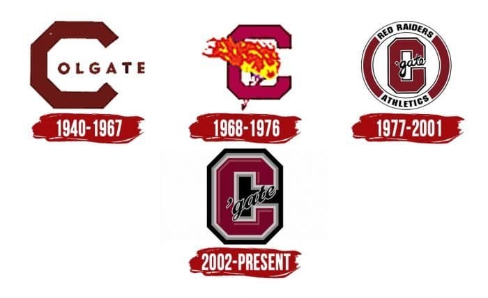
The letter “C” is executed in an original way in all emblems – first in the word “Colgate.” From 1940 to 1967, it had the form of an incomplete octagon without one vertical edge on the right side. “O,” “L,” “G,” “A,” “T,” and “E” were arranged in a straight line, starting inside the “C.” A little later, in the 1970s, department heads approved a new sports mascot – a hand holding a torch. This was reflected in the logo: until 1976, a burning torch was depicted next to the letter “C.”
What is Colgate Raiders?
The Colgate Raiders is a sports division belonging to Colgate University that consists of 23 student teams. It is located in Hamilton, New York, and participates in the Patriot League. The exception is the hockey teams, which are members of ECAC Hockey (both men and women). All teams compete in NCAA Division I.
1940 – 1967
1968 – 1976
1977 – 2001
2002 – today
In 1997, another redesign occurred. The artists changed the concept, placing the letter in an original ring and complementing it with many inscriptions. The second half of the words “Colgate” and “gate” pass through the “C.” The font imitates handwriting. Above the inner side of the ring is the team’s old nickname, “Red Raiders,” and below – “Athletics.” In 2002, the logo was simplified: the designers removed the round frame, leaving only the letter “C” with a diagonal inscription “Gate.” At the same time, they added a three-dimensional drawing with several contours (black, gray, white) and light broken lines.
Colgate Raiders: Interesting Facts
The Colgate Raiders are a sports team from Colgate University in Hamilton, New York. They play in big college competitions and are part of the Patriot League.
- Long History: Colgate started in 1819 and has been involved in sports for a long time. The “Raiders” name shows that they love to compete and win.
- Football Stars: The football team is really good. They had an unbeaten season in 1932 and played for a national championship in 2003. Football is a big deal at Colgate.
- Top in Their League: They play in the Patriot League, which cares a lot about being good at sports and doing well in school. The Raiders win many championships.
- Olympic Athletes: Some Colgate athletes have attended the Olympics in the Winter and Summer Games. This shows that Colgate helps athletes reach their dreams.
- Great Places to Play: They have amazing sports venues, like a modern hockey arena and a big football stadium. These help athletes do their best.
- Women’s Ice Hockey: The women’s ice hockey team is awesome. They almost won a national championship in 2018, which got them much attention.
- Helping Out: Colgate athletes greatly help people in their town and nearby. This shows they care about more than just sports.
- Smart Athletes: The students who play sports at Colgate are also good at their studies. They get high grades and win awards for being smart.
- Fun Mascot: Their Raider mascot is a big part of the school spirit. It gets everyone excited to cheer for the Raiders.
The Colgate Raiders are not just about winning games; they’re about doing well in school, helping out, and having a long history of being great at sports.
Font and Colors
Colgate Raiders color codes
| Ruby Red | Hex color: | #8e0a26 |
|---|---|---|
| RGB: | 142 10 38 | |
| CMYK: | 0 93 73 44 | |
| Pantone: | PMS 7621 C |
| Rose Vale | Hex color: | #b9505a |
|---|---|---|
| RGB: | 185 80 90 | |
| CMYK: | 0 57 51 27 | |
| Pantone: | PMS 7418 C |
| Medium Gray | Hex color: | #3b5b4b4 |
|---|---|---|
| RGB: | 181 180 180 | |
| CMYK: | 0 1 1 29 | |
| Pantone: | PMS Cool Gray 5 C |
| Black | Hex color: | #000000 |
|---|---|---|
| RGB: | 0 0 0 | |
| CMYK: | 0 0 0 100 | |
| Pantone: | PMS Process Black C |
