


![]() East Carolina Pirates Logo PNG
East Carolina Pirates Logo PNG
East Carolina takes pride in the achievements of its athletes, who make up the East Carolina Pirates team. The team’s logo accurately reflects the essence of the name. Since 1988, they have created a memorable image of the region’s geography and history.
East Carolina University was founded in 1907 in Greenville, North Carolina. Football began in 1932 with games against regional opponents. In 1934, coach Clarence Stasavich introduced the nickname “Pirates,” drawing on the coastal history and shaping the team’s identity through purple and gold.
A defining moment came in 1970 after a game against Marshall University. A plane carrying the Marshall team crashed on its return, killing 75 people. A memorial near Dowdy–Ficklen Stadium marks the event.
National attention rose in 1991 with a Peach Bowl win over NC State, 37:34. Women’s basketball won conference tournaments in 1984 and 1985, defeating Richmond and James Madison.
The 2007 Hawaii Bowl victory over Boise State marked the first bowl win in seven years. In 2008, ECU defeated ranked Virginia Tech 27:22 and West Virginia 24:3 in consecutive weeks, reaching No. 14 in the AP poll. The team won the Conference USA title against Tulsa and repeated as Conference USA champion in 2009 against Houston.
In 2013, under Ruffin McNeill, the program recorded a second ten-win season and beat North Carolina 55:31. In 2014, East Carolina University joined the American Athletic Conference and opened with a win over Virginia Tech.
Women’s basketball claimed the conference tournament in 2023 and returned to the NCAA Tournament. The football program produced over 20 All-Americans and more than 20 bowl appearances.
Meaning and History
![]()
The name Pirates is linked to the educational institution’s geographical location in North Carolina, where the infamous Blackbeard once lived. The nickname was approved in 1934. In 1983, they tried to change the name to “Pee Dee the Pirate,” but the students did not support the initiative.
The East Carolina University team chose the pirate name in 1934 to highlight the region’s historical connection to sea raiders. During the late colonial period in North America, many attacks were made on ships carrying goods to England. Moreover, the pirate theme reflects such essential qualities as courage, fearlessness, determination, and team spirit, which help achieve success at work. It symbolizes freedom and rebellion, which attracts the youth, especially students.
The East Carolina Pirates use various elements associated with sea raiders in their symbolism. Skulls, bones, bandanas, swords, wide-brimmed hats, and eye patches are what most team logos are based on. Some images were supplemented with custom-made inscriptions. Sometimes, you could see a pirate in full height, just the head. In 2014, the emblem became a parody of the Jolly Roger. It’s an important symbol that helps create a bright and memorable brand image.
What is East Carolina Pirates Logo?
The East Carolina Pirates is the name of the sports team representing East Carolina University, located in Greenville, North Carolina. The university is one of the largest and most recognizable in the state, thanks to its successful sports program, which began over 90 years ago with the creation of a football team in 1932. Then came basketball, baseball, and other sports teams. The East Carolina Pirates have a rich history of athletic achievements, including six conference football titles, over 20 championship titles across various sports, and participation in 13 postseason basketball tournaments.
1971 – 1980
![]()
The emblem features a pirate with a white face, highlighted by purple wrinkle lines and the outlines of the right eye, eyebrows, nose, mouth, and long mustache. The left eye is covered with a dark bandana, indicating the sea robber’s battle experience. The menacing look and dagger clenched in the teeth promise trouble for anyone daring to clash with the East Carolina Pirates. One ear of the man has a large gold earring – a typical pirate accessory. The other ear is covered by a yellow bandana, hanging sideways and tied on the forehead. His head is adorned with a purple hat featuring a white pattern, known as the Jolly Roger.
1980 – 1983
![]()
The style of the emblem changed. The pirate is no longer young but old: his face is covered with wrinkles. His skin has turned beige, and he has stubble on his chin. The wild hair sticking out in all directions, bushy eyebrows, and large, unkempt mustaches complete the image of a wild sea-robber. The artist made the dagger in his teeth yellow to make it stand out better and added a gold line along the upper brim of the hat. The image of the skull and bones was also reworked, becoming more clearly defined.
1983 – 1998
![]()
The proud pirate appears before sports fans at full height, so you can see how strong and muscular he is. He wears a purple tunic with yellow cuffs and lapels. Underneath is a classic sailor’s vest with black-and-white stripes. On his legs are yellow pants and black boots. The raider’s accessories include a belt with a gold buckle, a round earring, and an eye patch. The Jolly Roger, which was once depicted on the purple hat, has been replaced by a yellow “ECU” inscription. The pirate is moving forward with clenched fists and rolled-up sleeves as if ready for hand-to-hand combat. Thanks to the new cartoonish design, the character looks more modern.
1998 – 2009
![]()
In this logo, the pirate takes a secondary role; only his reduced head is visible, positioned in the upper-left corner. Most of the space is occupied by the purple word “PIRATES,” consisting of capital letters with unusual triangular serifs. Below is a sword with a hilt resembling an inflated sail. At the top right is a two-level inscription: “East Carolina University.” It is set in a small, thin font with large spacing between the letters. All elements, except this phrase, are surrounded by a golden halo.
2009 – 2014
![]()
The colors became darker than in the previous version. As a result, the logo is better seen on a light background. The graphic elements and inscriptions remained unchanged.
2014 – today
![]()
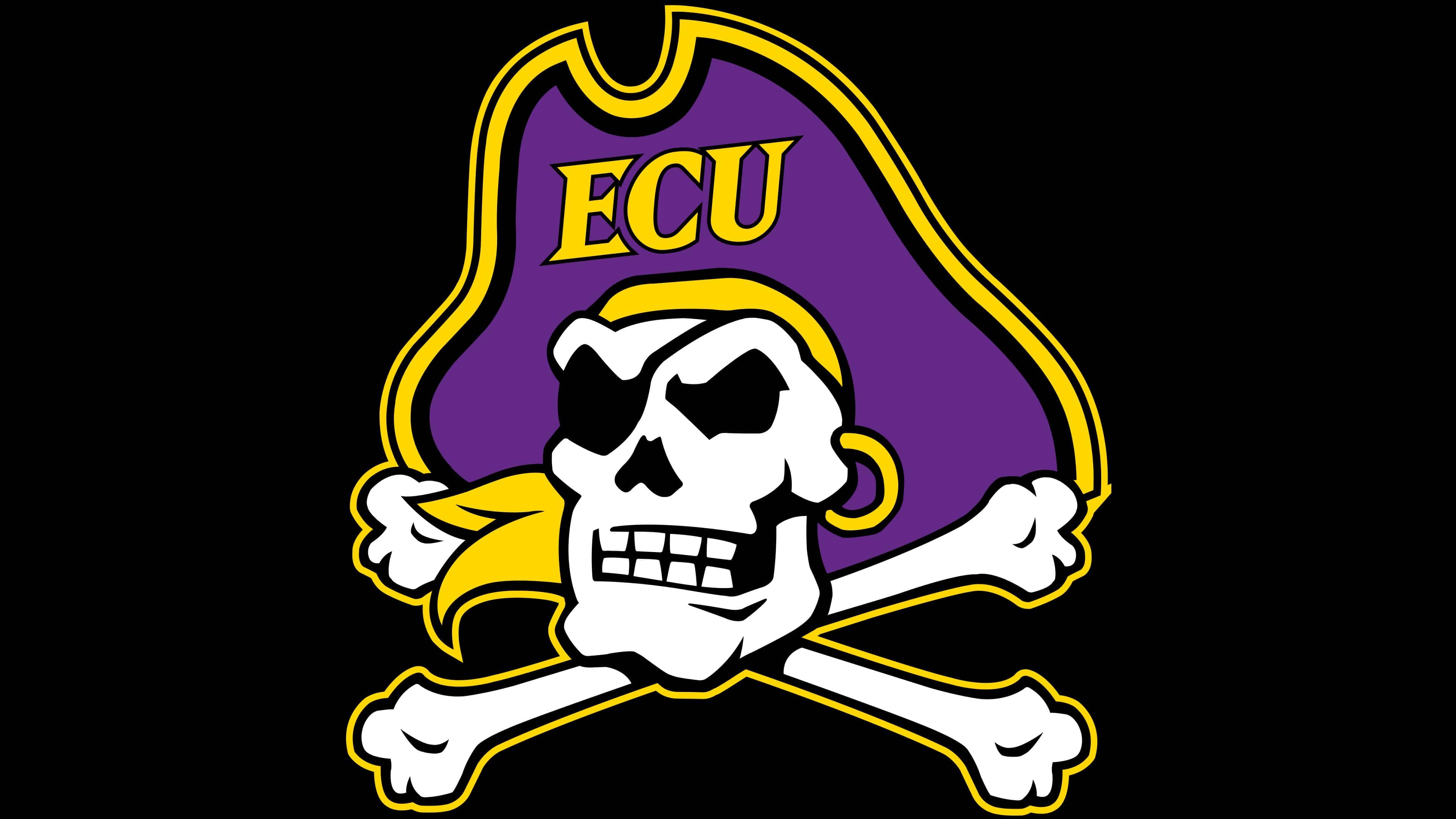
In 2014, many university teams underwent rebranding. The East Carolina Pirates also introduced their new logo during the offseason, which appeared on helmets and sports arenas. Now, its sole element is a stylized Jolly Roger with a pirate hat featuring the letters “E,” “C,” and “U.” Surprisingly, the skull has a lively expression; it grins, showing two rows of strong teeth. One eye socket appears to be frowning menacingly. It also has a gold earring and a kerchief blowing in the wind. This sign reflects the team’s pride and grandeur.
Basketball was the first intercollegiate sport sponsored by East Carolina University. In 1947, the men’s team joined the North State Conference of the NAIA, and six years later, it won the conference championship. It also participated in the NCAA tournaments twice, in 1972 and 1993. The women’s team also participated in the NCAA Division I basketball tournament twice: in 1982 and 2007. The women’s home games are held at Williams Arena at the Minges Coliseum.
Font and Colors
The 2014 East Carolina University logo uses a slightly modified version of the Matrix Extra Bold font. The letters are adapted to the cartoonish drawing style. This is the university’s official font, which is sometimes used alongside Gotham in its identity.

The primary colors of the East Carolina Pirates are gold (#FFC702 or #FDC82F for coated paper) and purple (#592A8A). They were chosen by a student committee in 1909 and are present on almost all of the educational institution’s signage. In the 2014 emblem, these colors are combined with black and white.