 Air Force Falcons Logo PNG
The Air Force Falcons logo, which unites both the men’s and women’s teams, is aesthetically appealing and emphasizes gender equality. The succinct textual acronym in the brand’s colors symbolizes confidence in victory, stability, and the aspiration to achieve the best results.
The Air Force Falcons trace their history to 1954, when the United States Air Force Academy opened in Colorado Springs alongside West Point and Annapolis. From the start, sport was embedded in officer training as a core discipline.
Teams appeared in the first years, with the Falcons’ name tied to aviation and a live falcon adopted as mascot. Blue and silver reflected the air focus. The academy entered the NCAA under stricter conditions than civilian programs, as cadets balanced sport with academic and military demands.
Football became the main program. By 1958, the team reached top-level college competition and began appearing in Bowl games. A turning point came in 1981, when Fisher DeBerry took charge and introduced an option offense suited to disciplined rosters.
In 1985, the Falcons went 12–1 and ranked among the nation’s leading teams, while also winning the Western Athletic Conference title. Rivalries with the Army and Navy grew into nationally followed fixtures.
The move to the Mountain West Conference in 1999 brought new competition from Brigham Young and Utah. In 2011, Troy Calhoun continued the system, leading to conference titles and Bowl appearances, including the 2023 Armed Forces Bowl.
The program also produced results in boxing and maintained a steady presence in basketball. With 29 teams and mandatory cadet participation, the Falcons have remained competitive within strict institutional limits.
Meaning and History
What are the Air Force Falcons?
Air Force Falcons are the sports division of the United States Air Force Academy, located in Colorado Springs, Colorado, and part of NCAA Division I. The program has 10 women’s and 17 men’s teams that compete in the Mountain West Conference. The organization is also a member of various sports associations, including Atlantic Hockey, WAC, and the Mountain Pacific Sports Federation.
1955 – 1956
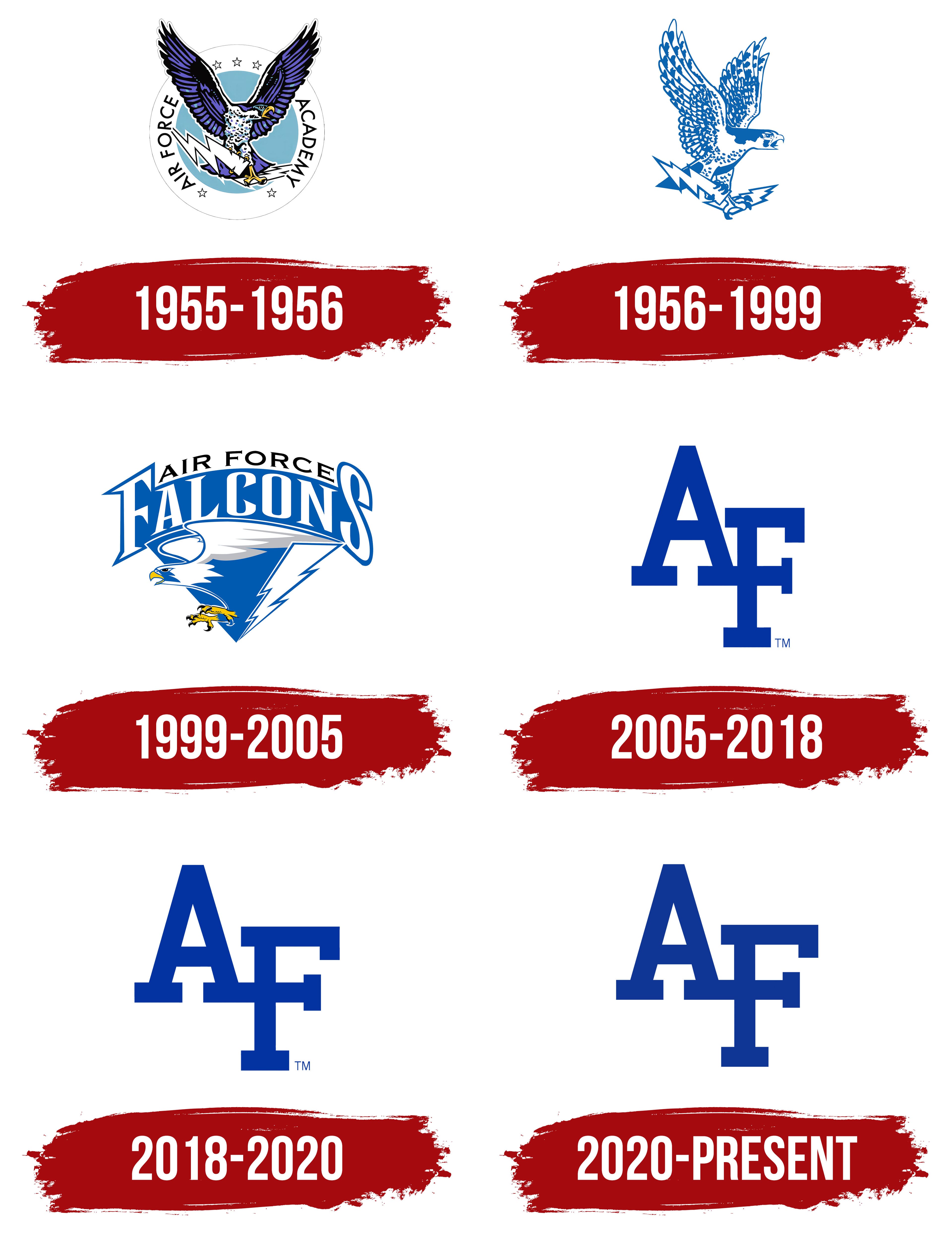
The history of the Air Force Falcons emblem began with the U.S. Air Force Academy’s earliest cadet traditions, before construction of its campus was complete. In the athletic teams’ name, Air Force identifies their military affiliation, while Falcons name its mascot. The academy was established on April 1, 1954. Classes began at its temporary home at Lowry Air Force Base in Denver in July 1955, and the academy moved to its permanent campus near Colorado Springs in 1958.
Several animals were considered before the falcon became the academy’s symbol. In spring 1955, a committee chaired by Captain Harrison Haberg Jr. evaluated the lion, tiger, bear, eagle, and falcon. Its June 29 report favored the falcon but left the final approval to the cadets. The first incoming class voted on September 25, 1955. Those cadets graduated in 1959. The bird represented the speed, strength, courage, and agility expected of future military aviators.
Several falcon species have served as the academy’s live mascots. The first peregrine falcon was introduced in October 1955. It was named Mach I after the speed of sound, giving the bird a name rooted in aviation.
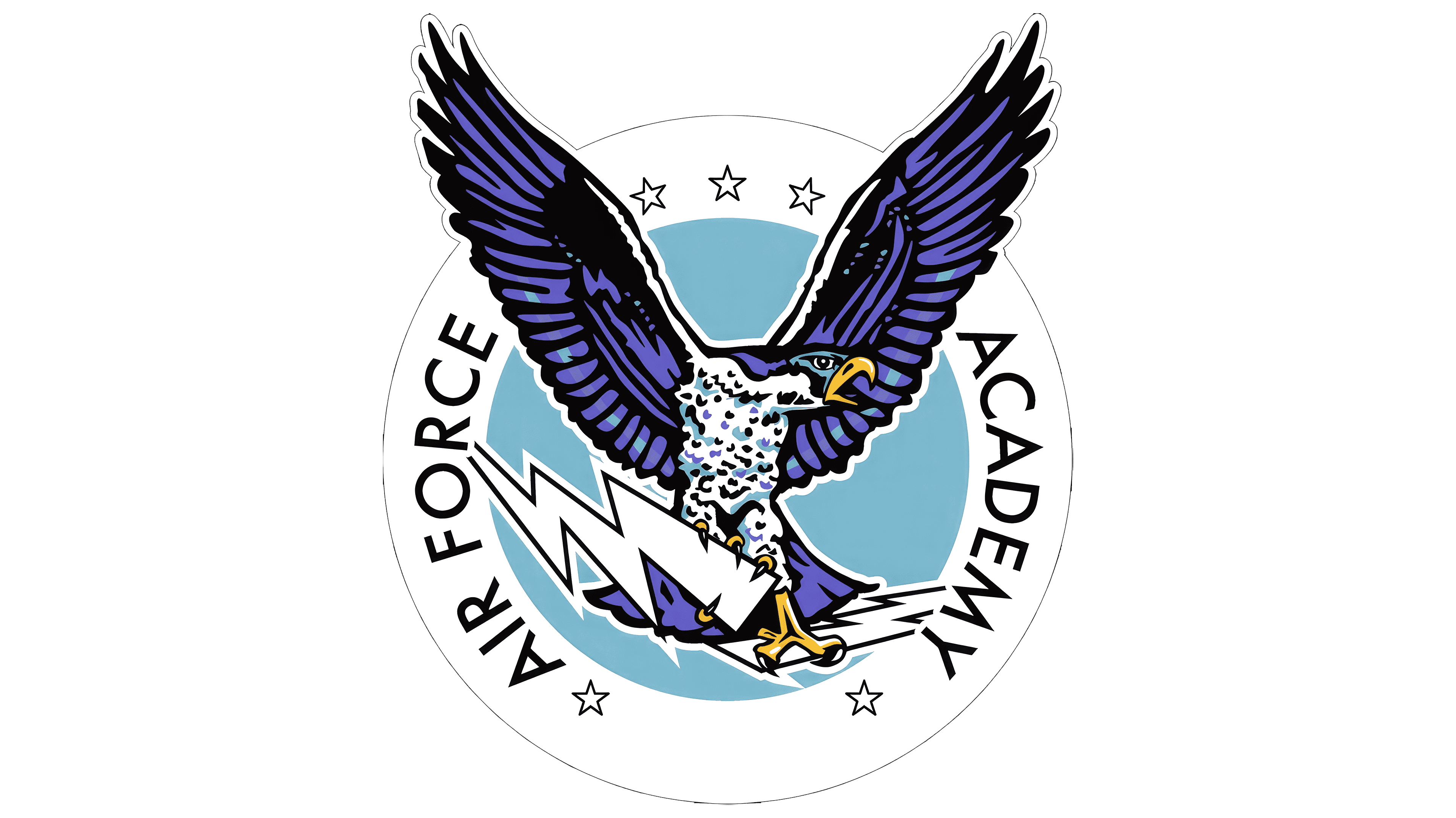
In the early emblem used from 1955 to 1956, a falcon occupied the center of a blue circle. A white ring containing stars and the words AIR FORCE ACADEMY surrounded it. Uppercase sans-serif letters followed the curve of the ring, framing the bird. Its wings rose above its head, its beak pointed right, and its talons gripped a zigzag lightning bolt. The illustration included detailed plumage, breast markings, and individual flight feathers. Yellow accents appeared on the beak and feet.
The athletic emblem subsequently underwent four revisions. The first three versions retained the falcon, connecting the team’s identity to the tradition established by the first cadet class.
1956 – 1999
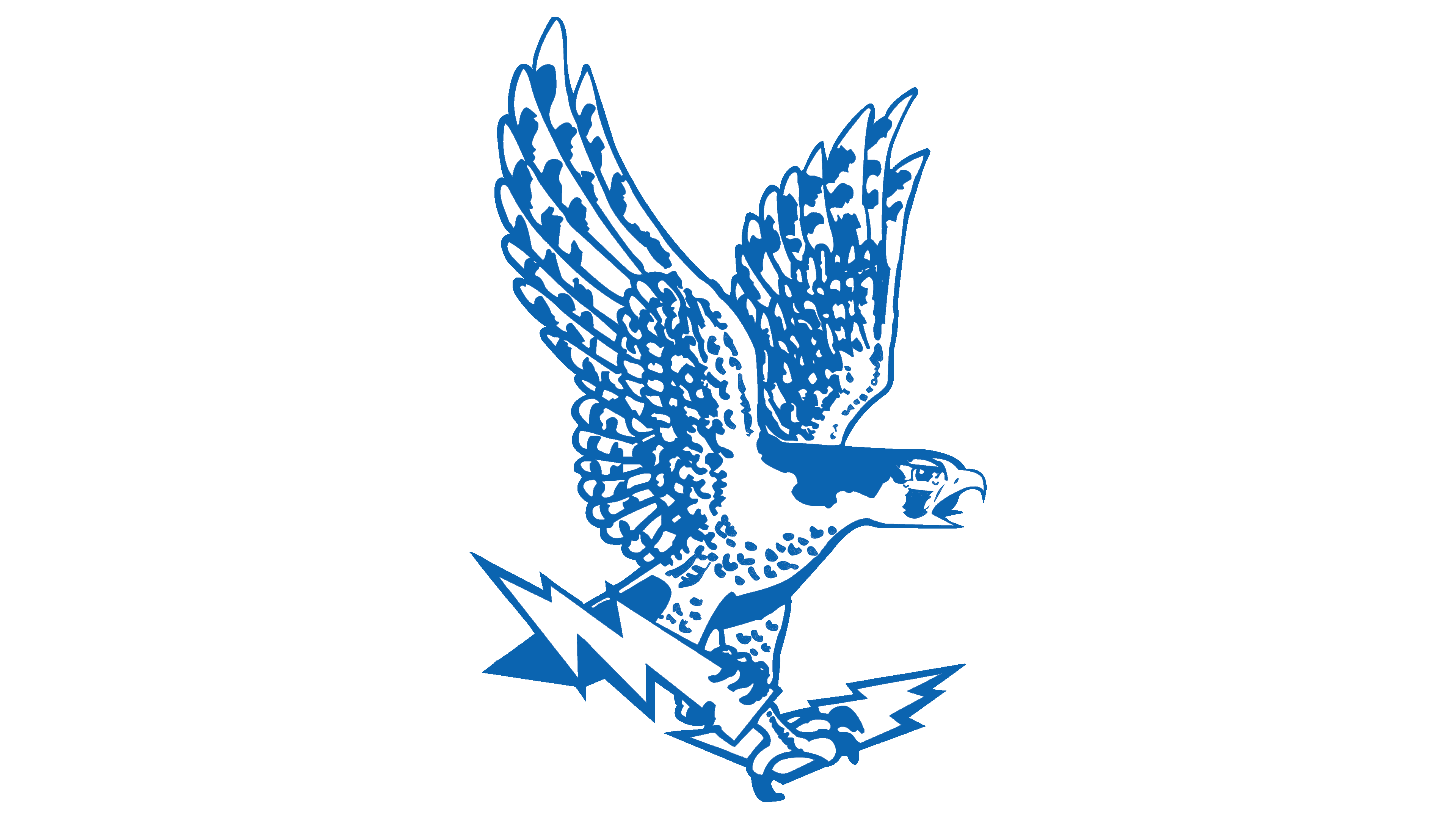
From 1956 to 1999, the Air Force Falcons used a falcon with a lightning bolt as their emblem. The circular frame and AIR FORCE ACADEMY lettering were removed, leaving the bird on its own. The emblem’s outer contour now followed the edges of its body and feathers.
The falcon retained its earlier pose, with its wings raised above its head. Its head still faced right, and the illustration preserved its hooked beak and long feathers. A lightning bolt sat beneath its feet. The bird of prey and lightning bolt formed the basis of the revised emblem.
Blue and white remained, replacing the yellow accents. Alternating blue areas and white spaces gave the body depth, while the boundaries between the colors defined its anatomical details.
1999 – 2005
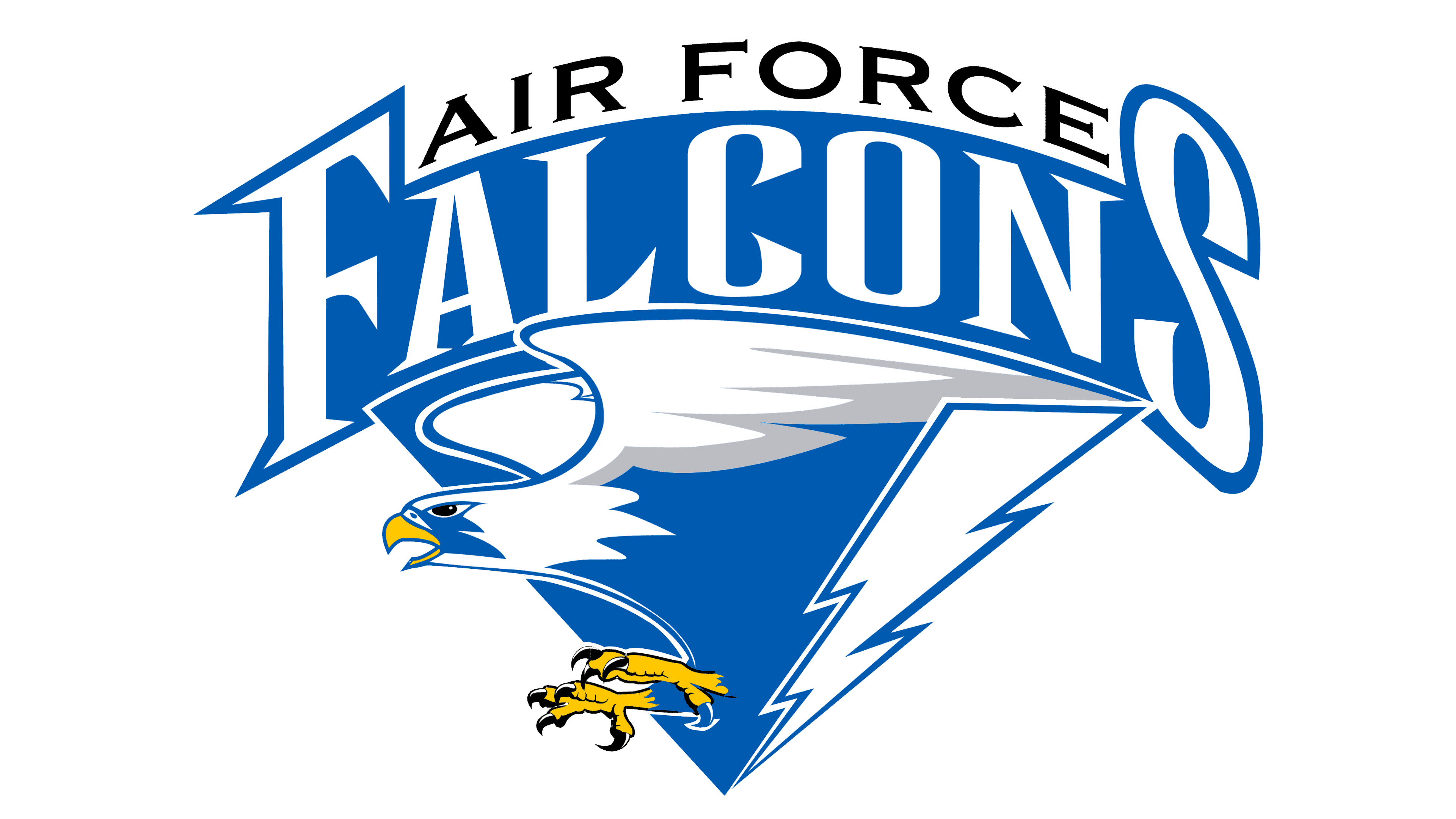
The introduction of Falcon 2000 in 1999 changed the balance between imagery and lettering in the Air Force Falcons’ identity. The primary emblem placed the team’s full name above the falcon. The bird’s nearly vertical silhouette gave way to a falcon flying left with its wings extended.
Two tiers of lettering occupied the top of the logo. Black uppercase AIR FORCE arched above a large white FALCONS on a blue background. Tall, narrow serif letters filled most of the upper section, with the “F” and “S” framing the word.
Below the name, the falcon’s blue body was paired with white and gray feathers. Its beak and talons were gold. A white lightning bolt ran beside the bird within the blue base. The falcon and bolt maintained a connection to the previous emblem.
2005 – 2018
A blue AF monogram became the primary mark for Air Force athletics in 2005. Interlocking initials had appeared in the academy’s identity since the 1960s, and the version adopted as the primary mark had been introduced as a secondary emblem in 1994. The update moved it into the lead role, removing the bird, lightning bolt, and full team name from the primary logo.
The initials stand for Air Force. A tall “A” occupies the left side of the monogram, while the “F” sits lower and to the right. The letters form a stepped arrangement that reads from top to bottom. The “F” extends into the right diagonal stroke of the “A,” and the letters join at the level of the crossbar of the “F.”
The large letters use the academy’s blue. Heavy strokes and rectangular serifs place the lettering within the tradition of American collegiate monograms.
2018 – 2020
The Air Force teams’ AF monogram was revised during 2018–2020, retaining the familiar arrangement of the initials. The changes affected the letters’ width-to-height proportions, interior spaces, and the junction between the “A” and “F.”
The revisions produced a more compact silhouette. The blue color and interlocking letters preserved the connection to the previous version.
2020 – today
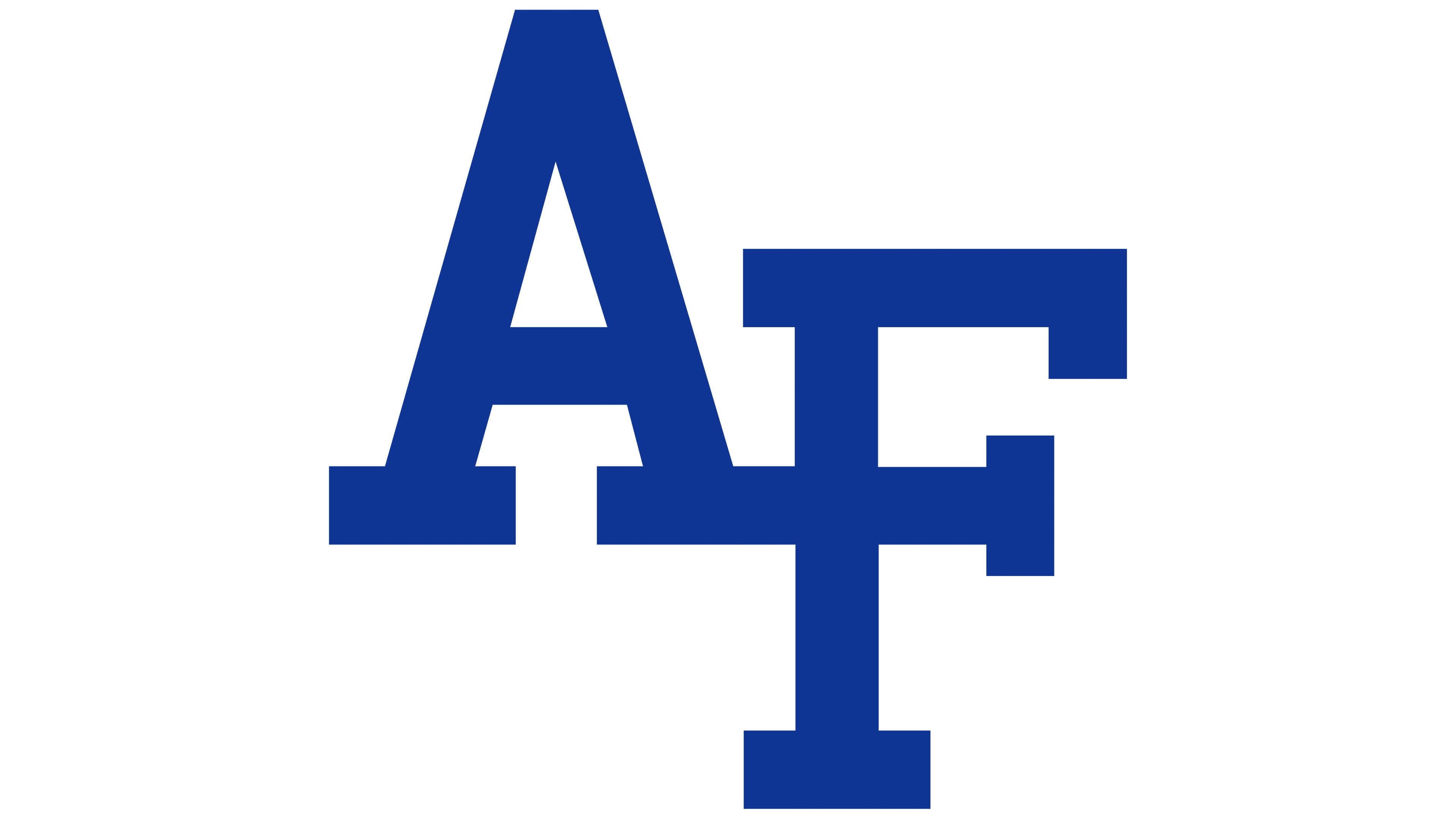
The AF monogram’s blue became slightly darker in 2020, while the interlocking letterforms remained unchanged. The earlier Academy Blue corresponded to Pantone 286. By 2024, the athletic identity used Pantone 661 C (hex code #003594). The supporting colors are white, silver (Pantone 421 C), and dark blue (Pantone 655 C). The latter two appear in secondary color combinations, including versions intended for different backgrounds.
The monogram remains the academy’s primary athletic emblem, followed by the standalone lightning bolt and falcon. An AIR FORCE wordmark is also available. To identify a particular team, the sport’s name appears beneath either the wordmark or the AF monogram. Separate standards govern these labels.
While retaining AF as its primary logo, the academy updated the falcon illustration. The new bird was unveiled in June 2022. Its designer, Jack Hadley, began working on the project in 2020 with marketing director Andrew Hamilton. Current cadets and graduates contributed to the discussions. The emblem was intended to represent the shared identity of an academy that prepares officers for both the U.S. Air Force and the U.S. Space Force.
The project also addressed practical concerns. Fine feather details in the earlier illustrations were lost when printed at small sizes or embroidered. The birds appeared to be perched on lightning bolts, while Hadley wanted to depict flight. He therefore revised the falcon’s pose and level of detail.
The model was Nova, a white female gyrfalcon from the academy’s falconry team. She arrived at the academy in 2020, and her name was associated with the formation of the Space Force. The project’s working title, SuperNova, extended that theme. Hadley photographed Nova, sketched her, and used those studies to develop a vector illustration. In the final version, large angular shapes in blue, dark blue, and white define the feathers. The head faces right, the wings are raised, and the talons grip a single lightning bolt.
The falcon incorporates references to the academy and both military branches. Its V-shaped wing arrangement echoes the U.S. Air Force symbol. A Polaris star on its chest represents a moral compass, while an adjacent shape references the Space Force delta. The tips of the right wing incorporate a motif drawn from the spires of the Cadet Chapel. Nine wing points correspond to the academy’s nine learning outcomes, encompassing science and engineering, communication, leadership, ethics, and military service. The single lightning bolt in its talons symbolizes the academy’s unity.