![]() Columbia Lions Logo PNG
Columbia Lions Logo PNG
The Columbia Lions logo reflects the university’s devotion to its history and royal heritage. The fierce face of the blue lion is meant to intimidate opponents and embodies the nobility, wisdom, and strength of the university’s athletes.
Columbia University began in 1754 as King’s College, establishing one of the earliest academic institutions in the United States with organized athletics. Football started in 1870, and in 1874 the team faced Rutgers, placing the program among the first participants in intercollegiate games.
In 1896, Columbia became part of the group that later formed the Ivy League, with the conference formally structured in 1954. Basketball emerged in 1904, expanding the athletic portfolio. In 1925, Baker Field opened as a large-scale sports complex in New York City.
The 1930s marked a peak in football history. In 1934, Columbia defeated Stanford in the Rose Bowl, securing one of the most notable wins in program history.
After World War II, athletic programs expanded across multiple sports. The 1960s brought upgrades to facilities, including Levien Gymnasium. The 1970s saw the introduction of women’s teams following Title IX, broadening participation.
Football struggles, including a long losing streak, marked the 1980s. In the 1990s, the university invested in infrastructure, opening a new athletic complex in 1996. Robert K. Kraft Field was completed in 2006.
In the 2010s, Columbia achieved consistent results in wrestling and fencing, with teams appearing in national rankings. By 2023, Columbia Lions continued to compete within the Ivy League, maintaining one of the longest continuous athletic traditions in college sports.
Meaning and History
![]()
What is Columbia Lions?
It is the athletic arm of Columbia University, comprising approximately 31 men’s and women’s teams that compete at the NCAA Division I level and are members of the Ivy League. Wearing the University’s recognizable blue-and-white uniforms, the teams compete in a range of sports, from soccer and basketball to fencing and rowing, and practice in state-of-the-art facilities such as the Baker Athletics Complex and Levien Gymnasium. They are unique in representing the University in intercollegiate competition while maintaining the high academic standards that characterize an Ivy League education. Team members combine competitive athletics with serious academic pursuits, embodying the ideal of the student-athlete. The University’s soccer team competes in the FCS division.
1936 – 1957
![]()
The first Columbia Lions logo greeted viewers not with a predatory snarl but with a bright cartoon character. A cheerful lion standing on its hind legs moves forward with a football in its paws. He resembles an experienced player running toward the finish line and glances slightly back, ready for any surprises on the field.
The lion’s image is both playful and bold. His face shows full concentration with a hint of irony. His eyes are narrowed, brows arched, and lips slightly stretched into a smile. He appears to be a player fully focused on winning and ready to outmaneuver any opponent.
An unusual accessory adds charm to the character. He wears an old leather helmet typical of American football in the first half of the twentieth century. This detail makes the image more playful and recalls the era of classic sporting contests.
The lion’s movement is energetic. In one paw, he firmly holds the oval ball, while the other is extended forward, ready to fend off an opponent. The character seems to have just received a pass and is trying to dodge a defender as they approach a long-awaited touchdown.
The first Columbia Lions logo conveys a light, playful team spirit, combining sport and humor in a single, vivid image.
1957 – 1971
![]()
The next period is remembered for an unusual lion image that differs from typical sports mascots. Instead of a realistic or cartoon figure, viewers encounter a lion that looks as if it stepped off an old heraldic crest, presented in a modern style. The lion symbol, introduced in 1948, partly resembles the Peugeot logo’s mark, although the team and the brand are not connected.
The lion’s figure is vertical, with raised paws, appearing frozen just before a strike. The animal’s mouth is open, showing sharp fangs and tongue. The entire body and head are turned to the left. The stance looks majestic and recalls figures from ancient knightly shields and family seals.
The body is covered with complex blue and black patterns woven into an intricate ornament. The image is built from decorative elements, with the mane rendered in sharp, pointed shapes that emphasize a fierce yet noble character.
In this lion image, strength and power are expressed through style and ornamentation, combining traditions with contemporary approaches to the Columbia Lions’ visual identity.
1971 – 1997
![]()
The visual identity changed again, dramatically. The lion silhouette remained the core image, now captured mid-leap to the left. The figure lacks detail and fine lines. Instead, the lion is defined by a smooth, flat contour, devoid of facial or body features. The mane is stylized with several sharp spikes running along the top of the head and neck.
Visual impact comes from the combination of two colors. Dark blue fills the entire figure, while a wide light-blue line outlines the silhouette, emphasizing the edges. The contrast between the tones adds depth and volume.
The lion appears in a dynamic pose, suggesting it is frozen just before a burst of movement. Despite the minimalist approach, the figure retains aggression and a strong athletic spirit.
1997 – 2006
![]()
Starting in 1997, the teams used an emblem that effectively combined the lion image with New York symbolism. The athletic mascot was shown in a new pose. The lion stretches its paws forward and opens its mouth, revealing sharp white fangs. Its gaze is stern. Beneath the paws, three diagonal lines emphasize the attack’s momentum, resembling claw marks.
The lion figure is rendered in two shades of blue. Light blue fills the main silhouette, while dark blue defines the mane, face, and muscular structure. The claws and teeth are highlighted in white with a blue outline.
The Columbia Lions logo is further complemented by a New York City skyline, depicted through building silhouettes that are unmistakable among world cities. Visible among them are the Chrysler Building, other iconic skyscrapers, and the Statue of Liberty. The skyline includes a text block placed within the city outline. The word COLUMBIA is set in a large light blue serif typeface, while UNIVERSITY appears below in a smaller white font of a similar style.
The combination of the lion and the New York skyline emphasizes the connection of Columbia University teams to the metropolis and its cultural symbols.
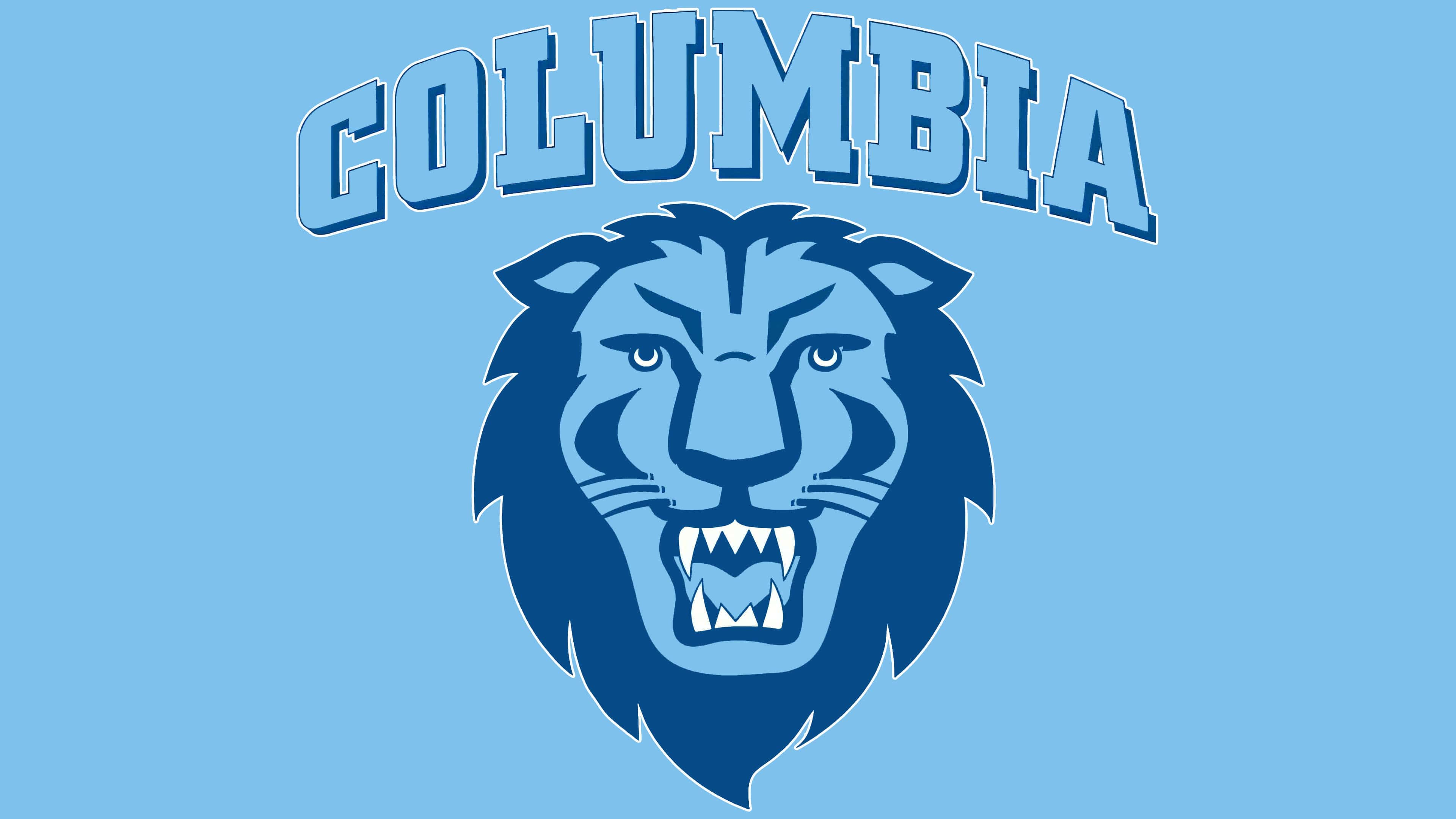
2006 – 2025
![]()
In 2006, a new emblem introduced a different lion image. It features a large, frontally shown head with an open mouth and an aggressive snarl. The direct and intense gaze underscores the mascot’s character, pride, and uncompromising strength.
The emblem uses two shades of blue. The upper part of the head is light blue, while the mane elements, shadows, and outlines are rendered in a darker blue. The lion’s teeth are bright white and outlined in dark blue.
Above the animal’s head runs a semicircular inscription reading COLUMBIA. The typeface is athletic and bold, with rectangular serifs similar to Varsity or Collegiate styles. The text is light blue with a dark blue outline, creating a sense of depth.
The new emblem conveys the energetic and combative spirit of the Columbia Lions. The concise lion image aligns with the university’s standard colors and highlights its athletic heritage.
2025 – today
![]()
In the current Columbia Lions visual identity, the familiar lion image has been retained, but the text elements have been removed. The main lines and details of the illustration remain unchanged, as does the aggressive facial styling. However, the color palette has shifted. The former light blue has become more muted, while the inner areas of the mane and selected strokes are rendered in a rich, dark blue.
In addition to the color change, the head image was enlarged, making the lion’s head the logo’s sole central element. The larger scale emphasizes the facial expression and enhances the image’s emotional impact.