


![]() Nebraska Cornhuskers Logo PNG
Nebraska Cornhuskers Logo PNG
The University of Nebraska, the state’s oldest university, is actively developing its own sports department, which initially used an emblem to associate the department with the university. Gradually, the formation of a new identity was driven by a desire for minimalism, and today, the Nebraska Cornhuskers’ letter logo reflects a closer connection to the city.
The Nebraska Cornhuskers program began in 1890 with the University of Nebraska-Lincoln’s first football team. Early squads were called “Bug Eaters,” a reference to the difficult local conditions. In 1899, journalist Cy Sherman introduced the name Cornhuskers, which was officially adopted in 1900.
A first dominant period was led by Ewald “Jumbo” Stiehm from 1911 to 1915. His teams went 35–2–3, won five Missouri Valley Conference titles, and built a 34-game unbeaten streak from 1912 to 1916. In 1922 and 1923, Nebraska defeated Notre Dame’s Four Horsemen.
In 1962, Bob Devaney took over and led the program to eight conference titles and national championships in 1970 and 1971. The 1971 season included a win over Oklahoma in the “Game of the Century” and a 38:6 victory against Alabama in the Orange Bowl.
Tom Osborne became head coach in 1973 and remained until 1997, finishing with a 255–49–3 record. His teams won national titles in 1994, 1995, and 1997, with key bowl wins over Miami, Florida, and Tennessee. The program also recorded 33 straight seasons with at least nine wins.
Three Heisman Trophy winners came from Nebraska: Johnny Rodgers in 1972, Mike Rozier in 1983, and Eric Crouch in 2001. Since 1962, Memorial Stadium has sold out every home game, establishing a long streak. In 2011, Nebraska joined the Big Ten after decades tied to conferences that originated from the Missouri Valley system.
Meaning and History
![]()
The sports department has had several names. Initially nicknamed Antelopes, the university was later adopted by another university: the University of Nebraska at Kearney. Then, names such as Old Gold Knights, Bugeaters, and Mankilling Mastodons appeared. However, in 1893, following a victory over the Iowa team, a newspaper article quoted the phrase, “We met the Cornhuskers, and they are ours.” Therefore, in 1899, writer Cy Sherman began calling them the Cornhuskers. The nickname stuck and was later officially adopted, reflected in the team’s symbolism.
What is Nebraska Cornhuskers?
The Nebraska Cornhuskers is the sports department of the University of Nebraska-Lincoln. It includes 22 student teams that compete in NCAA Division I, are members of the Big Ten Conference, and participate in the Patriot Rifle Conference (19). They have won 29 national championships.
1970 – 1993
![]()
Starting in 1970, the Nebraska Cornhuskers team used a logo depicting a large red letter “N,” outlined in red and white. Designers chose a font with massive rectangular serifs to make the logo more noticeable on sports clothing.
1993 – 2003
![]()
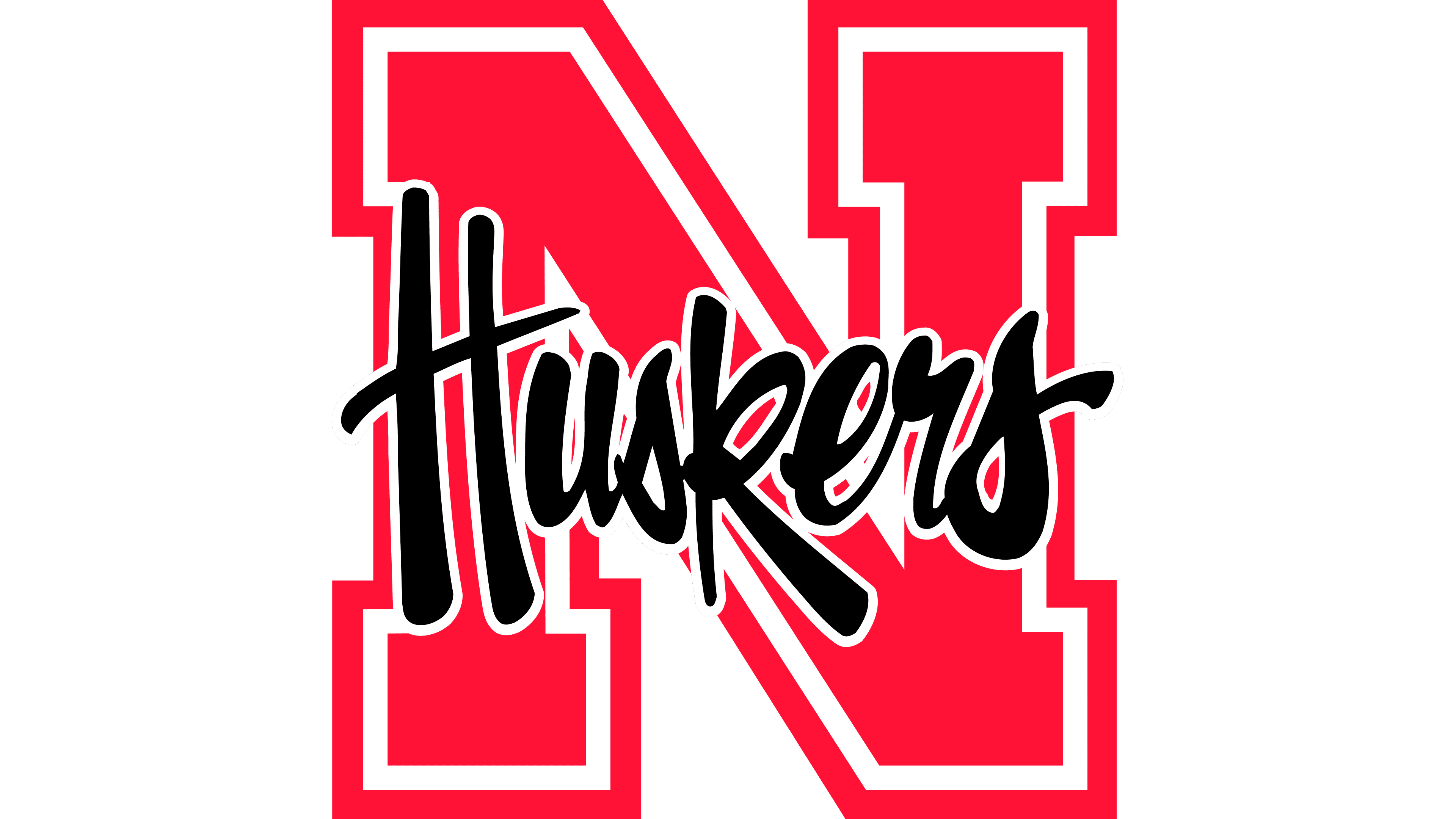
After a 2003 redesign, the outer red line along the letter became wider. The logo now featured the black word “Huskers,” written in an uneven script. The letters “H” and “k” were slightly lowered, creating a sense of “jumping” in the inscription.
2003 – 2006
![]()
In 2003, the word “Huskers” disappeared, leaving only the red block “N.” It was almost indistinguishable from the original emblem, though slightly thinner.
2006 – 2016
![]()
The components of “N” became almost one and a half times wider than before. Additionally, designers changed the red shade, making it darker and more saturated.
2016 – today
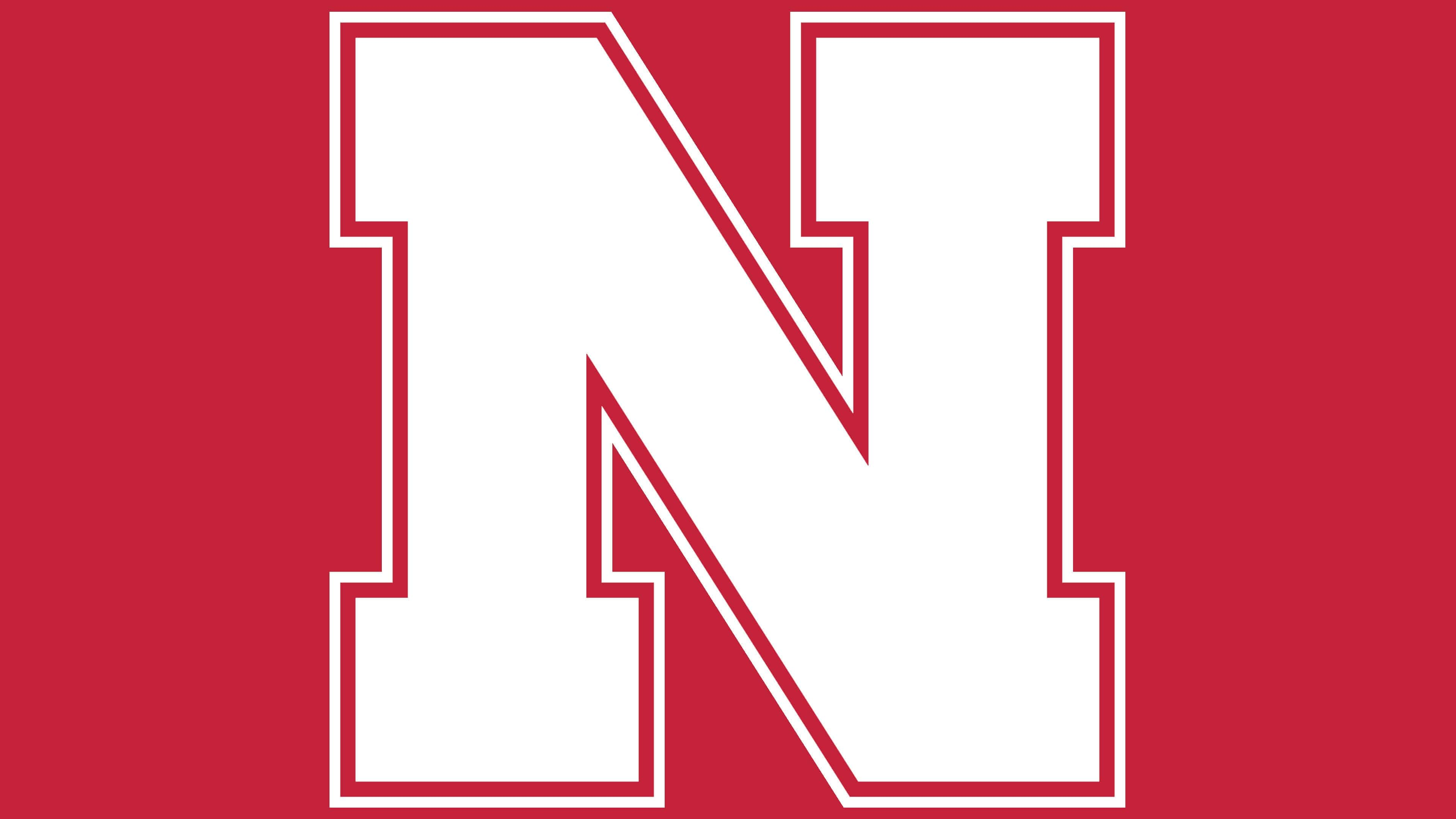
![]()
In 2016, the developers of the Nebraska Cornhuskers logo balanced the thickness of all elements of the letter “N”. They retained the color, double outline, and massive rectangular serifs.
Developers enlarged and narrowed the letter, adding a double border around the entire perimeter. As a result, the minimalist logo looks much more solid than before. There was also a slight color difference: the previous version was bright red, while the current one is a muted, noble red.
Nebraska Cornhuskers Football Logo
The football team played its first season in 1890/91. Since then, the University of Nebraska-Lincoln team has won five national championships in the main NCAA selection rounds. Since 2019, it has been part of the NCAA Division I Football Bowl Subdivision. The athletes play their home games at Memorial Stadium and are coached by Scott Frost.
Nebraska Cornhuskers Basketball Logo
![]()
The university has two basketball teams: women’s and men’s. The former is more successful: it has twice reached the NCAA Sweet Sixteen in 2010 and 2013. The women’s team can also boast five second-place finishes in the tournament and fourteen appearances in the same organization’s tournament.
The men’s team’s successes are more modest. They have participated in the NCAA tournament only 7 times and have won the conference regular-season championship 6 times.
Nebraska Cornhuskers Baseball Logo
![]()
The University of Nebraska-Lincoln is proud to have participated in the College World Series three times: in 2001, 2002, and 2005. The athletes are in NCAA Division I and are coached by Will Bolt. In addition, the team has been recognized as the NCAA regional champion four times, bringing the total number of their appearances in this format to 18. They have also won four conference championships.
Font and Colors
The logo contains only text. There are no graphic elements. One letter reflects the administrative and geographical affiliation of the sports department and the university to which it belongs.