


 24 Hour Fitness Logo PNG
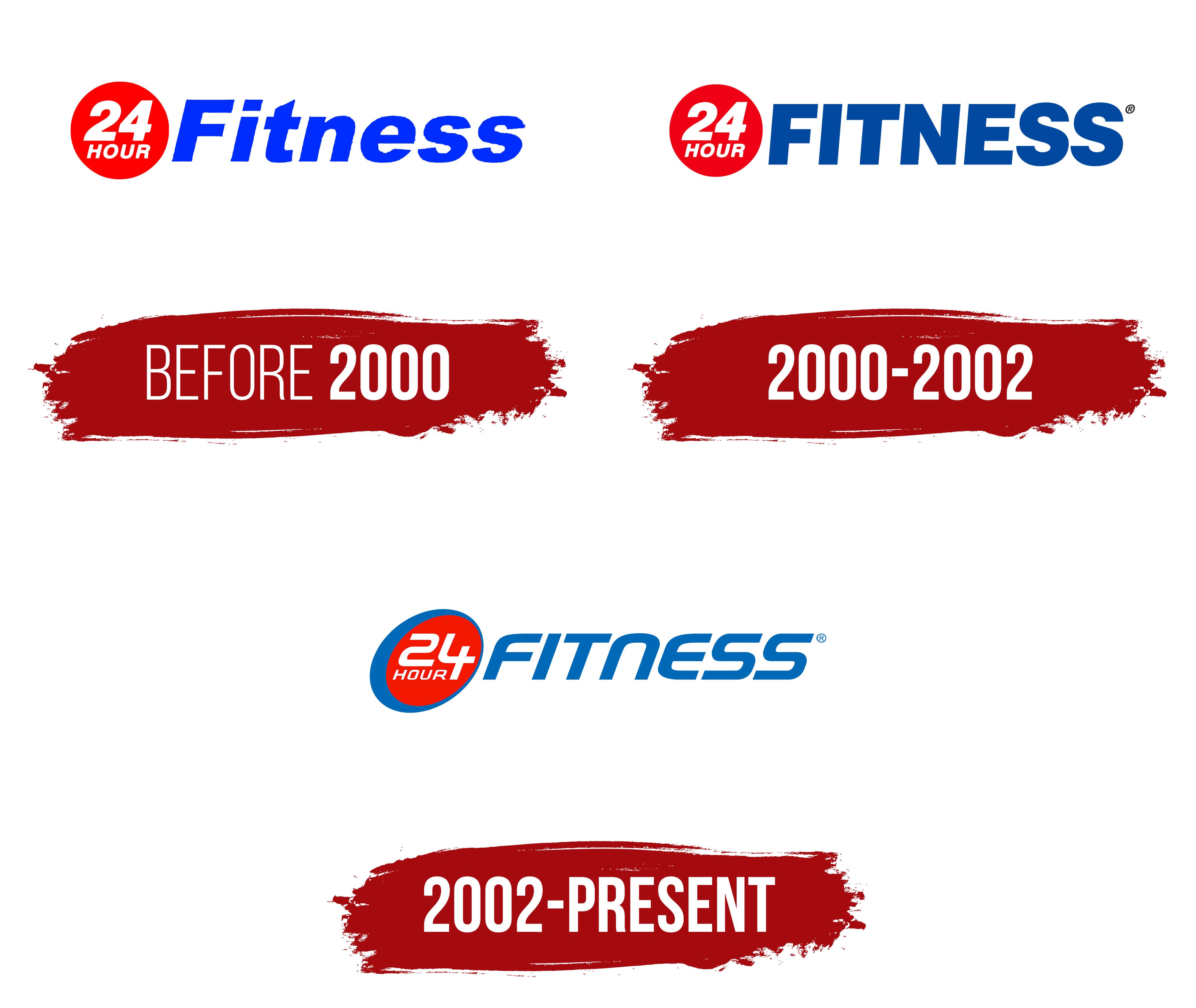
The 24-Hour Fitness logo attracts attention with its vibrant colors and originality while remaining stylish and concise. It accurately conveys the brand’s theme, reflecting dynamism in the text and the symbol. Although the design lacks complex or excessive elements, the identity retains individuality and looks presentable. The history of the fitness club chain and its key milestones are reflected in the logos from different periods. However, the latest version has lasted the longest and has become the most successful and expressive.
The central element of the logo is the word “fitness,” which takes the main position and is placed to the right of the emblem. The emblem is an ellipse whose contour seamlessly incorporates the number “24,” which is part of the name. This graphic solution creates a cohesive image and clarifies the company’s connection to sports activities. The logo almost embodies an ideal athletic body, highlighting the company’s success and professionalism, which managed 410 clubs across America until 2020.
The logo’s aesthetics express simplicity and unity while reflecting the brand’s confidence and stability in the fitness services market.
24 Hour Fitness began in 1983, when Mark Mastrov opened 24 Hour Nautilus in San Leandro, California. Mastrov, a former professional tennis player, built the club around round-the-clock access, giving members a way to train outside regular gym hours. The format quickly found an audience in the San Francisco Bay Area, where new locations followed.
In 1994, the company changed its name to 24 Hour Fitness, reflecting a broader mix of equipment, training options, and club services. The same year, it acquired Family Fitness Centers, which expanded its market share and helped the business move beyond its early California base. By the mid-1990s, the chain was buying existing fitness franchises and opening clubs in other U.S. states.
A key visibility push came in 1996, when 24 Hour Fitness partnered with Magic Johnson to create Magic Johnson Sports Clubs. The late 1990s brought more acquisitions, including Q Sports Clubs, LivingWell Lady Fitness, and Ray Wilson’s Family Fitness. In 2000, the company entered Asia with clubs in Singapore and Hong Kong, marking its first major international stage.
Forstmann Little & Co. bought control of 24 Hour Fitness in 2004 for $1.6 billion. In 2006, the brand became the official fitness center of the U.S. Olympic team, sponsoring athletes and providing training facilities. AEA investors acquired the chain in 2014. From 2016 to 2023, the company added online group classes, personalized fitness apps, Super-Sport clubs with pools and basketball courts, new personal training programs, virtual workouts, hygiene upgrades, mobile tools, and hundreds of U.S. locations.
Meaning and History
What is 24 Hour Fitness?
This national network of fitness centers provides 24/7 access to workout enthusiasts across the United States. The gyms serve a wide range of clients, including both early birds and night owls. The centers are equipped with various machines, free weights, and functional training areas, and they offer group classes such as yoga and high-intensity interval training. Many locations offer additional services, including saunas, basketball courts, and pools. The company emphasizes its commitment to accessibility through various membership packages catering to different budgets and client goals.
Before 2000
The origin of the 24-Hour Nautilus business, later known as 24-Hour Fitness, dates back to 1983. Its founder, Mark Mastrov, created a unique project that rapidly developed and gained popularity. In the early stages, the company had a different name, but over time it transformed into a well-known fitness club chain known as “24 Hour Fitness.” During this time, their signature logo appeared, which, despite its simplicity, was quite bright and memorable, using only three primary colors.
The logo’s creators chose a white background, which provided the best readability for the fonts and highlighted all the elements. The combination of white, red, and blue gave the logo an appealing, clean look, creating a contrast that drew attention.
The identity included three primary color elements: a red circle, numbers, and text. The circle, located on the left along the logo’s central line, became a key part of the design. Inside the circle, in white, matching the background, the number “24” was inscribed. It occupied a significant space but remained proportional to the circle, creating harmony. To the right of the circle was the word “fitness.” The word’s first letter was capitalized, but it did not exceed the circle’s boundaries. The other letters were smaller but stood out due to the bold font, ensuring readability and visibility.
The logo, combining simplicity and expressiveness, embodied the chain’s energy and dynamism, creating a bright and recognizable image that strengthened 24 Hour Fitness’s reputation as a leader in the fitness industry.
2000 – 2002
In 2002, only a few innovations were noticeable in the logo, but they proved significant for its perception. The main elements were preserved but underwent a partial transformation. The circle was reduced in size while maintaining its bright red color. The bold numbers lost their previous three-dimensional effect, yet their visibility remained strong. The text remained in its usual place but adopted a more refined, restrained style. The font’s color gradient, transitioning from light to darker shades, added elegance and originality to the logo. The letters now appeared uniform in shape and size, without capital letters. Serifs and roundings were also removed, giving the logo a crisp and formal look.
Each letter, with clean lines, appeared perfectly drawn, symbolizing the fitness club chain’s reliability and impeccable reputation. The 2002 logo can be characterized as powerful and confident; it conveyed strength and determination, evoking the challenging journey toward physical perfection.
2002 – today
The 24-Hour Fitness logo attracted the audience’s attention with its original design, which retained traditional identity elements while offering an unusual presentation format. It combines dynamism and simplicity, perfectly reflecting the brand’s philosophy of access to fitness services 24 hours a day, without interruptions or unnecessary barriers. The central element of the emblem is a red-filled circle, inside which is the white number “24” and the word “HOUR.” The red symbolizes energy, activity, and passion, while the white numbers and letters stand out against the background, making them easy to read and remember.
The circle’s outline is blue, seamlessly transitioning into the word “FITNESS,” also in blue. Blue is always associated with calmness, stability, and trust, emphasizing the company’s reliability and serious approach to service quality.
The font of the word “FITNESS” is upright and italic, with a slight rightward tilt, creating a sense of movement and speed. This element highlights the fitness center’s dynamic nature, which is always in motion and working for its clients. The lines of the letters are smooth and slightly rounded, resembling waves, giving the logo a modern and energetic look.
Interestingly, the numbers “24” are designed in a geometric, angular style, emphasizing clarity and structure. This can be seen as a symbol of consistency and reliability; the fitness center operates around the clock without breaks.
The logo combines energy, stability, and accessibility qualities that have made the brand popular among people striving for a healthy lifestyle.