


 Crunch Fitness Logo PNG
The Crunch Fitness logo depicts a strongman who can easily crush a metal sheet with one hand. The emblem embodies strength and phenomenal physical fitness, attainable through training at the company’s clubs.
Crunch Fitness began in 1989, when Doug Levine opened the first club in a basement on East 13th Street in New York City. A former stockbroker, Levine wanted to build a gym unlike the standard fitness centers of the period, with a less rigid atmosphere, unusual classes, and a no-judgment approach for people who did not feel comfortable in conventional training spaces.
The first location became known for its basement setting and experimental programs, including AntiGravity Yoga and indoor cycling workouts. In the early 1990s, Crunch opened additional clubs in New York and built its image around group fitness, humor, and a more open club culture. In 1995, the brand began national expansion by opening its first location outside New York, in Los Angeles.
Around 1998, Crunch was acquired by Bally Total Fitness, one of the largest gym operators in the United States at the time. In 2001, the first franchised club opened, giving the company a new path for growth. In 2006, managing partner Mark Mastrov and private investment firm Angelo Gordon & Company acquired the business and continued developing the original fitness concept.
In 2009, financial problems forced Crunch into bankruptcy. New Evolution Ventures and its partners, including Mark Mastrov and Jim Rowley, former head of 24 Hour Fitness, then bought the company. After restructuring, Crunch focused on franchising and reached its 150th club in 2016 and 200th club in 2017. Later changes included an updated mobile app in 2018, Crunch Signature in 2019, expanded virtual classes in 2020, new clubs in 2021, new training programs in 2022, and Crunch Live for online workouts in 2022.
Meaning and History
What is Crunch Fitness?
It is a chain of fitness gyms known for its “No Judgment” policy and wide range of workout programs. The organization offers a variety of group fitness programs and standard gym equipment to suit different interests and fitness levels. The brand is known for its creative, often unconventional classes, ranging from unusual options like aerial yoga, pole dancing, and themed workouts to more typical options like yoga and cycling. State-of-the-art equipment, spacious workout rooms, and extras such as saunas and locker rooms are standard features of a gym. The brand has become a popular option for fitness enthusiasts looking for a gym that combines intense workouts with a fun, enjoyable atmosphere. Gyms are located throughout the United States and abroad.
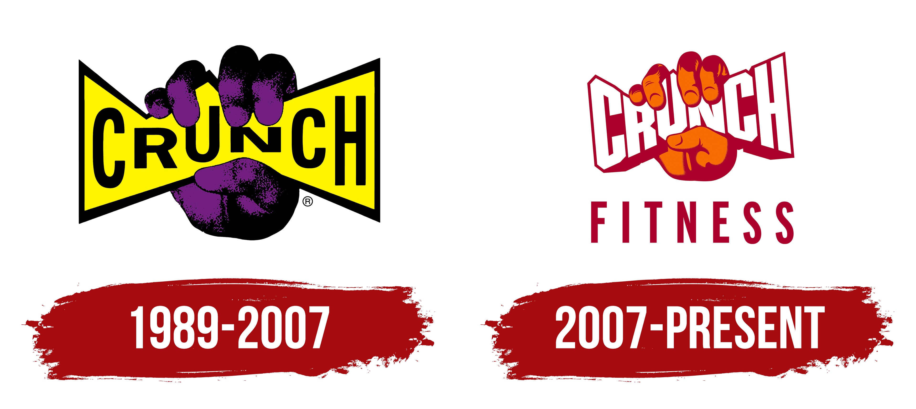
1989 – 2007
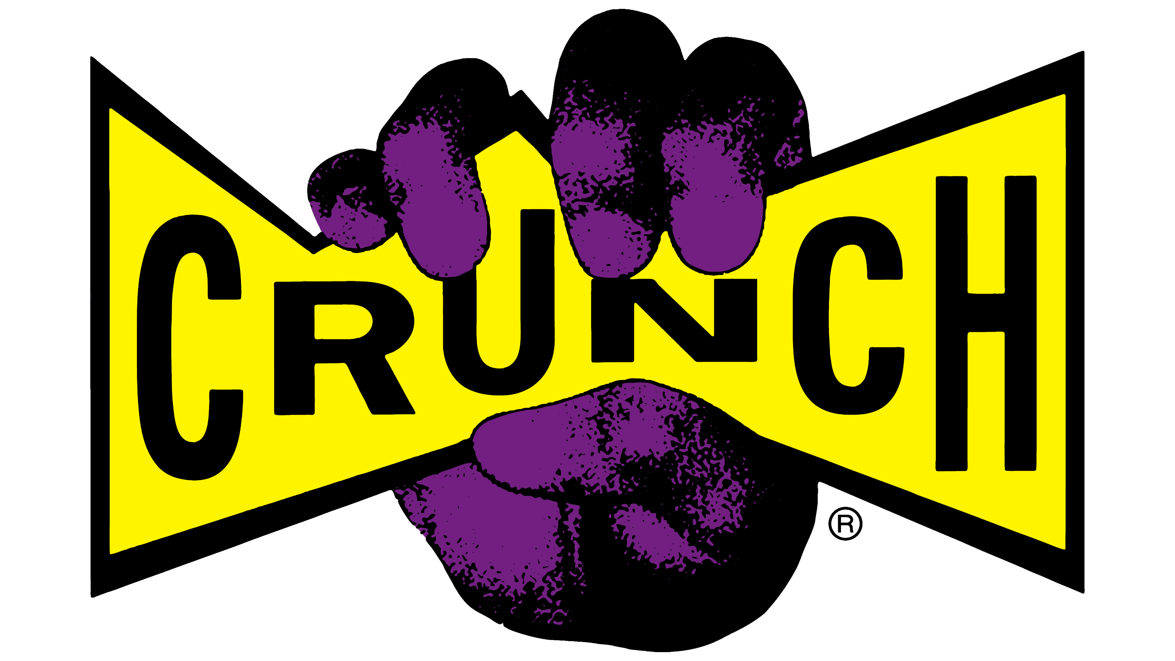
The company’s logo echoes the theme of the Hulk, a mighty superhuman with enormous muscles. The emblem features a massive hand gripping the club’s sign, symbolizing strength and power. The brand’s name evokes the sound of a board cracking or breaking, reinforcing the association with physical strength.
The emblem represents:
- Strength: Gym workouts help develop powerful muscles, providing confidence and the ability to overcome obstacles.
- Breaking Stereotypes: One key aspect of the company’s philosophy is rejecting bias based on visitors’ appearance at its gyms. Overweight or very thin individuals often feel uncomfortable in traditional fitness clubs, but Crunch Fitness aims to change this perception. The slogan “No Judgments” emphasizes their commitment to fostering a positive, supportive atmosphere for everyone.
The hand’s purple color symbolizes physical and mental strength, which aligns with the brand’s philosophy.
2007 – today
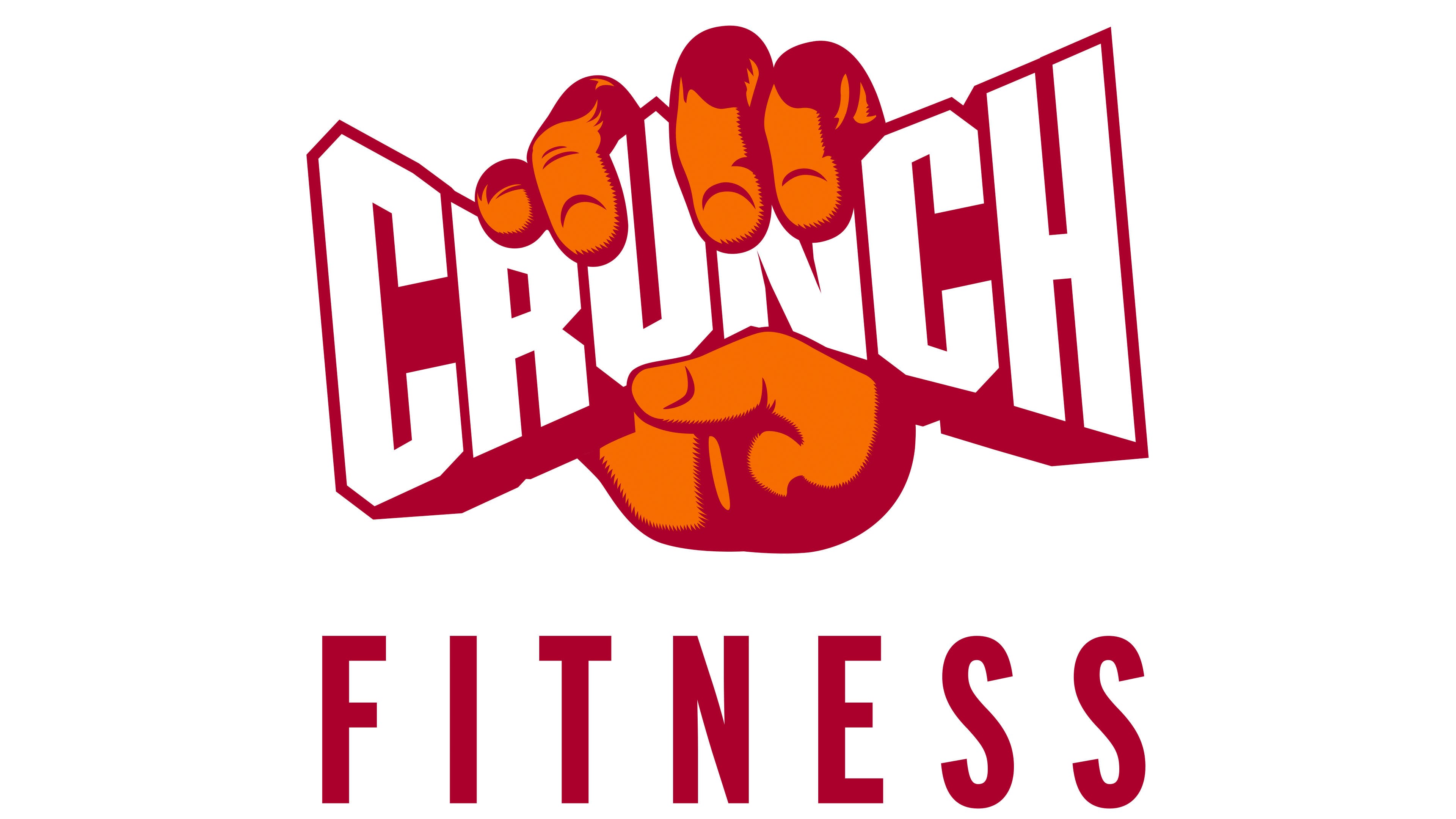
The Crunch Fitness logo is bright and energetic, designed to attract attention and emphasize the brand’s dynamic nature. At the center of the composition is the symbol of a clenched fist, gripping the word “CRUNCH.” This visual solution symbolizes strength, determination, and readiness to overcome challenges, perfectly aligning with the fitness club’s philosophy.
The color scheme comprises red and orange shades associated with energy, activity, and positivity. These colors create a sense of warmth and friendliness, highlighting the club’s accessibility for people of all fitness levels. At the bottom of the visual symbol, the word “FITNESS” is added in a strict font, indicating the company’s primary focus.
The large font has clear outlines, making the text easy to read and memorable. The combination of angular lines and smooth transitions in the font creates a sense of movement and progress, reflecting continuous physical improvement.
The company’s founders aimed to create a place where everyone could find a suitable workout intensity level and an environment free from bias and snobbery. The logo, featuring a regular hand, reflects this approach: Crunch Fitness gyms are intended for people of all ages, body types, and fitness levels.