Despite the fact that the Adult Swim logo is a text logo, it looks innovative. This impression is created due to the use of modern fonts with smooth and smooth letters in a business style. If we draw parallels with other types of designs, this logo can be compared to a modern-style item. It is refined, modern, and has a peculiar taste, which allows it to take a leading position among competitors.
Adult Swim: Brand overview
Meaning and History
This cable channel was created as a late-night alternative to the Cartoon Network children’s television network because its target audience is asleep at such a late hour. It is aimed at an adult audience. In order not to leave the airwaves empty, the owners decided to broadcast content designed for a different age group. So there were night programs, live broadcasts without montage, documentaries, and short films. Today, this channel is considered one of the best sources of colorful programs for adults and anime.
Despite its minimalism, Adult Swim’s logo is very stylish and sophisticated. Its aura is formed by perfectly even letters of geometric shape. The emblem appeared at the same time as the channel, as it was designed to represent it to the viewers. It was not adjusted or remodeled but was launched in its current form – as text. In 2003, side brackets were added, and an abbreviated version was added, which is used only on the channel itself.
What is Adult Swim?
Adult Swim is a nightly broadcast channel airing on the Cartoon Network cable platform. It runs until 6 a.m., offering a variety of content including anime, series, short films, adult-themed movies, shows, and more. It first appeared in 2001.
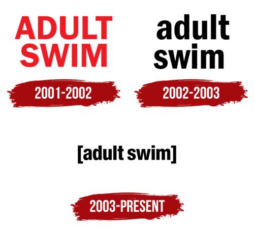
2001 – 2002
In the fall of 2001, the new cable channel adopted a laconic logo – simple, clear, understandable, and easy to read. Thanks to its bright color, it stands out well, attracting the attention of potential viewers. This is due to the specifics of the channel, as it shows content only in the dark when other colors are difficult to distinguish. At the same time, the color hints at the “sharp” and “hot” night program.
The channel name is placed on two levels and centered, which gives the impression that the side letters are disproportionate and extend beyond the borders. The Franklin Gothic Bold font is smooth and geometric, with crisp angles and straight lines. The glyphs are uppercase and bold. The distance between them is small, but it does not affect the normal readability of the inscription, as they do not merge on a light background.
2002 – 2003
In the winter of 2002, the Adult Swim logo underwent a radical transformation. The lettering was changed from uppercase to lowercase, and instead of red, it became charcoal-black. Another innovation was the addition of soft curves to the letters. As a result, they became smooth and streamlined, and the emblem – more friendly and welcoming. However, the two-level arrangement of lines was retained, which still gives the symbol strictness, businesslike, and seriousness.
2003 – today
The logo consists of a one-line caption: the designers combined the upper and lower lines to make the text more understandable. In addition, they put the phrase in square brackets, hinting at a limited segment of viewers – adults only. At the same time, a shorter version appeared, consisting of the first letters of the title: [as]. The developers have also slightly tweaked the font. However, the letters still remain rounded and streamlined, hinting at the trusting, friendly atmosphere of the channel. Glyphs are bold and soft. Instead of the classic dot over “I,” a square is used.
Font and Colors
For the Adult Swim logo, the designers chose smooth sans-serif fonts. They are Franklin Gothic Bold and Helvetica Neue Condensed Heavy, which have similarities in lowercase letters. The color palette is monochromatic. The black emblem is placed on a white background; the white emblem is placed on a black background. This contrast creates tension and maintains the internal dynamics of a static sign.
Adult Swim color codes
| Black | Hex color: | #000000 |
|---|---|---|
| RGB: | 0 0 0 | |
| CMYK: | 0 0 0 100 | |
| Pantone: | PMS Process Black C |


