


![]() Bulls Logo PNG
Bulls Logo PNG
The Bulls’ logo reflects the aggressive, straightforward playing style of a South African rugby team. It’s a symbol of strength and an uncompromising attitude, integral to the club’s sporting character.
The Bulls Rugby Club was established in 1938 when Northern Transvaal split from the Transvaal Rugby Union to form an independent team. The red Barberton Daisy became the club’s symbol, and light blue was chosen as the primary color, although the team initially wore Pretoria Combined’s red-and-gold jerseys. Within eight years, the Bulls won their first Currie Cup, defeating Western Province.
The club’s golden era occurred in the 1970s under the legendary coach Buurman van Zyl, who won five consecutive national championships. After rugby became professional in 1996, the Bulls struggled initially, often finishing at the bottom of Super Rugby, including a winless 2002 season.
A turning point came in 2007 when the Bulls secured their first Super 14 title in a dramatic final against the Sharks, thanks to Bryan Habana’s last-second try. They won two more Super 14 titles in 2009 and 2010, becoming South Africa’s most successful club in the competition.
Today, the Bulls play at Loftus Versfeld Stadium, known for their traditional, powerful forwards and strong half-back line.
Meaning and History
![]()
What is Bulls?
A famous South African rugby club based in a major city in the country. Its home stadium has a capacity of over 50,000 spectators. The team competes in international tournaments against clubs from Europe and South Africa, known for their physical playing style, which emphasizes powerful scrums and territorial control. The team has repeatedly won prestigious Southern Hemisphere tournaments, developing renowned athletes for the national squad.
1997 – 1998
![]()
The first Northern Bulls logo featured a distinctive design that reflected the team’s character. Its symbol is a black bull’s head, outlined in thin white contours. The bull symbolizes power, aggression, and persistence, qualities essential in rugby, where physical strength significantly determines match outcomes.
The image is highlighted by elongated, horizontally stretched horns, emphasizing the team’s attacking style.
The logo background is a circle divided into four segments, colored sky blue, grass green, rich red, and muted purple. Each sector symbolically represented the club’s areas of activity and player unity toward a common goal.
Since its founding, this South African rugby club has made the bull a central part of its identity, highlighting aggressive play. Despite its brief use, this first emblem laid the foundation for later variations of the team logo.
1998 – 2000
![]()
The Northern Bulls redesign dramatically changed the logo’s visual concept. Instead of the previous abstract silhouette, a typographic composition appeared. A notable feature was transforming the word “Bulls” into a graphic bull’s head. The letters “B” and “S” became stylized, massive horns. The lettering is large, bold, and white against a dark blue background.
Above is the word “Northern,” written in straight uppercase red letters, with a thin white outline. The color selection reflects the club’s traditional hues and South African rugby conventions, with a dominant use of dark tones.
Below is a small oval resembling a rugby ball, subtly emphasizing the club’s sport. The change marked the shift from abstract graphics to typographic symbolism, visualizing the team name.
2001 – 2023
![]()
Introduced in 2001, the Bulls’ logo solidified the team’s shortened name. The emblem became more concise. The central symbol is the word “BULLS,” with the elongated ends of the letters “B” and “S” forming horns.
The color scheme changed to lighter blue and white, matching the team’s club colors. The former red “Northern” inscription disappeared, simplifying the design. The blue color identifies the club with its region.
Below, a small rugby ball icon highlights the club’s sporting focus, emphasizing the logo’s athletic nature.
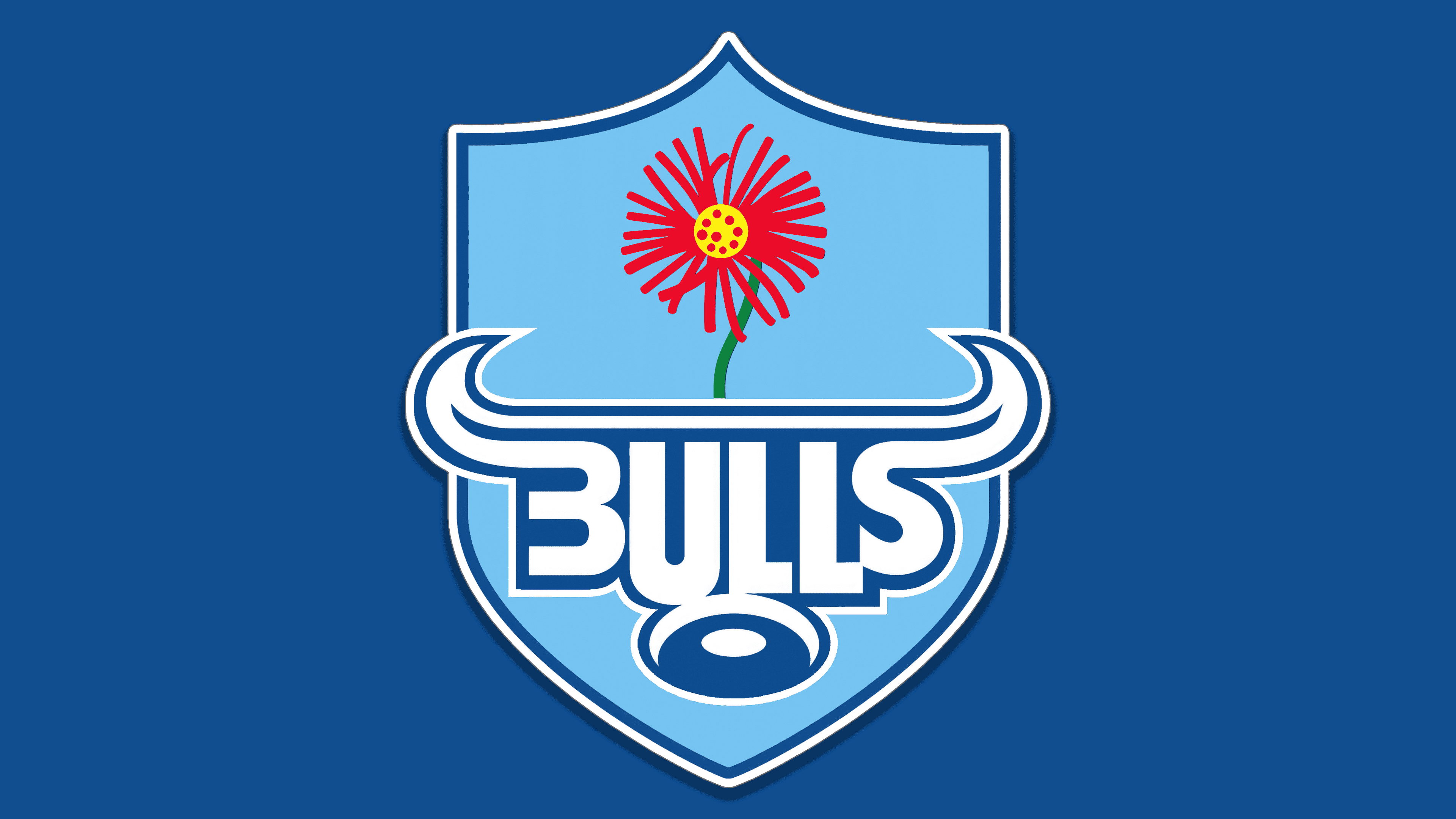
2023 – today
![]()
The current Bulls logo is designed in a heraldic style, giving the club an official and authoritative image. The emblem takes the form of a shield with traditional contours and smoothly curved lines, typical of heraldry in sports. The shield is colored light blue and outlined with a double dark blue border, creating a sense of depth and dimension.
At the top of the shield is a stylized depiction of the Barberton Daisy, an iconic symbol of the Transvaal region, the team’s homeland. The flower is presented abstractly, with thin red petals and a bright yellow center that contrasts sharply with the shield’s cool background, resembling a blazing sun in the sky. This emphasizes the club’s regional identity and serves as an emotional connection to local traditions and historical heritage.
The team name “Bulls” is set in a custom-designed typeface integrated into the central part of the shield. A distinctive feature of the font is that the letters “B” and “S” are stylized to resemble symmetrical bull horns, while the letters “U” and “L” have stricter, geometrically precise outlines. Visually, the typography evokes the silhouette of a bull’s head, creating a powerful image of athleticism and physical strength. The typeface is characterized by bold, sans-serif strokes and proportions optimized for sports branding.
The logo’s color palette consists of various shades of blue, traditionally associated with the team and sports in general. The main light-blue background represents purity, clarity, and reliability, while the dark-blue outline reinforces the brand’s solidity and stability.
The new emblem enhances the team’s identity by incorporating a historical regional symbol, merging athletic strength and local cultural roots into a single shield that reflects the club’s ambitions and character.
Font and Colors
The font stands out with distinctive letters “B” and “S,” their ends extended to form symbolic bull horns. Central letters “U” and “L” maintain standard geometric proportions and text balance. The lettering style is simple, sans-serif, and highlighted in white against the background.
The emblem’s light-blue background signifies its traditional regional connection. Dark blue outlines around the letters and the shield provide contrast. The central gerbera daisy serves as the sole vivid accent in red and yellow, enhancing visual expressiveness.