


![]() Hurricanes Logo PNG
Hurricanes Logo PNG
The Carolina Hurricanes hockey club logo symbolizes the team’s energy and aggressiveness. The dynamic graphic design effectively conveys the club’s competitive spirit, speed, and perseverance.
The Hurricanes rugby team was formed in 1995 to compete in the Super 12 tournament, uniting nine New Zealand regions. In their first game in 1996, they lost to Auckland Blues, but Alama Ieremia scored the tournament’s first try. After a difficult first season, the team reached the semi-finals in 1997, showcasing an aggressive “ruck and run rugby” rugby.
In 1998, Hurricanes became the first New Zealand team to defeat the Brumbies in Canberra, although captain Mark Allen soon retired due to a serious neck injury. In the early 2000s, legend Jonah Lomu joined the club, scoring two tries in his debut at Wellington’s new stadium. In 2006, Hurricanes reached their first Super 14 final, losing to the Crusaders in thick fog.
With the arrival of coach Chris Boyd in 2015, a new era began. Dane Coles became captain, leading the team to its first championship in 2016, when it defeated South Africa’s Lions. The Hurricanes have consistently reached the playoffs and are known for their attacking style. Famous players include Jonah Lomu, Tana Umaga, Ma’a Nonu, Ardie Savea, and TJ Perenara.
Meaning and History
![]()
What is Hurricanes?
It is a rugby club from Wellington, New Zealand, competing in the international Super Rugby tournament. Players primarily come from the North Island provinces. The team is known for its fast, combination-style rugby and consistently competes for top positions, having won a Super Rugby title. Famous players include rugby stars Jonah Lomu, Tana Umaga, and Beauden Barrett. Home games are played at Sky Stadium.
1996 – 1999
![]()
The Super Rugby Wellington Hurricanes logo was created for the team’s debut in the new Super 12 tournament. Its visual composition conveyed the idea of a “hurricane” through dynamically distorted typography and circular visual accents. The letters in the word “Hurricanes” were designed in a pseudo-geometric style, with the letters stretched and distorted on the sides, narrowing toward the center, creating a strong optical illusion of rotation and movement. The sans serif typeface featured slanted lines and elongated proportions, emphasizing the team’s speed and aggression on the field.
The color palette was based on a striking contrast: the bright yellow of the letters was complemented by bold black shadows. This yellow-and-black pairing underscored the design’s energy and dynamism, evoking associations with warning signs and the raw power of natural storms. The additional white elements in the word “Wellington” stood out clearly against the dark background, maintaining legibility and recognizability at different scales and across various applications.
The typographic composition was designed to enhance the sense of speed and motion. The illusion of circular rotation resembled a hurricane, conveying the aggressive style of “ruck and run rugby” in a meaningful, metaphorical way. The logo became an integral part of a new professional era for New Zealand rugby, symbolizing the power, speed, and determination of the Wellington Hurricanes players.
1999 – today
![]()
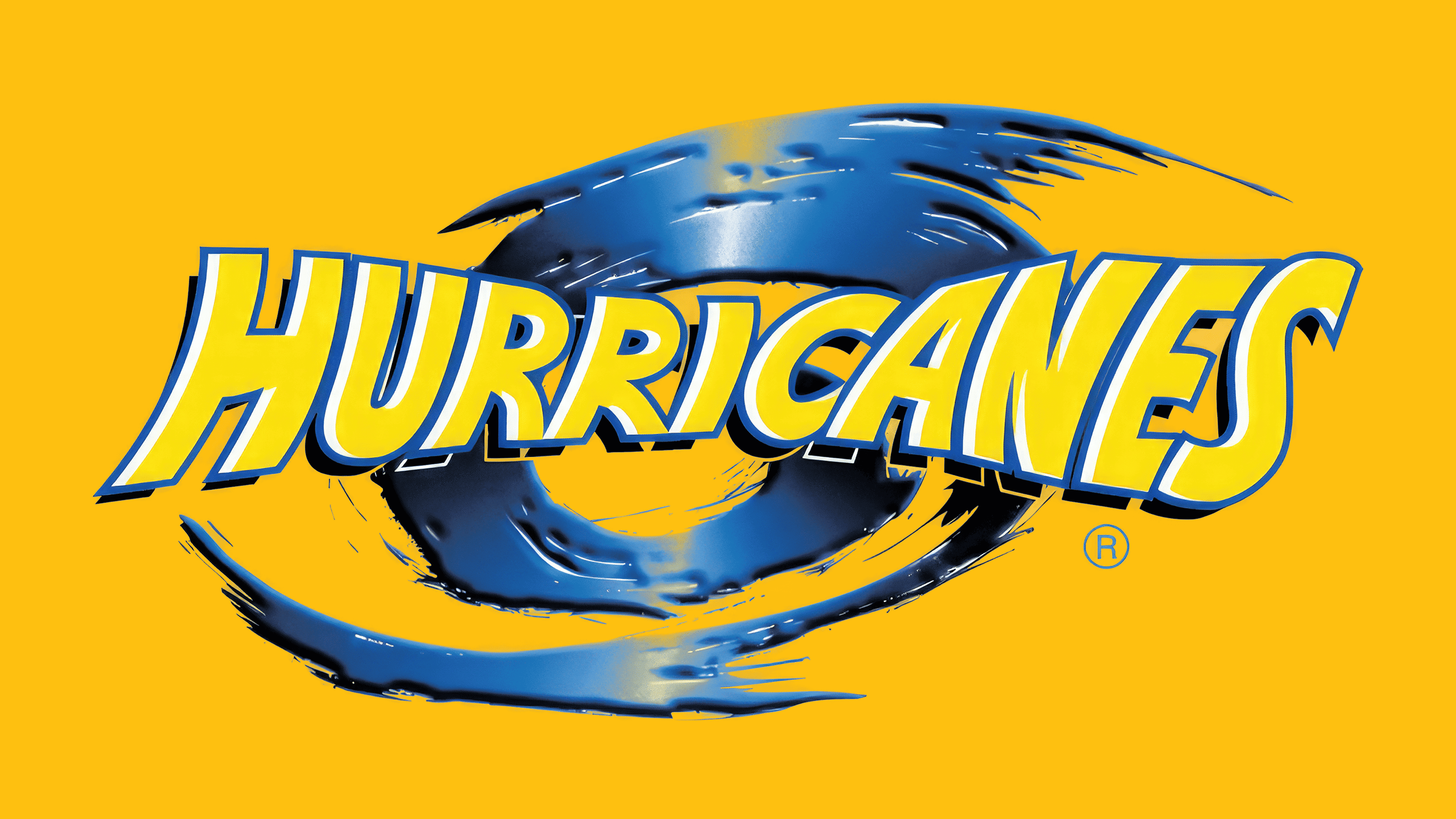
In 1999, the Hurricanes, previously known as the Wellington Hurricanes, introduced a new emblem to coincide with the start of the Super 12 season. The design was developed by the club’s in-house team in collaboration with designer Peter Thornburgh, with support from the New Zealand Rugby Union.
The main motif of the emblem is a stylized tropical cyclone form in deep blue, with a vivid gradient that creates depth and a sense of continuous motion. At the center is an abstract depiction of the hurricane’s “eye,” highlighted by a circular arrangement that reinforces the team’s identity and playing energy.
The typographic element of the emblem features the word “HURRICANES,” set in a custom geometric sans-serif typeface with enlarged letters at the ends and smaller ones in the center, visually imitating the rotation of an air current. The letterforms have softly rounded edges and slanted strokes, enhancing the dynamic effect and evoking the rugby club’s high-speed character. The letters are slightly tilted, creating the visual impression of being pulled into a vortex.
The color choice is based on a high-contrast combination of bright yellow and rich blue. Blue emphasizes energy and strength, while yellow adds positive associations and boosts the brand’s overall visual appeal, making the emblem stand out and remain memorable in any setting and across any medium.
The Hurricanes’ emblem embodies a natural force, symbolizing the team’s intensity and power, as well as its fast, uncompromising style.
Font and Colors
The Hurricanes’ emblem’s font is a geometric sans serif with a strong sense of motion and smooth, rounded strokes. The letter heights vary: the ones at the edges of the word stretch upward the most, while those in the middle decrease in size. This creates the sensation of swirling movement, mirroring the natural force of a hurricane and drawing attention to the notional “eye” of the cyclone.
The color palette is built on the combination of bright yellow and rich blue. Yellow was chosen for its energy, impact, and emotional charge, visually enhancing the team’s playing dynamism. The dark yet vibrant shade of blue strengthens the impression of force and nature’s power, adding depth and bold contrast to the composition while underscoring the brand’s sporting character.