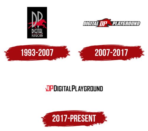
The Digital Playground logo represents the brand’s evolution as a premier adult content provider, mirroring the company’s growth and increased market visibility.
The acronym “DP,” which stands for Digital Playground, is now more prominent and centrally placed in the logo. Rendered in vibrant red color, it suggests passion and excitement – emotions fitting for a brand in the adult entertainment industry. The interlocking design of the letters signifies the brand’s unity and cohesion, underscoring its consolidated position in the market.
Embedded within the “D” is the silhouette of a horse’s head, an element carried over from earlier versions of the logo. This symbol could be interpreted in many ways. Horses are typically associated with strength, vitality, and wild freedom, which might echo the brand’s aim to empower adult content viewership.
The text “DigitalPlayground.com,” placed under the acronym, is presented in sharp, black letters, providing a strong contrast to the red “DP.” This serves to underscore the brand’s online presence and allows customers to identify the company’s website easily.
The Digital Playground logo symbolizes the brand’s dynamism, passion, and commitment to delivering quality adult content while underscoring its strong online presence and platform.
Digital Playground: Brand overview
| Founded: | 1993 |
| Founder: | Joone |
| Headquarters: | Burbank, California, U.S. |
| Website: | digitalplayground.com |
Digital Playground is an American pornographic film studio headquartered in Burbank, California. As a prominent brand in the adult entertainment industry, Digital Playground has established itself as a leader in producing high-quality adult content that explores various genres and fantasies. The studio embraces digital platforms, virtual reality (VR), and interactive features to create an immersive and personalized experience for its viewers.
Meaning and History
The logo of Digital Playground reflects its brand identity. It often features the company’s name in bold and stylish typography, accompanied by visual elements that allude to sensuality and desire. The logo’s design is meant to captivate the audience, evoking a sense of anticipation and allure.
Its brand identity is built upon professionalism, consent, and an emphasis on creating a safe and respectful environment for performers. Digital Playground continues to explore new avenues and technologies to enhance the adult entertainment experience and meet the evolving needs of its viewers.
What is Digital Playground?
Digital Playground is a production company for adult content that was founded in 1993. The company, which originated as a computer effects company, transitioned into a film production company that primarily creates adult films. It’s known for its high-quality production values compared to the standard in the adult film industry.
1993 – 2007
2007 – 2017
2017 – today
Digital Playground color codes
| Pigment Red | Hex color: | #ed202d |
|---|---|---|
| RGB: | 237 32 45 | |
| CMYK: | 0 86 81 7 | |
| Pantone: | PMS Bright Red C |
| Black | Hex color: | #000000 |
|---|---|---|
| RGB: | 0 0 0 | |
| CMYK: | 0 0 0 100 | |
| Pantone: | PMS Process Black C |

