


![]() Durex Logo PNG
Durex Logo PNG
The Durex logo symbolizes confidence, safety, and reliability of the contraception brand. Its minimalist, concise design highlights the company’s professional approach to a sensitive subject and its commitment to consumer trust.
Durex was introduced in London in 1929, when the London Rubber Company, founded by L.A. Jackson, registered the trademark. The name “Durex” stood for Durability, Reliability, and Excellence.
Significant condom production began in 1932, following the development of new rubber-manufacturing machines by Lucian Landau. During World War II, Durex condoms were supplied to British troops, strengthening the brand’s market presence.
In 1950, Durex was the first to introduce lubricated condoms, followed by anatomically shaped condoms in 1957. In the 1970s, Durex expanded internationally, launching colored and flavored condoms.
In the 1990s, Durex introduced the latex-free Avanti range, made of polyurethane, which was suitable for individuals with allergies. In 2010, Durex was acquired by Reckitt, subsequently expanding its sexual health product line.
Today, Durex offers various condoms, lubricants, and sex toys, holding approximately one-quarter of the global market. The brand actively participates in social initiatives, including an HIV prevention campaign in South Africa with the (RED) foundation.
Meaning and History
![]()
What is Durex?
It is a British brand specializing in safe-sex products, known for reliability and a wide product range. Offerings include various types of condoms, lubricants, and vibrating devices. The company openly addresses sensitive topics through youth educational campaigns. Bold, often humorous marketing has made the brand highly recognizable. Products are widely available in stores, pharmacies, and vending machines.
1960s – 1980s
![]()
In the mid-20th century, Durex’s visual identity underwent a design overhaul that became the basis for subsequent versions. The composition was built from lowercase sans-serif letters with thin strokes, in which geometric shapes and proportions created a calm, balanced rhythm. Thin contour lines followed the letters, echoing their outlines and forming a distinctive frame that enhanced the inscription’s depth. This appeared vividly on lighter backgrounds, most commonly white or gray.
The palette relied on light brown and golden shades. The muted tones combined with refined outlines created an impression of reliability and stability, aligning with the brand’s name, an acronym for Durability, Reliability, and Excellence, established upon its registration in 1929. The typeface resembled Century Gothic and other geometric sans-serifs in character but had a custom interpretation tailored to the brand’s objectives.
Structurally, the logo was monospaced, with consistent stroke thickness and carefully considered letter-spacing. The space between the letters’ main silhouettes and their outlines produced an internal illumination effect. While variations included monochromatic or inverted color schemes, the horizontal wordmark format remained the central element.
1980s – 1990
![]()
The new version preserved the recognizable letterforms but introduced a darker color, making the inscription more distinct and readable from a distance.
The composition featured a horizontal underline that started from the lower-right stroke of the letter “x” and extended beneath the entire word. This line added direction and dynamism. The lower-right leg of the “x” was elongated, intensifying asymmetry and creating emphasis at the end of the word. The font remained rounded and sans-serif, still evoking the style of Century Gothic, with occasional thin outlines that mirrored the letter curves from the earlier version. The palette was built around black-and-white contrast.
1990 – 2006
![]()
At the start of the 1990s, the brand introduced an updated visual mark, shifting toward a more confident and technological presentation. The rectangular background with gently rounded corners acquired a vivid blue shade. Within this field, the word “durex” appeared in bold, sans-serif lettering without thin outlines. The letter proportions became denser and the silhouettes more solid.
The structure included a distinctive element: the lower stroke of the letter “x” smoothly transitioned into a horizontal line running beneath the entire word, framing the inner area. This linked the word and background shape, giving the composition coherence and a unified rhythm. Letters were arranged with minimal spacing, further strengthening the visual solidity.
The palette relied on a contrast between white lettering and the rich blue background. This combination projected reliability and modernity, aligning with the brand’s international image at the time. Monochrome and inverted versions were used when specific printing conditions required adaptation.
The logo accompanied significant brand initiatives. In 1996, it became the visual emblem of the first Durex website, marking the brand’s entry into the digital space. Throughout the 1990s, this logo appeared on products with a new global quality mark, reinforcing the company’s reputation as an innovative and responsible manufacturer. The design was intended for extensive use, from packaging to POS materials, to ensure brand consistency across all markets.
2006 – 2013
![]()
The next redesign was developed by the British agency Elmwood, tasked with rethinking Durex’s visual identity. The primary goal was to move away from an overly clinical, male-oriented aesthetic, shifting the brand’s perception toward a more universal and friendly image. The core concept involved softening the logo’s outlines and increasing its shelf visibility, which made the brand feel more aligned with an unisex category.
The new version retained the rectangular shape with rounded corners, the inner frame, and the brand’s lowercase “durex” lettering. However, the background adopted a gradient that transitioned smoothly from light blue at the top to deep blue at the bottom, creating a sense of depth. The frame thickness increased, while sharp angles in the upper segments of letters were replaced with softer transitions, giving the composition greater softness and individuality.
Typography continued to reference geometric sans-serif fonts, such as Century Gothic or Shadeerah Regular. Still, it was customized for the brand with smoothed contours, balanced proportions, and no sharp angles. White lettering on a deep blue background enhanced contrast and readability across different applications.
The logo relaunch coincided with an expanded marketing strategy: by 2009, Durex had shifted its focus from “safe sex” to the concept of “sexual wellbeing,” reflected in updated packaging and more contemporary communications. The redesign had a measurable impact, increasing sales by approximately 9.4% in the first year and by an additional 7.3% the following year. Branding investments paid off within just five days, and the new visual approach solidified the brand’s updated global image.
2013 – 2020
![]()
As part of a refresh, the brand engaged agencies Havas London and Design Bridge to build a new strategy and visual system. Research showed high anxiety and uncertainty regarding sexual norms, so the redesign aimed to create an honest, inclusive image and broaden the audience beyond the brand’s traditional perception.
The new logo retained the recognizable lozenge shape with oval outlines and a blue field but adopted a simplified, standardized structure. Instead of the previous linear gradient, a dual-fill effect was introduced: the upper part, smaller and light blue, featured a gentle curve, while the lower part was dark blue. The lower stroke of the “x” received a soft glow, adding visual emphasis.
Typography was revised with a custom font, One Night Sans, created for the brand by Colophon Foundry. The typeface features nine weight variations, ranging from Condensed to Black, with details that reference the lozenge shape. The letterforms feature smooth lines, soft curves, and uniform stroke thickness. The font was designed as a versatile tool for global communication across various channels, including packaging, digital platforms, and advertising materials. The name “One Night Sans” incorporates wordplay that references Durex’s brand tone.
The palette emphasized contrast between rich blue and white, with an additional lighter blue used in the upper section to create volume and visual depth. This combination reinforced freshness and trustworthiness. In communications, the lozenge became a frame for the word “Durex” and a functional design element that framed photos and key messages.
2020 – today
![]()
The launch of the 2020 version was part of a comprehensive brand transformation, based on the strategy developed by Havas London and visual design by Design Bridge. Colophon Foundry developed typography. The redesign responded to findings from Durex’s global 2017 study, revealing high levels of “sexual anxiety” and a demand for more open, inclusive communication. The brand’s new mission was articulated as an aspiration to become a “mainstream activist” in this field.
Visually, the logo presents a simplified interpretation of the signature lozenge shape, with a frame and lettering rendered in rich blue, without gradients or glossy effects. The flat design ensured versatility and scalability across various media. Proportions became more balanced, enhancing the perception of the logo as a “seal of trust.” The oval frame is used both as part of the logo and as an independent visual module for framing images and product labeling.
Typography was carried over from the previous version. The palette is based on pure blue, used for the frame and lettering, set against a white background.
The presentation took place on February 14, 2020, coinciding with Valentine’s Day, accompanied by a global media campaign. The new logo and visual concept laid the foundation for an updated corporate identity oriented toward inclusivity and broader dialogue with the audience.
2022 – today
![]()
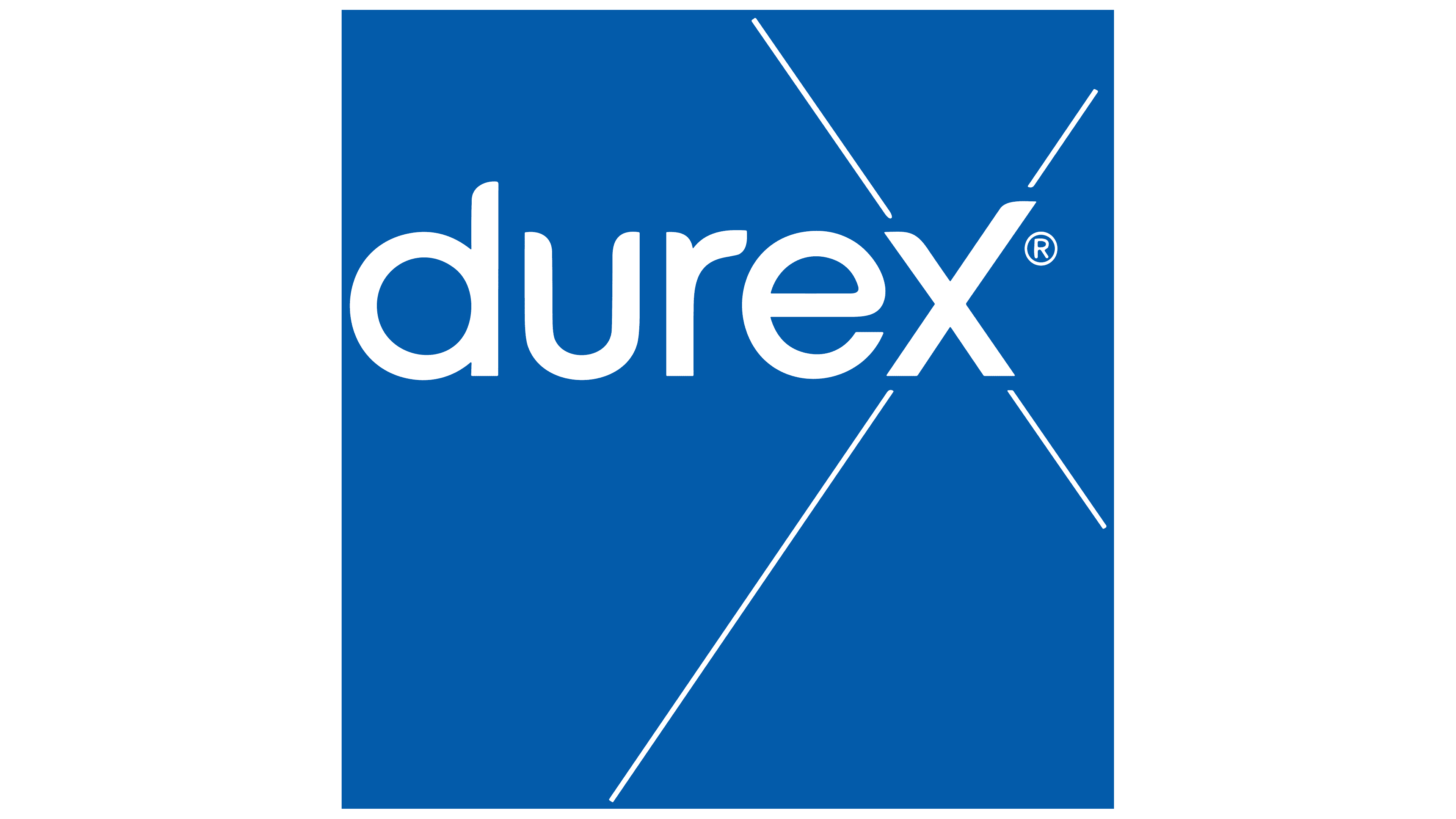
In 2022, the brand introduced an updated version of its logo, building upon the visual system established during the previous update. This variant maintained the recognizable shape of the wordmark and the signature blue color. Still, it shifted emphasis toward the redesigned letter “x.” The revision specifically affected this character: thin lines radiate outward from each stroke of the “x,” extending in four directions. These lines add dynamism and transform the “x” into a compositional focal point, visually referencing the ideas of connection and interaction, as well as the linguistic play inherent in the brand’s name: the combination of “sex” and the letter “x” in Durex.
The typeface remained the same: the custom One Night Sans developed by Colophon Foundry. The palette continues to rely on pure blue and white without additional effects or gradients.
This version is used alongside the classic lozenge variant, offering a lighter, more open visual emphasis in communications that require a focus on the brand’s energy and progressiveness. The lines emanating from the “x” serve as a meaningful element, evoking associations with the intersection of ideas, people, and cultures that align with Durex’s mission to encourage open dialogue about sex.
Font and Colors
In this logo version, emphasis is placed on clean lines and contemporary letterforms. The brand’s lowercase wordmark “Durex” appears in a modern sans-serif typeface featuring smooth proportions and balanced strokes. The foundation is the custom typeface One Night Sans, characterized by slightly angled contours in some glyphs and smooth curve junctions. Stylistically, it resembles Shadeerah Regular yet shares features with the simpler Korto Medium, adapted specifically for brand identification across all formats, from packaging to digital media.
The palette employs the brand’s distinctive blue, calm yet vibrant enough to ensure high readability and clear visibility against light backgrounds. This shade conveys reliability and professionalism, creating a sense of security and stability for consumers. Combined with the minimalist logo design, the color enhances trust in the brand’s visual communication and is consistently reproduced across print and digital platforms.