The Reckitt logo is bright, fragrant, and iridescent. It resembles a rainbow in the bubbles of cleaning products produced by the corporation. The emblem resonates with every aspect of the giant’s work, demonstrating its versatility.
Reckitt: Brand overview
| Founded: | 1999 |
| Founder: | Isaac Reckitt, Jeremiah Colman, Johann Benckiser, Edward Mead Johnson |
| Headquarters: | Slough, England, UK |
| Website: | reckitt.com |
Reckitt is a British multinational corporation with a profit of over 3 billion dollars, producing household goods. It was formed by the merger of the English Reckitt & Colman and the German Benckiser in 1999. The company offers a range of household chemicals, personal hygiene brands, medicines, and vitamins.
Meaning and History
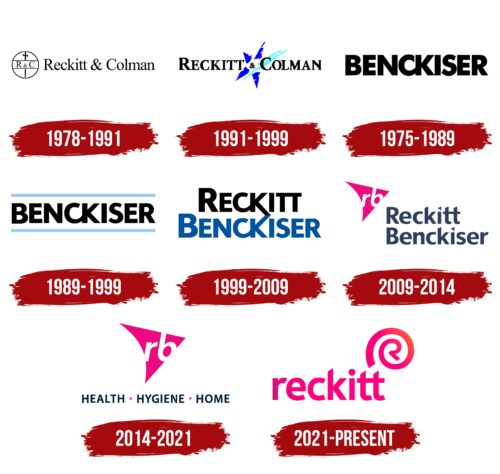
Despite the official birth of the modern conglomerate in 1999, the first logo appeared in 1978, and the predecessor companies of future Reckitt were founded in the early 19th century. Therefore, the logo of each predecessor can be considered the first in the company’s history. However, the 1978 emblem dedicated to Reckitt & Colman, which appeared in 1938, was chosen as the starting point. In 1978, it entered the American market by purchasing the giant Boyle-Midway. A special emblem was created for this occasion. In the future, the conglomerate’s emblems changed after each merger or renaming, reflecting the fascinating and lengthy history of the company that eventually became Reckitt.
What is Reckitt?
An English conglomerate that owns household and medical brands such as Vanish, Finish, Calgon, Veet, Nurofen, Strepsils, and Gaviscon. Products are sold in 190 countries worldwide. The headquarters is located in Slough.
1978 – 1991
The first emblem consists of a circular logo and the company name. The logo illustrates that the formation of the corporation involved two companies: Reckitt & Sons and Johnson & Johnson Colman. Each was named after its founder. Therefore, the name of the new corporation immortalized the names of Isaac Reckitt and Jeremiah Colman, both of whom lived almost a century before the merger.
The circular logo represents the Earth. The symbol of a sword divides the circle into two halves, signifying the conquest of the world and the competition between two strong and powerful companies sharing the global market. In the center of the circle, there is a band with the company’s abbreviation inscribed on it. The band covers the dividing line as if indicating that the union of the two families and companies led to the reconciliation of former competitors.
The image evokes associations with knighthood and the time of tournaments. It remotely resembles symbols of monarchical power – scepter and orb, suggesting control over the global market.
1991 – 1999
1975 – 1989
1989 – 1999
1999 – 2009
2009 – 2014
2014 – 2021
2021 – today
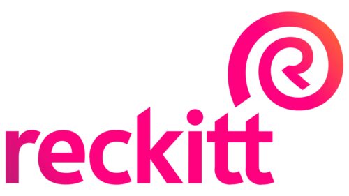
In 2021, the corporation decided to rebrand and return to the leading name, Reckitt, from the abbreviation RB, which had been used since 2014. Numerous mergers and acquisitions diminished the significance of other family names. Only the Reckitt name remained constant since the late 19th century. Therefore, the corporation focused on it.
In the logo, the surname is written in lowercase letters with bright raspberry-colored letters and a blue gradient in the first character. The gradient speaks of the company’s diverse past, which, however, remains behind since it only affects the initial element.
The lowercase letters demonstrate the transformation of the surname into a brand over time. The corporation evolves and moves forward. With each century, it undergoes significant changes. Therefore, in the eyes of today’s customers, the word Reckitt is associated not with Isaac Reckitt, who remains far from the past, but with the brand.
Above the last letter, t, there is a symbol resembling the @ sign but with the letter R in the center. The emblem is another symbol of transformation and keeping up with the times. The company enters the internet, sells products online, and advertises on the World Wide Web.
The circle also resembles a trademark symbol. Reckitt is no longer a surname or part of a name but a full-fledged trademark of the corporation. The orange gradient on the stripes of the drawing hints at the Sun. The brand has risen high in the sky, and its lines reflect the rays of the sun.
Font and Colors
The bright raspberry color of the logo demonstrates the rejuvenation and modern style of the corporation. The shade lifts the mood and speaks of the effectiveness and pleasant scent of Reckitt’s household products. A touch of playfulness points to feminine glamour and contraceptive products since the corporation owns brands of female hygiene products and a condom brand.
The font is simple and even, echoing many classic fonts, but with a transformation of the last two letters, t, which are merged with their upper crossbars. This technique highlights the unique series of mergers that took place during the birth of the corporation. It also alludes to social networks like Telegram and Twitter and the internet in general, which harmonizes with the R symbol in the circle.
Reckitt color codes
| Rose | Hex color: | #ff007f |
|---|---|---|
| RGB: | 255 0 127 | |
| CMYK: | 0 100 50 0 | |
| Pantone: | PMS 1925 C |
| Sunset Orange | Hex color: | #ff4d45 |
|---|---|---|
| RGB: | 255 77 69 | |
| CMYK: | 0 70 73 0 | |
| Pantone: | PMS Bright Red C |
