


![]() Repsol Logo PNG
Repsol Logo PNG
The Repsol logo reflects the company’s spirit and its connection to nature. The sun, sea, and horizon line symbolize energy and openness to the world. The bright colors and form emphasize the brand’s modern character and its evolution.
Repsol traces its origins to 1927, when the Spanish government created CAMPSA, a state monopoly controlling oil imports and distribution. The system unified foreign and private operators under centralized management and remained in place for decades.
In 1948, REPESA was established to build a refinery in Escombreras near Cartagena. It produced fuels and lubricants and introduced the REPSOL brand, which gained recognition as a commercial name. In 1981, the government formed the Instituto Nacional de Hidrocarburos to consolidate state oil assets.
A major shift came in 1986, when Spain joined the European Community. That same year, Repsol S.A. was created as an integrated company combining exploration, refining, and petrochemicals. The name was selected based on public familiarity with CAMPSA and REPSOL.
In 1989, the government began privatization with a 26 percent share sale, raising about $ 1.06 billion. The process continued through several offerings and ended in 1997, when the final state stake was sold. By then, Repsol had refined more than 60 percent of Spain’s oil.
In 1999, the company acquired 97.81 percent of YPF for approximately $ 15 billion, forming Repsol-YPF and expanding across Latin America. In 2012, Argentina nationalized a 51 percent stake, leading to a 5 billion dollar settlement in 2014.
In 2015, Repsol acquired Talisman Energy for about $ 8 billion, strengthening its global presence. In Europe, the company competes with TotalEnergies and Shell.
Meaning and History
![]()
What is Repsol?
It is the largest representative of the oil and gas industry in Spain and a leader in Latin America’s energy market. This company is engaged in extracting oil and natural gas in 30 countries worldwide. It was founded in 1986 and was initially state-owned; its shares were later divided. The largest share belongs to La Caixa, Sacyr Vallehermoso, and Temasek Holdings.
1968 – 1987
![]()
Repsol traces its origins to 1948, when it operated under the name Repesa. The name was formed as an abbreviation of Refinería de Petróleos de Escombreras. The starting point was a refinery project in the Escombreras valley near Cartagena, with production beginning three years later. By the late 1960s, Repesa needed a way to identify its products, specifically motor oils. This led to the creation of the first circular symbol.
The emblem appeared as a round badge in a red-and-blue color scheme. At the center of a blue circle was a white letter R, with its horizontal bar extending beyond the circle. Between the center and the outer ring ran a white band separating the inner area from a wide red rim.
Below the badge was the name REPSOL. It was set in uppercase letters using a sans-serif typeface. The text color matched the center’s blue tone, so the symbol and the name read as a single unit.
1987 – 1997
![]()
In the late 1980s, Repsol became a major energy group by consolidating state-controlled assets under a single brand. These included the oil exploration and production company Hispanoil, the refining arm Enpetrol, chemical and LNG operations, and the butane supplier Butano SA. As the company expanded, a visual identity update was carried out in 1987, introducing a new logo designed by Wolff Olins.
The mark was composed of two elements: an abstract shape on the left and a wordmark on the right. The left side featured an elongated symbol resembling the sun or its reflection on water. The treatment had a watercolor feel. An orange semicircle with an uneven edge appeared at the top, and a red segment of a similar shape appeared below it. A horizontal wavy line ran between them, crossing the symbol and continuing beneath the name.
The name “Repsol” on the right was set in italics and in uppercase. The typeface appeared dense and heavy, with industrial proportions and geometry, closely resembling Eurostile Bold Italic or Square Sans. The overall composition evoked a marine horizon with sunset tones. The palette included dark blue with a green cast, orange, and red.
1997 – 2012
![]()
In 1997, Repsol updated its logo. The work was assigned to designer José María Cruz Novillo. The period coincided with the completion of privatization, as the state sold the remaining 10 percent of shares through an IPO. Two years later, Repsol acquired a controlling stake in the Argentine oil corporation YPF, and the group began operating as Repsol-YPF SA.
The logo consisted of an abstract mark and a text block. The composition was placed on a dark blue square. At the top, the company name appeared in white uppercase letters. The typeface was dense with a slight slant, close to Eurostile Bold Italic.
Below is a symbol composed of three stacked vertical parts. At the top was the largest orange element, shaped like a wide semicircle with a rectangular projection on the left. Beneath it was a white band that separated the composition and featured an uneven lower edge. At the bottom sat a red semicircle of smaller height, echoing the top shape’s contour and balancing the overall silhouette.
2012 – 2025
![]()
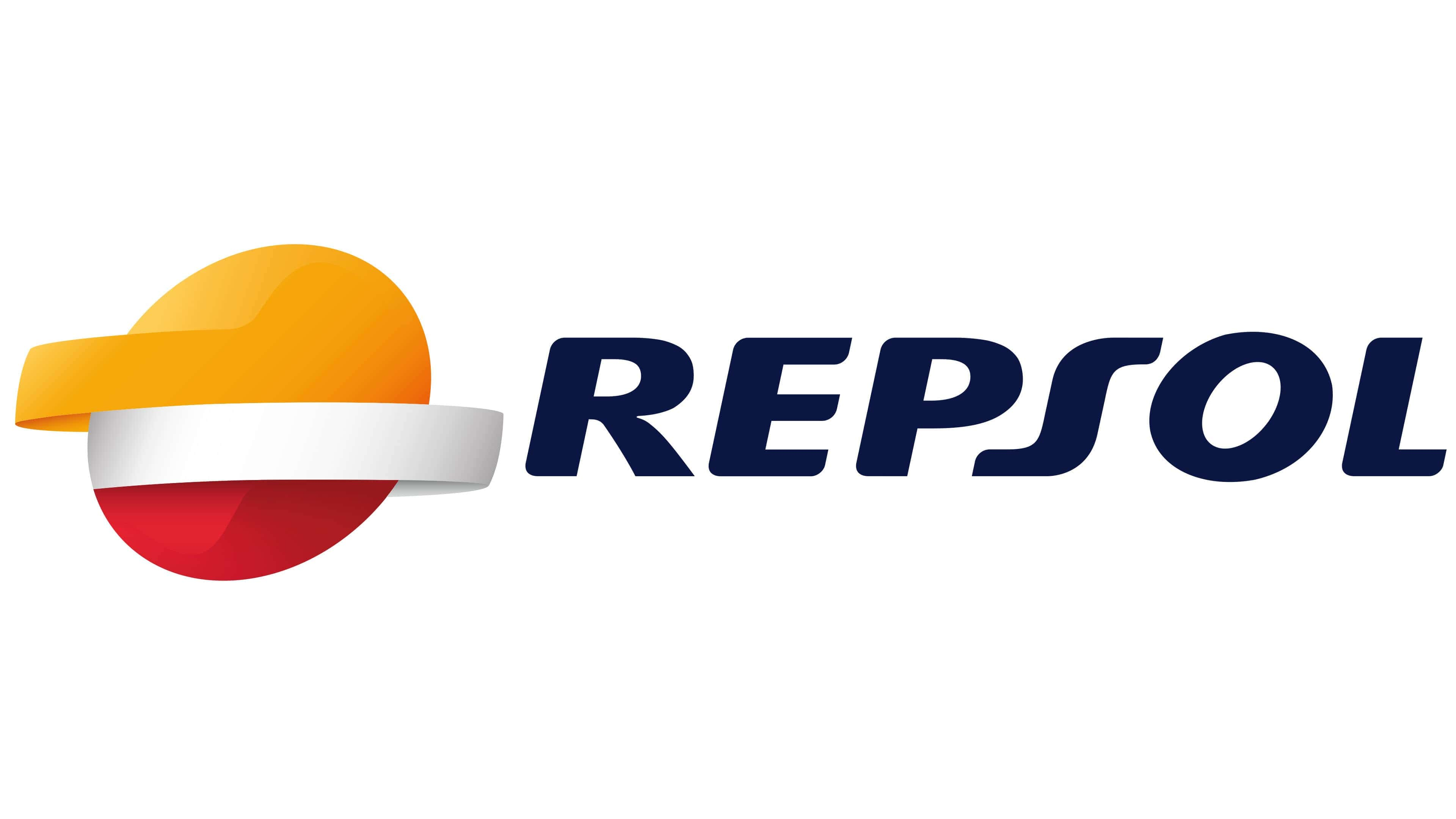
In 2012, the company redesigned its visual identity in response to changes in the oil and gas industry. The project was developed by Interbrand, with the presentation held on May 29. The company moved away from its previous logo and adopted a new visual system aimed at a more contemporary look.
The dark rectangular background was removed from the composition. The company name was placed below the symbol, and the symbol itself was rendered in three dimensions. The form still consisted of three connected parts. The top segment was colored in an orange-yellow tone, with an elongated element added on the left. A highlight indicated a lit surface.
The middle band took on a silver metallic tone. It wrapped around the shape, creating a sense of volume. The right side of the band receded backward along a curve, producing a turning effect.
The lower segment was red and completed the overall form. Color transitions created a lighting effect, with darker edges and lighter centers. The three-dimensional elements became larger. The name below was set in uppercase letters using a dense italic typeface.
2025 – today
![]()
In the summer of 2025, the brand introduced a new logo, continuing its gradual evolution of identity. The appearance became fresher while maintaining a connection to the previous version and the familiar brand style.
The name appears to the right of the symbol. The lettering is set in lowercase, using a sans-serif typeface with soft, rounded corners and a slight rightward slant. The typeface is geometric at its core, giving the word a clean and modern look. In style, it is close to Avenir or Nunito Sans.
On the left is a spherical symbol. The form is visually divided into three horizontal layers. The color transitions smoothly from yellow to orange and then to dark red. The top is light yellow, the middle is a rich orange, and the bottom shifts into red. The image evokes the sun at the horizon, suggesting morning or evening. The update was developed by Repsol’s in-house team, in collaboration with Saffron Brand Consultants, and the typeface was created in collaboration with Dalton Maag.
Font and Colors
As noted, corporate symbols embody the sea, sun, and its reflection in the water. Over time, they have changed, acquiring features that are perfect, clear, and stylish, and aligned with the company’s activities.
The main colors of the company’s logo are red, orange, dark blue, and white. Each of them has its own interpretation and symbolizes certain qualities. Red is dynamics and spark; orange is energy and warmth; blue is solidarity and responsibility; and white is transparent management and clean energy.
The oval’s rightward tilt conveys the oil and gas magnate’s commitment to development and relentless forward momentum. The individual font of the inscription. It is characterized by a slightly flat letter “S” with evenly elongated ends.
The minimalistic italic inscription “REPSOL,” which appears on the right side of the logo, is executed in a sans-serif font. It is very similar to FF Celeste Sans Black Italic, created by typographer Christopher Burke. This font is recognizable for its rounded corners, smooth gradients, Z-shaped letter “S,” and the slanted letter “O.”
Repsol’s color palette is very diverse, including white, black, several shades of gray, yellow, orange, and red. Moreover, related shades do not exist in isolation; they blend smoothly into one another. The gradient has been used in the design since 2012.