


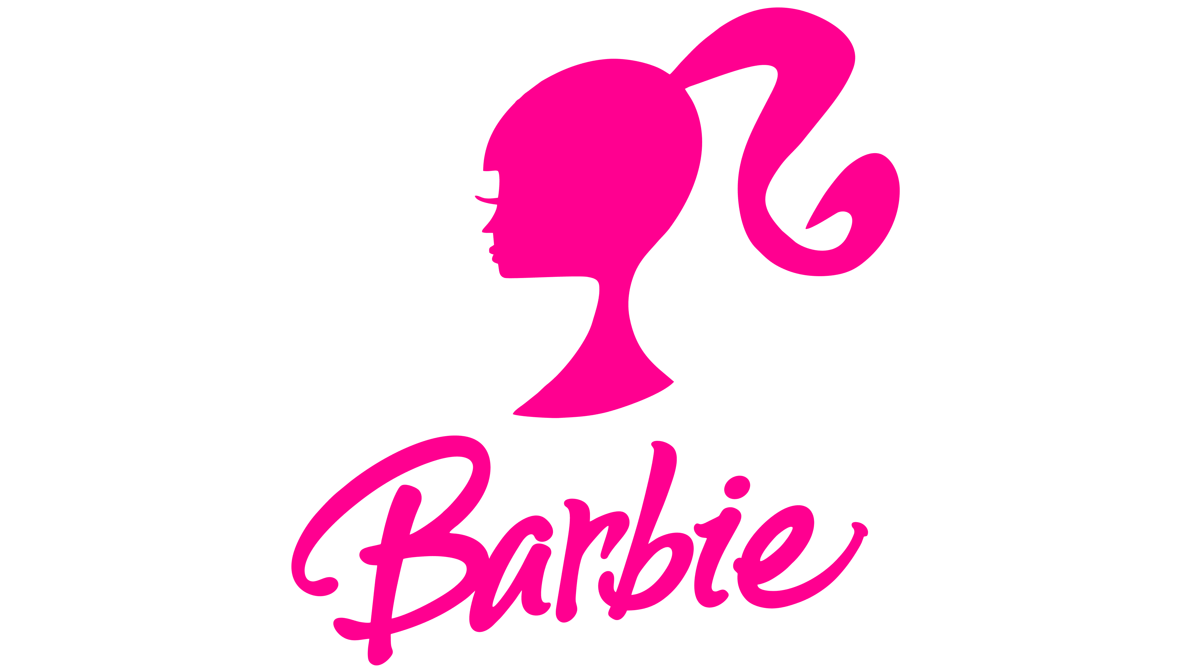
![]() Barbie Logo PNG
Barbie Logo PNG
The first children’s toy for girls appeared and, at the same time, received the recognizable Barbie logo, which, through a series of changes, retained its recognizability, modern look, and compliance with new requirements. The logo’s color and style reflect the target consumer’s gender identity.
The Barbie concept emerged in the early 1950s, when Ruth Handler, co-founder of Mattel, noticed her daughter playing with paper dolls representing adult women. At the time, the market focused on baby dolls, leaving no equivalent for role-play.
In 1956, during a trip to Europe, Handler discovered the German doll Bild Lilli and brought several examples back to the United States. With designer Jack Ryan, the concept was adapted into a mass-market product and named after her daughter, Barbara.
On March 9, 1959, Barbie debuted at the American International Toy Fair in New York. The first version, priced at $3, wore a black-and-white swimsuit and featured a high ponytail. Despite skepticism, about 300,000 units were sold in the first year.
Marketing played a key role. Since 1955, Mattel had promoted toys through television, including sponsorship of the Mickey Mouse Club, and Barbie entered TV advertising at launch. Clothing and accessories were sold separately, establishing an ongoing sales model.
The product line expanded quickly. Ken appeared in 1961, followed by Midge in 1963 and Skipper in 1964. Dolls with different skin tones were introduced in 1968, while official Black and Hispanic versions arrived in 1980.
In 1961, the producers of the Bild Lilli, Greiner & Hausser, filed a patent claim. The dispute was settled, and in 1964 Mattel acquired full rights for $21,600.
Criticism over body proportions led to revisions. In 2016, Mattel introduced new body types and broader diversity. By 2006, over one billion dollars had been sold worldwide.
Meaning and History
![]()
An adult doll with various outfits and accessories quickly gained popularity among girls, becoming a true brand. Its logo appeared simultaneously with the toy and has undergone about five modifications. Initially, the brand name was written in cursive; as the Barbie design expanded, it adopted a different style.
What is Barbie?
Barbie is an American toy brand. The brand name has become a proper name for the dolls, first introduced in 1959. For a long time, they were the world’s best-selling dolls, but after the launch of the Bratz doll, their popularity began to decline. The primary owner and manufacturer of the dolls is the parent company, Mattel.
1959 – 1975
![]()
The original emblem was handwritten in a childlike, semi-glamorous style. The first letter is capitalized; the rest are lowercase. The lowest are “a,” “r,” and “e.” The top loop of the second “b” is almost equal in height to the capital “B.” Thanks to the dot, the symbol “i” appears quite large and is only slightly smaller than “b.”
The text symbol has two highlights. The main one is the jumping letters, which are arranged randomly rather than in order. They have completely different tops and bottoms, which makes the logo look light and casual. This stylistic technique supports a playful mood, airiness, naivety, and charm. An additional feature is a curl at the capital letter “B.” It is located at the bottom and directed inward, forming a miniature oval.
1975 – 1991
![]()
The debut logo lasted for more than 15 years before being revised. An attempt to modernize the trademark led to the appearance of a volumetric name, practical and without a background, in a cheerful mood. The main emphasis is on strictness and shadows, which give the word a 3D effect.
All letters in the logo are of the same height and lowercase, except for the capital “B.” The line is straight, and the symbols are aligned. The only thing that dilutes the seriousness of the emblem is the rising inscription, as the word is positioned diagonally. This technique conveys a sense of happiness and optimism. The most unusual letter is “B,” consisting of two elegant curls. The other letters seem stretched and wide due to overly large shadows.
1991 – 1999
![]()
In 1991, designers returned the logo to its joyful and childlike lightness. They simplified it by removing bulky details. The shape of the letters remained unchanged, removing unnecessary curls from the letter “B.” This version was perceived as much more interesting despite the restrained writing style. The lowercase letters “b” and “i” are now almost the same height.
1999 – 2004
![]()
In 1999, the logo developers revisited it. As a result, the font became cursive, with a slight rightward tilt. The capital letter “B” regained its lower inner curl, making it airy and elegant. The word “Barbie” appears to be written in one stroke, without breaking the connection between the characters. The logo’s color is close to red.
2004 – 2005
![]()
The previous version of the logo lasted only one year before being adjusted. The artists made the first letter expansive and bold, with the top and bottom parts extending far beyond the front legs. The symbols are written without internal connections and arranged differently, so the name looks like it’s galloping. The lowercase letter “b” has a tail, and “i” is a five-petal flower instead of a dot. Thus, the company’s management ensured the logo was as childlike as possible.
2005 – 2009
![]()
After four years of use, the logo transformed again: the flower disappeared, and a classic dot appeared in its place. The letter “a” remained unclosed, and “e” with an upward-stretched leg.
2009 – today
![]()
Currently, the debut emblem, established in 1959, is used. It is adopted without changes and recognized as a standard in both style and color.
Font and Colors
Across the Barbie brand, designers have used only the word “part” in the logo; it has never included graphics. The word is positioned diagonally and reads from bottom to top.
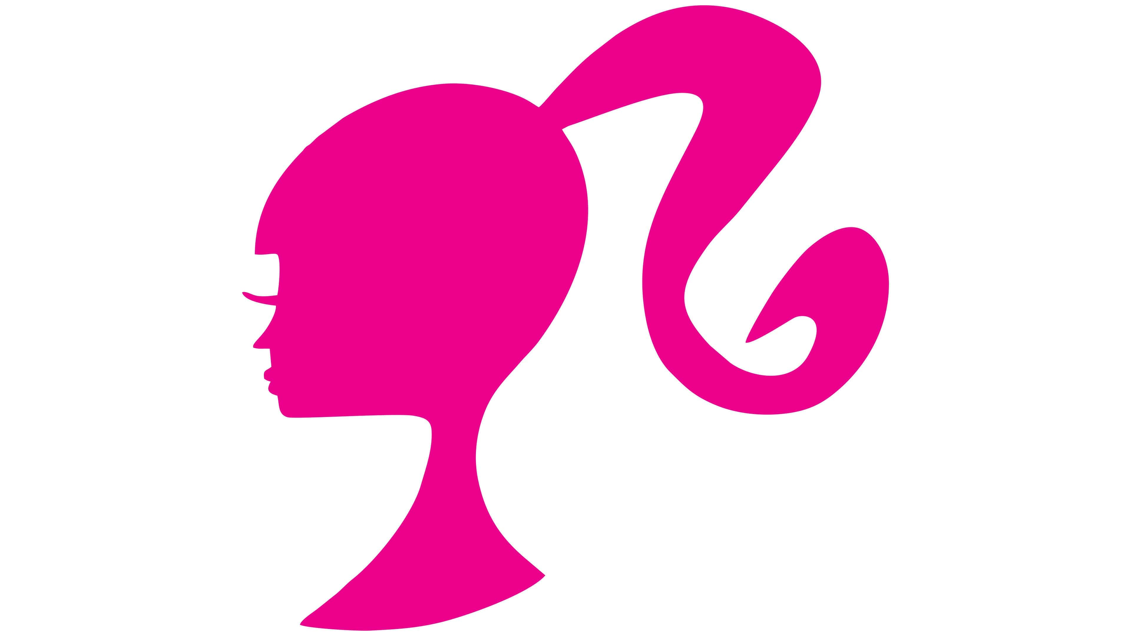
barbie head logo
The emblem’s font is custom, primarily in an italicized, handwritten style. The brand’s color has been a gentle candy pink since its inception and has remained consistent.
FAQ
What is Barbie’s signature color?
The Barbie brand’s signature color, Barbie Pink (Pantone 219C), is owned by Mattel. To emphasize this, Mattel and Pantone jointly released a new doll in a pink dress featuring numerous Pantone 219C markings.
Why is the Barbie logo pink?
Designers relied on gender stereotypes to choose a color for the Barbie logo. They made the wordmark bright pink because they believed this shade would attract the attention of the target audience, girls and women.
What does the Barbie logo look like?
The Barbie logo is a bright pink wordmark. The inscription is in a handwritten font, which looks elegant and relaxed. All letter edges are slightly rounded.