


![]() IKEA Logo PNG
IKEA Logo PNG
The IKEA emblem is an acronym of the place of birth and the name and surname of the company’s founder. Today, the emblem reflects a commitment to its origins despite the many redesigns throughout the company’s history.
IKEA began in Småland, Sweden, where Ingvar Kamprad was born on March 30, 1926. As a child, he sold matches and small goods. On July 28, 1943, he registered IKEA, combining his name with Elmtaryd and Agunnaryd. The business started as a mail-order operation, using local transport for deliveries.
In 1948, furniture was added to the range, which quickly replaced other products. By 1951, IKEA focused on home products and launched its first catalog. In 1953, a showroom opened in Älmhult, and in 1958, the first large store was built there.
In the mid-1950s, Swedish suppliers boycotted IKEA due to low prices. The company moved to in-house design and international production, including Poland. Flat-pack furniture appeared, reducing costs and changing logistics.
In 1960, in-store restaurants were introduced. Expansion followed with Norway in 1963 and Denmark in 1969. During the 1970s, stores opened in Switzerland, West Germany, Japan, Australia, and Canada. The United States followed in 1985 and the United Kingdom in 1987.
The catalog became a key sales tool, distributed globally in large volumes. Products were named instead of numbered, reflecting Kamprad’s system.
In the 1980s, ownership shifted to a complex structure of foundations in the Netherlands and Liechtenstein. Kamprad maintained a frugal image throughout his life. He died on January 27, 2018, in Småland.
Meaning and History
![]()
The company received its logo a year after opening, in 1951. The logo’s basis is an acronym formed from the founder’s surname and the name of the village where he was born. Thus, IKEA stands for Ingvar Kamprad Elmtaryd Agunnaryd. Over the years, the company has had more than ten emblems.
What is IKEA?
IKEA is a Dutch company that manufactures furniture and home goods for subsequent sale in an international chain of stores. The low cost of products is due to reduced assembly costs: customers have to assemble their purchases themselves. The organization has existed since 1943.
1951 – 1952
![]()
The debut version looks like a classic postal stamp made of sealing wax. Such stamps were placed on registered and valuable letters and parcels. This association is not accidental; it stems from the fact that Ingvar has been in business since childhood, buying small goods in bulk. He sold them to retail traders, delivering them personally to homes or sending them by mail. In the center of the logo is the word “IKEA” in lowercase, and around it in uppercase is “Kvalitets Garanti.”
1952 – 1957
![]()
During this period, the emblem was simplified, leaving a white inscription with the company’s name against a khaki background. It served as a trademark.
1952 – 1953
![]()
Another variation was developed in parallel. On it, against a brown background in the form of a spot, several inscriptions are depicted:
- The company name
- The year of the catalog’s release
- The name of the founder’s native village
The three-part “spot” is enclosed in a brown-beige rectangle with vertical stripes.
1953 – 1955
![]()
In 1953, the background was simplified, making it monochrome (beige). In the central element, only the word “IKEA” remained, and in the lower right corner appeared the inscription “Agunnaryd.”
1955 – 1956
![]()
Designers changed the colors and shape of the logo. Now, it looks like a black rectangle with yellow elements inside.
1956 – 1957
![]()
A year later, another variant appeared: a beige square with a black line along the edge.
1957 – 1958
![]()
When the company changed its name to Möbel-IKEA and began producing furniture, the logo was redesigned. The developers changed the main color to neon yellow and superimposed a black background with the white inscription “IKEA”.
1958 – 1962
![]()
Changes in these years concerned only the color palette: bright yellow was replaced with black, and the background, in the form of a “spot,” became a diagonal oval.
1962 – 1967
![]()
![]()
In 1962, a logo in the form of a horizontal ellipse appeared. In the first version, the inscriptions were located above and below; in the second, they were below but on a different background.
1967 – 2019
![]()
This is a legendary time in the company’s history, as it received its final name, IKEA, without the Scandinavian mark above the letter “E.”
1981 – 1982
![]()
During these years, the brand used a red version of the main logo.
1982 – 2019
![]()
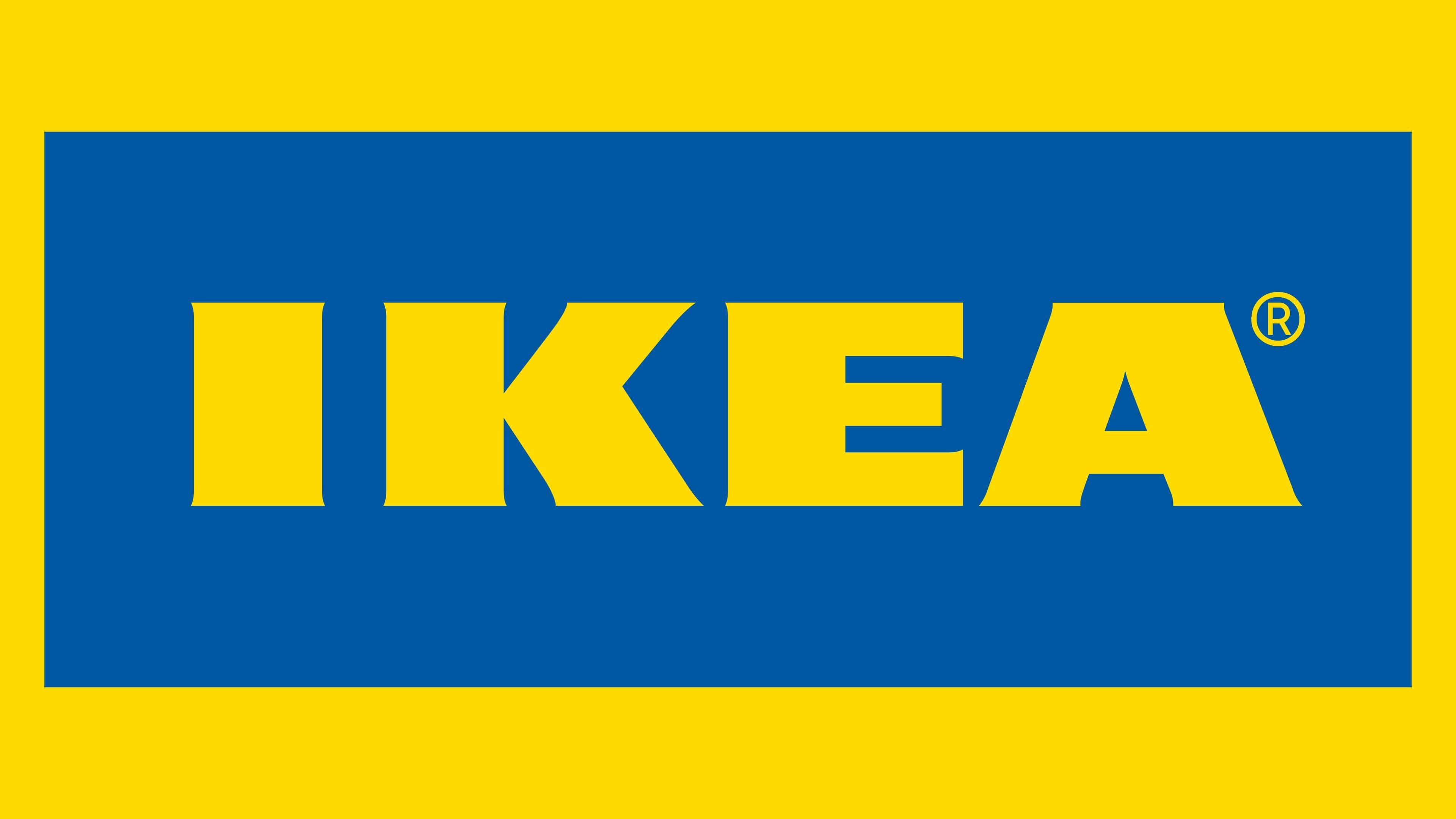
In 1982, all brand names were changed. However, the changes did not affect the shape, details, or letters – only the color of the logo was revised. It was then that the company first appeared with its legendary blue-and-yellow palette. The Stockholm design bureau Seventy created both the trademark itself and its alternative version.
2019 – today
![]()
The current emblem is lighter in color than all previous versions. Within the horizontal rectangle is a narrow oval containing the inscription “IKEA.” The main feature of the emblem is the golden ratio with perfect aspect ratio and proportioned dimensions.
Font and Colors
Both early and late versions share a common element: the company name in the center. Depending on the year, it has always been complemented by geometric shapes such as ovals, circles, squares, rectangles, and vertical lines.
The inscriptions on the logos are maximally simplified: the letters are flat and strict, even without serifs. Since 1967, the dominant word has been “IKEA,” written in a wide, massive font associated with heavy furniture.
The color palette is not uniform: different years were dominated by brown, beige, gray, khaki, and red. After the 1982 redesign, the brand’s signature yellow-and-blue combination emerged.
FAQ
What does the IKEA company logo represent?
The IKEA company logo represents its name, which stands for Ingvar Kamprad Elmtaryd Agunnaryd. The first two words are the name and surname of the company’s founder, and the third and fourth are the place where he lived as a child. The combination of yellow and blue is a tribute to the Swedish flag’s color palette, since the trade group was originally based in Sweden.
Why did IKEA change its logo?
Few know, but in 2019, IKEA changed its logo to make the name more readable on physical and digital media. The designers slightly increased the inner letter spacing of “A,” increased the distance between the horizontal strokes of “E,” reduced the spacing between the letters, and moved the registered trademark sign to the top-right corner next to the word.
What font is used in the IKEA logo?
The font used to create the trade group’s logo is called Ikea Sans. It was created for individual use and is based on the Futura font. It is bold and grotesque, with contrasting line thickness.