![]() Garmin Logo PNG
Garmin Logo PNG
An example of pure design is the Garmin logo, which symbolizes the ability to achieve success with minimal graphic load through high-quality products. The font’s perfect size and shape, transparency, and airiness reflect the main directions of activity.
Garmin’s origins date back to 1983, when Gary Burrell of King Radio and Min Kao of Magnavox decided to develop civilian applications for GPS technology. The company was founded in 1989 in Lenexa, Kansas, initially under the name ProNav. Its first product, the GPS 100 for marine use, debuted in 1990 and secured 5,000 orders.
In 1991, the US Army became a major customer, using Garmin devices during the Gulf War. That same year, production began in Taiwan. By 1994, the company introduced the GPS 155, the first IFR-certified aviation system, and by 1995, revenue reached $102 million with $23 million in profit.
The headquarters moved to Olathe in 1996, and by 1997, Garmin had sold its millionth unit. In 1998, it launched the GNS 430 for aviation and the StreetPilot, entering the automotive navigation market. Revenue grew to $232.6 million in 1999.
On December 8, 2000, Garmin went public on NASDAQ, raising $147 million after selling over 3 million devices across 100 countries. In 2003, it introduced the G1000 avionics system and the Forerunner 201, thereby opening the sports-wearable category.
The nüvi series, launched in 2005, expanded its presence in the car navigation market, intensifying competition with TomTom. By 2006, revenue reached $1.77 billion, driven by retail expansion and products such as Edge cycling computers.
Garmin entered the smartphone market in 2008 with the Garmin-Asus Nuvifone, but the line was later discontinued. In 2012, the fēnix watch marked a shift toward outdoor devices, competing with Suunto and Polar.
In 2010, Garmin re-registered in Switzerland, and in 2021, moved its listing to the New York Stock Exchange. Its sensor technology was later used in NASA’s Ingenuity Mars helicopter.
Meaning and History
![]()
The corporate logo was introduced when the company was founded in 1989 and registered in 2010. Throughout its existence, it has changed only once, serving as an example of concise design with a minimum of elements. The main emphasis is on the name.
What is Garmin?
Garmin is an American company and a leader in GPS technology. It produces marine, aviation, and consumer devices that use satellite radio navigation systems. Among its products are avionics for helicopters and light aircraft, sonars for boats and fishing, fitness trackers for athletes, and navigators for cars and bicycles.
1989 – 2006
![]()
This is a simple and elegant logo. It was named after the company’s founders, Gary Burrell and Min Kao (Gar + Min). It consists of slightly slanted capital letters. All lines are thickened. A miniature graphic sign is in front of the word, a globe made of semi-transparent stripes. The primary palette is black and white.
2006 – today
![]()
In 2006, the logo became more minimalistic. The letters became thinner and smoother, giving them the so-called transparency, a trend that prevailed across all areas.
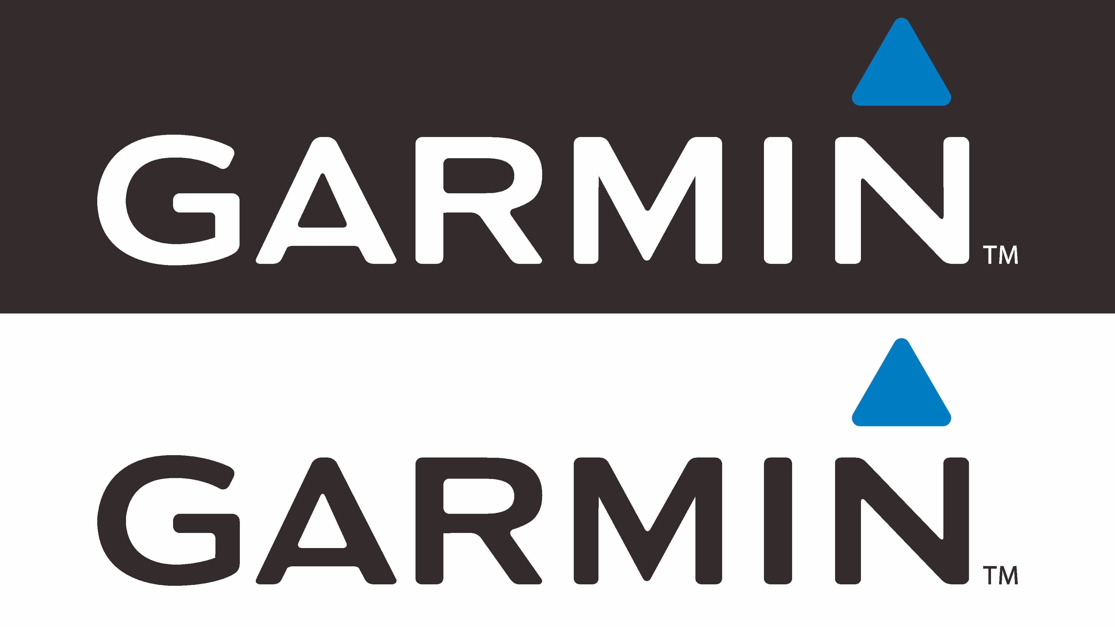
The modern logo consists of two parts: word and graphic. The name is typed in capital letters using a simple sans-serif font. Unlike the initial version, the symbols are thin, emphasizing lightness.
There is also a geometric sign, a triangle, which, according to the developers’ intention, focuses attention on innovation, dynamics, reliability, and professionalism. The primary color is black, with an additional light blue to highlight the graphics.
Font and Colors
For the Garmin brand logo, developers used a font with elongated letters. It resembles several font types. In particular, with Praktika from the Bold Extended group and FM Bolyar. In some lines and shapes, it is close to Media Gothic by Studio Media, Frutiger Bold (typographer Adrian Frutiger), and Rleud Extended by Stawix. The logo’s palette is simple, consisting of just two colors: black and blue.