


![]() John Deere Logo PNG
John Deere Logo PNG
The John Deere logo demonstrates that the company’s machinery fits perfectly into the environment. The machines are safe for the environment and animals. The emblem ensures the company has a deep understanding of construction, logging, and agricultural processes.
John Deere dates back to 1837, when blacksmith John Deere in Illinois built a polished-steel plow from a broken saw blade. It solved the problem of sticky Midwest soil that clogged cast-iron tools. Early output rose from 3 units in 1838 to 100 by 1842.
In 1843, Deere partnered with Leonard Andrus to scale production. By 1848, he moved operations to Moline for access to water power and transportation. In 1858, leadership passed to his son Charles Deere, who formalized the business. The company was incorporated as Deere & Company in 1868 and expanded its distribution across the Midwest.
By the late 19th century, the firm added seeders, cultivators, and horse-drawn equipment, competing with International Harvester. In 1911, Deere acquired several manufacturers, including Dain Manufacturing and Marseilles Company, building a vertically integrated structure.
A turning point came in 1918 with the purchase of the Waterloo Gasoline Engine Company and its Waterloo Boy tractors, marking Deere’s entry into the engine business. In 1923, the company launched the Model D, a two-cylinder tractor that remained in production until 1953.
During the Great Depression, Deere extended credit to farmers rather than cut financing. After World War II, modernization followed. In 1960, the New Generation of Power replaced two-cylinder engines with four- and six-cylinder models and was presented in Dallas.
By 1963, Deere surpassed International Harvester in US agricultural equipment sales. The company went public in 1969 and later expanded into construction and forestry machinery. In 2017–2018, it acquired Wirtgen Group for $5.2 billion.
Meaning and History
![]()
Despite its early appearance, the company’s debut logo is unremarkable, so no one refers to it. The evolution of emblems began in 1876 with the appearance of an image of a leaping deer. It served as the basis for all subsequent variations associated with the machinery corporation.
What is John Deere?
The American corporation John Deere manufactures agricultural and heavy equipment, including loaders, forwarders, combines, graders, excavators, trenchers, special equipment with a telescopic boom, tractors, and other equipment.
1876 - 1912
![]()
The original features a black-and-white deer, drawn as close to its natural appearance as possible. The animal is depicted slightly sideways, so the body-to-legs ratio seems disproportionate. The antlered deer is leaping over a small log. To the right and left of its antlers is an arc-shaped inscription of the company name. Below it is the inscription “Moline, ILL”.
1912 – 1950
![]()
In 1912, the company’s management revised the logo and eliminated the animal’s disproportionate appearance. The design of the trademark also changed, with the slogan “The mark of quality, famous for good tools” written in capital letters with serifs at the bottom.
1950 – 1968
![]()
In the mid-twentieth century, the company changed its brand design. As a result, a simple emblem featuring a schematic deer without a log appeared at the bottom. The company’s mascot and the surrounding inscription are framed.
1968 – 2000
![]()
After another transformation, the emblem became minimalist. Thanks to the absence of unnecessary information, it looks stylish: the logo only contains the corporation’s name and a leaping deer with less-branched antlers.
2000 – today
![]()
The dawn of the new millennium brought legendary changes to the machinery giant: the logo now has color and a double frame. The company name was removed from the frame.
Font and Colors
From the beginning, John Deere’s symbolism was associated with the image of a leaping deer. Today, the leaping animal is rendered graceful and elegant, hinting at the ease of operating the equipment produced.
Great attention was paid to the text so that the inscriptions would be clearly legible even on a miniature label. In the early years, a serif font was used. Inscriptions were made in bold, large letters. In 1968, the font became elegant and simple, without serifs. Until 2000, the logo was black and white, and then green and yellow, in keeping with the corporation’s traditional colors.
FAQ
What does the John Deere logo mean?
The leaping deer in the John Deere logo symbolizes strength, stability, persistence, hard work, and innovation.
What does the John Deere logo look like?
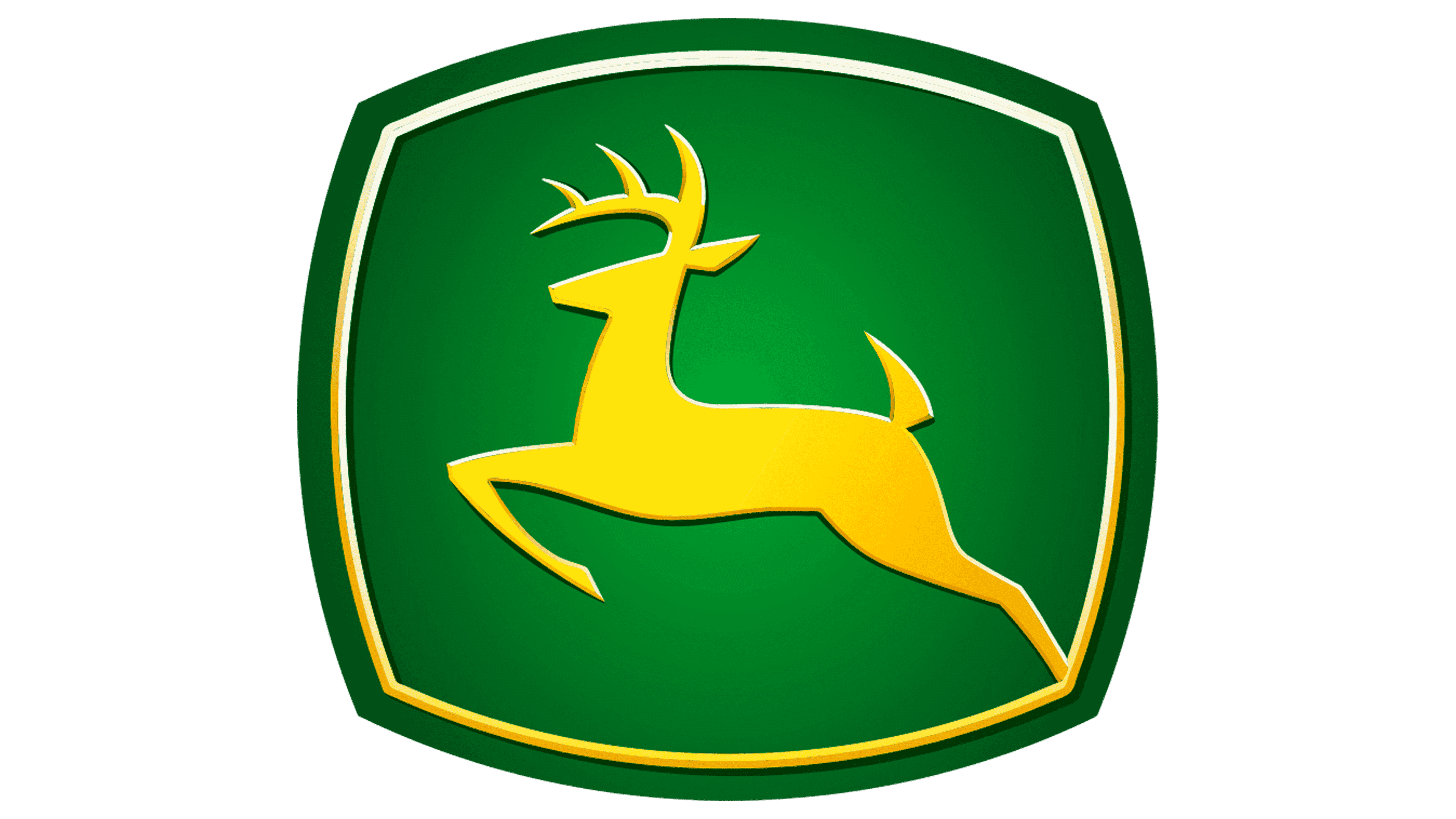
The logo’s basis is a green square with rounded corners and a gradient. Along the inner edge is a yellow stripe that frames the leaping deer, also yellow. Below, in capital letters, is the phrase “JOHN DEERE”.
Who created the John Deere logo?
Todd True, a designer at the company Landor, contributed to the creation of the current John Deere logo. He transformed the “landing” deer into a “leaping” one and used the iconic green color.
Can I use the John Deere logo?
As with any other identification, the John Deere logo may be used only with official permission from Deere & Company and in accordance with the terms set out in the Branding Guide.