The electrical company wants to emphasize its powerful products, so it is under an expressive sign. Not only is the Cummins logo bright red, but it’s also extra-wide. The first letter of the name is massive, blocky, and huge, shaped like an industrial magnet that attracts all things metallic.
Cummins: Brand overview
Today, Cummins is an American multinational corporation that manufactures energy products such as fuel systems, filtration equipment, electric motors, etc.
Working for export with 190 countries, the company has 600 independent distributors and 600 dealers. The company can position itself as a market leader and loudly proclaim itself, albeit with a concise logo.
Meaning and History
Even an experienced branding specialist can’t tell you how many logos one company can change over its existence. The number of visual transformations probably depends on trends in visual culture and changes in company management strategy.
The Cummins brand has changed logos many times in its history. However, the brand’s history goes back to the first half of the twentieth century, and more specifically, in 1919, the brand and its first logo were introduced.
It is impossible to keep track of the course of thought of the managers who took responsibility for the branding organization. At first, it was one economic approach, then came people of a different time and mentality, which means they brought a new spirit of the time and new ideas for visualization.
What is Cummins?
Cummins is a company that specializes in the production of engines and their subsystems, including turbochargers and filters. A second line of work is the production of generator sets and everything related to them. The organization was formed in 1919 and is currently based in Columbus, in southern Indiana.
1919 – 1944
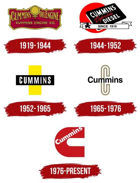
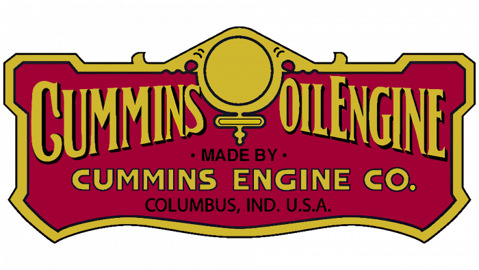
The logo was first introduced with a circular O-shaped center frame between Cummins and the “oil engine.” This center appeared to symbolize Venus, the feminine symbol of strength. Immediately below it, the company’s name was re-emphasized, and geographical location data was added. Between the yellow gold words, a short line reads “made.” It looks like an engraved plaque. It emphasizes the business style of the time. The plaque is the color of a ripe cherry touched by the sun. The logo resembles an automobile’s frontal view when viewed from the front.
1944 – 1952
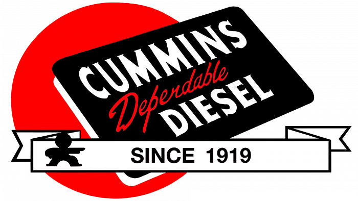
A dramatic change in the logo – and a new stage in the company’s development. A bright red circle appears, preceded by a black rectangle with a white shadow border that reads Cummins Diesel (in white) and Dependable (in ornate red lettering). We wanted to emphasize the importance and historical significance of the brand’s appearance – 1919. Curiously, the inscription “since 1919” on the stylized ribbon is located in the middle, and on the left side, there is a black outline of a man pointing at this inscription with his right hand. The logo seems oversaturated with symbols, fonts, and inscriptions, but it generally looks laconic due to the combination of colors. From the minuses of the logo, if you look closely, it seems that the focus of the images is shifted to the left because there is a large red oval at the intersection of the planes of the “business card” and “ribbon.”
1952 – 1965
The lesson was learned, and logo design and color selection mistakes were eliminated. While the previous one resembled the flag of Japan in places, now it looks like a cross, with a yellow rectangle vertically and a black line longitudinally, on which “Cummins” is modestly written in white letters. The font has become sans-serif, simpler, and more elongated. It is difficult to understand what the authors of this logo wanted to say, as there are no visual associations with the brand. The main goal was to eliminate fancy figurative details and graphic elements.
1965 – 1976
This period again saw a dramatic change in the logo. The font was made clear and readable, and the background was removed. A large first letter drawn with an outline appeared in place of the yellow stripe.
1976 – today
The logo changed this year. It is now simple, clean, neat, and conservative, though with a twist.
The letter C is in the center of attention, where the company name is diagonally inscribed. At the same time, the last letter extends beyond the C, which creates the illusion of a continuation of the inscription. Logo designer Paul Rand, who has created visuals for companies such as IBM, ABC, Westinghouse, and UPS, could afford to add a bit of curiosity to the logo, which would be greatly refreshed if it had a simple diagonal lettering. Incidentally, the color C is closer to light blue, and the letters of the full name are white for contrast.
In 2006, the C color was changed—this time, black accentuates the full brand name. Visually, the C disappears, but this is just an artistic technique.
Cummins: Interesting Facts
Cummins Inc. is a leading global company specializing in diesel and natural gas engines, electric and hybrid powertrains, and related components. Founded in 1919 by Clessie Cummins in Columbus, Indiana, it now serves customers in over 190 countries.
- Pioneering Diesel Engines: Clessie Cummins pioneered commercial diesel engines, showcasing the first diesel-powered car in the U.S. at the Indianapolis 500 in 1933.
- Supporting WWII Efforts: Cummins engines played a vital role in WWII, and they were used in various equipment for the Allied forces, which helped expand the company.
- Global Presence: Cummins started expanding internationally in the 1950s and now has manufacturing facilities worldwide, including in the UK, China, India, and Brazil.
- Environmental Leadership: A leader in reducing emissions, Cummins met EPA emissions standards early on and continues to develop cleaner engine technologies.
- Trailblazing Leadership: In 2004, Pamela Carter became the first female and first African American woman CEO in the industry, leading Cummins.
- Focus on Electrification: Committed to sustainability, Cummins invests in electrification, fuel cell technology, and alternative fuels to lower emissions.
- Railroad Innovations: Cummins has a history with railroads, supplying diesel engines for some of the first diesel-powered passenger trains in the U.S.
- Corporate Responsibility: Cummins is recognized for its social responsibility and is committed to diversity, environmental sustainability, and community involvement.
- Technological Advances: Cummins has continuously innovated, developing products like the X15 engine, known for its fuel efficiency and power.
- Economic Contributor: As a significant manufacturer of diesel engines, Cummins is essential to the trucking, mining, construction, and marine industries, boosting global economic development.
Cummins’ journey from a small Indiana company to a global leader exemplifies its dedication to innovation, quality, and environmental stewardship. With ongoing advancements in cleaner technology, Cummins is set to be a key player in the shift towards a more sustainable future.
Font and Colors
The appropriate and modest font, Helvetica Neue 95 Black, fits perfectly into the logo’s overall look. Interestingly, the letter C has taken on a customized shape as it was graphically modified specifically for the logo, bypassing the traditional Helvetica font.
The fairly common colors—red, black, blue, and white—set each logo apart. The logo is also easy to remember, meaning the brand has completely won over its target audience.
FAQ
Who designed the Cummins logo?
American designer Paul Rand invented the first version of the Cummins logo, which featured a large horseshoe-shaped letter C as the background for the inscription. He has also designed corporate identities for many other companies, including ABC, Westinghouse, Morningstar, Enron, and IBM.
What are the Cummins colors?
The Cummins brand strategy is based on a color palette consisting of white (#FFFFFFFF), black (# 000000), and Pantone 485C red (# DA291C).
What typeface is the Cummins logo in?
The Cummins logo’s typography is based on Helvetica Neue 95 Black. It’s a bold, grotesque design by Linotype Design Studio. Only the letter “C” was custom-made.


