The company’s name dictates its visual identity: the Chevron logo looks like a patch on a military uniform. The signage consists of two wide arrows pointing downward. The different colors balance the sign and make it as attractive as possible, while the gradient adds originality. After all, uniqueness is what the second-largest oil and gas refinery in the United States strives for.
Chevron: Brand overview
The proverb “What you name the ship, that’s how it sails” is not an empty phrase for big businessmen. A lot depends on the brand name: the attitude of the target audience, customer loyalty, and increased consumer interest. It is good when the brand is promoted and its name is on everyone’s lips. Nevertheless, a necessary element of the organization of any business is to create a visual link to the logo. The time comes, and the brand acquires a visual design, a graphic outline, which, at the slightest glance at it, instantly builds an associative array with the name and the goods or services offered.
Today, the logo solves many problems, so no self-respecting entrepreneur will not refuse the opportunity to remind themselves customers, with a bright and memorable symbolism. Establishing an emotional connection with the client through a visual image is the main task of a logo.
The path to creating a unique and ideal image for a specific business activity is thorny and interesting in its own way. The example of the Chevron logo shows how important it is to define your business niche precisely, work with customers in the same cultural field, and give feedback not only in the form of innovations in production but also to change the appearance as you work on your mistakes.
Meaning and History
Today, Chevron is well known to Americans as its gas stations are located almost all over the United States. The brand has gained credibility among competitors, customer loyalty, and a lot of respect in the field of entrepreneurship. And all because not only high-quality raw materials and excellent service provided by the staff but also quality design developed personality made Chevron the flagship of the fuel industry.
What is Chevron?
Chevron is the second largest oil company in the United States. It is engaged in the production of oil and natural gas, power generation, petrochemicals, fuels, and lubricants.
1879 – 1906
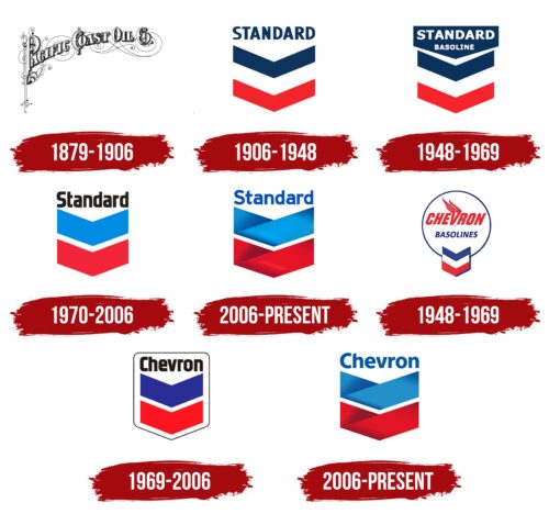
The history of the brand began about 100 years ago when The Pacific Coast Oil Company was founded in 1879. At the time, such a name was not surprising – the clear description at the heart of the name provided simple information directly to the potential buyer. You could say that there was a definite tendency to call things by their proper names and not to name companies with flashy, colorful, and complicated, irrelevant words. In this case, the company positioned itself as a leader in the Pacific region, anchoring the geographical names and representing the production area. The stylized lettering, appropriate to the time, reflected the graphic traditions of American manufacturers’ visual design. It was the lettering and ornamentation that made the image of the future market leader conservative, pragmatic, and modern.
1906 – 1948
A number of changes followed. The general concept of the business model was changing; there was a lull time when the company adjusted its image and developed in a difficult period for America. At the same time, Standard gas stations began to appear, focused on high-quality raw materials. In the context of identity development, the manufacturer’s strategy was to add the word “Standard” and the geometric shapes of the letter “V.” Three multicolored lines with a characteristic bend in the middle resembling a chevron appeared. Colors – blue, white, and red – layered one on another, forming visually sharp wings or enlarged arrowheads. The blue lettering at the top – “Standard” – was written in capital letters and no longer stood out.
1948 – 1969
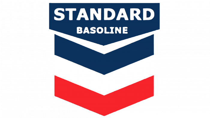
Again, changes in the appearance of the brand took place in 1948. The sidelines holding the three “V’s” together were removed, more visual white space was made, and the word “Standard Basoline” was added at the top. This word was built into the overall model of the conventionally named “wings” and resembled a bolt or cork to plug a pipe with. An interesting vision of the image is associated with a flag, a chimney, or a box, but these were unconventional decisions of the management. And it knew exactly what it wanted to achieve from the logo – to attract customers’ attention and establish close partnerships.
1970 – 2006
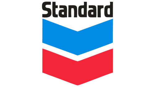
The flagship of the U.S. fuel and energy industry got a simplified logo. It lacks the former scale. The modesty of the identity is emphasized by the word “Standard,” which was the name of the company. It indicated its standardness, familiar assortment, and standardization, that is, high-quality products that meet all requirements (standards). The inscription occupied the upper position and was located above the stripes with a triangular curve. The red and blue stripes were increased in width, and the white one, on the contrary, was reduced and looked like an empty space between them.
2006 – today
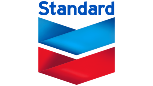
The “Standard” product series is indicated by an emblem with two wide stripes of red and blue colors, which were added using a gradient. Thanks to this graphic technique, the lines have become richer and brighter and resemble ribbons with bent ends.
1948 – 1969
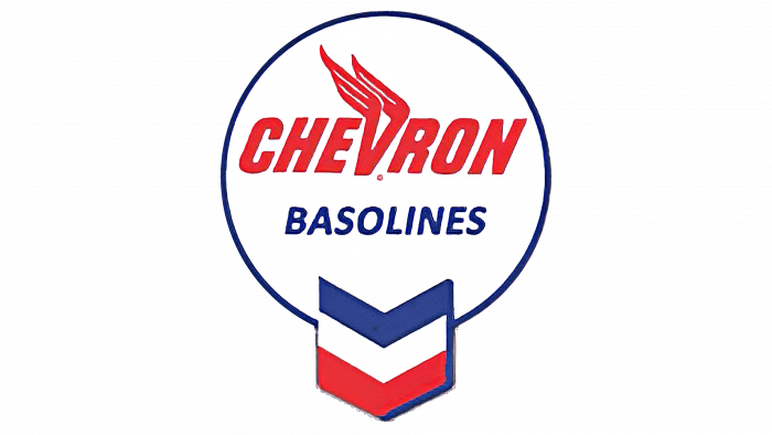
Following this, the concept of the logo changed dramatically. The first emblem was included in the logo. It looked like an inscription in a circle connected by three V’s. Separately, it is worth noting that these V-shaped “wings” were framed by a shadow on the right side, which had not been done graphically before. Anyway, the innovations became very noticeable. The customer’s attention turned to the round “cap” of the logo. Perhaps it was just a tribute to the fashion of the visual culture of the time. After all, as we know, since the 50s, rounded patterns began to appear more and more often, both in textiles and architecture. Nothing stopped Chevron from picking up on this trend by adding a new circle to its graphic design. Incidentally, the circle included not only the Chevron baselines but also a fire on the V, as if the wind was blowing on the right side and the flames had jumped to the left side. Overall, the logo began to resemble a magic ball with a set foot or a light bulb. Impressions from it are ambiguous: the manufacturer loudly declares itself, in every possible way, demonstrating the sphere of its activity (fire, a bulb that burns), but at the same time forgets about the rules of proportionality, appropriateness, and simplicity. There are too many colors and details of different sizes. This attracts with its motley but at the same time repulsed by the clutter of details. This logo definitely could not be left indifferent.
1969 – 2006
Once again, there was a simplification of the logo. The leaders of the industry leader realized the mistake and decided to redesign the logo, reducing the style to less pretentious and more formal. The simplification of the logo turned into meaningful formalism. Just two letters, V, in shades of blue and red, with the words “Standard” at the top. Nothing remarkable, but due to the lettering adjacent to the upper V, the top of the logo seems rounded. You can’t say that the logo of the time evoked any emotion or association: just a standard logo, just lines.
2006 – today
A brand’s name and logo should be consistent with each other. That’s why Chevron became a visual chevron rather than a veiled symbol of the company’s field of activity. Of course, we can agree that the name does not reflect the essence of the company; rather, the original logo dictated its own naming rules. But still, one cannot deny the victory of sincerity and simplicity over demonstrativeness and exaggerated desire to stand out. Tastefully selected, neat, and concise greetings from Chevron not only please the eye of the buyer, making it recognizable and unique at the same time, but also authoritatively state masters are masters because they know how to recognize mistakes and make them better. It should be added that now the Chevron logo is inscribed in a rectangle with a sharp end at the bottom, and the white V-shaped line does not stand out at all but only hints at its presence. The font of the “Chevron” inscription has also changed, blending seamlessly into the overall concept of the logo. The logo can be called integral, solid, and self-sufficient, as all elements are connected with each other in meaning and form. In 2005, in accordance with the traditions of visual graphics of that time, it was decided to add a gradient to the blue and red colors and “wrap” the letter V. From above, the Chevron lettering became less jarring due to the change in typeface, which appeared more inviting and visually less conformal.
Chevron: Interesting Facts
Chevron Corporation is a major player in the global energy market, involved in everything related to energy, from oil and natural gas to geothermal energy.
- Early Days: Chevron started in 1879 as the Pacific Coast Oil Co., making it one of the oldest big oil companies in the US. It grew over the years, merging with other companies to become the Chevron we know today.
- Global Influence: In the mid-20th century, Chevron was part of the “Seven Sisters,” seven companies that led the global oil industry until the 1970s, significantly influencing the world economy and politics.
- Growth Through Mergers: Chevron expanded by partnering with other companies. In 2001, it merged with Texaco; in 2005, it acquired Unocal Corporation, boosting its Asian presence.
- Worldwide Presence: Chevron operates in over 180 countries in all parts of the oil and natural gas sector, from finding and extracting oil and gas from the ground to selling and transporting it, making chemicals, and generating power.
- Innovation: Chevron is a top producer of geothermal energy and invests in renewable energy and new technologies to make future energy use more sustainable.
- Environmental and Social Efforts: The company invests in renewable energy projects and community programs worldwide despite facing criticism and legal issues related to environmental and social matters.
- Major Discoveries: Chevron discovered the Tengiz Field in Kazakhstan, one of the biggest oil finds in the last 40 years.
- Deepwater Drilling: It leads in deepwater drilling, with advanced projects in the Gulf of Mexico and off West Africa’s coast.
- Art Collection: Chevron has many works from American and international artists, showing its global reach and varied interests.
- Focus on Safety and Ethics: The company is recognized for its global operations’ strong safety culture and high ethical standards.
Chevron’s story, from a local oil company to a global energy powerhouse, showcases the evolution of the energy industry. Its history of innovation, strategic growth, and attempts to address environmental issues highlight the challenge of supplying the world with energy while moving towards sustainable sources.
Font and Colors
The 1969 emblem was used as the basis for the current emblem. They share a common design vision, but the “muted” font, soft color palette, and 3D effect lend finality and consistency to the current identity.
The typeface bears a resemblance to Myriad Pro-Bold, designed by Robert Slimbach and Carol Twombly for Adobe. At least the letter “h” has been modified, as its top has been beveled to give a better size next to the capital “C.” When it comes to color, there is no ambiguity or doubt – blue and red hues on a white background form a fold in the shape of a sharp-angled letter V, with a blurred gradient evident in some areas of the fold.
Chevron color codes
| Medium Electric Blue | Hex color: | #0054a4 |
|---|---|---|
| RGB: | 0 84 164 | |
| CMYK: | 100 49 0 36 | |
| Pantone: | PMS 2945 C |
| Rich Electric Blue | Hex color: | #198fcb |
|---|---|---|
| RGB: | 25 143 203 | |
| CMYK: | 88 30 0 20 | |
| Pantone: | PMS 639 C |
| Maximum Red | Hex color: | #e20d19 |
|---|---|---|
| RGB: | 226 13 25 | |
| CMYK: | 0 94 89 11 | |
| Pantone: | PMS Bright Red C |
| Japanese Carmine | Hex color: | #a31127 |
|---|---|---|
| RGB: | 163 17 39 | |
| CMYK: | 0 90 76 36 | |
| Pantone: | PMS 186 C |
FAQ
What does the Chevron logo stand for?
The double V-shaped pattern on the company logo is similar to a chevron. This symbol is often used in heraldry on various flags and insignia.
Why is the Chevron company called Chevron?
At first, the Chevron trademark was used only for some products of the Standard Oil Co. of California. After a reorganization, the Chevron name was transferred to the entire energy corporation.
What is the company Chevron?
Chevron is an energy company that was created by Standard Oil Co.
What is Chevron’s slogan?
Chevron’s main advertising slogan is “Human Energy.” It suggests that the energy corporation contributes to the development of mankind.
