Caterpillar, an American diversified manufacturer of specialized equipment, showcases its rich history and professional characteristics. The brand name pays homage to the first caterpillar tractor, and the CAT logo represents a commitment to minimalism and modern technology.
CAT (Caterpillar): Brand overview
CAT is an acronym for Caterpillar, a company specializing in the production of power plants, diesel engines, construction equipment, and various types of earthmoving and transport equipment. In 1904, caterpillar tractors were released under the Caterpillar brand. The eponymous company was founded in 1925.
Meaning and History
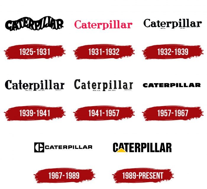
There are eight versions of the CAT logo, with only minor differences. The shape of the letters and additional mini-inscriptions change.
What is CAT (Caterpillar)?
CAT (Caterpillar) is an American brand of construction equipment, machinery, rugged mobile phones, work boots, and uniforms. CAT also provides financial and insurance services.
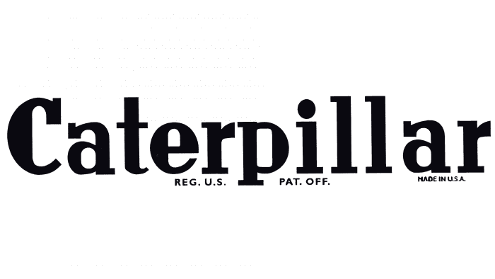
1925 – 1931
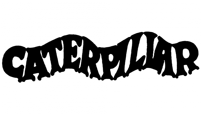
The company’s first logo was the wavy word “CATERPILLAR.” It is believed that its shape symbolizes the tracks of a tractor. This assumption is confirmed by small notches located under each sign. The black version of the emblem looks minimalist. The red color is complemented by uneven grey contours and the words “REG. U. S.” “PAT. OFF.”
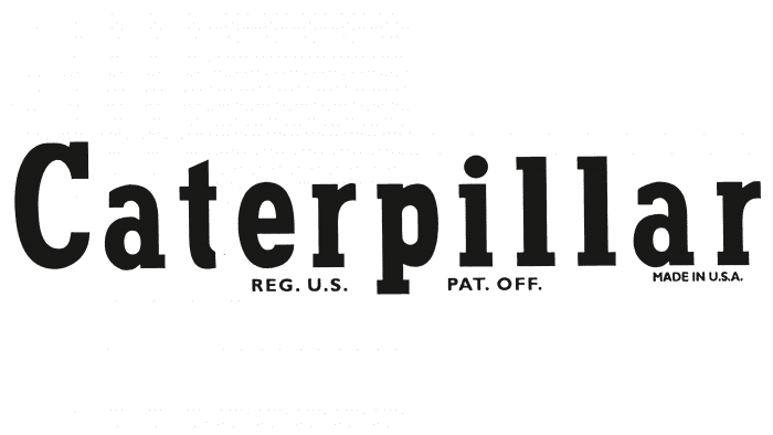
1931 – 1932
In 1931, designers changed the font, making it more formal. Rounded lines and rectangular notches stand out. Below are thin, light-gray phrases “REG. U. S.”, “PAT. OFF.” and “MADE IN THE UNITED STATES OF AMERICA.” The primary color is red.
1932 – 1939
The emblem became black. The shape of the letters did not change.
1939 – 1941
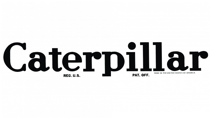
The bold dots at the ends of the letter “r” disappeared. The strokes became wider and longer. Instead of the inscription “MADE IN THE UNITED STATES OF AMERICA,” its abbreviated version: “MADE IN U.S.A.” is used.
1941 – 1957
The font changed again. The letters became elongated and symmetrical. The distance between the letters was increased.
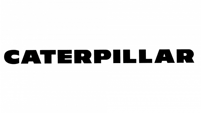
1957 – 1967
The distance between the letters was reduced again. More straight angles and wider lines appeared. The additional inscription under “CATERPILLAR” disappeared.
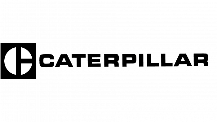
1967 – 1989
The letters became less bold. To the left is a graphic sign: a black square with a white circle divided into three segments.
1989 – today
Artists removed the miniature square and replaced it with a large yellow triangle in front of “CAT.”
CAT (Caterpillar): Interesting Facts
Caterpillar, or CAT, is a big company that makes equipment for construction and mining. It’s been around for a long time and is known worldwide for its big machines like bulldozers and tractors.
- How It Started: In 1925, two companies joined to create Caterpillar. Its story began when Benjamin Holt made the first tractor that moved on tracks instead of wheels in 1904.
- The Name “Caterpillar” came from Holt’s tractor, which, because of its tracks, looked like a caterpillar crawling on the ground.
- Helping in Wars: Caterpillar machines were important in World War I and II. They helped build things and move stuff around, which was a big help to the soldiers.
- Around the World: Caterpillar is a huge company worldwide. It makes machines for many different jobs, not just construction and mining.
- Always Improving: CAT is always coming up with new ideas to improve their machines, like making them run on electricity or adding technology to make them easier to use.
- Lots of Different Machines: Even though most people think of big construction equipment, Caterpillar also makes engines, turbines, and even trains.
- Giving Back: The Caterpillar Foundation helps people by supporting projects that improve the world, such as education and environmental protection.
- A Big Deal: Caterpillar is one of the biggest companies in the world. It’s known for making good products and being a leader in the industry.
- Racing, Too: Caterpillar is also involved in racing, like car races, showing off how good their engines are.
Caterpillar started as a small tractor company but now helps build and mine things worldwide, always working on new ways to improve and help more people.
Font and Colors
The company’s current logo has a rectangular shape. Inside the black geometric figure are the white letters “C,” “A,” and “T.” In the foreground is a yellow isosceles triangle with a dark outline. CAT is an acronym for the full name of the company, Caterpillar.
The word “CATERPILLAR” is written in a strict rectangular font of the Helvetica family. Most likely, it is either Helvetica Compressed or Helvetica Inserat Roman. Both fonts are sans-serif and have uniform strokes of the same thickness.
The bright yellow shade complements the black-and-white color palette. This palette is characteristic of the latest CAT logo, adopted in 1989. Before that, there were monochrome emblems in which white was combined with black or red.
CAT (Caterpillar) color codes
| Mikado Yellow | Hex color: | #ffc500 |
|---|---|---|
| RGB: | 255 197 0 | |
| CMYK: | 0 23 100 0 | |
| Pantone: | PMS 7549 C |
| Black | Hex color: | #000000 |
|---|---|---|
| RGB: | 0 0 0 | |
| CMYK: | 0 0 0 100 | |
| Pantone: | PMS Process Black C |
FAQ
What does the Caterpillar emblem mean?
The word CATERPILLAR on the emblem represents the American corporation. The yellow triangle in front of CAT is used as a decorative element. It conveys dynamics, symbolizing stability and innovation.
What does the triangle on the CAT emblem represent?
The CAT logo features a yellow triangle. It is isosceles: two sides of equal length with a wide base create a sense of stability.
Are CAT and Caterpillar the same company?
CAT is the flagship brand of the Caterpillar corporation.
What does CAT mean for Caterpillar?
CAT is the flagship brand of the Caterpillar company, under which most of its products are sold. It is primarily known for its specialized premium-class vehicles and engines.
