


![]() BP Logo PNG
BP Logo PNG
The world’s largest oil and gas producer, British Petroleum, changed its corporate identity after being renamed in 2001. Now, the BP logo features Helios, a god from Greek mythology, symbolizing energy in all its forms and the breadth of the product range.
BP began in May 1901, when William Knox D’Arcy secured a 60-year concession from the Persian shah to explore oil. After costly failures, he brought in the Burmah Oil Company in 1905, while geologist George Reynolds continued drilling.
In May 1908, after an order to stop work, Reynolds delayed the shutdown. On May 26, oil struck at Masjed-e-Soleyman, the first major commercial discovery in the region. On April 14, 1909, the Anglo-Persian Oil Company was registered as a subsidiary of Burmah Oil.
In 1912, a refinery opened in Abadan and later became the world’s largest. In May 1914, the British government, under Winston Churchill, acquired 53 percent of APOC, securing fuel supplies for the navy.
In 1935, the company became Anglo-Iranian Oil Company. By 1950, Abadan processed about a third of Middle Eastern oil. In March 1951, Iran nationalized the industry under Mohammad Mossadegh, triggering a British-led boycott.
In 1953, a coup backed by British and American intelligence removed Mossadegh. In 1954, a new consortium including Standard Oil of Indiana restored operations, and the company adopted the name British Petroleum.
In 1970, BP discovered the Forties field in the North Sea, reducing reliance on the Middle East. In 1987, the UK government under Margaret Thatcher completed the privatization process.
In 1998–2000, BP acquired Amoco and ARCO, joining ExxonMobil and Royal Dutch Shell as one of the largest oil companies. On April 20, 2010, the Deepwater Horizon explosion led to 11 deaths and a spill of about 4.9 million barrels. BP paid over $ 65 billion, and CEO Tony Hayward resigned.
Meaning and History
![]()
Originally, the company was called the Anglo-Persian Oil Company, as it was involved in oil and gas extraction in the Persian region. The company also included Burmah Oil Company, which was its subsidiary. Now, it is a large corporation that provides professional attention to 70 countries. Its emblem has evolved from a simple monochrome abbreviation to complex color graphics.
What is BP?
BP is one of the seven largest oil and gas companies in the world, a member of the so-called “supermajors.” In addition to fossil fuel extraction and processing, it is engaged in the production of fuels and lubricants. It also develops projects in renewable energy. The organization got its current name in 2001, using the initials “British Petroleum.”
1909 – 1920
![]()
The oil and gas company BP originated in 1909 as the Anglo-Persian Oil Company. Its first product was BP Motor Spirit gasoline, sold in the UK in the 1920s. In advertisements, the brand name was divided into three lines and centered. At the top were the letters “B.P.,” an abbreviation of British Petroleum. The middle row was occupied by the word “MOTOR” with an elongated downward letter “M,” and below it – “SPIRIT” with an enlarged letter “S.” The inscription used a bold sans-serif font, similar to a combination of Code Pro Bold Caps from Fontfabric and Königsberg Semi Bold from Sharkshock. The black text was placed inside a white square with rounded corners, and a wide, dark stripe runs along the base’s edge.
1920 – 1930
![]()
The official debut logo of the oil and gas company appeared in 1920. Its central element was a shortened version of the new name, British Petroleum. The letters “BP” became the brand name’s only detail. They were enclosed in black quotation marks and placed on an absolutely white background. The logo would lack individuality without the unique glyphs, with their characteristic sharp serifs and diamond-shaped angles.
1930 – 1947
![]()
For the next 17 years, a unique corporate symbol prevailed, featuring the abbreviation “BP” on a heraldic shield. It has a black edge and the same black letters in the center. The author of this version is BP Saunders.
1947 – 1961
![]()
In 1947, the company’s management decided to improve the logo and ordered a color version. As a result, the shield became multicolored – muted green. It was outlined with a thin yellow stripe, and the same inscription as before appeared in the center, “BP,” but without quotation marks and in color. To give the letters volume, artists used black shadows on the right side.
1961 – 1989
![]()
At the beginning of this period, a group of designers started updating the logo. Renowned specialist Raymond Loewy led them. The shape and contours of the brand name remained the same; only the color changed. The artists replaced green with green-blue, removed the border from the shield, removed the shadows, and made the inscription distinctly yellow, close to a golden hue. The glyphs were also changed, but the serifs were not touched – they remained sharp and of the same shape.
1989 – 2000
![]()
After nearly 20 years of using the logo, the company decided to rework it again, linking this to a revision of the corporate image. This time, it turned to Siegel & Gale for help. It offered a completely different version that corresponded to the progressive style.
As a result, green became a rich green, yellow turned sunny, and the palette grew richer. The shield became thickened at the bottom and devoid of sharp protrusions at the top. The letters became italic with a slight tilt to the right.
2000 – today
![]()
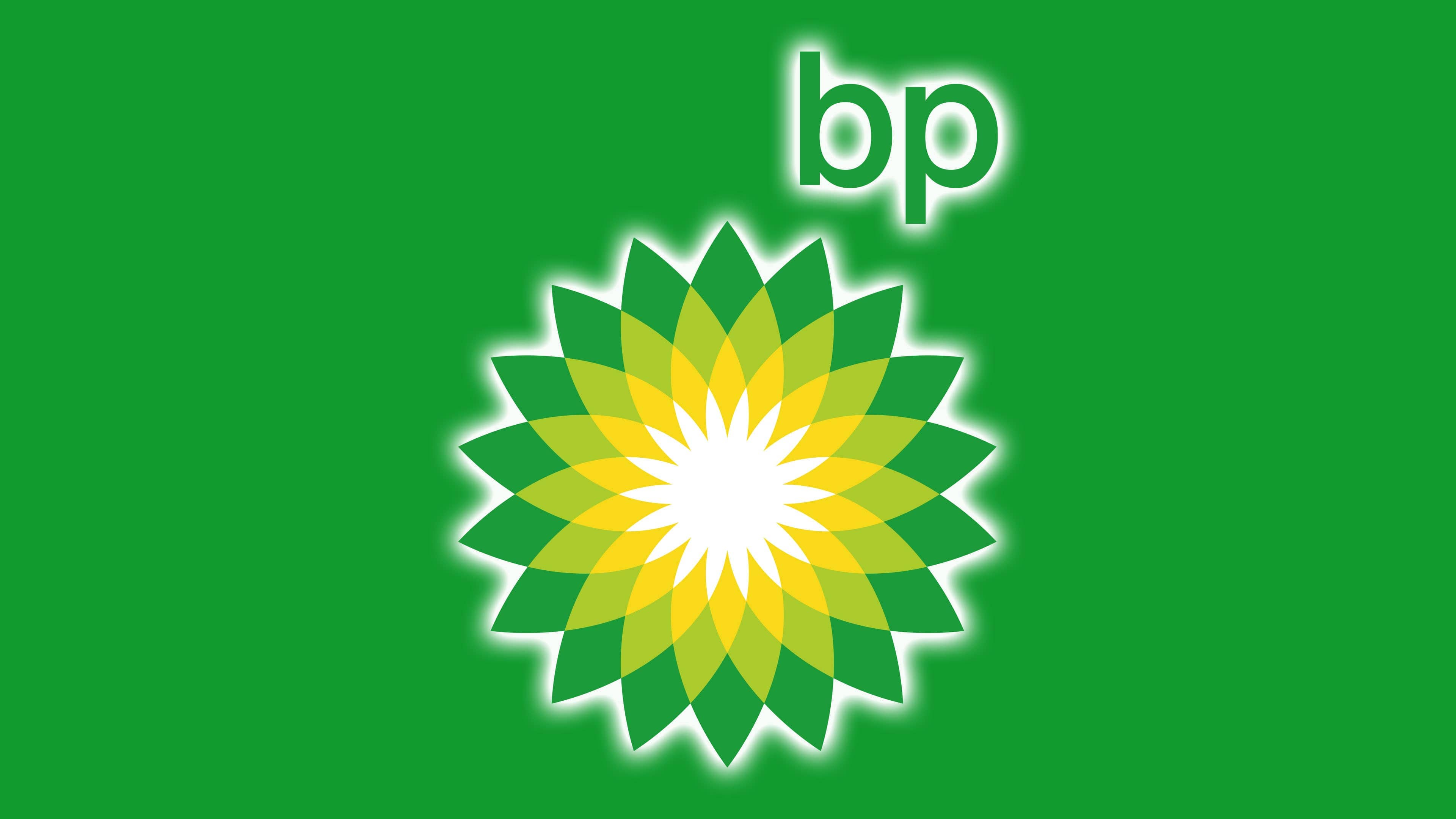
British Petroleum introduced a new emblem in response to media outrage over low safety standards. The idea of sunlight is accurately conveyed in it, as the graphic “flower” resembles the sun, after which it was named: Helios.
2000 was a turning point for the logo, as it moved away from outdated standards. The progressive development of Landor Associates truly symbolizes the radiant energy of the celestial body. On the right side of the graphic is the lowercase letter “bp,” formed from the company’s new name, Beyond Petroleum.
Font and Colors

For the first hundred years, the oil and gas company used symbols centered on the BP abbreviation within a knight’s shield. The onset of the 21st century radically changed the emblem, shifting the focus to graphics.
In old versions, the textual part was primary, so it was given great importance. The caps had serifs and a wide frame, emphasizing the company’s stability and strength. The new logo’s font is modern and more stylish, smooth, rounded, sans-serif, with a well-played “mirror” writing of the lowercase letter “bp.”
Regarding color, the emblem’s evolution is a transformation of the palette. The original version is black-and-white. Then, shades of green and yellow appeared in it.
FAQ
Why did BP change its logo?
Oil and gas giant BP updated its logo as part of a new $200 million marketing campaign. The sunflower-shaped emblem was meant to emphasize the company’s ecological image and convey that it is involved not only in the extraction of fossil fuels but also in the production of alternative energy sources that help improve the environment.
What does the BP emblem mean?
The modern BP emblem was named Helios after the solar deity from ancient Greek religion. It represents a sunflower consisting of a white center and three rows of petals: yellow, yellow-green, and green. But the floral element is much more than it seems. It symbolizes energy in all its manifestations.