The Shell logo demonstrates the royal capabilities opened by the extraction of oil and gas. The emblem shows how the company extracts minerals and uses them in various production areas.
Shell: Brand overview
Royal Dutch Shell is a British-Dutch company involved in the extraction and processing of gas and oil and chemical production. It was formed in 1907 as a result of the merger of Royal Dutch Petroleum Company and The Shell Transport and Trading Company Ltd.
Meaning and History
The organization inherited its trademark and name from The Shell Transport and Trading Company Ltd. In the 1930s, this company was far from the oil and gas industry. It was founded by entrepreneur Marcus Samuel, who sold boxes decorated with seashells.
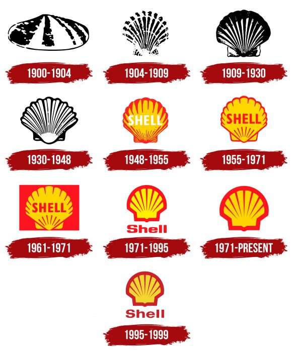
All Shell logos are incredibly similar to each other, except for minor differences in design. They depict a large shell – sometimes with a caption, sometimes without. From 1900 to 1904, it was a bivalve shell of an oval shape, but then it was replaced by a round comb.
Until 1948, the drawing was black and white. Later, the brand developers decided to use a red and yellow palette to make it noticeable and attractive. It was then that the word “SHELL” first appeared on the logo. In 1955, it changed color to red, and in 1971, it disappeared. Designer Raymond Loewy proposed this version. That same year, the shell was again supplemented with an inscription, but now at the bottom. In 1995, the font of the word changed – the letters became more rounded.
What is Shell?
Shell is the trademark of the British-Dutch company Royal Dutch Shell, which specializes in the extraction of fossil fuels, oil refining, and chemical production. It sells petroleum products, sulfur, biofuel, liquefied natural gas, hydrogen fuel, and electricity. About 40% of the shares are owned by the Dutch Central Institute of Fat Studies.
1900 – 1904
The debut Shell logo is a solitary mollusk shell. It has a classic look: oval, with a slightly protruding center. Thanks to the play of black and white, designers conveyed a rough texture, depicting it as uneven dots. The alternation of opposite-colored stripes forming a ribbed surface is also clearly visible on the shell. A dotted black line runs along the edge.
1904 – 1909
In 1904, artists removed the oval shell and used another – a comb shell. The fan-shaped shell is depicted in a straightforward and realistic manner. Its ribbing is conveyed by alternating dark and light lines. But in this case, they are narrow, not wide, like in the first version. Transverse stripes on the fan-shaped shell also stand out. Overall, the logo looks like a comb imprint on a monochrome surface.
1909 – 1930
After the redesign, the emblem slightly changed its appearance: despite retaining its monochrome, it became much clearer. It had more black, and the lower element stood out even more. Artists emphasized the fan-shaped form of the comb, expanding it on both sides. There is much less white in the logo now – it remains only in the form of vertical stripes, repeating the ribbed surface. The edges of the mollusk shell are not flat but slightly wavy.
1930 – 1948
To balance the monochrome, designers added white to the logo. At the same time, they reduced the width of the black stripes and made them much thinner than before. Now, the dark lines convey the characteristic ribbing of the shell and its wavy edge. Developers left the bottom area completely white, emphasizing the actual convexity.
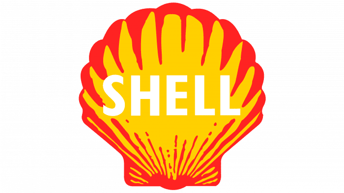
1948 – 1955
This period is very significant in the history of the Shell logo, as the color was introduced. For this, artists chose yellow and red colors. The first was used for the main surface of the shell, and the second for the edges and faces. Such saturated colors possibly convey the company’s main activity related to the extraction and processing of fuel, as by their nature, they are the main shades of fire. They express energy, light, and warmth. To fit the company name in the center of the emblem, designers removed the ribs, leaving them only on the edges: larger and wider at the top and smaller and thinner at the bottom.
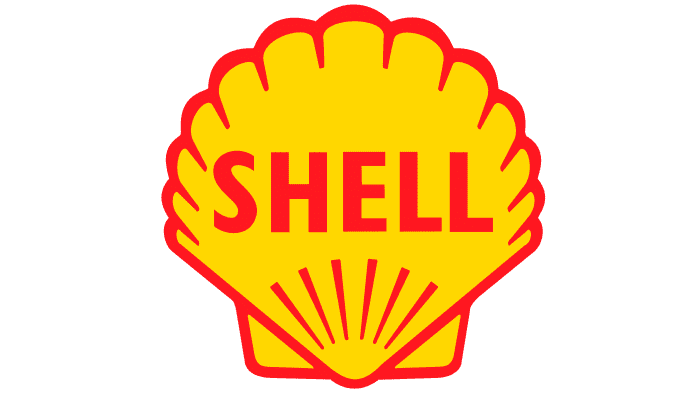
1955 – 1971
The authors decided to move away from the realistic style and offered a schematic but clear drawing of the shell. As a result, the irregularities disappeared from the logo, leaving straight stripes forming a structured ornament. Artists continued to keep the middle solid, but the name of the oil refinery was repainted red (previously, it was white).
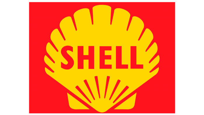
1961 – 1971
The company management approved a new version with a yellow shell in a red rectangle to emphasize the explosive connection and attract attention to the emblem. At the same time, the background harmoniously combined with the thin red lines.
1971 – 1995
The red rectangle in the emblem did not last long: Ten years later, it was removed. As a result, in 1971, the era of the emblem with a wide border began: a strip surrounded the shell on all sides. Thin inner lines again diverge like sun rays, forming a semblance of a celestial body, as it symbolizes fire, light, and warmth. Conical stripes are directed from the edge inward. The company name is now located at the bottom.
1971 – today
Reworking the emblem, designers slightly increased the width of the border strip, keeping the top edge of the shell flat in the form of an arch. The word “Shell” was removed altogether, focusing consumer attention on the graphic image, as by that time, the company had become widely known. In addition, the cold lemon-yellow color was replaced with a warm, sunny one.
1995 – 1999
This logo used the style of the 1971-1995 drawing, so the logos fully match in graphics but not in color. In the modified version, it shifts to a darker palette, so the red color is not scarlet but burgundy. Another distinctive feature of this version is the name of the oil company at the bottom under the shell.
Shell: Interesting Facts
Shell is a big energy company known around the world. It started a long time ago, in 1833, selling seashells, and grew into a huge company.
- Beginnings: It began as a small shop in London selling shells. Over time, it turned into a major oil and gas company.
- Becoming Big: Shell merged with another company in 1907 to better compete with Standard Oil, a big American company.
- The Shell Logo: The Shell symbol, a scallop shell, has been around for a long time and changed looks over the years. The one we see now started in 1971.
- Worldwide Work: Shell has over 80,000 workers in over 70 places. Its activities include finding oil, preparing it for use, and selling it. It also works with renewable energy, such as wind and solar power.
- Innovation: Shell created a special fuel called Shell V-Power to help engines run better and use less fuel. They spend a lot of time and money improving their products.
- Renewable Energy: Shell wants to help the environment by using more wind and solar power, biofuels, and hydrogen. To fight climate change, they aim to reduce their carbon footprint by 2050 greatly.
- Deepwater Exploration: Shell is skilled at finding and extracting oil from deep under the ocean. It has some of the most advanced technology for this tough job.
- LNG Leader: Shell is a top company that has been turning natural gas into liquid (LNG) for shipping worldwide since 1964.
- Helping the Planet and People: Shell supports environmental projects and works with groups to improve the world.
- Shell Eco-marathon: Every year, Shell holds a big competition where students create cars that use very little energy. It’s a way to encourage new ideas for saving energy and using it wisely.
Shell has been important in making sure people have the energy they need and is working on making energy in ways that are better for the planet.
Font and Colors
Currently, the oil and gas company uses the 1971 trademark developed by Raymond Loewy. If in the first versions (before 1948) artists tried to convey realism, then in this case, the comb shell is depicted schematically. It is a semicircle with a rectangular extension at the bottom. It is crossed by seven rays going from the edges to the center. Closer to the middle, the lines narrow. The pattern’s contour and stripes are red, and the inner part is yellow.
Along with this logo, there is a 1995 version with the inscription “SHELL.” However, it is not so popular – it is used only at some Royal Dutch Shell gas stations.
Despite the fact that the image of the shell is associated with the extraction of oil and gas, it is the main symbol of the company. This is a tribute to the historical past of “The Shell Transport and Trading Company Ltd,” which once sold boxes decorated with seashells. Rumor has it that the first drawing was taken from the family crest of Mr. Graham, one of the company’s executives.
The current logo has no inscriptions. But in the history of Royal Dutch Shell, there have been cases when the word “Shell” was added to the graphics, typed in bold, sans-serif font. From 1948 to 1971, the letters were uppercase, then all letters except the first became lowercase. In 1971, the font changed. If before it was rectangular, now designers smoothed the corners, making them more rounded. In 1995, another version appeared – with rounded letters.
Regarding the palette, it only gained brightness in 1948. The first emblems resembled old black-and-white photographs. However, designers decided to fix the situation and added fresh colors to the drawing. Since then, the color scheme has not been updated; it is still represented in yellow and red tones. It is believed that such a combination corresponds to the red-yellow flag of Spain, as the first Royal Dutch Shell service stations are located in California, which was formerly a Spanish colony.
Shell color codes
| Pigment Red | Hex color: | #ed1c24 |
|---|---|---|
| RGB: | 237 28 36 | |
| CMYK: | 0 88 85 7 | |
| Pantone: | PMS Bright Red C |
| Gold | Hex color: | #ffd500 |
|---|---|---|
| RGB: | 255 213 0 | |
| CMYK: | 0 16 100 0 | |
| Pantone: | PMS 109 C |
FAQ
What does the Shell logo represent?
The Royal Dutch Shell logo depicts a shell, but not a usual one, rather stylized as a crown. This form indicates that the oil and gas company is a leader in the energy industry. The color combination is also symbolic. The mix of orange and red reminds of the Spanish flag, as the first Shell gas stations were located in California, which previously belonged to this country.
Why is a shell depicted on the Shell logo?
The shell of a sea scallop is depicted on the Shell logo for a reason. Initially, Marcus Samuel, who founded the oil and gas company, sold antiques and boxes decorated with seashells. Later, his sons expanded the business, engaging in oil export, which gradually evolved into the extraction of fossil fuels. The enterprise grew, but the old logo concept remained.
What does the brand with the Shell logo represent?
The shell is depicted on the logo of the global petrochemical and energy conglomerate Royal Dutch Shell, which was developed back in 1907. The design has changed several times, evolving from realistic to abstract styles.
When did Shell change its logo?
The Shell brand logo has changed very often. The first color version appeared in 1948, and the version without a shell appeared in 1971. It is used today, although, in 1995, the company made another attempt at a redesign.

