


 Georgia Bulldogs Logo PNG
The Georgia Bulldogs logo inspires confidence. It symbolizes unstoppable bravery and strength conveyed through a unique image. The emblem captures the depth of dedication to the sport and the readiness to seize victory from opponents in a heated battle.
The University of Georgia’s Bulldogs trace their roots to 1892, when the football team played its first official game against Mercer and won 50-0. The Bulldogs’ name spread in the early 1900s, linked to sportswriter Morgan Blake’s 1920 comparison of the team’s toughness to a bulldog’s grip. Sanford Stadium opened in 1929, the same period when Uga, the English bulldog mascot, became one of the program’s defining traditions.
Football reached a major early peak in 1942 under Wally Butts, culminating in a national championship. Other sports grew as well, including tennis and track. Vince Dooley led the football team from 1964 to 1988, winning six SEC titles and the 1980 national championship after an unbeaten season built around Herschel Walker and a victory over Notre Dame in the Sugar Bowl.
Mark Richt arrived in 2001 and kept Georgia near the top of the SEC, winning conference titles in 2002 and 2005. Kirby Smart took over in 2015. After an 8-5 first season, Georgia broke through in 2017, won the SEC title, defeated Oklahoma in the Rose Bowl, and lost the national final to Alabama in overtime. The team later won the Peach Bowl after the shortened 2020 season.
In 2021, Georgia won its first national title since 1980, beating Michigan and Alabama in the playoff. In 2022, the Bulldogs went unbeaten, won the SEC again, and defended the national championship by defeating Ohio State and TCU. The program’s growth increased revenue, supported facility upgrades, and strengthened Georgia’s place among leading NCAA athletic departments.
Meaning and History
Eight men’s teams representing the Georgia Bulldogs and eleven women’s teams under the Lady Bulldogs banner proudly defend the University of Georgia’s honor at the NCAA Division I level, competing in the Southeastern Conference. Together, these teams have claimed nearly 900 NCAA championships and over 150 conference titles. According to EADA, in 2006, they held the highest profit margin among all U.S. sports programs. The British bulldog mascot, affectionately known as Uga, was officially adopted in 1920, when the team adopted the nickname “Bulldogs.”
Since 1964, the department has embraced a simple yet iconic logo consisting of just two elements: an elongated “G” and a red ring. Although the letter’s font is close to the classic style, it has a unique appearance. The inner part of the “G” forms an open circle, while the outer edge forms an oval shape, achieved through varying thicknesses at the top and bottom. This distinctive letter design appeared on players’ helmets during the first game of the 1964-1965 season.
Encircling the “G” is a bold red oval ring, separated by a white gap, which enhances the logo’s contrast and draws attention to its core elements. Football coach Vince Dooley created this logo, with the original concept brought to life by the wife of a former Georgia Bulldog player.
The men’s varsity basketball team was formed in 1891, but its first significant achievement came later, when it reached the NCAA Final Four in 1983. However, the Lady Bulldogs women’s basketball team found success much sooner, earning four SEC Women’s Basketball Tournament titles and seven SEC regular-season championships. In addition, the team has made thirty-three appearances in the NCAA Women’s Division I Basketball Tournament, finishing second overall.
Georgia Bulldogs athletes have won 13 Southeastern Conference championships and played in 2 national championship games. The team’s home games are played at Sanford Stadium, where Kirby Smart is the head coach.
The university’s baseball team also uses the nickname “Diamond Dawgs.” Established in 1886, the program saw modest results for a century before achieving notable success in the 2000s, during which it participated in the College World Series (CWS) several times and claimed three Southeastern Conference championships.
What is Georgia Bulldogs?
These are the University of Georgia sports teams competing in the Southeastern Conference. They are well-known for their red-and-black uniforms and dominance in college football. Their home field, Sanford Stadium, features a unique hedgescape surrounding the playing field, creating a memorable game backdrop. Besides football, the university’s teams have succeeded in track and field, gymnastics, swimming, and other sports. The university takes pride in producing many scholar-athletes who balance academic rigor and athletic achievement.
1920 – 1933
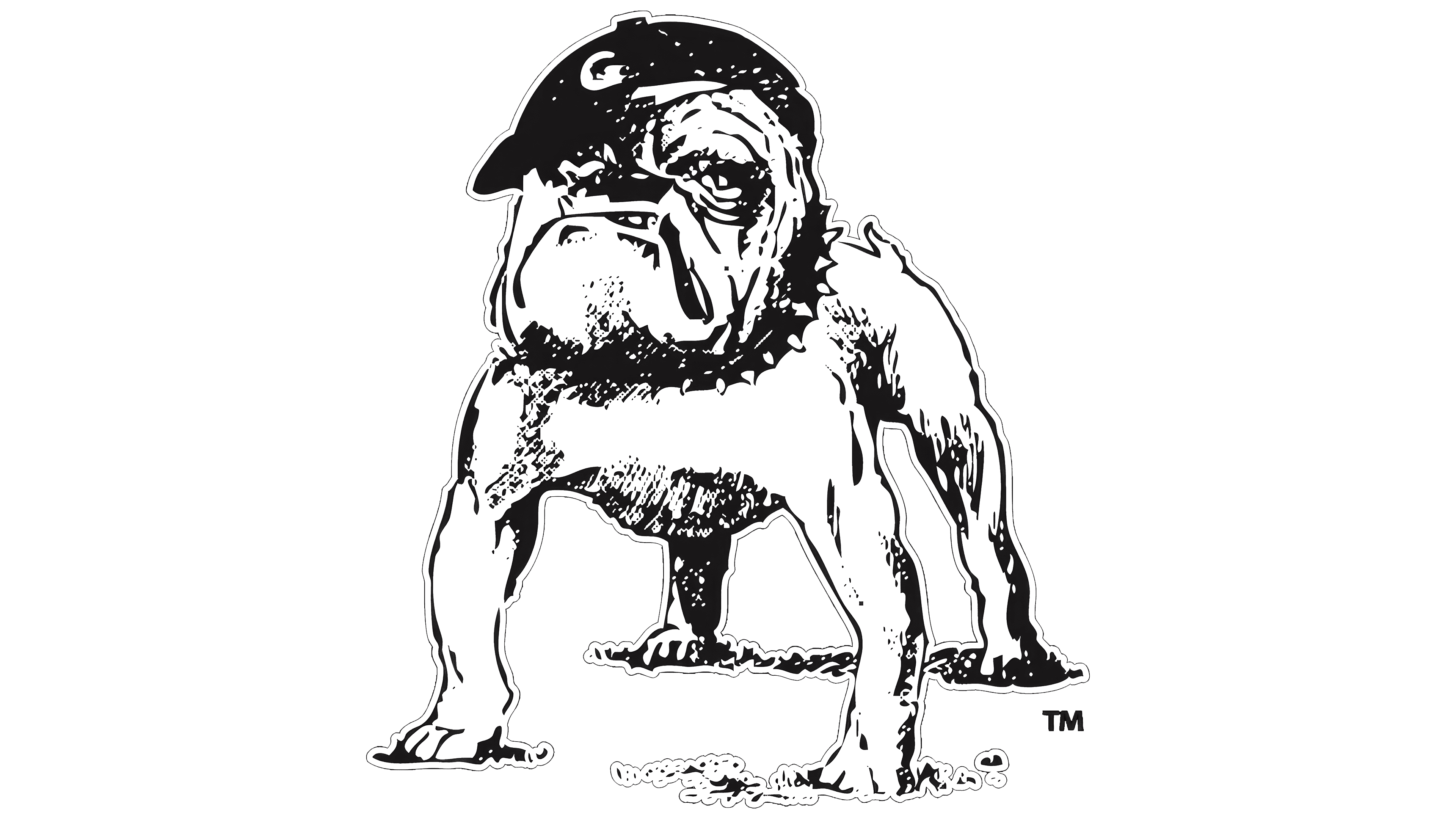
The main element of the Georgia Bulldogs logo is Uga, a dog. Naturally, it’s a bulldog, as this breed serves as the mascot of the University of Georgia’s athletic division, with the teams named in its honor. The dog stands with its head held high, displaying readiness for a clash with opponents, highlighting the aggressiveness that characterizes this breed. Despite its small size, members of this breed fiercely protect anything they consider their own.
The bulldog is depicted in an outline style with black strokes on a white background. Thanks to the artist’s skill, it appears three-dimensional, with the ground visible under its paws. The dog’s character is well represented as proud, restless, and potentially dangerous, as evidenced by its large lower jaw. This is also evident in its muscular legs, sharp teeth, powerful chest, and intense gaze. Only its short tail hints at any friendliness.
Around the dog’s neck is a spiked collar, and on its head sits a black baseball cap with the capital letter “G.” This bold, uneven glyph is white, making it stand out against the dark background. It signifies the team members’ pride in their university, underscores their patriotism, and points to their authenticity, as the single letter represents the state from which the athletic division originates.
The rough style reflects the informal emblem, while the monochrome palette conveys its business-like character and the athletes’ discipline. This logo is, in a sense, contradictory: behind the appealing image of a small dog lies a fierce and unpredictable animal.
1945 – 1958
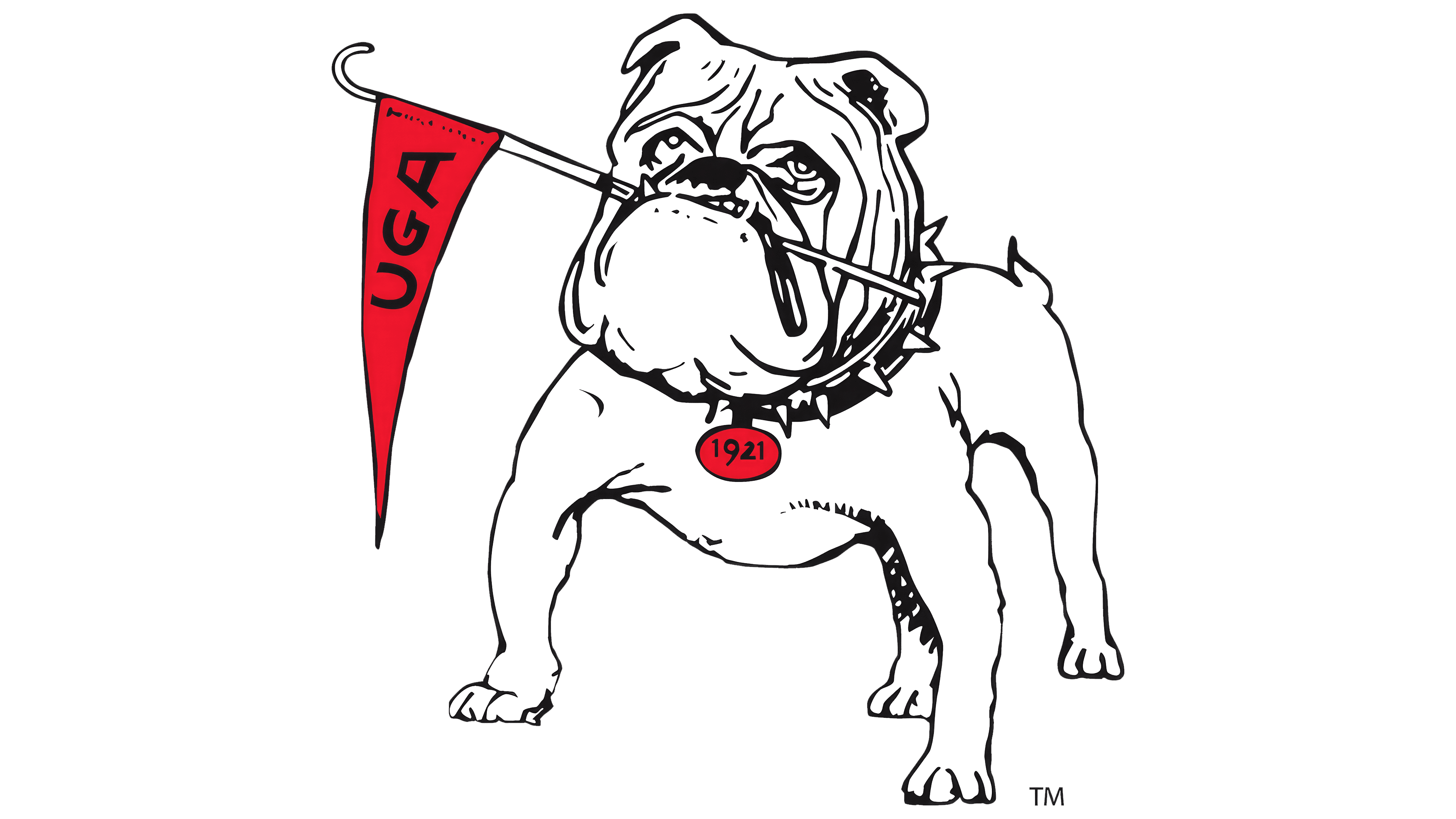
In this version of the Georgia Bulldogs logo, the dog is depicted in the same assertive, intimidating pose as before, yet in a completely different style. The style has drastically improved: the bulldog no longer looks cartoonish; it is drawn with a thin black outline, cleanly and smoothly. Other changes were also made:
- Shadows on the dog’s body were removed;
- a flag appeared in its mouth;
- A medallion was added to the collar.
- The baseball cap was removed from its head.
These adjustments elevated the emblem to a new level of perception: the dog now appears sweet and friendly, with a look of interest and hope in its eyes. Of course, the snarl on its face remains, but it’s clear that this expression is simply characteristic of the breed. This influenced the concept of the sports teams: the logo now reflects a drive for honest leadership rather than aggression toward opponents.
The flag held in the bulldog’s mouth has a long pole and a small triangular pennant. It displays “UGA” in uppercase letters, a shortened form of the University of Georgia in Athens, and the mascot’s name. The abbreviation is printed in bold, sans-serif black font, which, along with red, is part of the university’s official color palette. The inscription on the medallion hanging from the collar shows the founding year of the athletic division.
1958 – 1964
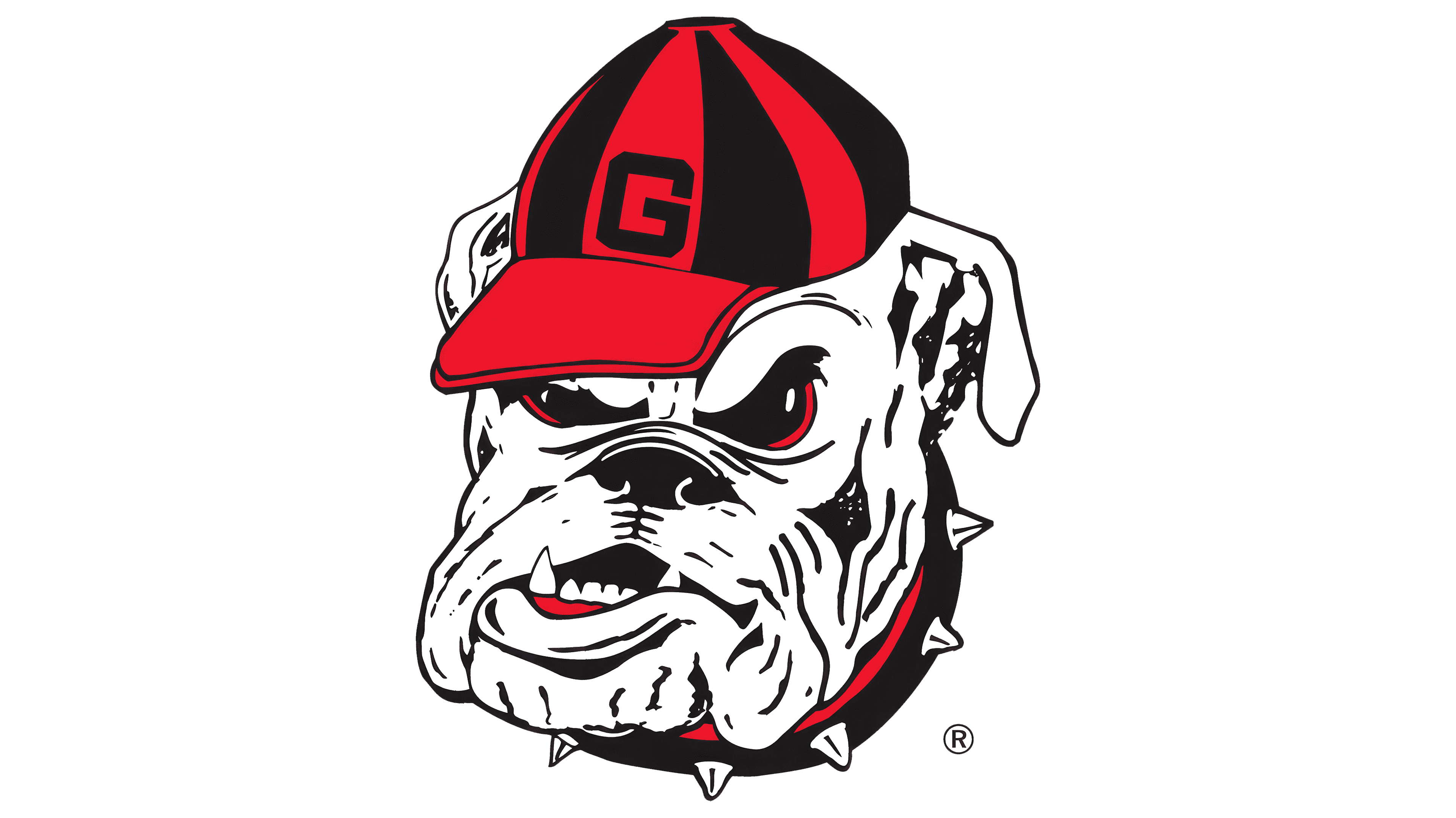
The designers amplified the bulldog’s aggressiveness, making its eyes display intense hatred toward rivals on the sports field. To convey the peak of negative emotions, the developers colored the pupils black, highlighted them with a white pinpoint gleam, and emphasized them with a red glare. Black is also concentrated in a few other areas:
- on the nose;
- in the mouth;
- on the collar.
There’s another spot in black, though it’s less noticeable due to the red: the baseball cap on the dog’s head, where alternating lines of different colors create a balanced pattern. A large, clear, square “G” with cropped corners sits on one red strip. Without the red stripe on the collar, the cap would seem out of place in the composition, as its style differs from the bulldog’s.
This time, the dog’s powerful fangs protruding from its mouth further highlight its unfriendly attitude. Their shape resembles massive spikes. With its prominent lower jaw jutting forward, the mouth conveys the threat. This illustrates how dangerous Georgia Bulldogs athletes are to their opponents, figuratively ready to “tear apart” anyone who stands in their way of victory.
1964 – 2015

The Georgia Bulldogs logo of this period took on an abstract-textual form. Although there’s no enraged dog, it still represents one. The bulldog’s head is suggested in the wide-stretched letter, whose arms resemble the massive jaw of an aggressive animal. The designers created an original glyph:
- large,
- horizontal,
- rounded,
- oval.
The capital “G” is also defined by high boldness, a block style, and clear geometry. The letter is so enormous that it fills the entire space of the emblem, outlined by a border. A thin line runs around the ellipse’s perimeter without interruption, forming a tight cocoon.
The designers didn’t forget the signature color combination: they colored the glyph black and the outline red, and placed them against a neutral white background. The result is a neat and precise symbol. This way, the logo captures both official colors of the Georgia Bulldogs team, representing their authenticity. These colors evoke the intense atmosphere on the field and in the stands, the passionate drive to achieve high results, strict adherence to the rules, and a fierce competitive spirit toward rivals.
2015 – today
Although the legendary bulldog is absent from the Georgia Bulldogs logo, the visual identity still appears powerful. It holds a high energy level as if barely contained by the red border. This simple emblem serves as a platform for vivid emotions. Its first and foremost quality is authenticity, conveyed through the official palette of black and red. These classic colors express joy, sophistication, victory, strength, and authority.
Authenticity is also conveyed by the capital letter “G,” which serves as the emblem itself. This choice was made because it is the first letter of the state’s name where the university is located. The designers also selected it to resemble the bulldog’s fierce snarl, as the semicircular shape suggests a mouth with a strong lower jaw. This elongation is mirrored in the glyph, which the developers stretched horizontally.
In addition to the standard bold letter, the logo features a border. However, unlike the previous version, it has a maroon tint, which pairs harmoniously with the gray background. As the athletes themselves note, the simple design honors the teams’ unwavering determination and the division’s exceptional history. The emblem embodies their fierce, assertive, resolute, and tenacious spirit.