


 Georgia Southern Eagles Logo PNG
Representatives of the local university’s athletics department, which dates back to 1924, take pride in their emblem, rooted in the state’s distant past. The mascot, the Georgia Southern Eagles, reflects intelligence, grandeur, courage, and the aspiration to reach the heights of victory.
Georgia Southern University dates back to 1906 in Statesboro, Georgia, when it was founded as an agricultural and teaching school. The team name shifted over time, from Blue Tide (1924–1941) to Professors after World War II. In 1959, students voted for Eagles, narrowly beating Colonels.
Football began in 1924 but ended in 1941 because of the war. The program returned in 1981 under Erk Russell, former Georgia Bulldogs defensive coordinator known for the “Junkyard Dogs” unit. Early teams played with basic gear and used a local high school field.
In 1985, Georgia Southern won its first FCS national title, followed by another in 1986. The offense relied on the triple option. Quarterback Tracy Ham led a comeback in the 1986 quarterfinal, turning a 28:6 deficit into a win. In 1989, the team went 15:0, the first undefeated season of its kind in that era.
In 1990, Tim Stowers secured a fourth title. After staff changes, Paul Johnson led the program back to a title in 1999. Running back Adrian Peterson rushed for 247 yards in the final, earning the Walter Payton Award. In 2000, Georgia Southern won its sixth FCS title against the Montana Grizzlies.
In 2014, the program moved to FBS and joined the Sun Belt Conference. In its first season, Georgia Southern went 8:0 in conference play. In 2015, the team beat Bowling Green in the GoDaddy Bowl. The rivalry with Appalachian State remains a defining part of the conference schedule.
Meaning and History
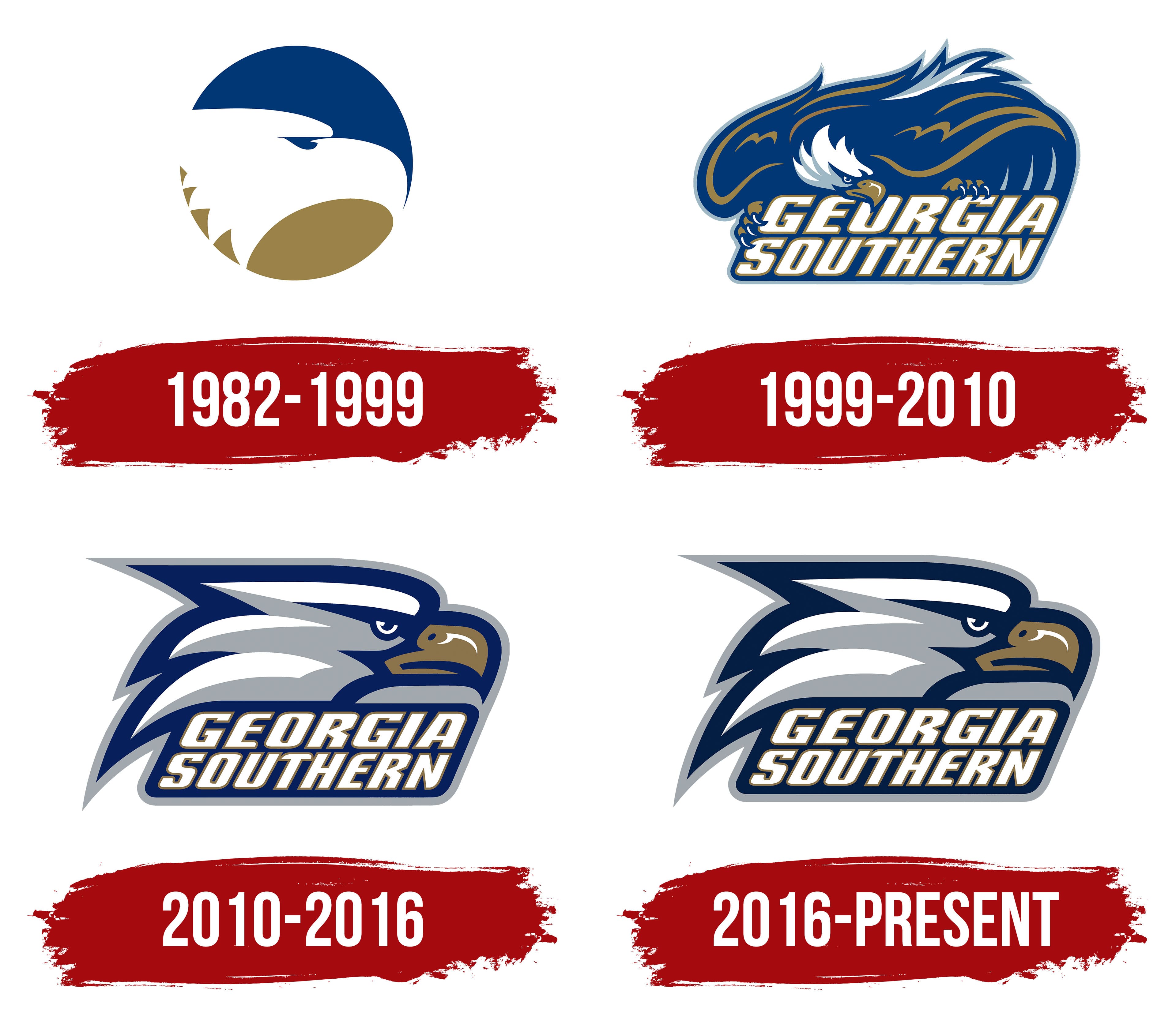
What is Georgia Southern Eagles?
The Georgia Southern Eagles are the athletics department of Georgia Southern University and include 17 teams. It is located in Statesboro, Georgia, and has been a member of the Sun Belt Conference since 2014. Students compete in NCAA Division I (FBS), Southern (shooting sports), and CCSA (women’s swimming and diving teams).
1982 – 1999
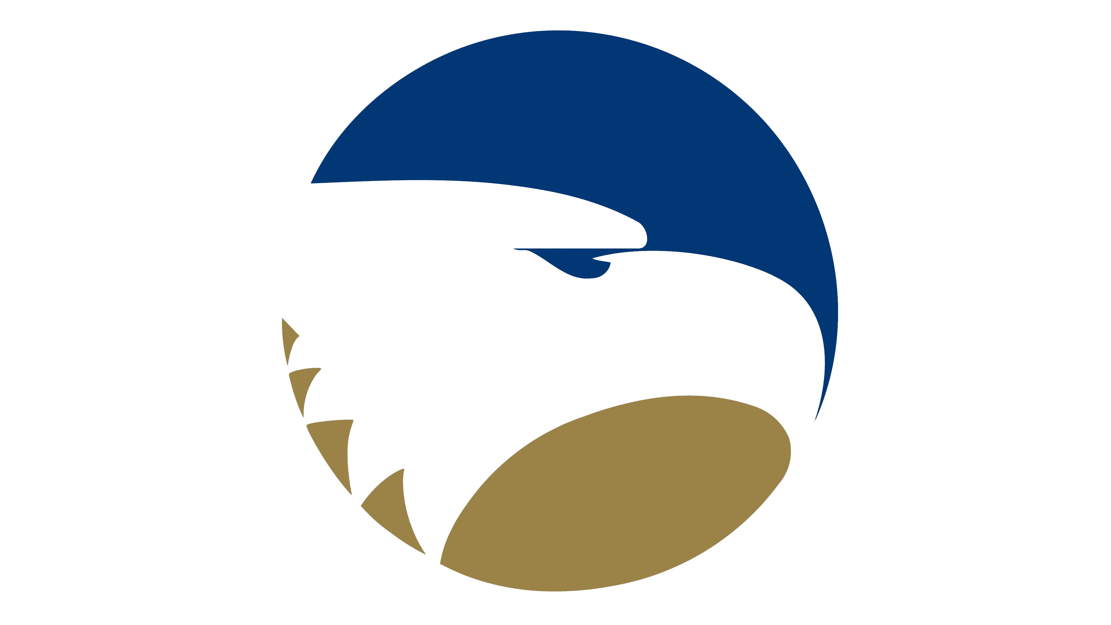
The circular emblem with a white eagle’s head, adopted on July 1, 1982, brought Georgia Southern University in Statesboro and its athletic teams under a shared identity. It was developed as part of an effort to establish a consistent look for the institution. The eagle referenced the athletic nickname students had chosen two decades earlier.
Georgia Southern identifies the institution’s location, while Eagles supply the team nickname. The university began in 1906 as the First District Agricultural & Mechanical School and later developed into a teachers college. Expanding academic programs led to its renaming from Georgia Teachers College to Georgia Southern College in 1959. It became Georgia Southern University in 1990.
Changes in the institution’s academic mission also affected its athletic names. From 1924 to 1941, the teams competed as the Blue Tide, followed by the Professors. The latter suited a teachers college, but program expansion and the 1959 name change weakened that connection. Athletic administrators asked students to choose a new nickname. Eagles narrowly defeated Colonels. The bird entered the institution’s identity long before emblems featuring detailed heads, beaks, and plumage.
By the early 1980s, college departments were using an assortment of unrelated emblems and designs. President Dale Lick supported developing a shared logo for the institution and its teams. John Parcels coordinated the effort, gathering existing imagery and interviewing administrators, faculty, and athletic staff. Participants wanted the new emblem to suggest academic quality and give the college a contemporary appearance. John’s father, J. Roy Parcels, co-founder of New York firm Dixon & Parcels Associates, took on the design. He donated the project to the college and joked with his son that he’d sell it to the Philadelphia Eagles if the college rejected it.
The logo’s adoption in 1982 coincided with the return of football under coach Erk Russell. The colors changed as well. Navy replaced light blue, and gold replaced the silver accent. Parcels and the working group associated navy with academic quality and gold with first-place achievement. The eagle’s right-facing head symbolized looking toward the future. An abstract bird now represented the Eagles’ name chosen by students.
The emblem is a circle containing a white eagle profile between two colored sections. The navy upper portion forms the background above the head. The gold lower section resembles a tilted oval. The edges of the white space define the forehead, beak, and neck, with a small blue shape marking the eye. Several angular gold projections on the left suggest feathers. The stylized bird fills the circle.
The circular eagle remained the Georgia Southern Eagles’ primary athletic emblem until 1999. It continued in university-wide use afterward. In the academic logo, the circle appears beside Georgia Southern University set in Neutraface 2.
1999 – 2010
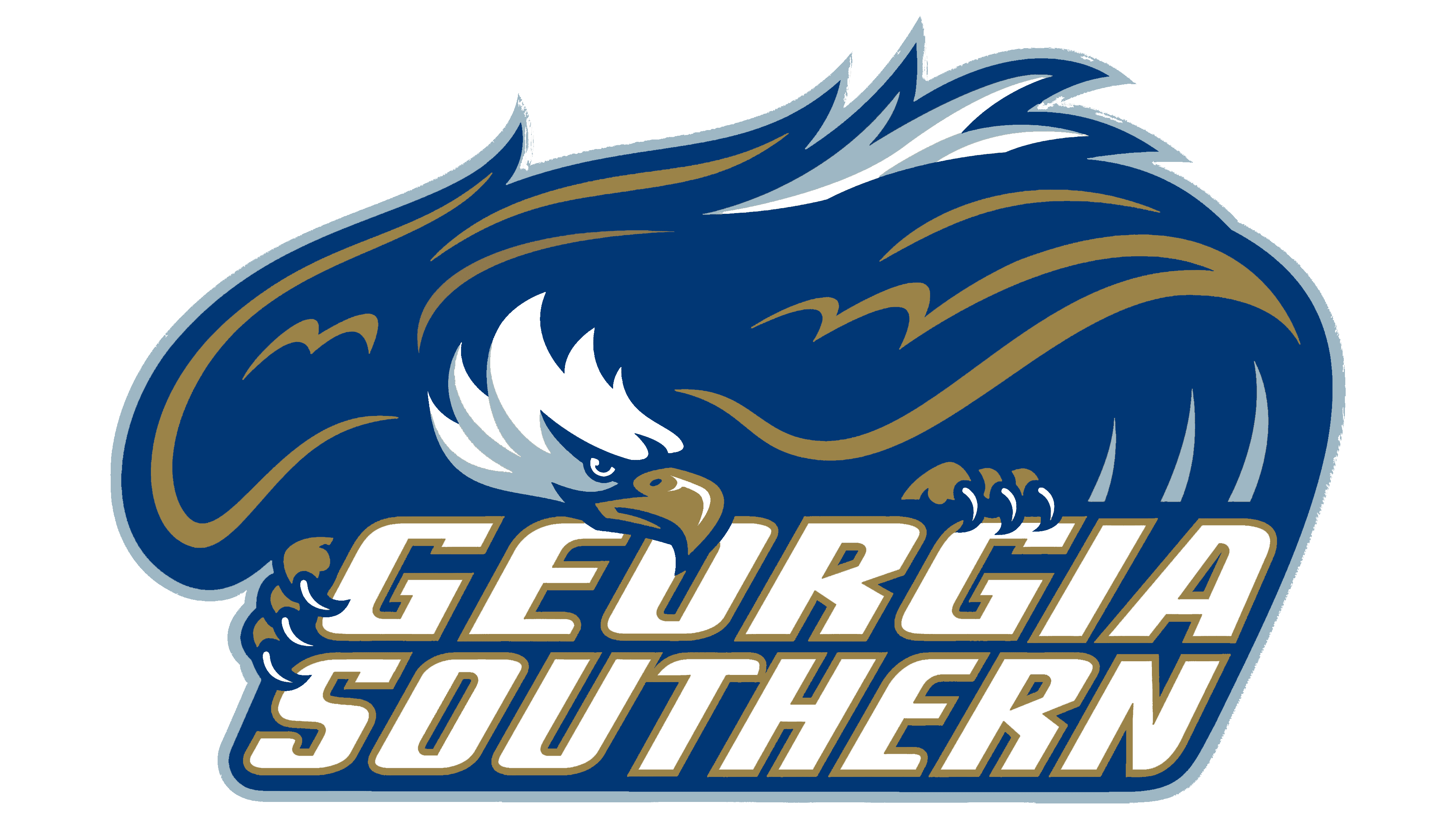
In 1999, Georgia Southern replaced the circular eagle head with a bird spreading its wings above the university name. This logo remained the primary athletic emblem until 2010. The eagle lowers its head toward the two-line GEORGIA SOUTHERN wordmark, with its talons reaching the tops of the letters. The name supports the bird and spans nearly the entire lower portion of the logo.
Outstretched navy wings form the emblem’s upper edge. Gold lines separate the feathers, white areas define the head, and a light outer outline distinguishes the eagle from the background. Beneath the bird, two tightly stacked lines use heavy, slanted uppercase letters with angular forms. Gold and dark outlines surround the white letters, repeating the colors of the plumage.
From 2004 to 2009, the university used a detailed eagle illustration. Irregular lines formed the wings and tail, while the mascot’s talons gripped the Georgia Southern wordmark. Italic serif lettering appeared above a rounded parallelogram.
The athletic collection included several combinations of the bird, full name, and GS abbreviation. Alongside the primary emblem were an eagle head above the name, a head paired with GS, and standalone wordmarks. In one version, feathers accompanied the initial “G” and “S.” In another, a wing extended from the “E” in EAGLES. A head, feathers, or wing preserved the eagle theme without depicting the entire bird.
2010 – 2016
A secondary mark from the 1999 collection provided the basis for Georgia Southern’s 2010 athletic logo update. The eagle head above the name became the primary emblem. The designers enlarged the illustration, widened its silhouette, and slightly revised the details. A profile head now sat above the two-line wordmark in place of the full bird with wings, body, and talons.
A right-facing beak and long, pointed feathers extending left define the head. Navy bands separate white and light-colored areas of plumage. A pale highlight appears on the gold beak, while the eye sits beneath a low, angular brow.
The Georgia Southern name remained below. Its slanted letterforms connected the updated emblem to the previous decade’s collection. A light gray border was added around the wordmark.
2016 – today
Georgia Southern retained the familiar athletic emblem in 2016, revising its colors and usage rules. The eagle profile, feather contours, and two-line name remained unchanged. Blue became darker, while the outer outline and light areas of the plumage became gray. Gold remained on the beak and around the letters.
In April, the athletic department issued instructions to stop using the earlier spread-wing eagle and the combination of the eagle head with GS. The updated emblem with the full name was designated for publications. The university also approved Georgia Southern University and Georgia Southern as brand names. Subsequent references were to use GS, while GSU was excluded from athletic communications. These rules helped distinguish Georgia Southern from Georgia State, two institutions in the same state with similar names. The full wordmark beneath the eagle head helped audiences outside the university community identify the emblem.
The primary athletic colors, Pantone 282 navy and white, are supported by Pantone 429 gray. Pantone 872 or 4505 gold provides accents. The eagle head remains the primary athletic emblem, with shades adjusted for reproduction on clothing and other materials. A specific rule applies to the eye in single-color versions. Its light area must contrast with the surrounding background and remain lighter than it.
Made by Pioneer, it later worked with Georgia Southern Athletics on a coordinated identity across its teams. The project addressed the broader visual system while retaining the eagle head as mascot imagery. The wordmarks include a script Eagles based on Erk Russell’s handwriting. It is rotated five degrees counterclockwise and reproduced in one color, usually blue or white. Strutting Gus, a walking eagle mascot, represents another strand of the university’s imagery.
Archival marks returned to merchandise in April 2024 through the True Blue Unlocked program. Fan requests and university merchandise retailers prompted the initiative. Historic emblems began appearing in limited collections celebrating earlier decades of Georgia Southern athletics. The current logos retained their primary roles.
In spring 2025, the collection added a baseball version of Strutting Gus with the words “You gotta love it.” It was based on Roger Inman’s dugout mural, painted during coach Jack Stallings’ tenure. Inman drew the outlines by hand, then filled in the eagle with small brushes. Beneath the bird was a handwritten phrase Stallings frequently used in everyday conversation. The merchandise reproduced the eagle and lettering from the baseball field, preserving both the artist’s work and the coach’s familiar saying.