


![]() UGA Logo PNG
UGA Logo PNG
The UGA logo opens the door to one of the country’s oldest universities, which has survived the dark periods in its history. At the same time, the emblem shows that knowledge is under reliable protection here, and that no historical events have affected the university’s work or its desire to serve its homeland.
The University of Georgia was chartered in 1785 by the Georgia General Assembly and received 40,000 acres to support its growth. Classes began in 1801 under President Josiah Meigs, and the first permanent campus building, Franklin College (now Old College), was completed in 1804.
Growth followed through the 19th century. The chapel was built in 1821, enrollment reached 100 by 1830, and the law school opened in 1859. During the Civil War, the university remained open, though enrollment fell as many students and faculty joined the army. Land-grant status in the 1870s expanded agricultural and technical education.
The university added programs for women in 1891, founded the College of Agriculture in 1895, opened a pharmacy in 1903, a forestry program in 1908, and an education program in 1932. In 1961, UGA admitted its first African American students, a major milestone in the South’s integration. New schools followed in business, social work, and environmental design during the 1960s.
Research grew in the 1980s, including the establishment of the Complex Carbohydrate Research Center in 1985. The 1990s saw growth in study abroad and the establishment of a campus in Italy. In comparison, the 2000s and 2010s saw the addition of new buildings, research centers, and interdisciplinary programs. By 2023, UGA had 17 schools and colleges with more than 200 academic programs. Its athletic identity is led by the Georgia Bulldogs, who compete in NCAA Division I and the SEC.
Meaning and History
![]()
Based on incomplete archival records, the UGA seal and motto were created in 1801 by a single person, Josiah Meigs. That year, the trustees chose a site to construct the university, and the new school president, Josiah Meigs (part-time, the only professor), began teaching physics without a suitable room. The first building appeared only later, in 1802. Students graduated in 1804. Graduates received diplomas with a seal that contained the inscription “Universitas Georgiae Sigillum 1801” inside the circle. There was also an old Latin motto. At that time, it consisted of the phrase “Et docere et rerum exquirere causas.” In 1990, the word “serve” was added to the phrase, but this did not affect the press.
Although the UGA logo has a short history, it has undergone one redesign. It reflects tradition because it depicts the famous arch of the University of Georgia, shown in the modern press and rising on the campus.
What is UGA?
It is one of the oldest universities in the United States. It existed before the war and has survived the Civil War era and many other historical events. Two statesmen established it. One of them, Lyman Hall, governor of Georgia, secured land to construct an educational institution. The other, Abraham Baldwin, a founding father of the United States, drafted the charter. The campus site was chosen in Athens. The first buildings did not appear until the early 1800s, and educational institutions only existed on paper. Now, it is the largest organization, including 18 colleges and schools. It owns museum complexes, libraries, more than 800 student organizations, about 470 facilities on the main campus, and dozens of additional centers outside Athens.
Old
![]()
Until 2016, the logo featured a black arch within a white circle outlined in dark gray. The design with three columns and an arc at the top looked almost identical to the print, but without detailing. This element seemed small against the background of the inscription, which the designers placed at the bottom.
Immediately below the arch was a long and wide line of dark red. Inside it, centered, was the white number “1785”. The university’s full name was even lower, with the article “The” preceding it. The high-contrast font with thin, long serifs was legible, but the narrow spacing caused some letters to blend. The phrase was underlined with a thin black stripe.
2016 – today
![]()
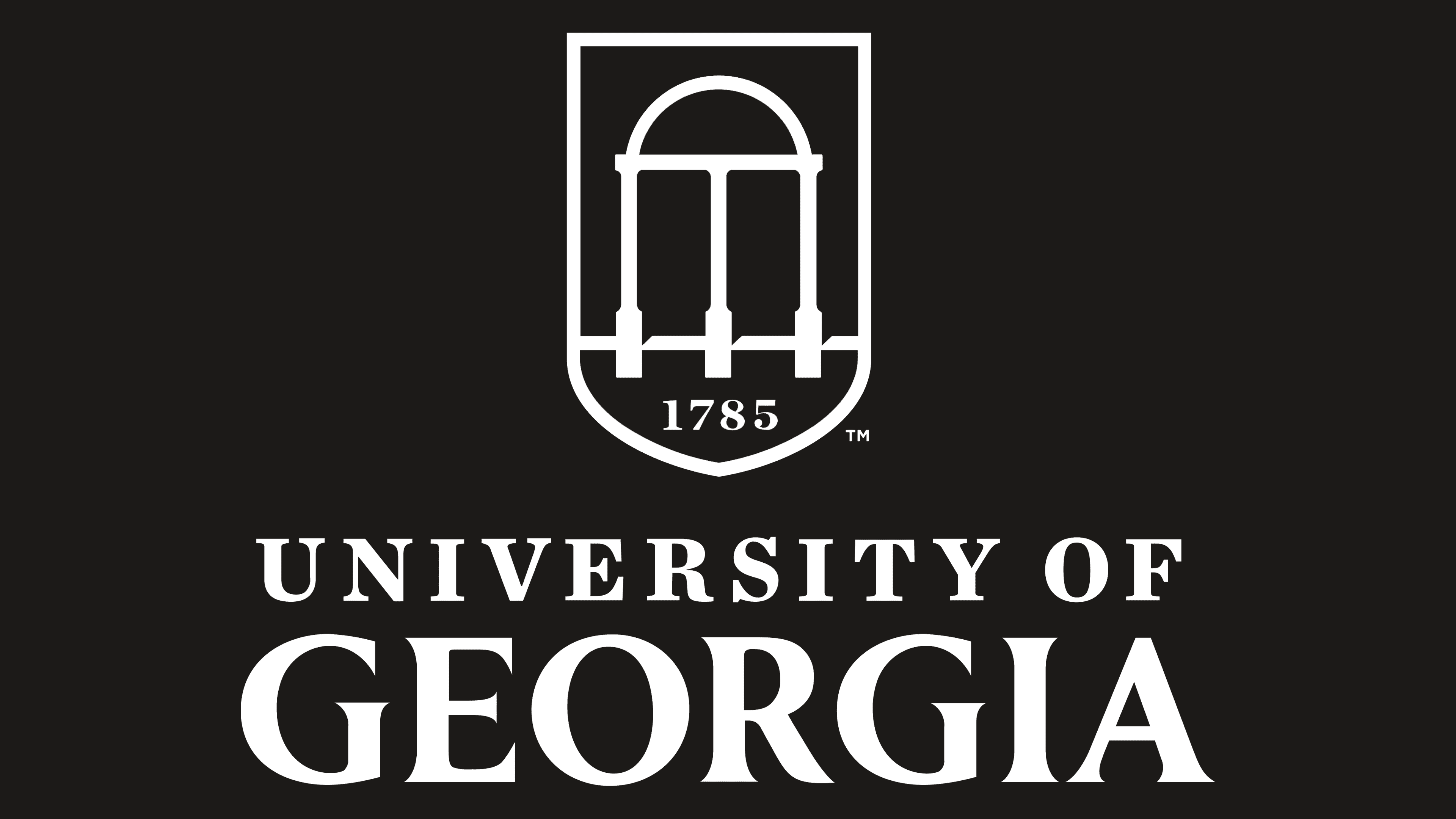
In April 2016, UGA announced its intention to update the logo, which unites all university departments, academic programs, and colleges. Work continued until September, after which a new version of the badge with an arch was presented to the public. The traditional element has turned white and stands out against the dark background. The silhouette of the arch is formed by negative space inside a rectangular shield with a rounded base. It, in turn, is divided into two color blocks: a black top and a red bottom. The year of the foundation of the educational institution is written at the bottom.
To the right of the icon is the phrase “UNIVERSITY OF GEORGIA,” already without the usual article “The.” The current design consists of capital letters. The black words “UNIVERSITY OF” are above the red “GEORGIA,” placed on a separate line.
The Seal
![]()
According to historical documents, the seal with the arch and the date of the university’s foundation appeared in the late 1890s. It was first used on the diplomas of students who graduated in 1897. The modern version has a similar structure. It is based on the Great Seal of the State of Georgia, which dates to 1799. Like the state symbol, the arch in the center embodies the State Constitution.
Three columns reflect the division of powers into the corresponding number of branches. On the upper arc is the word “CONSTITUTION,” and the state motto is written in Latin on the scrolls attached to the columns. It is divided into several parts: “WIS” and “DOM” on the left, “JUSTICE” in the middle, and “MODER” and “ATION” on the right.
The arch rises on three long steps. According to legend, a warrior from one of the militias participating in the American War of Independence stands there. The sword raised in his hands symbolizes his readiness to defend the current laws of the United States.
On the UGA seal, the central graphic elements are arranged in a ring and are surrounded at the top by the university’s motto, coined by Josiah Meigs in 1801. The original Latin version remains: “ET DOCERE ET RERUM EXQUIRERE CAUSAS.” Outside the black ring, the words “SIGILLUM,” “UNIVERSITAS,” and “GEORGIAE” are written, separated by bold dots. And at the bottom, instead of the date of adoption of the State Constitution (as on the state symbol), is the year the university was founded, 1785.
Font and Colors
The specialists of the Division for Marketing and Communications worked on the logo. They surveyed students and teachers, which showed that everyone considers the arch and the number “1785” to be the most important symbols of the educational institution. Therefore, they were included in the new graphic sign. However, many called the article “The” excessive, so it no longer exists.
The arch is depicted within a heraldic shield, with three columns protruding beyond the white horizontal line separating the black top from the red bottom. Small black triangles create three-dimensional space on the right side of each column. As a result, the line appears to be a curb, with the arch in front of it.

University of Georgia logo
One of the university’s official fonts is the Merriweather serif. However, the logo creators used completely different versions of the typeface. The letters on the top line have rectangular serifs, while those of the word “GEORGIA” are sharp and elongated. The font in the first case resembles TeX Gyre Schola Bold by GUST eFoundry, and in the second case, it resembles Begum Semi Bold by Indian Type Foundry.
An equally important element of the UGA identity is the color scheme. If the print is black-and-white, the logo is more colorful. His colors are called Chapel Bell White (#FFFFFF), Arch Black (#000000), and Bulldog Red (#BA0C2F).