


![]() TCU Logo PNG
TCU Logo PNG
Faith and spiritual values occupy an important place at the university. The TCU logo pays tribute to the knowledge of the universe’s structure and the laws by which it works. The emblem insists that true science is impossible without recognizing the existence of the Creator.
Meaning and History

The brothers were helped by their father, Joseph A. Clark, to create the university. His sons were representatives of the Restoration Movement, which became the base of the modern Disciples of Christ organization. They were preachers, teachers, scholars, movement leaders, and education advocates. They first established a preparatory school for children, better known as the Male & Female Seminary of Fort Worth. She was based in Fort Worth and worked for only a few years, from 1869 to 1874.
The brothers found a new site in Thorp Spring to construct the university. There, they founded Add-Ran Male & Female College. This happened in 1873. Subsequently, a higher educational institution became the embodiment of their dream: Christian in character, non-sectarian in spirit, and intellectually open. In 1889, it was granted university status and renamed Add-Ran Christian University. However, there were not enough students, so the educational institution underwent another large-scale move, this time to Waco, where population density and traffic are high.
What is TCU (Texas Christian University)?
This distinguished private university in Fort Worth, Texas, combines academic excellence with Christian values. It comprises eight schools and colleges, including the Neeley School of Business, the College of Communication, and the School of Nursing. The campus, known for its yellow-brick buildings and well-maintained grounds, provides a comfortable environment for nearly 10,000 students. Emphasis is placed on leadership development and hands-on learning, with small class sizes supporting close interaction between students and faculty. The university is also renowned for its athletic achievements, with the Horned Frogs teams excelling in the Big 12 Conference, especially in basketball and football.
In 1902, the university was renamed Texas Christian University and immediately received the TCU abbreviation. It also features the Horned Frog mascot and its signature colors, purple and white. However, after many years of wandering, the institution of higher education returned to its ancestral lands, Fort Worth. This happened after a mysterious but devastating fire. The fire forced the university’s leadership to relocate and rebuild all the buildings, with donations from benefactors.
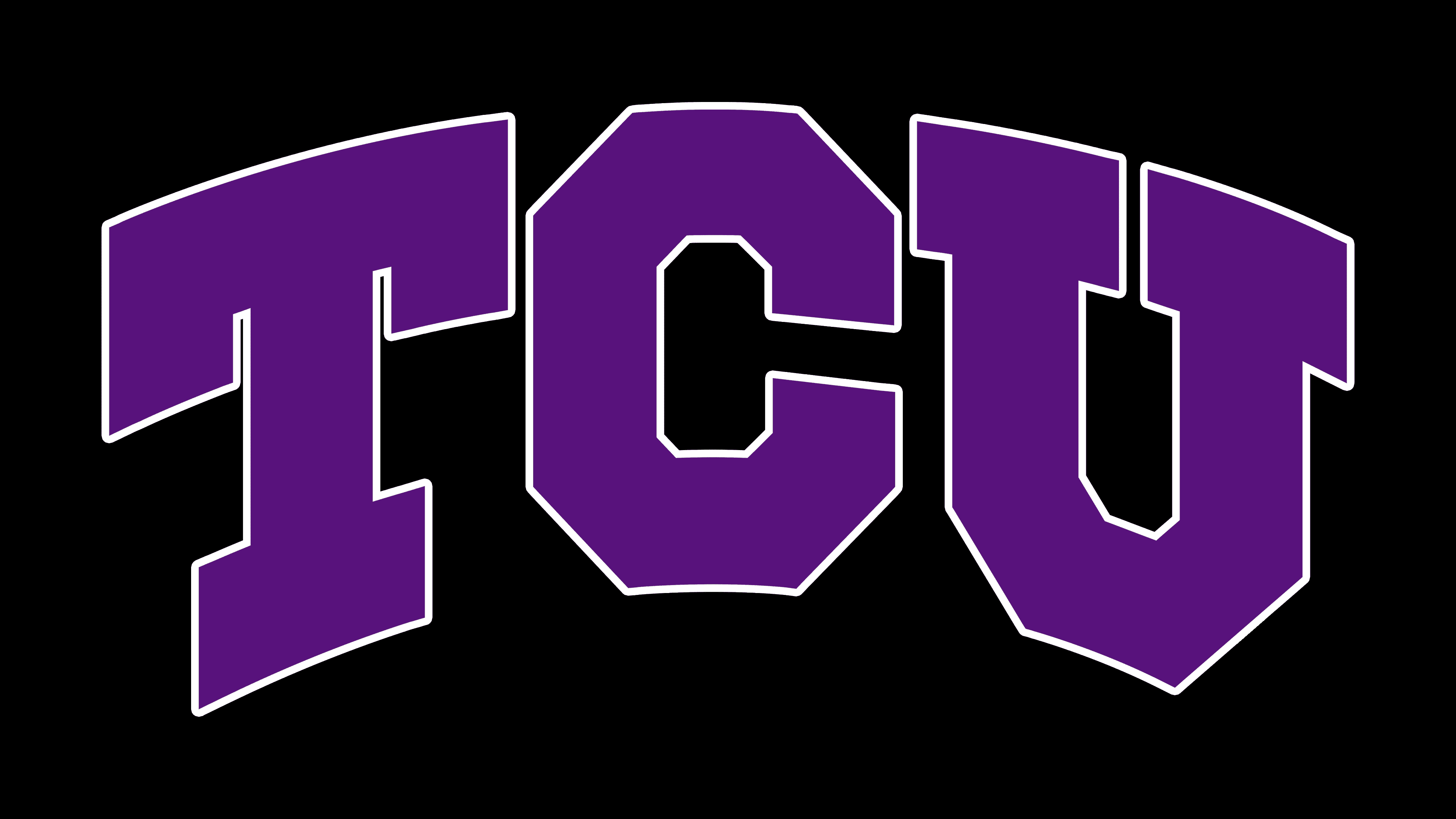
In contrast to the multi-structured printing, the university’s academic symbolism is monosyllabic. It is dominated by text elevated to the status of a graphic element. The abbreviation, in use since the university’s renaming, serves as the basis. This “TCU” is short for Texas Christian University. The inscription is massive, bold, and typed in uppercase characters. It is not horizontal but arched, resembling an arch. Geometrically precise letters are decorated with rectangular serifs. The inside and outside corners “C” and “U” are cut off, forming polygons. But “T” has nothing of the kind on either side. It is smooth and smooth. The base logo color is deep purple.
The Seal
![]()
The seal’s basis is a seven-pointed shield with a complex configuration resembling a saddle. In its upper half, a spiny-bodied reptile is depicted, the so-called horned toad-like lizard. At the bottom is the Christian star, which is believed to have announced the birth of Jesus Christ. Beams radiate from it eight strokes of different lengths on each side.
This symbol is perceived as a beacon pointing the way to knowledge. The year of the university’s establishment, “1873,” is also marked there. It is divided by an arrow into two halves. The shield is surrounded by the inscriptions “EST,” “Disciplina,” and “Facultas.” The central elements are drawn within a ring outlined by a thin purple line. A wide field follows it, with the university’s detailed name and its location designation. These labels are in bold serif type. There is a wide border around the edge of the round stamp.
Font and Colors
The sports logo has evolved from a complex graphic element into a simple text detail that adorns form and paraphernalia. The university-wide sign looks very similar. The oldest is the academic press, which reflects the university’s key principles and history.
The university uses massive, bold, large, serif fonts for its identity. One of them is arched. The base colors of this institution of higher education are magenta (a shade of purple) and white.