


![]() Gfrevenge Logo PNG
Gfrevenge Logo PNG
At Gfrevenge, the logo directly reflects the web resource’s content and shows its direction. A demonstrative gesture is great for such a site, so it does not shock users. The abbreviation is ambiguous and has several transcriptions, but each conveys a provocative meaning.
Meaning and History
![]()
The website logo was designed in 2004. It perfectly reflects the resource’s direction and has not changed since the portal’s inception.
The emblem is two-level and consists of an image of a man and the site’s name. The abbreviation GF is placed at the top, with several possible decodings:
- Girlfriend (girl for relationships). Videos with women in the title role dominate the site.
- Call to go (go) in the direction indicated by the man.
- Description of special relationships with gay guys.
- Guys (guys) performing the action shown in the image.
What is Gfrevenge?
This is a specialized adult entertainment channel within the Reality Kings network. It creates themed content focused on amateur-style presentations. The brand maintains its independent approach to content development while operating within the network’s broader distribution infrastructure, offering access through individual memberships and full network subscriptions. Based in the United States, the channel contributes to the larger adult entertainment ecosystem while preserving its distinct style and theme as one of many specialized channels within its parent company’s extensive portfolio.
All transcripts perfectly convey the content.
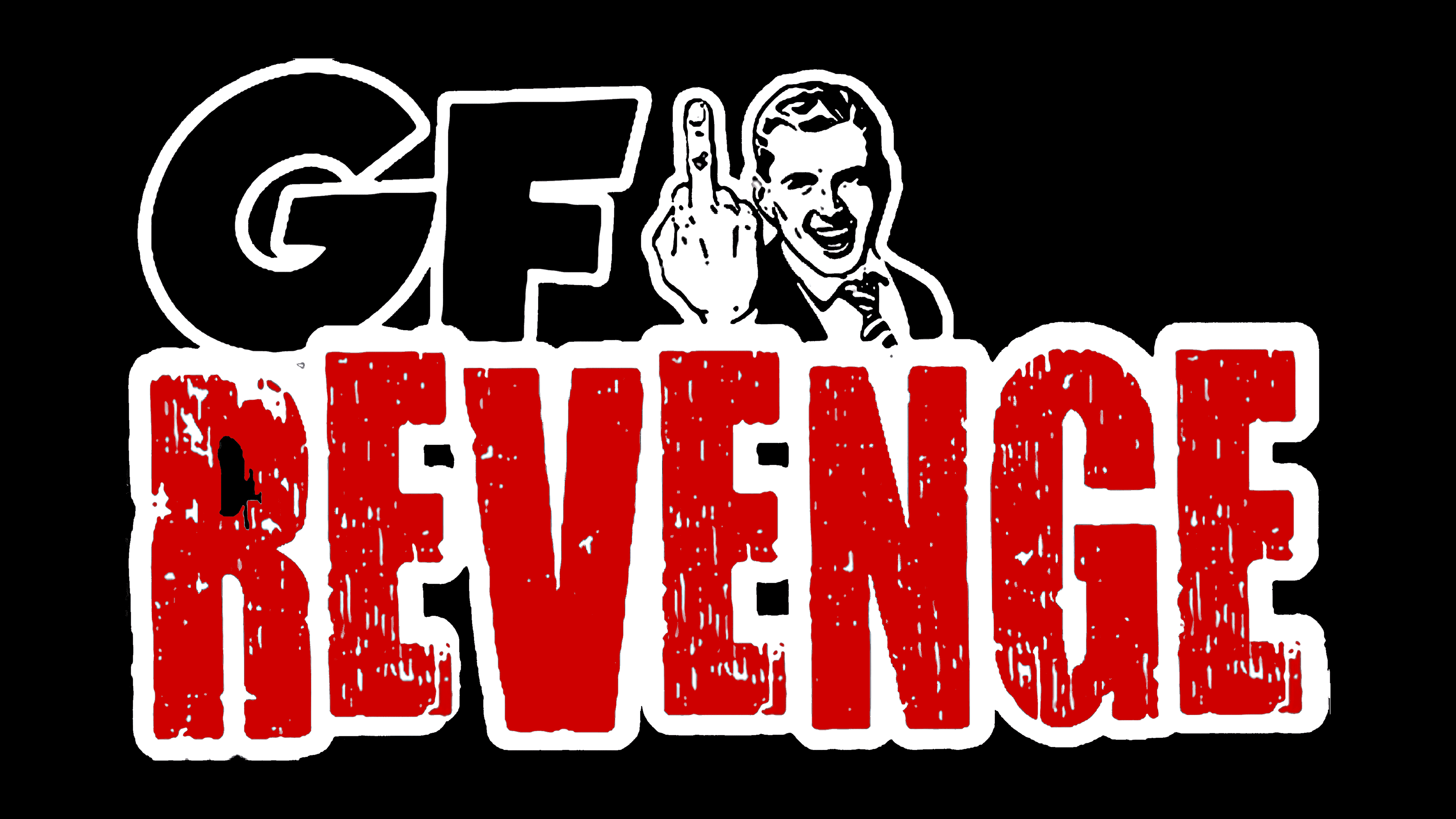
The image of a man, or rather the demonstrated gesture, is the key to understanding the essence of the resource. A young man in a suit and tie held out his hand with a raised finger. The action makes him laugh and enjoy himself. In all his images, mockery is seen: “Well, what? Got? There you are!” The man is having fun and doesn’t care what people think of him. He had a great time despite all the detractors. The suit and hairstyle suggest businesspeople with no time to build relationships.
The word “revenge” (revenge) is written in large letters at the second level. It conveys the full range of reasons for visiting the site and for bringing the videos watched there to life. The word “revenge” is specially aged. Scuffs point to a theme that dates back centuries, a recurring story about the relationship between the sexes. Aging is also a nod to an ancient profession.
Multi-level letter writing creates the illusion of movement and enhances the emotional message. The energy of feelings is complemented by the logo, implemented as a sticker (as indicated by the white edging). Compact images are much more accurate and faster at conveying the essence of a message than words.
Font and Colors
The classic red-and-black combination is used for the emblem.
- Red letters of revenge carry a powerful energy message. They personify a storm of emotions, passion, and flashes of feeling. The bright color symbolizes the stop sign, a taboo subject.
- Black elements in the upper part of the logo convey clarity of intent, basic instinct, relevance to the topic, and an authoritative source in this area.
The font for the word “revenge” is Pikelet Caps Jumbled.