![]() Hentai Haven Logo PNG
Hentai Haven Logo PNG
The Hentai Haven logo does not correspond to the theme. It is serious and restrained, while the platform itself is a site for sharing adult hentai content reminiscent of various manga and anime. Its emblem is the abbreviation “HH,” set within a complex geometric figure shaped like a lightning bolt.
Meaning and History
![]()
This portal opened in 2014 for fans of hentai adult-themed videos and images. The entertainment service allows both viewing and sharing them. Almost from the moment of its appearance, the platform periodically ceased operating and then resumed. It is assumed that the reason lies in financial issues rather than ethical ones. The site was repeatedly stopped between 2016 and 2019. It was last relaunched on a different domain.
Although the name of the web platform translates from Japanese as “anomaly” or “perversion,” this is not reflected in the identity. The Hentai Haven logo is very serious and discreet. It has no hints of the theme, only strict lines, clear geometry, original abbreviation, and minimal color.
What is Hentai Haven?
Hentai Haven is an adult-themed entertainment web portal. It was launched in 2014 and has repeatedly ceased operation and then resumed it. The platform provides access to materials in the hentai style, a blend of manga and anime (videos, drawings, graphics).
2014 – 2018
![]()
The emblem depicts a geometric figure of complex configuration. In the center is an abbreviated version of the internet platform’s name, “HH.” Both symbols are uppercase and diagonally placed: the left glyph at the top and the right one at the bottom. They have elongated legs with points at the ends. The crossbars are also positioned sideways, tilted to the right. The background is a simple white space. A black stripe runs along the outer edge. It completely repeats the letters’ unusual shape, thus forming sharp angles.
2019 – today
![]()
After reopening under an updated domain, the adult web resource retained the old logo. Therefore, there was no redesign. The symbol remained the same: with a stylized abbreviation in the center and a thin black frame of complex configuration, resembling a lightning bolt.
Since its inception, the Hentai Haven logo has not changed, even though the resource has closed and reopened several times. Interestingly, in none of the versions is there any text, only the two letters “H.” They are so “encrypted” that they do not resemble standard alphabet characters. Due to the zigzags, the glyphs look like double lightning bolts.
Font and Colors
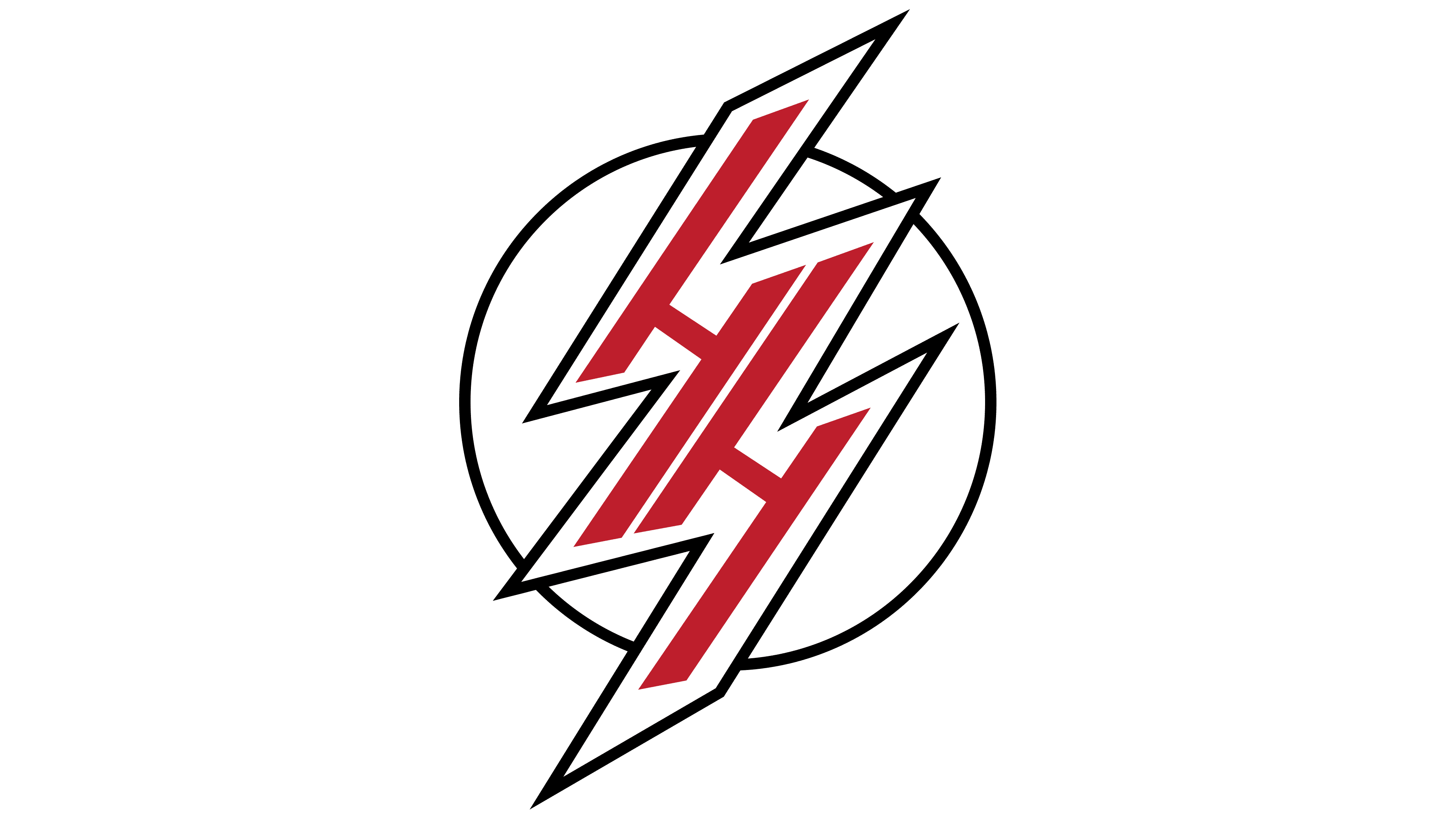
There is no text in the logo, and the abbreviated name of the online service is composed of individual symbols with no analogs. They represent not printed characters but drawn ones. The emblem’s color palette is restrained, comprising a classic combination of black (frame), white (background), and red (abbreviation).