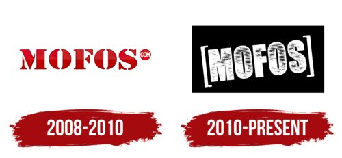
Mofos Network Logo, the primary emblem for this Canadian adult content studio, was crafted in 2008. It’s in use to this day, serving both the studio and its digital platform, albeit with minor tweaks over time.
The emblem this brand exhibits striking capital letters spelling out “Mofos.” Rendered in black, the lettering features white portions that give an illusion of a distressed or weathered surface. Generally set against a stark white backdrop, the bold text can be encased in a white outline for enhanced visibility against darker backgrounds.
For the digital platform’s emblem, the same bold typography persists but with the addition of “.com” in smaller letters placed vertically to the right. Above this, a red rectangle makes its appearance – a singular deviation from the otherwise monochromatic scheme. This logo, encased within large, white square brackets, imbues a sense of vibrancy and modernity.
The strong and solid letters in the logo represent the brand’s robust identity, making an assertive statement that resonates with viewers. The use of black and white evokes a sense of sophistication and balance, while the worn-out effect suggests an experienced and well-established brand.
The addition of “.com” and the red rectangle in the web-platform version signifies its online presence. The red color adds a spark of energy and passion, correlating with the stimulating content offered by the digital platform. The brackets surrounding the logo symbolize its encapsulation of a broad and diverse range of content, signifying inclusivity.
The Mofos Network emblem symbolizes the brand’s assertive identity, experienced presence, online reach, and comprehensive content range conveyed through its bold typography, distressed effect, color choices, and design elements.
Mofos Network: Brand overview
| Founded: | November 1, 2008 |
| Founder: | Brazzers |
| Headquarters: | Montreal, Quebec, Canada |
| Website: | mofos.com |
Mofos Network, hailing from Canada, made its mark on the adult entertainment industry by specializing in reality-based pornography. The production company burst onto the scene with a unique perspective on adult content, capturing authentic moments while keeping the fantasies of its audience in mind.
The initial years saw it carving out a distinct niche in the industry, diverging from traditional scripts and staged sets. Instead, the focus was on creating a semblance of real-life situations, an approach that quickly appealed to an expansive audience. Today, it stands as a testament to the evolution of adult entertainment, with a notable reputation for its unique content style.
Meaning and History
As for the brand identity, it revolves around authenticity and boldness. The content it creates steers clear of artificial setups and prefers situations that appear more relatable to the average viewer. This commitment to keeping things ‘real’ sets it apart from its competitors and resonates with its audience, offering them a more engaging viewing experience.
Visual elements of the brand also adhere to the ‘keeping it real’ mantra. The logo is straightforward and unpretentious, reinforcing the brand’s dedication to authenticity. The color scheme is kept simple and bold, reflecting the company’s confidence in its unique approach to adult content.
To encapsulate, this Canadian production company stands as a beacon of evolution in the adult entertainment sector, adopting a strategy that leans towards authenticity and relatability. Its brand identity is deeply rooted in these principles, which are communicated through its content and visual branding elements. The result is a brand that is not only distinct but also widely recognized and appreciated within its industry.
What is Mofos Network?
Mofos Network is an adult content production company that was founded on November 1, 2008, by Brazzers, a well-known company in the adult entertainment industry. The company is based in Montreal, Quebec, Canada. Mofos Network specializes in producing and distributing online adult content and operates multiple websites within its network. The company’s content is known for its variety and high production quality within the industry.
2008 – 2010
2010 – today
Mofos Network color codes
| Black | Hex color: | #000000 |
|---|---|---|
| RGB: | 0 0 0 | |
| CMYK: | 0 0 0 100 | |
| Pantone: | PMS Process Black C |


