


 Texas State Bobcats Logo PNG
The Texas State Bobcats logo symbolizes the unique character of the university’s sports teams, tied to the bobcat’s choice as the embodiment of their spirit. The image highlights their drive for success, accompanies the university’s growth, and strengthens the team’s position in competitions.
Texas State athletics began after Southwest Texas State Normal School was founded in 1899. The first teams appeared in the early 1900s, with football starting in 1909 and the bobcat adopted as the mascot. A gym opened in 1921, basketball followed, and a new football stadium was completed in 1931 as competition with regional colleges became more organized.
After World War II, returning veterans strengthened the athletic program. A basketball arena opened in 1948, and teams won league titles during the 1950s and 1960s. Strahan Coliseum became the permanent basketball home in 1964. Following Title IX in the 1970s, women’s basketball, volleyball and other programs expanded, with women’s basketball entering intercollegiate competition in 1975.
Football moved into NCAA Division II in 1982. Facility upgrades followed in 1987, while preparations for Division I-AA began in 1997. The university entered Division I in 2001 and adopted the name Texas State University in 2003. The Bobcats joined the Southland Conference in 2005 after investments in coaching, recruitment and infrastructure.
In 2012, football moved to the FBS level through the Western Athletic Conference. The program joined the Sun Belt Conference in 2013, while Bobcat Stadium received major renovations and added capacity. From 2020 to 2023, the school continued investing in facilities, athlete support, and football and basketball programs, with former players advancing into professional careers.
Meaning and History
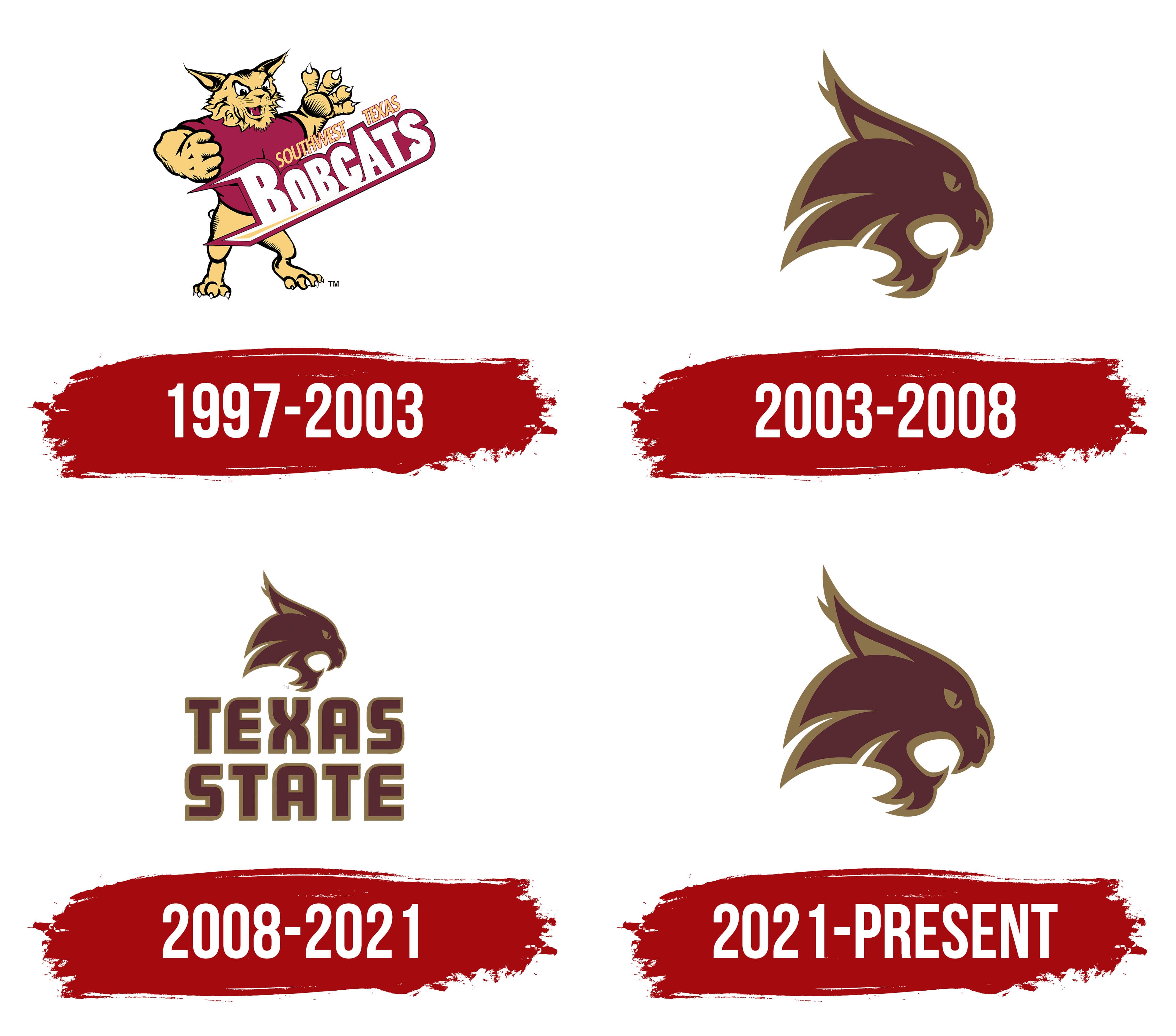
What is Texas State Bobcats?
These are the university’s sports teams representing their alma mater in NCAA Division I competitions. Their players compete in maroon-and-gold uniforms in football, basketball, baseball, volleyball, and other sports. Major events are held at a modern stadium and the university’s sports center, drawing students and fans together. The team’s mascot, a bobcat, symbolizes the drive for victory and the fighting spirit of its members. The game-day atmosphere is amplified by an energetic cheer squad known for its enthusiasm and loud chants. The campus, located by the San Marcos River, serves as a gathering place for students and alumni united by their passion for sports.
1997 – 2003
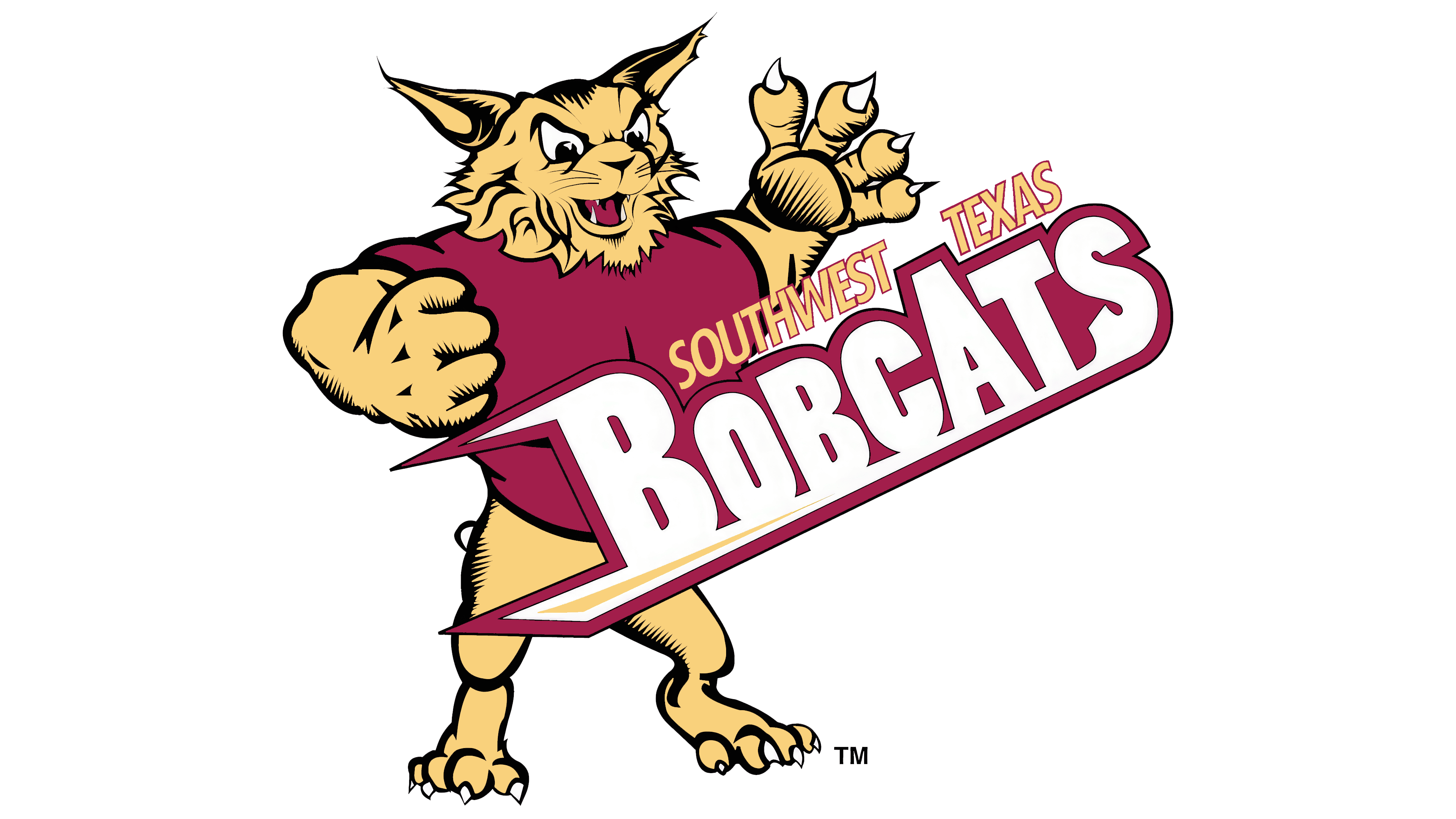
The Texas State Bobcats’ first logo features a vivid, powerful design that embodies the team’s strength and dynamism. The emblem depicts a full-bodied bobcat with bared fangs and a raised paw featuring sharp claws. The image emphasizes aggression and readiness for action. The pose and details convey intense motion, reflecting the team’s drive for victory.
The composition centers on large diagonal letters spelling “BOBCATS.” The letters “B” and “A” are capitalized and more prominent, drawing attention to the team’s name. The text’s slant adds a sense of speed and momentum. The font features bold, sharp lines that highlight seriousness and strength.
Above the main text, the words “Southwest Texas” are displayed in a smaller font, indicating the team’s geographic affiliation. This adds local identity and connects the logo to the university.
The color palette includes maroon and gold, traditionally associated with richness, warmth, and energy. These colors underscore the team’s individuality.
2003 – 2008

The new 2003 Texas State Bobcats logo features only the head of a bobcat, in a minimalist, modern style. Unlike previous versions, this design emphasizes lines. The sharp, pointed ears symbolize readiness for action. The eyes convey alertness and focus, highlighting the team’s determination.
The primary color is now maroon, outlined in gold. This combination emphasizes the university affiliation and conveys a sense of strength. The lines forming the head’s outline are smoothly curved yet incorporate angular elements, giving the design a modern appearance. The balance between smooth transitions and defined edges creates harmony between aggression and elegance.
The emblem has completely abandoned previous full-body images and complex lettering, replacing them with a simple, concise, recognizable silhouette. This approach reflects the university’s aim to simplify and adapt the logo for the digital environment, where contrast and legibility are crucial.
2008 – 2021

The updated 2008 logo features the text “TEXAS STATE” positioned below the image of the bobcat’s head. The words are rendered in uppercase letters, adding a sense of solidity and confidence to the design. The bold and formal font, with clean lines and small serifs, emphasizes stability and academic affiliation.
The text’s color scheme matches the bobcat symbol’s primary palette: maroon lettering is outlined in thin gold. These colors reinforce the connection to the university and ensure harmony between the image and the text.
The text is centrally aligned, giving the logo symmetry and making it easy to read. This addition enhanced recognizability by incorporating the university’s name into the design and highlighting its geographic identity.
2021 – today
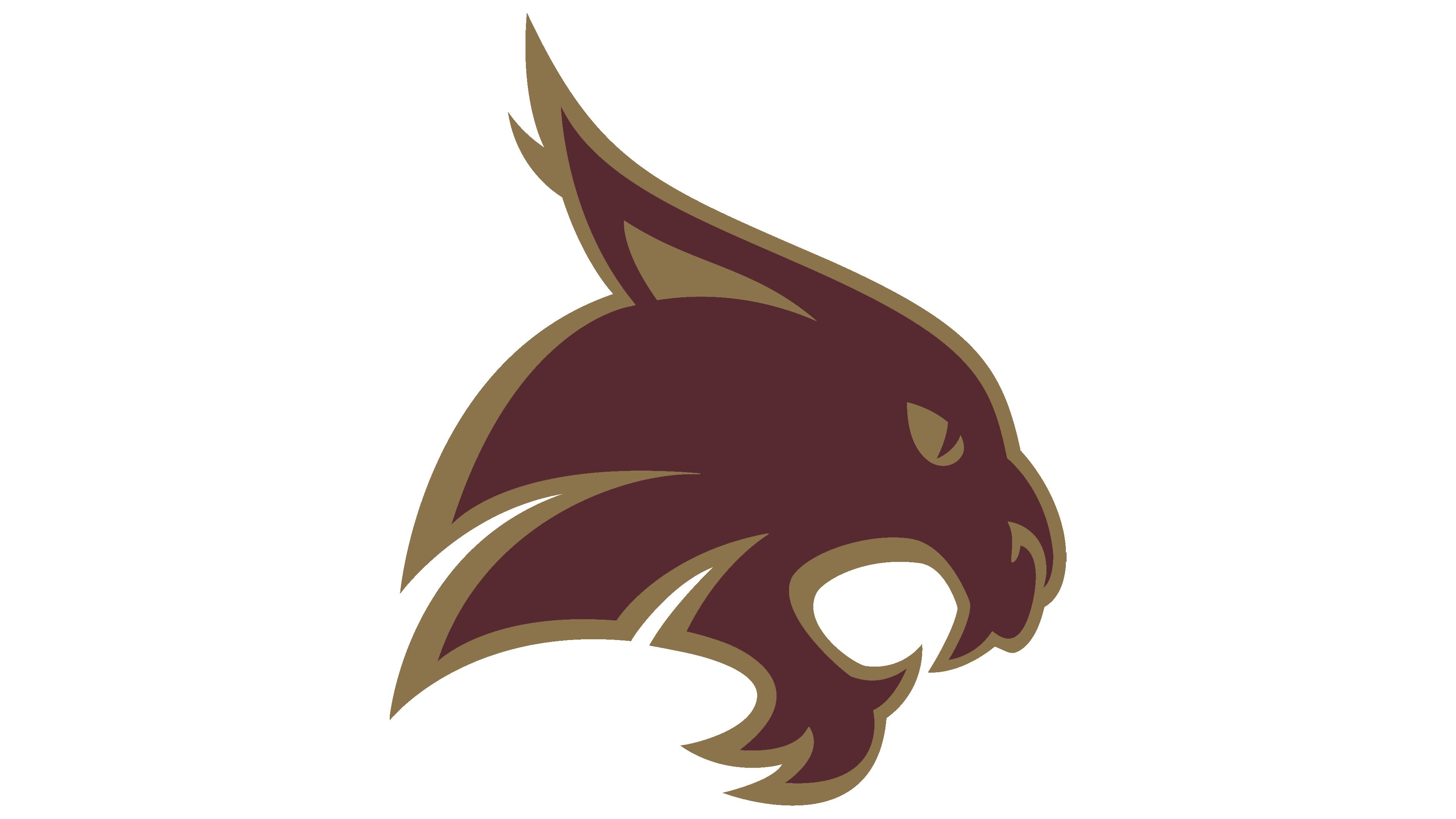
The updated 2016 logo retained the original concept introduced in 2003, focusing solely on the bobcat’s head. Simplifying the design by removing text elements made the emblem more concise and versatile.
The color palette remained unchanged: maroon and gold. These shades symbolize strength, pride, and the university’s heritage. The contours of the head are rendered in smooth and precise lines, conveying a sense of dynamism and energy.