


 Grand Canyon Antelopes Logo PNG
The three-letter abbreviation is the minimalist logo of the Grand Canyon Antelopes, the local university’s sports program. The symbol reflects the aspiration to a new story that began after the 1990s. The emblem presents the brand positively, ensuring recognition and clarity.
Grand Canyon University was founded in 1949 in Prescott, Arizona, as a small Christian college. In its first year, students chose the Antelope as the mascot, giving rise to the nickname “Lopes”. In 1951, the campus moved to Phoenix.
Basketball quickly became the main sport. After joining the Arizona Intercollegiate Conference in 1967, the team won NAIA national titles in 1975 and 1978, both with 30:3 records, and added another in 1988. Among the players were Horacio Llamas and Bayard Forrest, who later played in the NBA for the Seattle SuperSonics and the Phoenix Suns.
In the early 1990s, the program entered NCAA Division II. The men’s soccer team won a national title in 1996 against Oakland University. In 2007, the basketball team won the PacWest Conference title and reached the NCAA tournament.
In 2012, Grand Canyon University announced a move to NCAA Division I and the Western Athletic Conference, effective in 2013, alongside rapid institutional expansion under Brian Mueller. Full membership began in 2017, following a transition period without postseason access.
Dan Majerle led the early Division I years, followed by Bryce Drew in 2020. In 2021, Lopes won the WAC regular-season and tournament titles, earning an NCAA Tournament berth. In 2024, they beat Saint Mary’s to win their first Division I tournament. In 2025, the program joined the Mountain West Conference.
Meaning and History
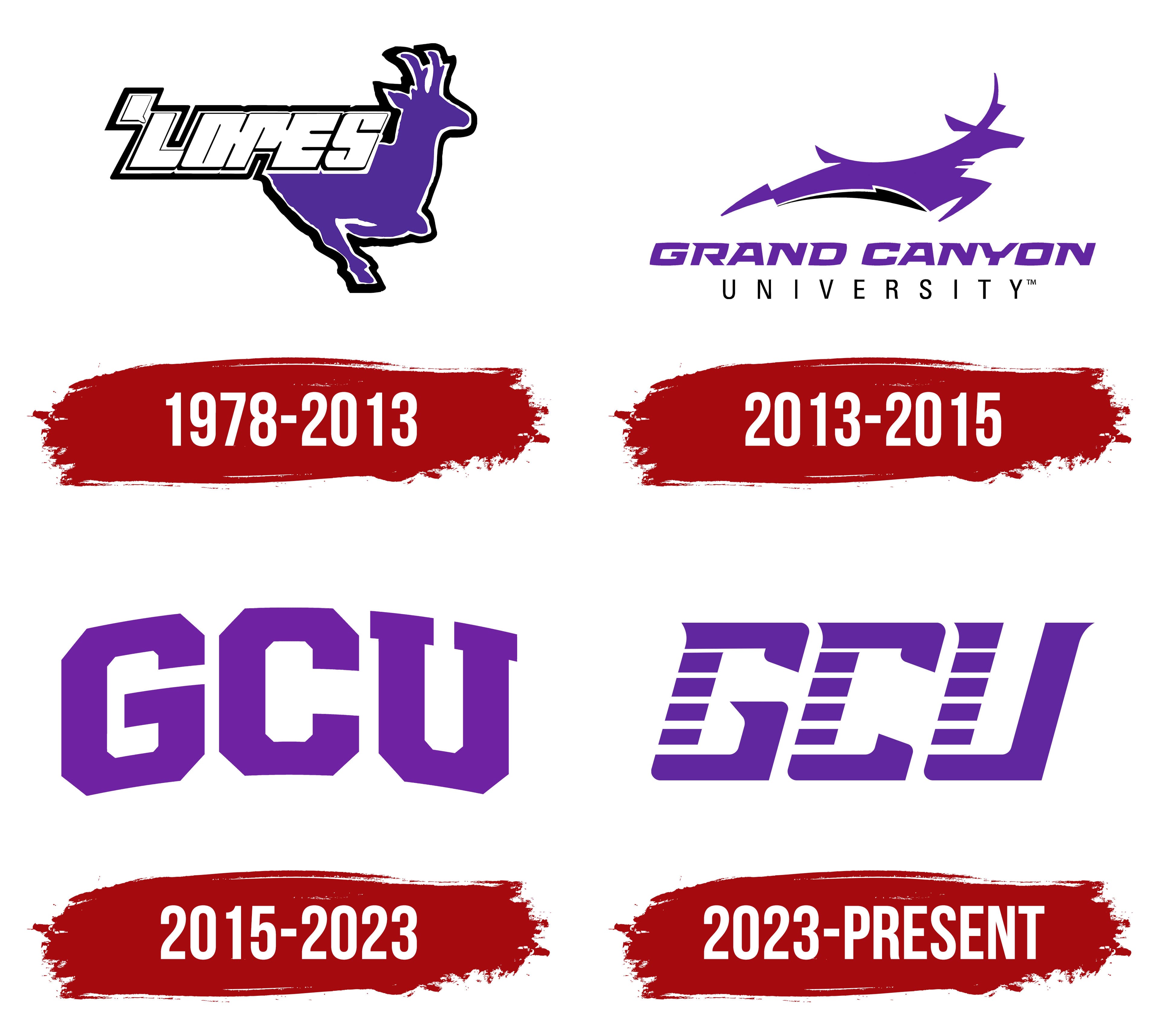
What is Grand Canyon Antelopes?
The Grand Canyon Antelopes are the sports program of Grand Canyon University. It includes 21 teams, is located in Phoenix, Arizona, and participates in NCAA Division I as a member of the Western Athletic Conference. Since the 2017-2018 season, the volleyball team has competed in MPSF.
1978 – 2013
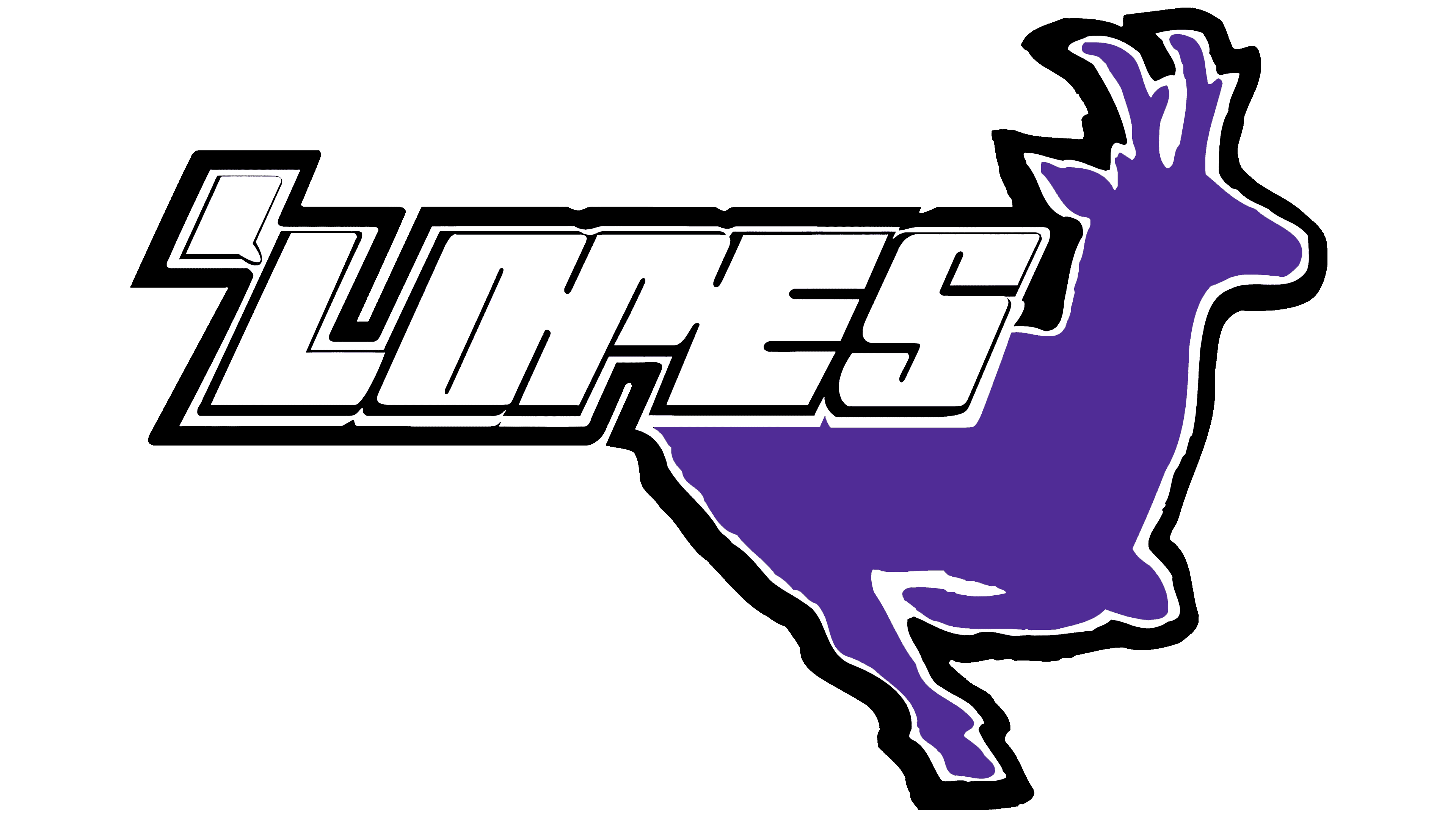
The apostrophe before LOPES in the early Grand Canyon Antelopes logo marked a shortened form of the team name. The final portion, Antelopes, was paired with an animal illustration. The teams represent Grand Canyon University in Phoenix, Arizona. The university name references the Grand Canyon, while the antelope connects the teams to local wildlife. The emblem was modeled on the pronghorn, native to western North America.
The athletic name originated in 1949, when Grand Canyon College opened in Prescott. Before the first basketball season, students voted on a college symbol and chose the antelope. Other options included the donkeys that carried visitors along Grand Canyon trails. Antelopes became the athletic nickname and were later shortened to Lopes.
In the early emblem, a purple animal faces right. Its head is raised, forked horns project above it, and its legs are gathered beneath its body. White and black outlines define the figure. Large white’ LOPES lettering overlaps the upper body and extends beyond it to the left. The slanted letters are tightly spaced and have clipped corners, with a large apostrophe before the “L.” A shared black outer border unites the lettering and silhouette, giving the emblem the appearance of a team patch.
Purple entered the college’s identity after its move to Phoenix in 1951. The earlier colors were maroon and gold, but students supported purple and white to distinguish Grand Canyon from Arizona State University. University tradition associates purple with royalty and the divine nature of Christ. Black and gray were added in 1987, alongside the introduction of black road uniforms for the basketball team under Paul Westphal. Yellow returned as a secondary accent in 2014.
Beyond printed emblems, a costumed mascot represented the antelope. In 1981, it replaced the furry purple character known as the Purple People Eater. The antelope was called Andy the Antelope and later Johnny Lope. In 2008, the mascot became Thunder, a name inspired by the rumble of an antelope herd’s hooves. The number 49 on its jersey referenced the college’s founding year.
Fans also developed a separate symbol of support. In 1996, student Jim D’Apis created the Lopes Up hand gesture to resemble an antelope’s head. The index and little fingers form the horns, while the joined middle finger, ring finger, and thumb form the muzzle. Brad Hodges helped popularize the gesture. An illustration of the hand later appeared on T-shirts and flags, complementing the university’s lettermarks and animal imagery.
2013 – 2015
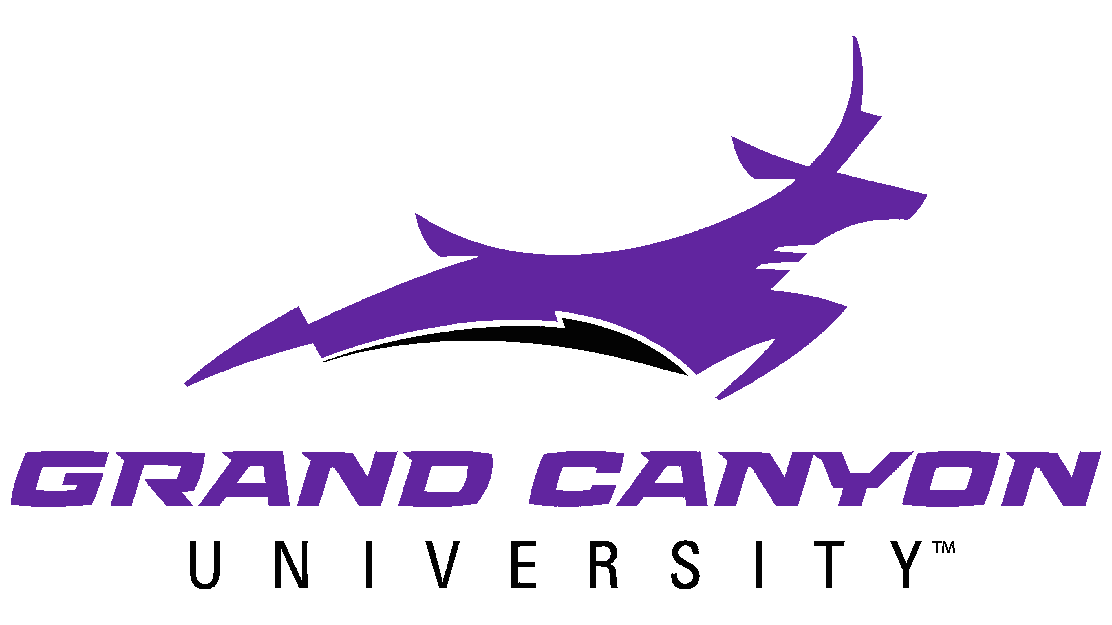
Grand Canyon’s move to NCAA Division I accompanied an athletic identity update unveiled on August 16, 2013. Marketing director Eric McHaney connected the project to the new level of competition and the long tenure of the previous emblem. The university reviewed options with administrators, marketing and athletic staff, and student representatives. Four of the 10 proposals reached the final round. The most popular design was refined and then approved by 95% of participants in a second student review.
The Moses Inc. team developed Running Lope under creative director Jason Smith. Katie Ely handled art direction and illustration. Her portfolio includes the finished antelope, preliminary sketches, and examples of the emblem on uniforms and a basketball court.
The elongated running animal was named Running Lope. The designers sought to convey the pronghorn’s ability to sustain high speeds over long distances. A long body with hind legs extended backward and front legs bent replaced the rounded torso and gathered legs. The head, ear, horn, and tail received pointed contours. Two light cutouts on the neck echo the pronghorn’s markings, while contrasting sections divide the lower body. A separate curved band with pointed ends runs beneath the belly.
In the full-name version, the purple antelope sits above GRAND CANYON. Heavy, slanted letters with angular forms match the animal’s color. UNIVERSITY appears below in thin, upright, widely spaced uppercase letters. Black defines the lower portion of the illustration and the accompanying text. Alongside the full name, the collection included versions with GCU, LOPES, and the standalone antelope silhouette.
2015 – 2023
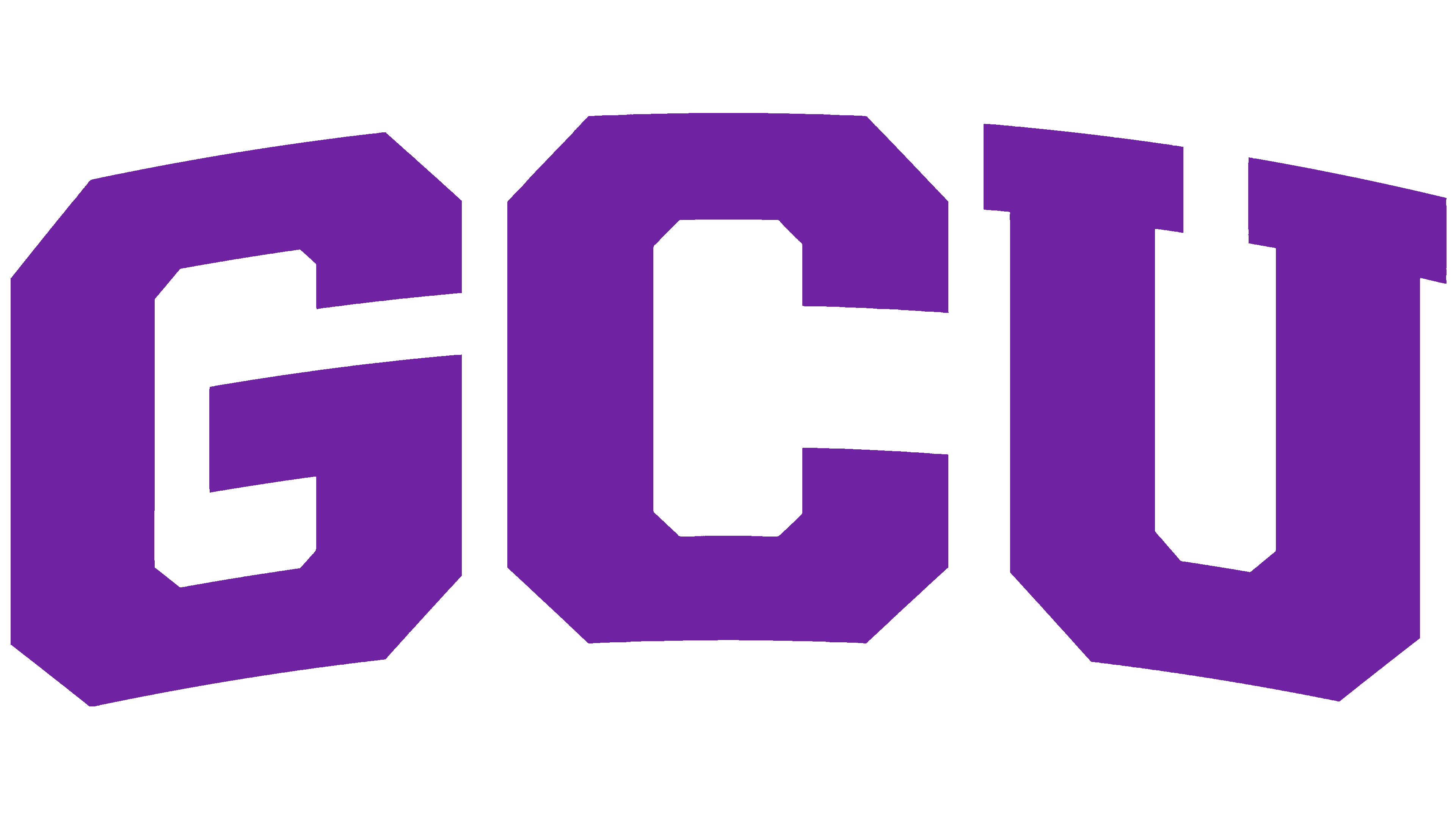
Arched GCU became Grand Canyon’s primary emblem in July 2015 and retained that role until 2023. It replaced the combination of the animal and full university name used in the primary 2013 version. Running Lope remained a secondary mark.
The Arched GCU name describes the arrangement of the three purple letters. The central “C” rises above the “G” and “U,” which descend toward the outer edges. Heavy strokes, vertical lines, and clipped corners follow American collegiate lettering traditions. Short serifs cap the “U,” while the strokes of the “G” and “C” end in flat cuts.
Other wordmarks were revised alongside the primary emblem. The apostrophe was removed from Lopes, and Running Lope was paired with updated Grand Canyon University lettering and GCU initials. The abbreviation could also appear horizontally, with white- and purple-outlined versions available.
2023 – today

Grand Canyon’s 2023 update replaced Arched GCU with Speed GCU. The university sought to coordinate the lettering with Running Lope and unify the identity across its departments. The new logo debuted at a Lopes basketball game in February, and the full collection launched on June 30 ahead of the 2023–24 academic year.
Speed GCU places the letters on a horizontal line with a rightward slant. Narrow white bands cross their left vertical sections, dividing the strokes into segments. Interior terminals are pointed, and lower corners are rounded. Slanted letters with cutouts and smooth transitions between strokes replaced the earlier angular forms.
A custom typeface called Thunder, with its own letterforms and numerals, was developed for the Lopes and Grand Canyon wordmarks. It began appearing on athletic uniforms and other university materials. Running Lope remained a secondary emblem, but a revised version has been used since July 1, 2023. The previous illustration with a separate lightning-shaped band beneath it was removed from the approved collection.
The primary athletic purple is Pantone 267 (#522398), supported by black, white, and gray. Approved names include Grand Canyon University, Grand Canyon, GCU, and Lopes. The full team name, Antelopes, is designated for first reference. The current Lopes spelling replaces the earlier’ Lopes with an apostrophe.