Air Liquide: Brand overview
Air Liquide S.A. has been a leader in the industrial gases industry for over a century, revolutionizing how businesses access the gases they need to operate. Founded in 1902, this multinational corporation has experienced significant growth, providing a variety of industrial gases and services to various industries worldwide.
Georges Claude, a visionary French engineer and inventor, pioneered air liquefaction technology and transformed industrial gases.
Air Liquide rapidly expanded its operations at home and abroad. By the 1920s, Air Liquide had significantly impacted countries such as the United States, Switzerland, and Japan.
Thanks to its pioneering spirit and desire to push the boundaries of gas technology, the company achieved significant successes, including patenting the Aqua-Lung apparatus. This underwater breathing apparatus has provided divers unprecedented freedom and safety, opening up new opportunities for exploration and discovery.
Air Liquide’s international expansion has strengthened its position as a global leader. With a presence in over 80 countries, the company supplies essential gases and services to customers worldwide and plays a key role in industrial processes.
Headquartered in the heart of Paris, Air Liquide is the central hub of its global operations. From this strategic base, the company delivers superior industrial gases and services to customers worldwide, wherever they are located.
Meaning and History
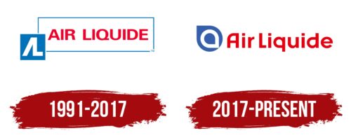
1991 – 2017
2017 – today
A French industrial gas company’s official and business emblem inspires confidence in customers, signaling that it is a reliable supplier and a qualified manufacturer. The emblem consists of two parts: text and graphics. First comes the personalized symbol formed by two drop-shaped elements. The central element is drawn in the form of a wide white stripe, the pointed end of which is directed downwards and to the right. The pointed end is directed upwards and to the left for the background. The lettering follows – red, chiseled, with a balanced combination of angles and curves.
The shapes of the drops look graceful, as if they are moving quickly. The white stripe almost looks like an arrow pointing to something important. The red letters are bold but not too flashy. The logo gives the impression that this company knows what it’s doing and does it well without too much hype.


