


 Pertamina Logo PNG
The Pertamina logo conveys the connection between natural resources and modern technologies. It reflects the company’s journey from extraction and processing to key positions in the energy sector. The design conveys the idea of balance between the surrounding world and the energy that supports everyday life and progress.
Pertamina’s history began in the 1950s, when Indonesia started taking direct control over oil and gas resources. The government created PT Eksploitasi Tambang Minyak Sumatera Utara to manage oil fields in Sumatra. In 1957, the company was renamed PT Perusahaan Minyak Nasional, or PERMINA. This date is often used as the starting point in Pertamina’s corporate history.
In 1960, PT Pertamina became Permina Public Enterprise, known as PN. In 1961, the Indonesian government created PN Pertamina to supervise national oil fields and reshape resource management. The key consolidation came in 1968, when PN Pertamina and PN Permina merged into PN Pertambangan Minyak dan Gas Bumi Negara, later known as Pertamina. The state corporation was based in Jakarta and focused on oil and natural gas production.
In 1971, the government granted Pertamina a monopoly over oil and gas exploration, production, refining, and marketing. This placed the company at the center of Indonesia’s energy system. In the 1980s, Pertamina expanded its retail operations, supplying gasoline and petroleum products to consumers across the domestic market.
In the 1990s, Pertamina invested in advanced technologies, including deepwater drilling and gas liquefaction, as part of research and development. In the 2000s, it expanded internationally and began moving toward renewable energy. According to the 2020 Fortune Global 500 list, Pertamina was Indonesia’s largest company and the country’s third-largest oil producer, behind ExxonMobil, Mobil Cepu Ltd, and Chevron Pacific Indonesia.
Meaning and History
What is Pertamina?
This is the largest energy company in Southeast Asia, playing a key role in ensuring energy security for the world’s largest archipelago. It operates Indonesia’s largest network of gas stations and six oil refineries across various islands, supplying fuel to over 270 million people. The organization oversees all stages of the country’s energy sector, including exploration, production, refining, and distribution of petroleum products, while actively developing geothermal projects. With its strategic location and extensive infrastructure, including a tanker fleet and a network of ports, it holds a significant position in global energy trade.
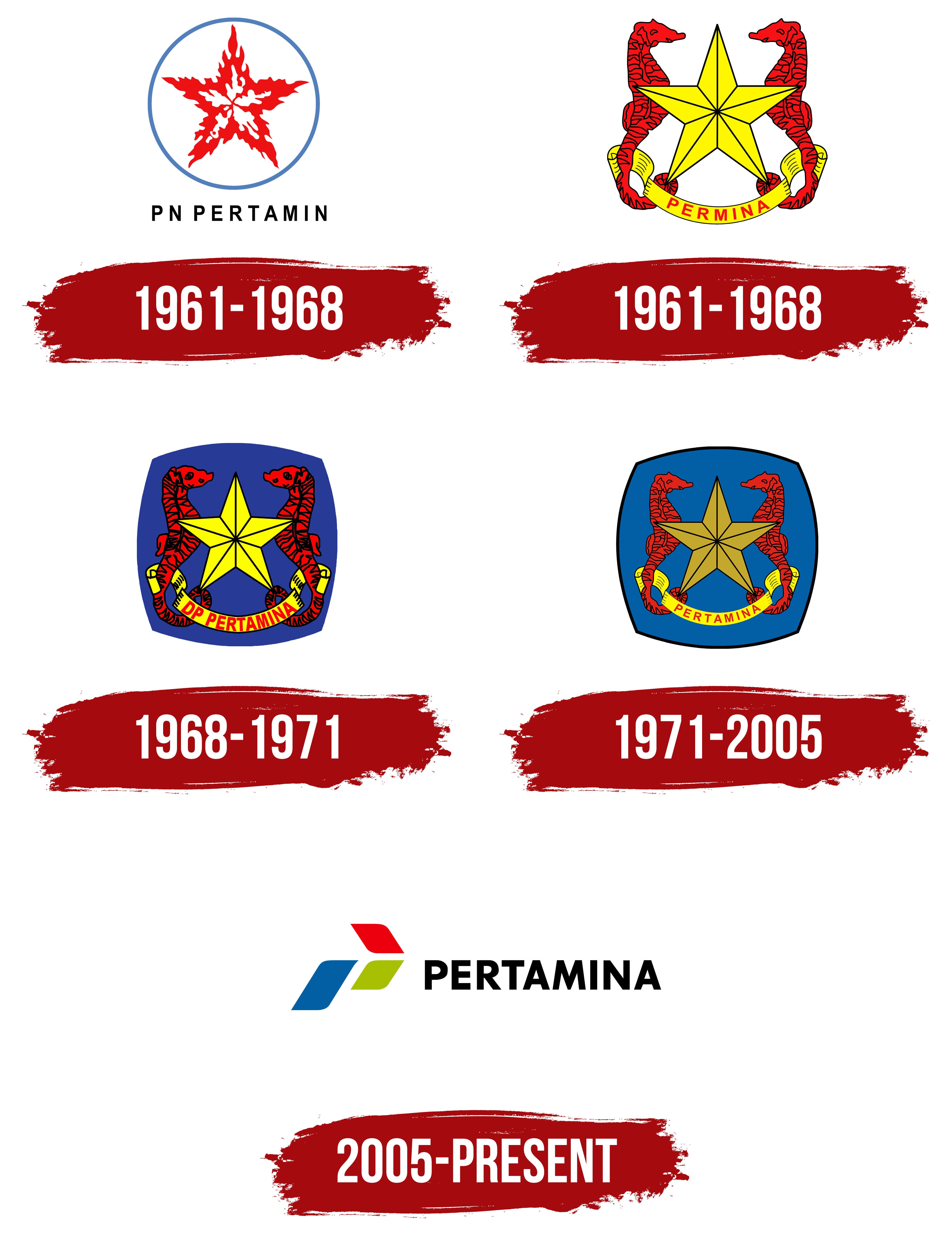
1961 – 1968
1961 – 1968
1968 – 1971
1971 – 2005
2005 – today
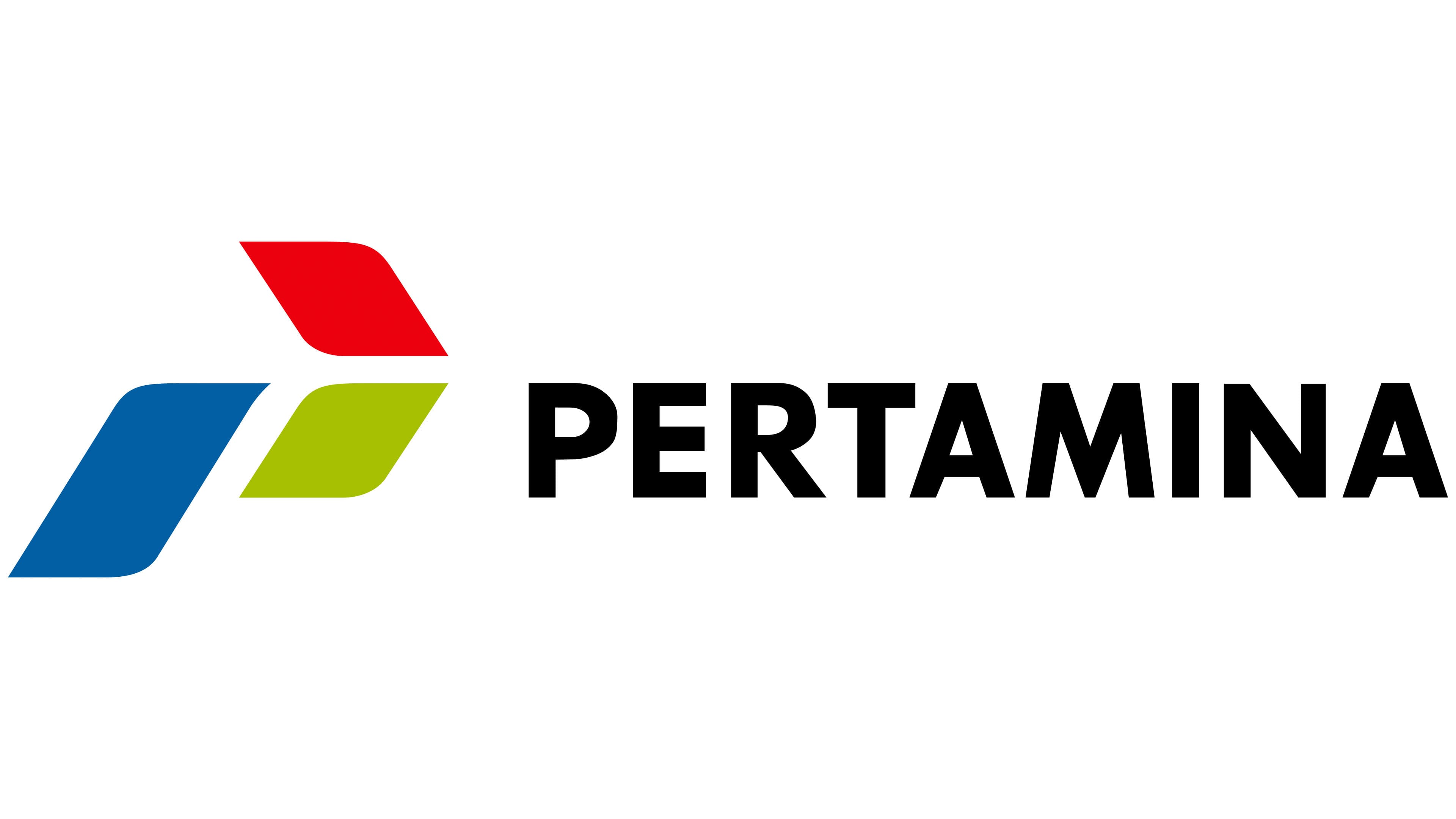
The Pertamina logo is a simple, expressive symbol that harmoniously combines the seriousness and dynamism of the Indonesian company. The company name is shortened to one word, making it easier to remember and use. The full name, Perusahaan Pertambangan Minyak dan Gas Bumi Negara, is too long for the logo and graphic design.
The font is executed in a minimalist style. The black lettering emphasizes the brand’s seriousness and reliability. The blocky letters, with sharp, evenly trimmed lines, give the text a strict, professional appearance. The style reflects the company’s technological focus and confidence in its market role.
The graphic element is placed to the left of the text and consists of three diamond-shaped figures arranged diagonally. This adds a sense of movement and forward momentum. Each diamond is colored differently: red, green, and blue. Red symbolizes energy and activity, green reflects a connection to nature and responsibility, and blue represents trust and technological development. The elongated and pointed tips of the diamonds add dynamism and emphasize the company’s drive for growth and progress.
Although the diamonds appear separate, their arrangement creates a cohesive and balanced image. This composition conveys the multifaceted nature of the company’s activities and its readiness to integrate different areas of work.
The Pertamina emblem organically combines national elements, reflected in the colors, with a modern design. It conveys the company’s core values: development, reliability, and respect for natural resources.