The ExxonMobil emblem shows the harmonious work of two giants united to expand opportunities and increase profits. The emblem is filled with ideas of leadership, equality, and common purpose.
ExxonMobil: Brand overview
ExxonMobil is an American global oil and gas giant. It owns fields in the United States, Asia, Australia, and Europe. It is headquartered in Texas. Generates a net profit of $23 billion dollars. The ExxonMobil logo unites more than 25 thousand gasoline stations, 19 refineries, and more than 16 chemical plants around the world.
The story of ExxonMobil is a 150-year history of wealth. The company itself, all its predecessors, and “sisters” occupied and continue to occupy leading positions in terms of revenues and capitalization in the world. The roots of the modern giant go back to 1870 when John D. Rockefeller founded the parent corporation – Standard Oil Company. Its success was overwhelming, and competitors, fleeing from ruin, achieved in 1911 through the court to split the giant into 34 firms to avoid monopoly. The largest of the 34 “subsidiaries” became Standard Oil of New Jersey and Standard Oil of New York.
Meaning and History
The ExxonMobil logo has not changed since the company was founded, but its appearance is due to the visual features of its predecessors. The New York design agency Lippincott & Margulies worked on the company’s identity. The specialists did not make any cardinal changes. The logo is a simple combination of the company name and visual signs. Exxon retains the unusual double-X style, while the Mobil letters remain straight and flat.
Both parts of the ExxonMobil logo are colored red, forming a unified combination. First, it is the primary color of the acquiring company. Secondly, after the merger, the formed giant became the world’s largest leader in the oil market. And red is the color of leadership.
What is ExxonMobil?
A major oil-producing and refining corporation in America. Formed by the merger of two subsidiaries of Standard Oil Company after almost 90 years of decentralization. Owns two separate brands, Exxon and Mobil.
Mobile
In addition to oil production, Standard Oil of New York (Socony) produced vacuum oil (purchased Vacuum Oil) and jet fuel. It owned the largest oil port on Staten Island. The oil was released under the Mobiloil brand and was so popular that the company gradually changed its name to Mobil (1963).
1892 – 1904
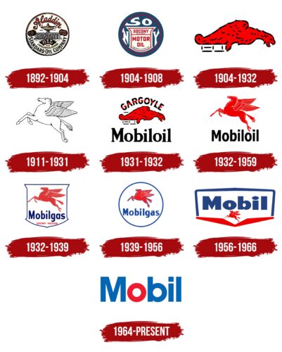
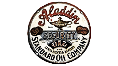
The emblem of Standard Oil of New York, part of the Rockefeller Trust, was a bit magical and contained many elements. It indicated oil of excellent quality that was delivered quickly, like a genie from an Aladdin tale. Eventually, Rockefeller created high-speed railroad delivery across the country. The circle shape indicates the train’s wheels and barrels. The emblem emphasizes the safety of the delivery by placing the word “security” in the center of the composition.
1904 – 1908
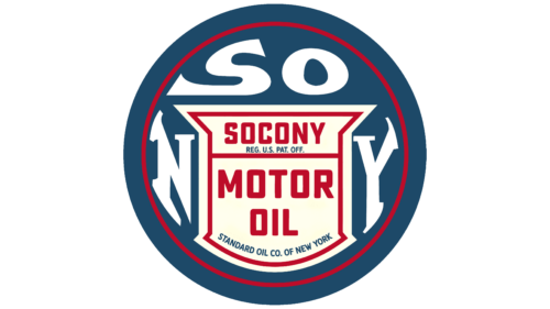
The circular emblem emphasizes the abbreviated name of the regional company and has the appearance of an automobile wheel. Inside is a silhouette resembling a gas tank. Around it is the abbreviation of the Socony acronym, which stands for Standard Oil Company of New York. The center indicates that the company offers motor oil.
1904 – 1932
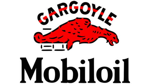
The second logo associated with the main Socony brand depicts a gargoyle. This is the name under which the company sells its products. Originally, the word Gargoyle referred to a drainpipe, from whose “mouth,” made in the shape of mythical animals, rainwater flowed in streams. It was this association with carving that was utilized. The combustibility of materials is shown in red on the emblem.
1911 – 1931
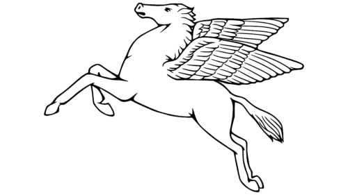
After the collapse of Rockefeller’s Standard Oil Company, Vacuum Oil, one of the companies previously absorbed by the giant, trademarked the image of a white Pegasus, representing the best brand of gasoline sold in Africa. This horse, according to mythology, was born out of the ocean and flew fast. It was worth it to hit with a hoof, and a spring appeared. Thus, in the emblem, the animal represents the company’s connection with the subsoil, high-quality gasoline, and the speed it gives to cars.
1931 – 1932
The Vacuum Oil company merges with the Socony company. They continue to sell Vacuum Oil under the Mobiloil brand and all other refined petroleum products under the Gargoyle brand. That’s why the emblem has one name at the bottom and another at the top. In the center is the image of a red gargoyle.
1932 – 1959
Socony also used the red Pegasus for gasoline in the East. Therefore, a year after the merger, the Pegasus became the main emblem. It flies upwards, demonstrating the strength and growth of the conglomerate, as well as hinting at the company’s passion for jet fuel. The horse also alludes to the fact that thanks to petroleum products, people have gained the freedom to travel: to drive and to fly.
1932 – 1939
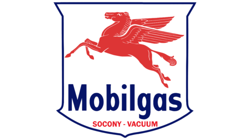
Most brands of gasoline were sold under the name Mobilgas, which was a combination of Mobiloil and Pegasus. The emblem was in the shape of a gas station or steam cylinder of the first automobiles. Inside the base were a horse and the brand name.
1939 – 1956
Mobilgas is one of the company’s most common brands of gasoline. Many types, such as General Petroleum, Gilmore, and Plume, changed their name to Mobilgas. The emblem of the leading brand will be slightly improved so that it can be placed on top of gas stations. The logo becomes round, demonstrating perfection.
1956 – 1966
In 1955, the decision was made to rename the company to Socony Mobil Oil. Its visual identity is updated, keeping the familiar red and blue colors. They were designed by the industrial design firm Peter Schladermundt, Inc.
The logo represented an amalgamation of two well-known companies – the blue square border at the top hints at Socony. The lower border line was replaced with an elongated red letter V, standing for Vacuum Oil. And inside is the two giants’ main product, Mobil oil.
Starting from the inner lines of the V, a miniature Pegasus – the conglomerate’s unchanging mark – flies upward. This logo was used until 1966 when a version developed in 1964 finally came into use.
1964 – today
In 1963, the name was shortened to Socony Mobil, and in 1966, to Mobil. With the elimination of the word “oil,” the name became simple and easy to use. In honor of the new name, a visual sign was developed, which is still used today. American graphic design agency Chermayeff & Geismar worked on the emblem.
The emblem turned out to be as simple and concise as the name itself. It is a verbal sign consisting of the inscription Mobil. At the same time, the hint of oil was preserved in the red color of the letter “o” and the whole composition – in blue.
The word Mobil echoes the word “mobile” and says that thanks to the company’s products, mankind has gained the ability to move. The logo also hints at the speed of service, as it was Socony that came up with the idea of paying through a terminal at gas stations and developed a special application.
Exxon
In addition to producing petroleum products, Standard Oil of New Jersey (Jersey Standard) was involved in hydrogenation, butyl rubber and toluene production, and alternative energy. Its petroleum products were sold under the Esso and Enco brand names. In 1972, Jersey Standard was forced to change its name to Exxon.
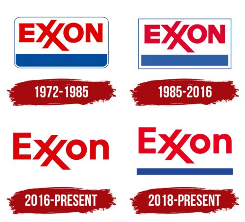
1972 – 1985
The main feature of the Exxon logo is the unusual spelling of the double letter X. The idea belongs to designer Lowy, who tried to link the new name with the famous Esso brand (its use was banned in some states, which caused the need for a new name).
The use of a rounded rectangle as a background showed that the new company takes into account all the claims of its past activities, and the brand does not violate any laws. The blue underline is a hint of the presence of the past. The brand is not created from scratch. It has a foundation; customers love it.
The color scheme is borrowed entirely from previous Standard Oil of New Jersey logos.
1985 – 2016
The company became the second-largest oil refining giant in the world. This achievement was marked by a change in visual marks. The main detail of the new image was the acquisition of right angles of the background. The emblem signaled that Exxon had stepped into a leadership position. It no longer needed to smooth out the corners. Let others reckon with its weight.
2016 – today
The new emblem was created after the merger with Mobil. Therefore, the emblem is dominated by the color red, and the image is fully in line with the mark of the new ExxonMobil company, being a part of it, as it were.
2018 – today
The blue base, characteristic of the brand’s past badges, has been returned to the emblem to emphasize its personality and hint at its legendary past. Now, the brand, although part of the overall combined company, has its own unique mark.
Interestingly, ExxonMobil is not the first collaboration between Jersey Standard and Socony. In 1933-62, they formed the company Stanvac, which worked in fifty countries around the world. And already in 1999, Exxon bought its competitor. Since the first and second fusion competitors had a word logo, the joint mark consisted of a word.
Font and Colors
Two colors dominate all the emblems of the parent and subsidiary companies: blue and red.
- Red is a symbol of combustible materials, an indicator of rapid development, growth, and superiority.
- Blue stands for gas, blue fuel. Demonstrates a business approach, planning, and ability to manage a large structure.
The inscription font is similar to ITC Avant Garde Gothic Paneuropean Bold but with a unique style of X-elements.
ExxonMobil color codes
| Imperial Red | Hex color: | #ec1b2f |
|---|---|---|
| RGB: | 236 27 47 | |
| CMYK: | 0 89 80 7 | |
| Pantone: | PMS Bright Red C |
