


 Caltex Logo PNG
The Caltex logo is designed to be memorable at first glance. Its star, with contrasting lines and rich colors, evokes a sense of movement and dynamism. The design creates a sense of stability, while the bold shapes hint at the strength and reliability the company is known for.
Caltex was founded in 1936 as a joint venture between Standard Oil of California and The Texas Company, known as Texaco. The new company, first called California Texas Oil Company, linked Standard Oil of California’s Middle Eastern and Asian oil interests with Texaco’s distribution network in Africa, Asia, and Australia. The alliance gave both firms a way to compete with British Petroleum and Royal Dutch Shell outside the United States.
Early Caltex operations focused on the Middle East and the Asia-Pacific region. In 1936, the company began selling petroleum products in Egypt and India, then expanded to Ceylon, Malaya, the Dutch East Indies, and Australia. A refinery in Bahrain became one of its key early assets, helping supply Asian markets without relying on shipments from the United States or Europe.
World War II damaged much of Caltex’s Asian infrastructure as the Japanese occupation hit Southeast Asia. After 1945, the company rebuilt operations in Australia, India, Pakistan, and the region. Its filling-station network expanded across markets from Bangkok to Johannesburg. At the same time, the Caltex name became closely associated with retail fuel.
In 1968, Caltex updated its brand identity, separating its image from that of its parent companies. From the 1970s to the 1990s, it competed with BP and Shell in Australia. It developed assets such as the Ssangyong Refinery in South Korea, later Caltex Oil Korea. After Chevron and Texaco merged in 2001, Caltex became part of ChevronTexaco, later Chevron Corporation. In 2015, Chevron sold its Australian assets to Ampol, which used the Caltex name until it reintroduced the Ampol brand in 2020.
Meaning and History
What is Caltex?
This is one of the world’s largest oil companies, which began as a small gas station in California and grew into a fuel empire. Today, the organization operates an extensive network of gas stations, refineries, and distribution hubs, holding a leading position in the Asia-Pacific region. It is known for high-quality fuel and exceptional customer service, drawing on best practices from American companies. Drivers are offered traditional fuels and exclusive products, including advanced gasoline and motor oil grades.
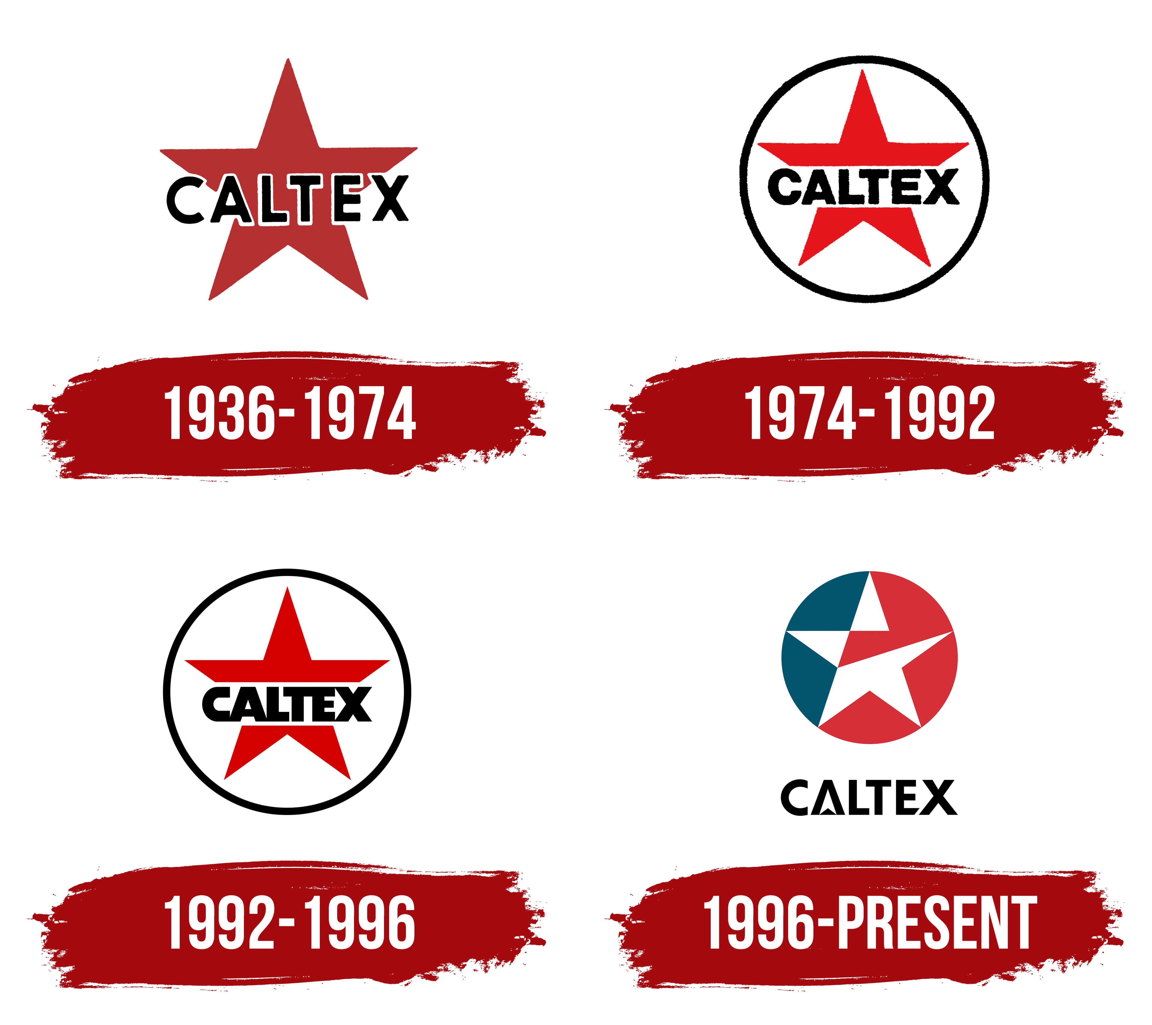
1936 – 1974

1974 – 1992

1992 – 1996

1996 – today
The Caltex logo is a bright, concise symbol emphasizing the brand’s history and uniqueness. The company name combines the first syllables of two American states: California (California) and Texas (Texas), where the founding firms were located. This name refers to the company’s origins and its connection to the development of the U.S. oil industry.
The design focuses on a circle divided into blue and red sections. These contrasting colors create a sense of balance and dynamism. A five-point white star at the circle’s center symbolizes reliability and leadership. Traditionally associated with success and ambition, the star features a unique detail: its right tip is slightly shortened, giving the design a modern, bold appearance. The white color enhances the contrast and makes the star memorable.
The circle surrounding the star represents unity and completeness, highlighting the company’s scale and global presence. A white border between the star and the colored sections adds precision and underscores the star as the emblem’s key element.
Below the star is the word “Caltex,” rendered in a sleek, sans-serif font. While the letter design appears minimalist, it contains intriguing details. For instance, the lower diagonal of the letter “E” is cut off, giving the text a modern, technological look. The letter “A” incorporates an arrow hidden in the negative space, hinting at forward motion and the company’s ambitious development. To achieve this effect, the horizontal bar of the letter “A” was replaced with a triangle, adding dynamism and visual originality.
The sans-serif font makes the text clean, versatile, and suitable for a global audience. The black lettering complements the logo’s color scheme, creating a harmonious blend of blue, red, and white.
The Caltex emblem combines elements that tell the company’s story, ambitions, and commitment to stability. The simplicity of the forms, combined with thoughtful details, reflects its connection to the rich heritage of the U.S. oil industry and its role on the global stage.