


 SLB Logo PNG
The SLB logo is clear and concise, conveying precision and professionalism. It resonates with those familiar with the energy industry, representing top-quality work and reliability. It also symbolizes experience, signifying the successful resolution of the most complex challenges.
Schlumberger Limited, SLB, was founded in 1926 by French geophysicists Conrad and Marcel Schlumberger. The company took its name from the brothers and grew into an oilfield services business headquartered in Houston, Texas. Its early development centered on geophysical research, subsurface mapping, and technical services for oil and gas exploration.
In the 1930s, SLB introduced the first electrical resistivity method, a tool used to study underground formations and support the search for oil and gas reserves. In the 1940s, the company expanded into the Middle East, Africa, and Latin America. During the same decade, SLB developed acoustic and nitrogen logging, adding new methods for well analysis, field evaluation, and operations across different production regions.
In the 1950s, SLB became a public company through a listing on the New York Stock Exchange, opening its development to a wider group of investors. At the same time, the company diversified into drilling and well services. In the 1960s, SLB continued moving into new business areas. In the 1970s, it developed the first directional drilling system, followed in the 1980s by the first horizontal drilling system, changing how oil and gas fields could be reached.
In the 1990s, SLB introduced the first intelligent well-drilling system. In the early 2000s, it developed the first digital oilfield, linking production activity with digital tools and field data. In the 2010s, the company presented the first autonomous drilling system. Today, SLB operates in more than 85 countries, employs over 90,000 people, and provides geophysical surveys, drilling, well workover, and production optimization services.
Meaning and History
What is SLB?
This global provider of technologies for oil and gas services offers a wide range of solutions for the energy sector. The organization specializes in comprehensive services, including production optimization, reserve evaluation, well drilling, and geological exploration. Its operations span more than 120 countries, with experts working in environments ranging from deepwater platforms to deserts. It is renowned for its cutting-edge digital solutions for the oil and gas sector and its extensive network of research centers, where technologies are developed to enhance the efficiency of hydrocarbon exploration and production.
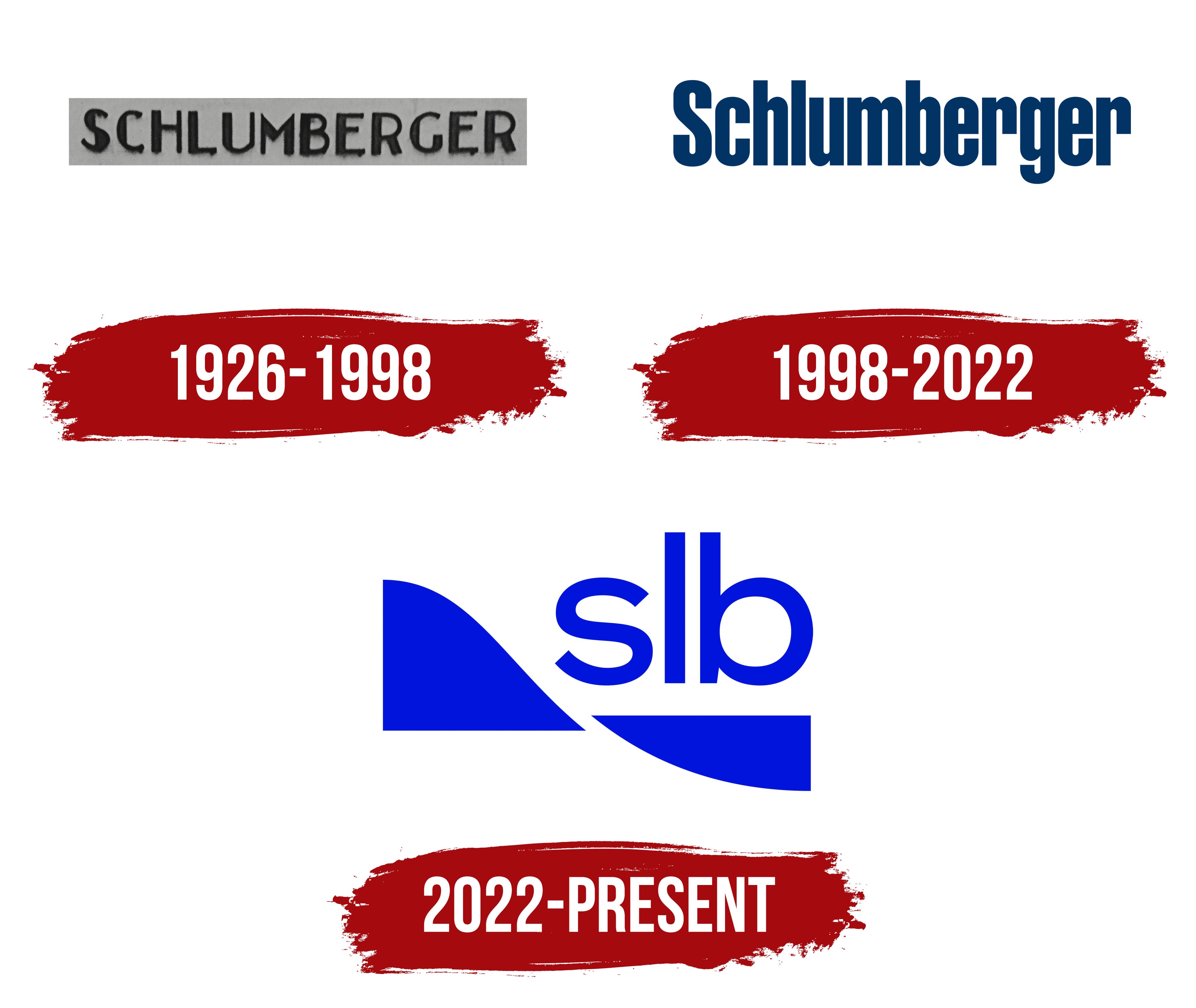
1926 – 1998
1998 – 2022
2022 – today
The SLB logo appears simple but is rich in meaning, thanks to its carefully considered design. The company’s abbreviation is derived from the full name Schlumberger Limited. An interesting detail is the use of lowercase letters rather than uppercase, which makes the overall appearance less formal and more approachable.
The inscription’s font is strict, sans-serif, with clean lines. It is bold, but the rounded edges give it a balanced and harmonious look. The letters “s,” “l,” and “b” combine straight lines and smooth curves, creating a sense of reliability and technology. The style reflects the company’s core values: resilience and innovation, which are important in its high-technology work.
Below the text are two abstract elements that complement the overall design. One is a smooth, curved line, and the other resembles the arc of a hill. These shapes evoke associations with natural landscapes and geological structures. The left element resembles mountainous contours or elevations, while the right, pointing downward, resembles a wave or a horizon line. The combination highlights the company’s work on land and at sea, covering various technologies and resources.
The primary color is a deep blue, symbolizing confidence, depth, and advanced technology. It underscores the importance of the company’s activities in the energy sector. The white background creates a sharp contrast and adds simplicity.
The abbreviation simplifies the brand’s perception while maintaining a connection to its history. This makes the logo modern and versatile, suitable for a global context.
The SLB emblem demonstrates how minimalism combines conciseness and depth. Each element serves its purpose, emphasizing the scale of the company’s activities and its drive toward future technologies.