


 TotalEnergies Logo PNG
The Total logo symbolizes global interconnectedness, demonstrating the scale and importance of the company’s work. Its design conveys dynamics, energy, and the connections that support stability and progress. It is part of the global flow, maintaining accessibility and clarity for everyone.
TotalEnergies SE traces its history to 1924, when France created Compagnie française des pétroles, known as CFP. The company was formed under President Raymond Poincaré amid concerns about dependence on foreign oil and the risk of conflict with Germany. Poincaré rejected cooperation with Royal Dutch Shell and supported a French oil company led by Colonel Ernest Mercier, backed by 90 banks and companies.
In its first decades, CFP focused on exploration and production. Its early work brought major discoveries in the Middle East, followed by expansion into refining, marketing, global oil trade, and chemical production. In 1954, CFP discovered the Hassi Messaoud oil field in Algeria, which the company’s history lists as a major stage in energy exploration and production.
By the 1960s, CFP had expanded further into the chemical industry and had acquired several oil companies. In 1964, CFP merged with the French company Fina, forming Total. In 1991, Total became the first French company to be listed on the New York Stock Exchange, providing access to a wider investment market and placing the company in a broader international financial context.
In 1999, Total merged with Belgian company Petrofina and became TotalFina. In 2000, TotalFina acquired Elf Aquitaine, creating TotalFinaElf. After restructuring, the company was renamed Total SA in 2003. In 2021, Total SA changed its name to TotalEnergies SE, reflecting activity across oil and gas, electricity, transport, refining, petroleum products, global trading, chemicals, and renewable energy.
Meaning and History
What is Total?
This is one of the largest energy businesses in the world, headquartered in France, with assets across all continents. The organization manages the full oil and gas production cycle from hydrocarbon exploration and extraction to refining and retail sales through thousands of gas stations. As a leading player in the African market, it holds a dominant position and undertakes projects in challenging locations, including deepwater fields and Arctic regions. It is also renowned for its petrochemical operations, including the production of polymers, specialty chemicals, and motor oils that are popular among drivers worldwide.
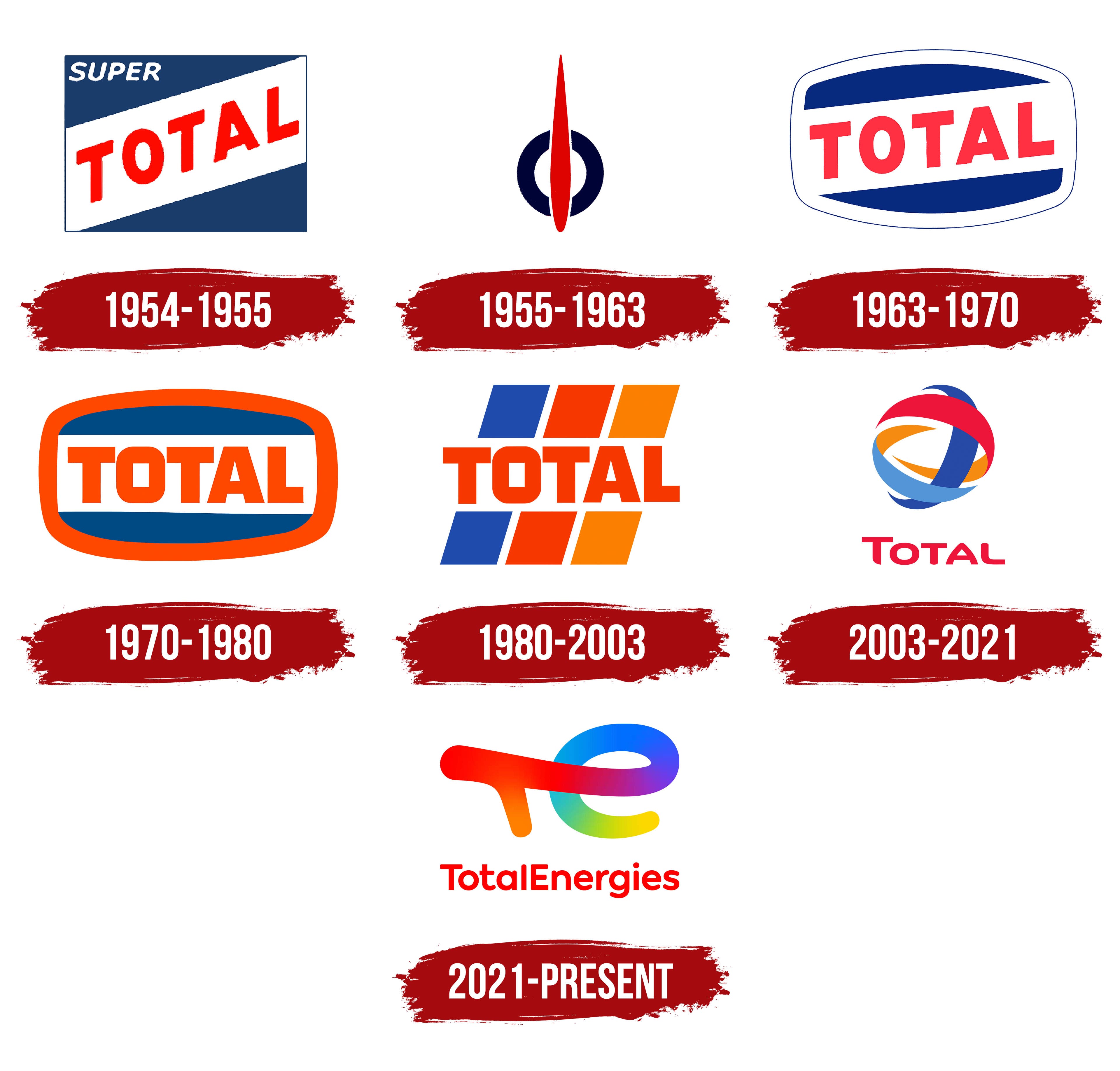
1954 – 1955

1955 – 1963

1963 – 1970
1970 – 1980

1980 – 2003
2003 – 2021
2021 – today
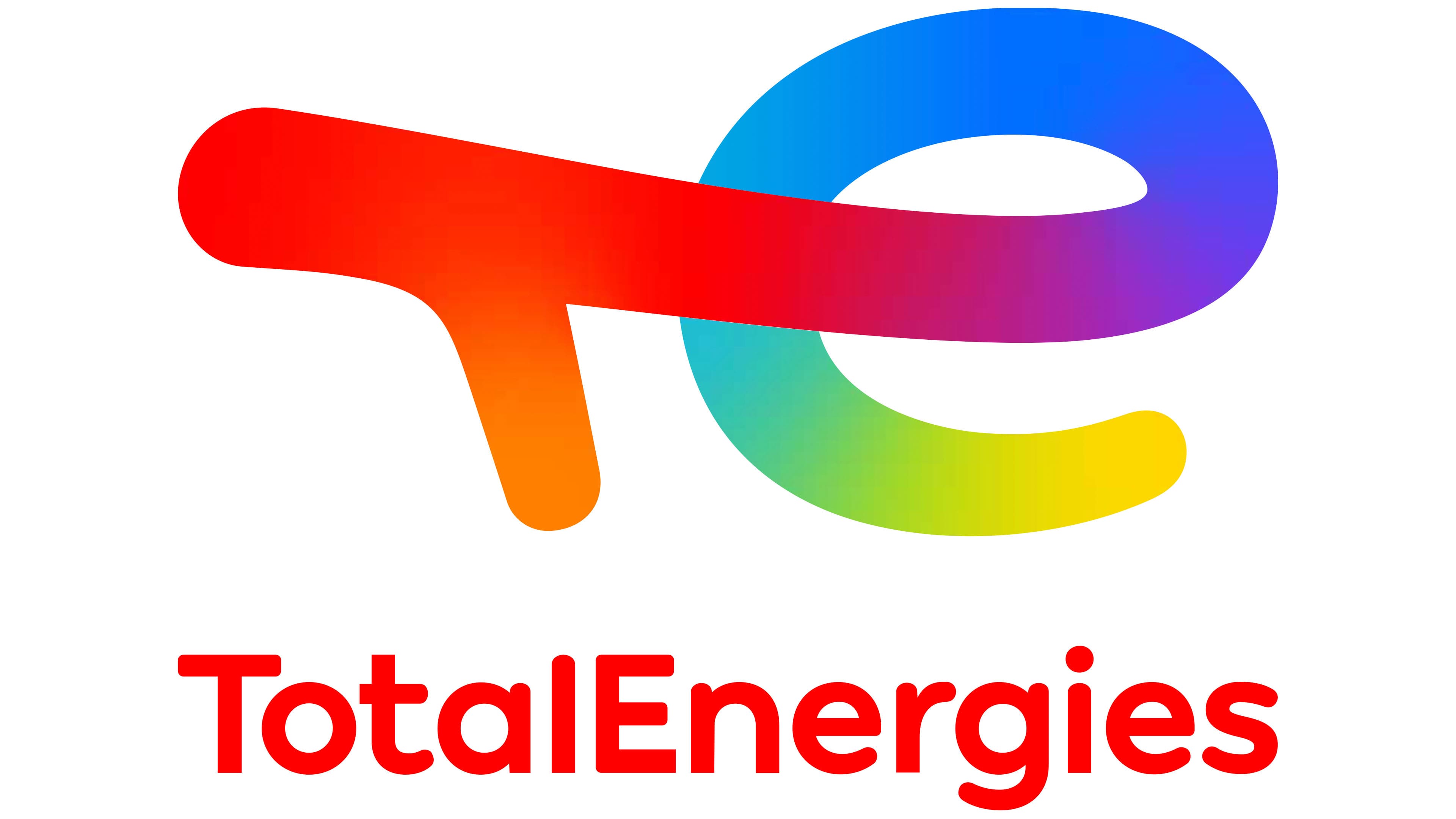
The TotalEnergies logo is bright and dynamic, reflecting the progress and diversity of the company’s work in the energy sector. The central element is a stylized combination of the letters “T” and “E” that forms a smooth, harmonious shape. This graphic element looks unified, symbolizing the integration of traditional and modern energy sources.
The upper part, where the red color smoothly transitions into orange, forms the horizontal line of the letter “T.” It resembles a wide brushstroke, adding liveliness and energy to the logo. The letter “E” begins in blue and transitions to yellow, creating a sense of completeness and emphasizing the company’s diverse operations. The color gradient conveys the shift from fossil energy sources to environmentally friendly and innovative solutions.
The color palette includes shades of red, orange, yellow, green, blue, and purple. These colors seamlessly blend into one another, symbolizing movement and the connection between the company’s sectors. Visually, this is energy in constant motion, highlighting the company’s adaptability to contemporary challenges.
Below the graphic element is the company’s name, written in lowercase letters. The font is modern, sans-serif, with soft, rounded forms that make the text clear and visually appealing. The red text adds emphasis and ties it harmoniously to the upper part of the emblem, reinforcing the composition’s overall cohesion.
The name conveys the brand’s core idea. “Total” emphasizes the company’s scale, while “Energies” highlights its specialization, encompassing both traditional and renewable energy sources.
The color transitions, shapes, and text work together to create an image that tells the story of diversity, innovation, and the company’s commitment to keeping pace with the times, paving the way for the future of energy.