The Amana logo is a model of precision and harmony. The emblem speaks to the technical excellence of the brand’s products, the thoughtfulness of its content and design, and the quality of assembly. The symbol reflects market leadership and the best performance indicators.
Amana: Brand overview
| Founded: | 1934 |
| Founder: | Whirlpool Corporation |
| Headquarters: | Benton Harbor, Michigan, U.S. |
| Website: | amana.com |
Amana is an American enterprise that manufactures climate control equipment and appliances. It belongs to two giants: the Japanese company Daikin (which has been producing air conditioners and heaters under the brand since 1997) and the Whirlpool Corporation (which has been manufacturing Amana appliances since 2002). Household equipment is assembled in Iowa at a leased factory owned by Wramia001 and at Daikin’s large facility in the USA.
Meaning and History
From the very beginning, the company chose a verbal expression of its identity without using drawings or symbols. As the company gradually grew and developed, the emblem changed several times in terms of font and color to more accurately reflect the manufacturer’s goals and describe the products being produced. The main reason for the change in the visual symbol is related to the desire to keep up with the times and look more modern.
What is Amana?
A major US brand producing heaters, air conditioners, and other household appliances. Income from the sale of the latter alone is over $5 billion. Headquarters in Michigan. Production facilities in Iowa.
1945 – 2016
Despite being founded in 1934, the company received its first logo in 1945 for two reasons, after the end of the war.
First, the specific views of the German immigrant Pietists, to whom founder George Foerstner sold the enterprise in 1936, had an impact. For the believing community, American business was new. Before the founding of Amana Society Inc, they engaged in communal farming. Therefore, it took time to restructure.
Second, with the onset of the war, the company was busy fulfilling military orders, and there was no time for visual identity.
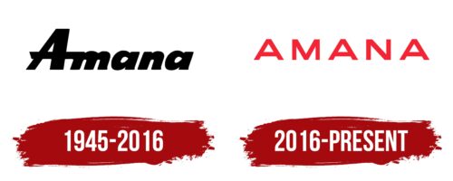
The emblem was invented when the decision was made to produce commercial freezers for sale. The first logo consisted of the inscription Amana in a slim, black, italicized uppercase font.
The brand name was taken from the common name of six Pietist settlements in the state of Iowa. The word Amana is taken from the Bible and means an honest and faithful person.
The logo perfectly reflected the community’s values. The impeccable handwriting spoke of perfectionism, as according to the belief of the Pietists, God chose a person for paradise based on the quality of their work. Therefore, all products were made with maximum precision. The black color and absence of drawings testified to the asceticism and strictness inherent in closed religious settlements. The products contained no unnecessary details, only those necessary for functionality and fulfilling their purpose.
2016 – today
In 2016, the decision was made to update the symbol, which had remained unchanged for almost 80 years. The emblem is designed to make the perception of the company more modern. The new symbol is also verbal. It consists of clear and even red uppercase letters.
There are wide spaces between the letters, representing each symbol as a finished and perfect product. The width of the letters hints at the stability of the products, which is important for stationary equipment during operation.
According to the company itself, the new symbol should emphasize the core values it adheres to when creating appliances: simplicity of use and impeccable quality. This is conveyed by the perfectly written symbols, without unnecessary details.
Font and Colors
The red color perfectly conveys the theme of temperature control, telling about climate control using Amana equipment and creating an ideal atmosphere. It speaks to the energy efficiency of all products. The color also tells of:
- the most modern technologies implemented in production,
- stylish design that pleases the eye,
- pleasant emotions from working with the equipment.
The shade contains many pleasant, joyful notes, representing the company as one that makes life easier. The equipment is perfect as a holiday gift. Each separate symbol in the name looks like a bright present.
The font is similar to Gonero Extra Bold.
Amana color codes
| Scarlet | Hex color: | #f42435 |
|---|---|---|
| RGB: | 244 36 53 | |
| CMYK: | 0 85 78 4 | |
| Pantone: | PMS Bright Red C |


