Software that makes you feel like a fish in water in the digital environment. This is the key idea that the Atos logo promotes with the improvised letter “O.” This letter evokes many associations, including a resemblance to a scaly underwater dweller. Admittedly, the similarity between the two is symbolic.
Atos: Brand overview
Atos is a French IT corporation engaged in systems integration, outsourcing, cloud computing, software, server manufacturing, bulk data management, and cybersecurity support. It was formed in 2000 and operates worldwide under several brands. Among others, this firm is known as Unify, Atos Healthcare, Canopy, Atos|Syntel, Groupe Bull, Atos Consulting, and Atos Worldgrid. The location of the company’s headquarters is Bezons in France. In addition, the company has many additional offices located in different countries.
Meaning and History
Although the official time of appearance of this organization is considered to be 2000, its history began four years earlier. Thus, in 1996, two companies working in the field of IT technologies were merged into one structure: Dutch BSO and Communications & Processing (Philips C&P). As a result, Origin BV was formed. In 1997, two French specialized platforms, Axime and Sligos, merged. As a result of this merger, Atos was born.
In 2000, the new IT companies merged to form the world-famous Atos Origin Corporation. Two years later, it bought KPMG Consulting, and another two years later, it bought SchlumbergerSema. Her next major acquisition was Siemens IT Solutions and Services, which she finally took over in 2011. There were many more acquisitions and mergers in its career to increase its technology base and expand its reach.
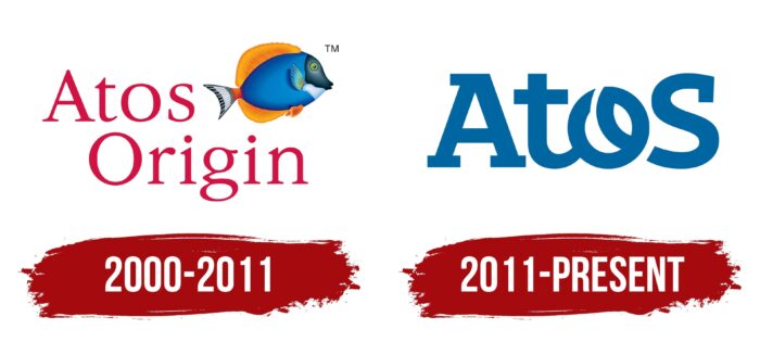
Subsequently, the French company reverted to the shortened version of its name, Atos. As for the visual identity mark, it changed it only once. This was directly related to the return of the former name. The first and second emblems are radically different from each other, which indicates a serious strategic maneuver of the corporation with the transition to more modern technologies.
What is Atos?
Atos is a French IT company specializing in software, cybersecurity, big data management, cloud computing, and integration systems. It has been around since 2000 and has several names under which it operates around the world. They are Unify, Atos Healthcare, Canopy, Atos|Syntel, Groupe Bull, and others. The company is headquartered in Bezon (France).
2000 – 2011
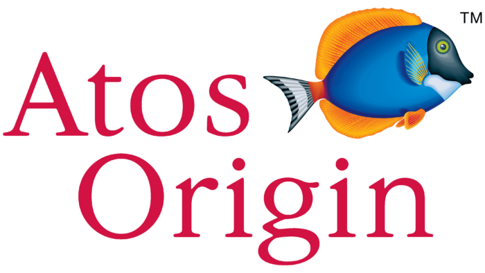
The debut logo was a combination of the company name and the image of a blue-orange fish with a black mask on the front and a striped tail. This is a surgeon fish, one of the dangerous inhabitants of the ocean. It has very sharp fins that cut the surface like a metal blade, which is the reason for its name. She is also a warrior: she fiercely defends her territory and defends it from everyone – even from members of her own species, not letting anyone in. It is for this character it was used in the emblem of a French IT company, one of the functions of which is to ensure cybersecurity.
To the left of the surgeon fish, positioned diagonally, was the name of the corporation. The phrase “Atos Origin” was typed in needlepoint red font. The width of the letter feet was uneven: bold in some places and thin in others. The text was grouped into two lines. The top line was occupied by the word “Atos” and the bottom line by “Origin.” They were slightly offset relative to each other and were not aligned on either edge.
2011 – today
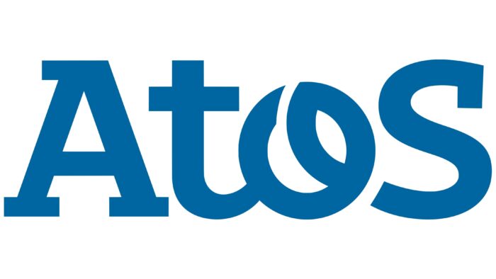
The rebranding was a watershed moment in the history of the Atos logo as it became radically different. It reflected technology and elegance, reflecting a purely French approach to style choices. In 2011, the company again switched to a shortened version of the name, leaving only one word in the emblem. It is typed in a smooth font with rounding and a minimum of sharp corners, noticeable only in the letter “A” in the upper intra-letter space and below in the serif zone. In other cases, the angles in the characters are either straight, obtuse, or absent altogether. In addition, the first and last letters are uppercase, while the center letters are lowercase. There is a connection between the letters “t” and “o”.
Font and Colors
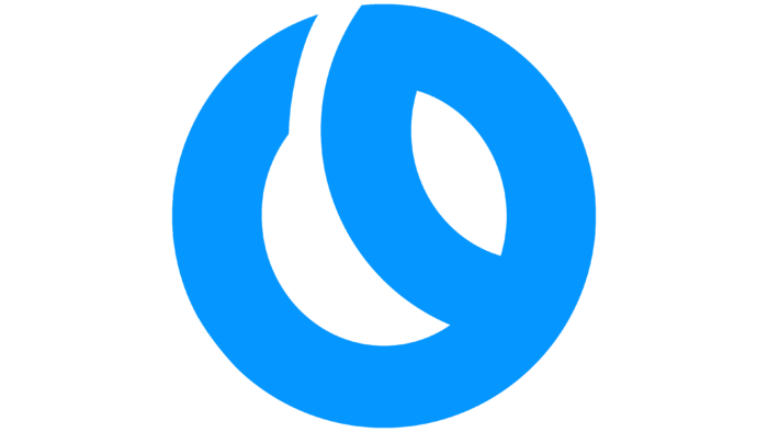
The modern version of the logo contains only one word – without additional background and framing. This indicates the company’s desire for minimalism and specificity. The letter “o” encrypts a single graphic image: looping, the element goes to the next symbol when writing. It represents two interconnected figures: an ellipse with sharp ends and a crescent moon positioned at an angle. The negative space between them resembles a leaf of a tree laid sideways. The fish in the first emblem symbolizes two factors. The first is a high degree of defense of one’s sphere (usually a quality that distinguishes the surgeonfish). The second is the concept of “feeling like a fish in the water,” that is, to move freely and without fear in the Internet space.
In the debut Atos logo, the text is typed in Garamond Nova Pro Light font, while the current one uses a modernized version of Vezus Serif Bold, which uses sharp corners instead of rounded ones. The corporate palette is also diverse: it consists of blue, orange, black, red, and white colors. But in the current emblem, the designers limited themselves to blue and white colors only.
Atos color codes
| Medium Persian Blue | Hex color: | #0066a1 |
|---|---|---|
| RGB: | 0 102 161 | |
| CMYK: | 100 37 0 37 | |
| Pantone: | PMS 3015 C |

