The Daikin logo symbolizes the ease of breathing and clean air provided by the company’s systems. The emblem focuses on the theme of air purification. The brand’s filters serve as a reliable barrier, preventing contaminants from entering living spaces.
Daikin: Brand overview
Daikin is a Japanese ventilation and air conditioning expert with manufacturing facilities in Australia, Asia, India, Europe, and the United States. The company has a net profit of $1.5 billion. Founded in 1924 as Osaka Metalworking Industries, it adopted its current name in 1963.
Meaning and History
The company’s logo has remained virtually unchanged for the past 60 years. Minor changes have been due to the desire to better express the brand’s goals and showcase the products it manufactures. The logo contains a symbolic image that can be understood in any language, which is important for a global brand with a worldwide presence.
What is Daikin?
Daikin is a large Japanese manufacturer and developer of heating, air conditioning, and ventilation systems, whose plants employ about 76 thousand people. The company’s headquarters is located in Osaka.
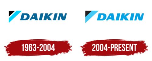
1963 – 2004
The first emblem consists of the image of a triangle in the upper left corner and the inscription “Daikin,” made in large blue letters. The triangle represents an air conditioner, usually installed at the top of a wall and consists of black and blue stripes. The black part symbolizes polluted air, and the blue part symbolizes the air after it has been cleaned by the unit and enters the room. Daikin ensures that the air is clean, so the lettering is as if it is coming out of the air conditioner and is inside the room.
The logo visualizes the phrase: “Dirty air is cleaned thanks to Daikin systems.”
The name of the company comes from the combination of the Japanese pronunciation of the first two Kanji characters of the words Osaka (the place where the company was founded) and Kinzoku (metal).
2004 – today
With the beginning of sales of the manufacturer’s air conditioners in the USA and Canada, the logo underwent changes. In the modern version, the inscription was slightly changed to accurately convey the original meaning. The black and blue stripes were combined, removing the empty space between them. In this form, the elements better reflect the process of air passing through the filter of the device.
The name took on the same blue hue as the clean air entering the room. The association with the letters as if coming out of the air conditioner became even stronger.
The capital letters symbolize the scale of the company as well as the large installations for manufacturing and high-rise buildings.
Font and Colors
The emblem is built on the contrast of blue and black colors. The blue shade symbolizes clean air, while black symbolizes pollution. In addition, the color blue is associated with dreams, innovation, and development. The company is considered an innovator in its industry. The black color indicates stability and constant striving for growth and development.
The font is reminiscent of Taz Extended Black Italic. The uppercase glyphs emphasize the company’s leadership and global presence. The angular glyphs mimic the rectangular shapes of the air conditioners, reflecting the company’s firm stance on build quality and performance.
Daikin color codes
| Spanish Sky Blue | Hex color: | #02a0e4 |
|---|---|---|
| RGB: | 2 160 228 | |
| CMYK: | 99 30 0 11 | |
| Pantone: | PMS 801 C |
| Vivid Sky Blue | Hex color: | #42c8f5 |
|---|---|---|
| RGB: | 66 200 245 | |
| CMYK: | 73 18 0 4 | |
| Pantone: | PMS 312 C |
| Black | Hex color: | #000000 |
|---|---|---|
| RGB: | 0 0 0 | |
| CMYK: | 0 0 0 100 | |
| Pantone: | PMS Process Black C |


