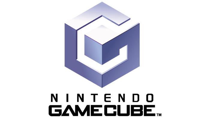
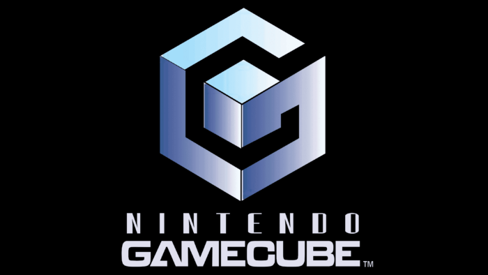
The gaming brand GameCube has chosen to use a graphic emblem. The cube is formed from folded ribbons that form a three-dimensional square. The three-dimensional figure of the GameCube emblem conveys the essence of the digital product: immersion in a virtual world, where it is necessary to understand the confusing “labyrinths” of the mind in order to emerge from them unequivocally victorious.
GameCube: Brand overview
Today, there is hardly an adult person who is not familiar with the products of Nintendo. In 2001-2002, the Nintendo GameCube home video game console became the representative of the sixth generation of game consoles, replacing the then-popular worldwide Nintendo 64. Its developers managed to create a console capable of competing on the world market with such “monsters” in the field of game consoles as Sony PlayStation 2 and Microsoft Xbox. This model was the first in Nintendo’s lineup equipped with a new way of reading data, thanks to which it was able to use optical disks. It used only MiniDVD game disks. It had a controller, a large selection of software, and high graphics and video performance. However, the limited functionality played a role in unexpectedly low sales figures, leading to the production being shut down after only six years.
For seven years – from the beginning of sales until their end in the retail network on all new game consoles and in advertising using the appropriate name logo – a volumetric cube with an uncovered edge, next to which was depicted the full name of the console. This ensured that the product was recognizable, demonstrating its novelty and a graphic interpretation of the title.
Meaning and History
The console’s history began in 1997 when the Nintendo 64 was completed. In the next phase, the development team moved to ArtX, a specialized graphics hardware company headed by Dr. Wei Yen. In 1998, the team worked with Nintendo to develop the sixth-generation processor. The following spring, the company announced a new project called Dolphin.
In April 2000, ATI bought out ArtX. However, the processor was already at the stage of completion. For this reason, it was not changed by the new owner.
The official name of the console – GameCube – was first heard at a Japanese press conference in 2000. For the first time, the manufacturer dropped the Super Mario demo at the console’s launch.
Marketing promotion of the new console began with the development and application of a new slogan – The Nintendo Difference, which was heard at the E3 2001 presentation. The promotional slogan will be modified in the future. A rotating three-dimensional cube would be used as the logo, turning into text – GameCube, with a female voice whispering the name.
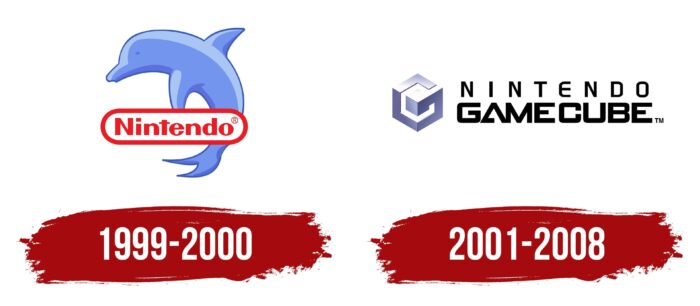
1999 – 2000
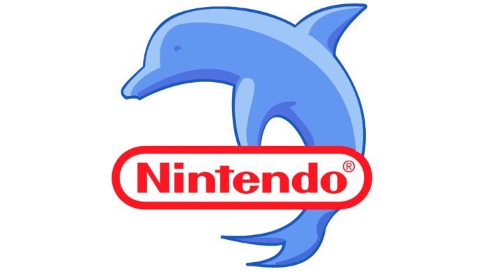
As a bonus, a free Dolphin emulator for the GameCube was released for use on Windows, Linux, macOS, and Android as a tribute to the project of the same name. Dolphin was the pre-release logo for the GameCube from 1999-2000. He was depicted jumping into the water in a “cornflower” color – darker on the sides of his torso and lighter blue along his back, as from the sunlight falling on him. Just below the torso, with an overlay on the part of the tail, was the traditional red element of the company’s emblem – its name. The logo retained the style of the very popular Nintendo 64 and Game Boy Color versions of the console prior to its release.
2001 – 2008
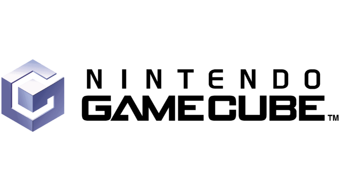
In 2001, the Nintendo GameCube logo took on its final form, which accompanied all advertising and was used on product packaging throughout this period.
GameCube: Interesting Facts
The Nintendo GameCube, released in 2001, is a landmark gaming console known for its innovations and memorable games.
- Switch to Optical Discs: For the first time, Nintendo used optical discs instead of cartridges for the GameCube. This allowed games to hold up to 1.5 GB of data.
- Compact and Portable Design: The GameCube’s small, cube-shaped design included a carrying handle, making it unique and more portable than its larger rivals.
- High Performance: At launch, the GameCube was among the most powerful consoles, with advanced processing and graphics capabilities allowing impressive game visuals.
- Gaming-First Approach: Nintendo focused the GameCube on gaming alone, unlike the PlayStation 2 and Xbox, which included DVD playback and other multimedia functions. Nintendo believed in delivering the best gaming experience through a dedicated device.
- Innovative Controller: The GameCube controller is celebrated for its comfort and design. It features a large A button and a C-stick, making it great for various games.
- Online Play Options: Though mainly focused on gaming, the GameCube did offer broadband and modem adapters for online gaming, a feature that was just starting to take off.
- Game Boy Advance Connectivity: Using a special cable, the GameCube could connect to the Game Boy Advance, offering second-screen features and new ways to play games like “The Legend of Zelda: Four Swords Adventures” and “Final Fantasy Crystal Chronicles.”
- Iconic Games: The GameCube hosted many acclaimed games, such as “The Legend of Zelda: Wind Waker,” “Metroid Prime,” and “Super Smash Bros. Melee.” Fans still love these games and have seen re-releases on newer systems.
- Variety of Colors and Limited Editions: It came in several colors and limited editions, including a rare Panasonic version in Japan that could play DVDs.
- Enduring Popularity: Despite not outselling its competitors, the GameCube has a dedicated fan base. Its focus on quality gaming has cemented its place in gaming history and influenced future Nintendo consoles and games.
GameCube is fondly remembered for its innovative design, powerful performance, and extensive game library, which showcases Nintendo’s lasting influence on the industry.
Font and Colors
The official logo of the console features an original image of a cube, which, with its three-dimensional contours, forms the first two letters of the console’s name – G and C. The two letters can be seen if you look at the element of the console’s name. They can be seen if you look at the element from the appropriate angle. The cube is made in a gradient transition of shiny dark violet-blue color to lighter smoky-white, which provides the effect of shimmer and metallic shade.
Next to it, strictly along the height of the cube, is text in black capital letters in two rows. The top one is “Nintendo.” The bottom one is “GameCube.” A thick font is used for the lower text, and a thin font is used for the upper text. In the continuation of the lower element of the last letter, a small TM sign is shown on the same line as it. The words are centered relative to each other.
GameCube color codes
| Maximum Blue Purple | Hex color: | #adb0d6 |
|---|---|---|
| RGB: | 173 176 214 | |
| CMYK: | 19 18 0 16 | |
| Pantone: | PMS 7444 C |
| Purple Navy | Hex color: | #66669c |
|---|---|---|
| RGB: | 102 102 156 | |
| CMYK: | 35 35 0 39 | |
| Pantone: | PMS 7669 C |
| Dark Slate Blue | Hex color: | #433977 |
|---|---|---|
| RGB: | 67 57 119 | |
| CMYK: | 44 52 0 33 | |
| Pantone: | PMS 7672 C |
| Black | Hex color: | #000000 |
|---|---|---|
| RGB: | 0 0 0 | |
| CMYK: | 0 0 0 100 | |
| Pantone: | PMS Process Black C |
