The Wipro logo is bright and harmonious. It speaks of the company’s technological focus and shows deep respect for its roots. The emblem represents the core values of the corporation and the ideas it brings to the world.
Wipro: Brand overview
Wipro is an Indian company founded in 1945. It is active in IT technology, investing in development and research. It provides services in business management, consulting, and digitalization. The company has a total revenue of around $9 billion and employs around 200,000 people.
Meaning and History
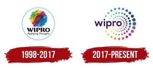
Although the brand was founded in 1945, its first logo dates back to 1998. This is due to a drastic change in the company’s focus. Until the 1980s, Wipro was involved in oil production, but after the 1980s, it started investing in software development, completely changing its focus by 1998. However, the company has chosen to retain its past history in its logos, even though it is no longer relevant to the modern Wipro.
What is Wipro?
An Indian giant that provides consulting and IT services across 175 offices worldwide. The company is ISO and SEI CMM Level 5 certified and serves clients from 50 countries.
1998 – 2017
The first logo was a memorable symbol that told the story of the company’s past. The logo consisted of an image of a sunflower painted in stripes of green, orange, red, purple, and blue. The choice of the flower is related to the sunflower oil produced by Wipro. The rainbow hues symbolize:
- India. The diversity of its population, languages, and religious preferences. The country uses colorful national costumes and jewelry. India is also associated with the festival of Holi when everyone sprinkles themselves with multicolored paints for joy. Therefore, multicolored stripes convey the spirit of the country in which the company was founded.
- Corporate Values. Green symbolizes the desire for growth and development. The red color symbolizes love for your business. Orange symbolizes creativity and warm relationships in the team and with customers. Blue symbolizes technology.
The gradual change of colors also demonstrated the company’s transition from plant-based products (green) to information technology (blue). In the early years, the corporation continued to work in both the new and the old direction. By 2012, all non-technology divisions were spun off into a separate company.
Below the image in stylish black letters was the inscription “Wipro,” followed by the more delicate “Application of Thought.” The company name was formed from the first letters of the name of Western India Palm Refined Oils and reflected the original business of the company. However, it was not changed during the transition to IT. In 1982, the name was simply shortened.
The addition of “application of thought” indicated that the company was working with smart products, embodying customer solutions, and finding the best ways.
2017 – today
In 2017, the company launched Wipro Holmes, an artificial intelligence program that allows customers to automate processes. The acquisition of several US companies led to significant market expansion. Globalization and the transition to modern technology were marked by a change in one of the most famous logos.
The sunflower disappeared in the modern logo, leaving the history of oil production far behind. However, the new logo retains the round shape of the flower and rainbow accents. The name of the company is located in the center of the composition, and from the last letter, diverge concentric circles consisting of multicolored dots.
This technique demonstrates purposefulness. The circles resemble waves spreading on the water, symbolizing the company’s influence on the world. The dots, instead of a natural flower, indicate the prevalence of computer technology. The change of colors still conveys the idea of the development of the wide range of services and technologies that the company provides.
The color palette also reflects the respect for India, the home of the project.
The multitude of dots also symbolizes the impressive number of customers, employees, and countries where Wipro products are available.
Interestingly, instead of capital letters, as in the first logo, the modern logo is written in lowercase letters, emphasizing the company’s role as an intermediary and service provider for customers.
The dot of the letter “i” is seamlessly incorporated into the last circle, demonstrating the thoughtfulness, systematic approach, and precision of calculation that characterizes the giant.
Font and Colors
Wipro’s emblem is bright and colorful. Each shade carries a significant semantic load, forming the overall portrait of the company.
- Orange is the color of warmth and sunshine. It conveys joy, optimism, sociability, and openness. It represents the company as ready for dialog, eager to help, and supporting constructive problem-solving.
- Red is the color of leadership, innovation, and love for one’s work. Wipro is well-known in the global market and has a strong position. Every product of the company is created with love for the customers, making them comfortable and bringing maximum benefits.
- Blue color – is associated with logic, engineering, and technology. It characterizes the corporation as a developer, skillfully managing affairs.
- Purple is a creative color. It indicates inspiration, inventions, and new products.
- Green symbolizes growth, prosperity, strength, and youth. Despite its almost 100-year history, the company is full of plans and energy.
The font of the inscription – Antapani Bold – is characterized by simple and strict letters that convey authority and a serious approach to work.
Wipro color codes
| Russian Violet | Hex color: | #341a55 |
|---|---|---|
| RGB: | 52 26 85 | |
| CMYK: | 39 69 0 67 | |
| Pantone: | PMS 2627 C |


