MTN’s logo is airy and sophisticated, showing the transmission of information through the air and clear lines of communication to reach every subscriber. The emblem is minimalist, hinting at purity of sound, simplicity, and accessibility.
MTN: Brand overview
MTN is Africa’s largest mobile operator and provider of digital services to businesses and individuals, with total revenues of $37.5 billion. Its services are used by 289 million customers in Africa and the Middle East, with a presence in 20 countries.
Meaning and History
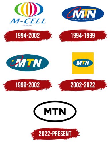
The brand’s logo has changed several times over the course of its existence. Mostly, rebranding is related to the acquisition of the operator by new owners, changing the name of the brand, and the scope of its activities. The unchanged oval symbol reflects the company’s commitment to flawless and high-quality performance of its functions, ensuring full presence in the market and wide coverage of users. The transition from a bright color scheme to a monochrome one indicates the growth and expansion of the market, as well as the desire to present the company as reliable, stylish, and restrained.
What is MTN?
MTN is the eighth largest mobile operator, internet service provider, and electronic payment provider in the world. Its customers have access to HSUPA, 4G, 5G, LTE, and IP telephony services. It covers 88% of the population in its markets. The company is headquartered in South Africa.
1994 – 2002
The first logo was an oval with multicolored stripes inside and the inscription M-Cell. The drawing symbolizes:
- The diversity and vibrancy of African cultures, especially the founding country. In South Africa, members of different ethnic groups such as blacks, whites, mixed race, Asians, and Indians make up more than 20 nationalities.
- The flag of South Africa uses white, green, red, blue, and black colors. Each color on the flag, as in the company logo, represents one of the population groups. Red represents English speakers, yellow represents Indians, blue represents Boers, and green represents mixed groups. The white stripes between the colors in the logo symbolize the unification of each nationality through mobile communication.
- Rainbow. The sequence of colors resembles the stripes of a rainbow, which carries a similar meaning to the previous points. In addition, it indicates the joy and positive emotions of using M-Cell services.
The colorful composition demonstrates customer orientation. The encapsulation of the stripes in an oval speaks of the desire to cover all residents of the country with services, symbolizing equality and work for every African, regardless of their nationality.
M-Cell is the first name of the corporation. “Mobile Cell” is a prototype of a living organism that would multiply and spread, taking over the market.
1994 – 1999
1999 – 2002
2002 – 2022
2022 – today
The modern logo, while retaining the general image, has significantly changed its content. The symbol has become transparent and consists only of black lines and letters. The name of the corporation, consisting of three large capital letters, is inscribed in an oval.
In 2002, MTN Group acquired M-Cell, changing the operator’s name to MTN South Africa. The modern acronym stands for Mobile Telephone Networks.
The black lines hint at the service area – primarily users of the Negroid race. MTN intends to increase its presence in this region in the coming years. The airiness of the symbol speaks of accessibility for the majority of residents and illustrates the idea of reducing environmental impact. By 2040, the company aims to be 100% eco-friendly.
The oval serves as a representation of the Earth, demonstrating Africa’s connection to the rest of the world. One of the company’s global goals is to integrate the African community into the global communication system, ensuring access to Internet information resources for all residents and equality. The logo reflects these aspirations.
The abbreviation MTN occupies the center of the composition, as the company sees itself as the realizer of these opportunities.
The closed figure symbolizes the full range of services. The composition also resembles a satellite dish, as the main data transmission protocol is based on satellite communication. The black lines represent the cables and fiber-optic lines that cover the entire region and create an extensive network. They also hint at antennas and cell towers.
Font and Colors
The main color of the emblem is black. It symbolizes the dark-skinned population associated with the African continent. This color emphasizes globality, stability, and advantage over competitors.
The white space between the symbols represents air. Mobile data is transmitted through the air and is invisible to the naked eye. In the logo, this is represented in the form of huge distances.
The font of the name is Novecento Sans Wide Bold with elegant clear contours of the letters, hinting at the purity of sound and the speed of data transmission.
MTN color codes
| Black | Hex color: | #000000 |
|---|---|---|
| RGB: | 0 0 0 | |
| CMYK: | 0 0 0 100 | |
| Pantone: | PMS Process Black C |

