BC Hydro: Brand overview
Created in 1961 through the merger of the British Columbia Electric Company and BC Power Commission, BC Hydro revolutionized the electricity generation and distribution system, providing more reliable and efficient energy to the people of British Columbia.
BC Hydro has worked to increase electricity generation in British Columbia, primarily by developing hydroelectric projects that take advantage of the region’s abundant water resources. Projects such as the W.A.C. Bennett Dam, the Revelstoke Dam, and the Site C Clean Energy Project have significantly increased clean energy production in the province, meeting the growing needs of consumers and industry.
BC Hydro prioritizes sustainability and takes proactive steps to reduce its environmental impact. Through initiatives such as the Power Smart program and the use of renewable energy sources such as wind, solar, and biomass, BC Hydro is reducing greenhouse gas emissions and contributing to a clean energy future.
As a provincial corporation, BC Hydro works under the oversight of the British Columbia Utilities Commission to ensure fair rates and services for the benefit of consumers. The Corporation works closely with the BC Ministry of Energy, Mines, and Low Carbon Innovation, complying with strategic recommendations and policy directions to remain at the forefront of innovation in the energy sector.
Meaning and History
1961 – 1997
1997 – 2001
2001 – 2016
2016 – today
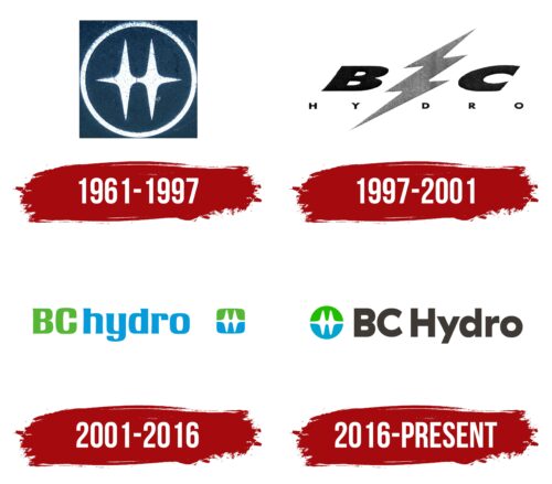
The Canadian Electricity Company is keeping up with the times, so it knows what consumers need. Its logo, which features a symbol that looks like a “heartbeat,” is a clear indication of that. It consists of two pulses, the tops of which resemble the letter “H” – the first letter in the word Hydro. They are connected by a horizontal band that stretches from one edge of the blue-green circle to the other. To the right is the company name. It is formal, dark gray, and large, consisting of uppercase and lowercase letters. This style evokes a sense of trust and speaks about the reliability of the provider.
The heart-shaped shape gives the feeling that the company is alive, almost like a living creature that understands what is going on. The blue-green circle is reminiscent of the Earth, making you think that the company cares about the planet. The official name on the side is reminiscent of an adult making sure everything is in order.
BC Hydro color codes
| Kelly Green | Hex color: | #20bc00 |
|---|---|---|
| RGB: | 32 188 0 | |
| CMYK: | 83 0 100 26 | |
| Pantone: | PMS 354 C |
| Bright Cerulean | Hex color: | #00a7d1 |
|---|---|---|
| RGB: | 0 167 209 | |
| CMYK: | 100 20 018 | |
| Pantone: | PMS 312 C |
| Black Pepper | Hex color: | #3e3934 |
|---|---|---|
| RGB: | 62 57 52 | |
| CMYK: | 0 8 16 76 | |
| Pantone: | PMS Black 7 C |


