


![]() Chennai Super Kings Logo PNG
Chennai Super Kings Logo PNG
The Chennai Super Kings logo conveys the team’s athletic character. Formal design symbolizes determination, team spirit, and success in the Indian Premier League.
The Chennai Super Kings were formed in January 2008 as one of the eight original teams in the Indian Premier League, owned by India Cements, and play at the M. A. Chidambaram Stadium (“Chepauk”) in Chennai. The roaring lion logo and name were chosen through a public contest.
The Super Kings reached the IPL finals in their inaugural season (2008) and won their first championship in 2010 against the Mumbai Indians. They defended the title in 2011. After a two-year suspension, the team returned in 2018 and won again. They claimed their fourth title in 2021 and fifth in 2023, beating the Gujarat Titans.
Captain MS Dhoni symbolized the team for years, leading the Super Kings to ten IPL finals. Ruturaj Gaikwad took over the captaincy in 2024. The Super Kings remain one of India’s most popular teams, having won the IPL five times.
Meaning and History
![]()
What is Chennai Super Kings?
It is a cricket team from Chennai competing in the Indian Premier League (IPL). The club is one of the most successful in league history, having won multiple championships. Longtime captain Mahendra Singh Dhoni is among India’s greatest cricketers. The team enjoys immense regional popularity and plays home matches at M. A. Chidambaram Stadium.
2008 – 2015, 2018 – today
![]()
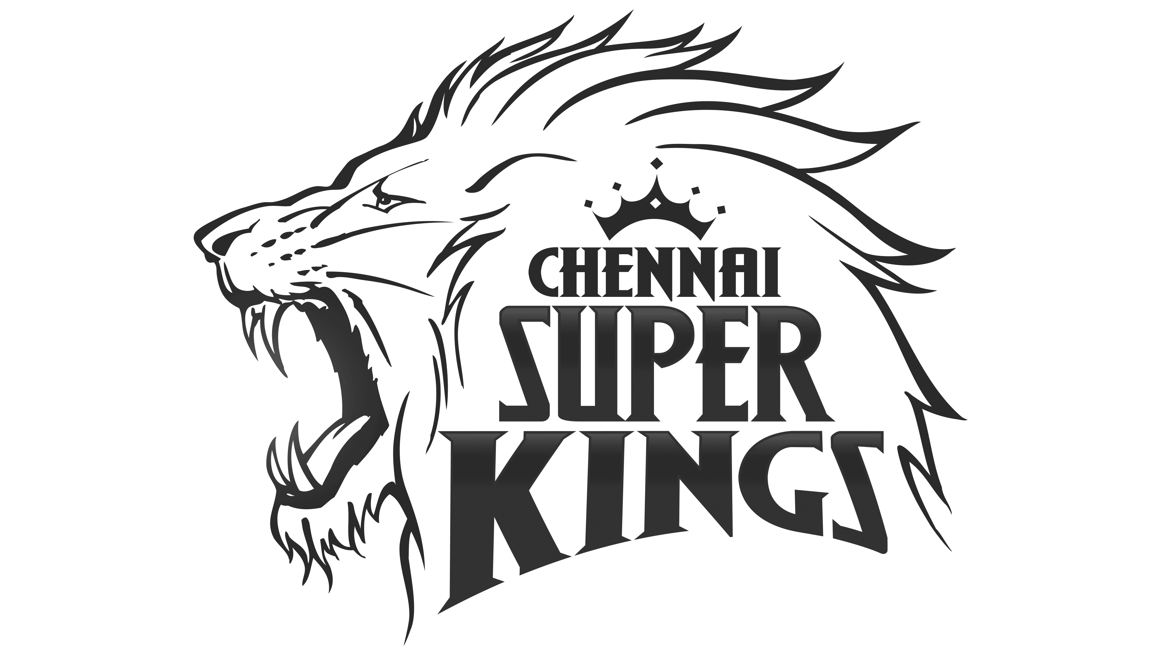
The Chennai Super Kings logo, designed in 2008 by Landor Associates for India Cements, is a vivid example of visual identity where symbolism, typography, and expressive color choices are seamlessly combined.
The lion’s profile is drawn with a thin outline, featuring an aggressive expression: the mouth is wide open, its sharp fangs clearly defined, and the mane flows downward in smooth yet pointed strokes, emphasizing the image’s dynamism and strength. Rendered in an orange gradient that transitions from rich amber to ochre-red, the graphic conveys the club’s energy, confidence, and determination. The lion symbolizes a “royal dynasty,” harmoniously tied to Chennai’s historical and cultural heritage.
The three-tier typographic composition occupies the central right side of the emblem. The words “CHENNAI SUPER KINGS” are set in a specially adapted serif font with sharp serifs, thickened vertical strokes, and geometric proportions. The typeface visually resembles commercial fonts such as Harmoniquetrade, Counte, or Wolf’s Bane. Still, it has been individually refined to ensure uniqueness and recognizability. The top tier (“CHENNAI”) is smaller, and the middle tier (“SUPER”) is the largest. It features a vivid gradient transition, with the bottom (“KINGS”) being slightly larger than the top, which balances the overall block and emphasizes the club’s name.
Rich blue gradient shades, ranging from light blue to indigo, convey professionalism, authority, and stability. Above the text is a minimalist crown graphic symbolizing the team’s leadership and status in the Indian Premier League (IPL).
The color and typographic design work in harmony with the team’s overall visual identity, particularly the bright yellow jerseys decorated with a lion print and camouflage elements, creating a cohesive and convincing brand language.
Despite a two-year absence from competition (2016–2017), the emblem has retained its relevance, continuing to project a stable, powerful identity and to stand as one of the most recognizable sports symbols in the IPL.
Font and Colors
The Chennai Super Kings’ typographic style is an individually developed decorative serif typeface with geometric proportions. All letters are uppercase, each with distinctive dynamism thanks to sharp serifs and lines that taper toward the top. Vertical strokes are thickened, creating a strong silhouette for the text. While visually similar to commercial fonts like Harmoniquetrade or Counte, the contours and curves have been deeply refined, giving the typeface a unique and recognizable character.
The club’s color palette is based on the contrast of two primary colors, orange and blue, both presented in gradient form. The orange gradient shifts from bright yellow around the lion’s mouth to a warmer, richer amber, emphasizing the emotional aspects of the design associated with energy, determination, and the team’s aggressive nature. Meanwhile, the text portion of the logo is in a deep blue gradient, transitioning smoothly from light blue at the top of the letters to dark navy at the bottom, visually conveying stability, professionalism, and the club’s authority.