


![]() Walla Walla Sweets Logo PNG
Walla Walla Sweets Logo PNG
The Walla Walla Sweets logo reflects the spirit of sports and local traditions, combining a passion for baseball with pride in the region. The team’s name is tied to the renowned onion, and its creation was the initiative of enthusiasts and local businesses to give the city a place for gathering, joy, and unity, where games turn into celebrations.
The Walla Walla Sweets were founded in 2010 as part of the West Coast Summer League by collaborating with local businesses and baseball enthusiasts. The team was named after the famous Walla Walla Sweet onion, a regional symbol. Originally owned by Pacific Baseball Ventures, which also managed the Yakima Valley Pippins, the team quickly became a local favorite.
The franchise had a strong debut season in 2010, earning immediate support from the community. Their home games were played at the historic Borleske Stadium, which opened in 1926. The stadium underwent renovations and upgrades to enhance the experience for players and fans attending games.
In 2011, efforts focused on recruiting talented collegiate athletes nationwide, further solidifying the team’s reputation within the league. Community engagement became a priority, with fan events and participation in local activities fostering a strong connection with Walla Walla residents.
In 2012, the team made its first league playoff appearance, a major milestone that sparked increased interest from fans and sponsors alike. That same year, a youth development program was launched, providing opportunities for local players to showcase their skills and potentially join the roster.
From 2013 to 2014, significant infrastructure improvements were made. Training facilities were upgraded, and Borleske Stadium was expanded to host more fan-focused pre- and post-game events. During this period, several attendance records were set at home games.
In 2015, the franchise celebrated its fifth anniversary. By this point, it had established itself as one of the league’s most consistent and promising organizations. A robust scouting system attracted talented players from across the nation.
Between 2016 and 2017, marketing strategies were enhanced. Improvements included upgrading the ticketing system, introducing new fan engagement activities, and expanding the selection of team merchandise. These efforts boosted visibility and strengthened their supporters’ loyalty.
In 2018, modernized training methods were implemented to improve player development. This initiative elevated the overall quality of on-field performance, yielding noticeable results.
After a successful regular season, the team returned to the playoffs in 2019, breaking a record for average home-game attendance that same year. This milestone reflected the growing popularity of the games.
In 2021 and 2022, the focus shifted toward expanding youth programs and community outreach. Enhanced fan experiences and a welcoming atmosphere at Borleske Stadium became central goals.
By 2023, the organization had become a cornerstone of the West Coast Summer League, continuing its tradition of nurturing young talent and delivering quality baseball entertainment. Over the years, it has developed a strong bond with the local community, symbolizing Walla Walla’s athletic and cultural spirit.
Meaning and History
![]()
What is Walla Walla Sweets Baseball?
The baseball team plays at the historic Borleske Stadium in Washington State. The stadium brings together talented student-athletes and a friendly, family-friendly atmosphere. The team hosts a variety of shows featuring its mascot, contests, fireworks, and themed events, making every game a vibrant experience. Inspired by the region’s agricultural heritage and known for its onion theme, the brand highlights a connection to local culture and traditions. The team helps young players develop their athletic potential while supporting their journey toward a professional career.
2010 – today
![]()
The Walla Walla Sweets baseball team logo combines energy, vibrancy, and regional identity.
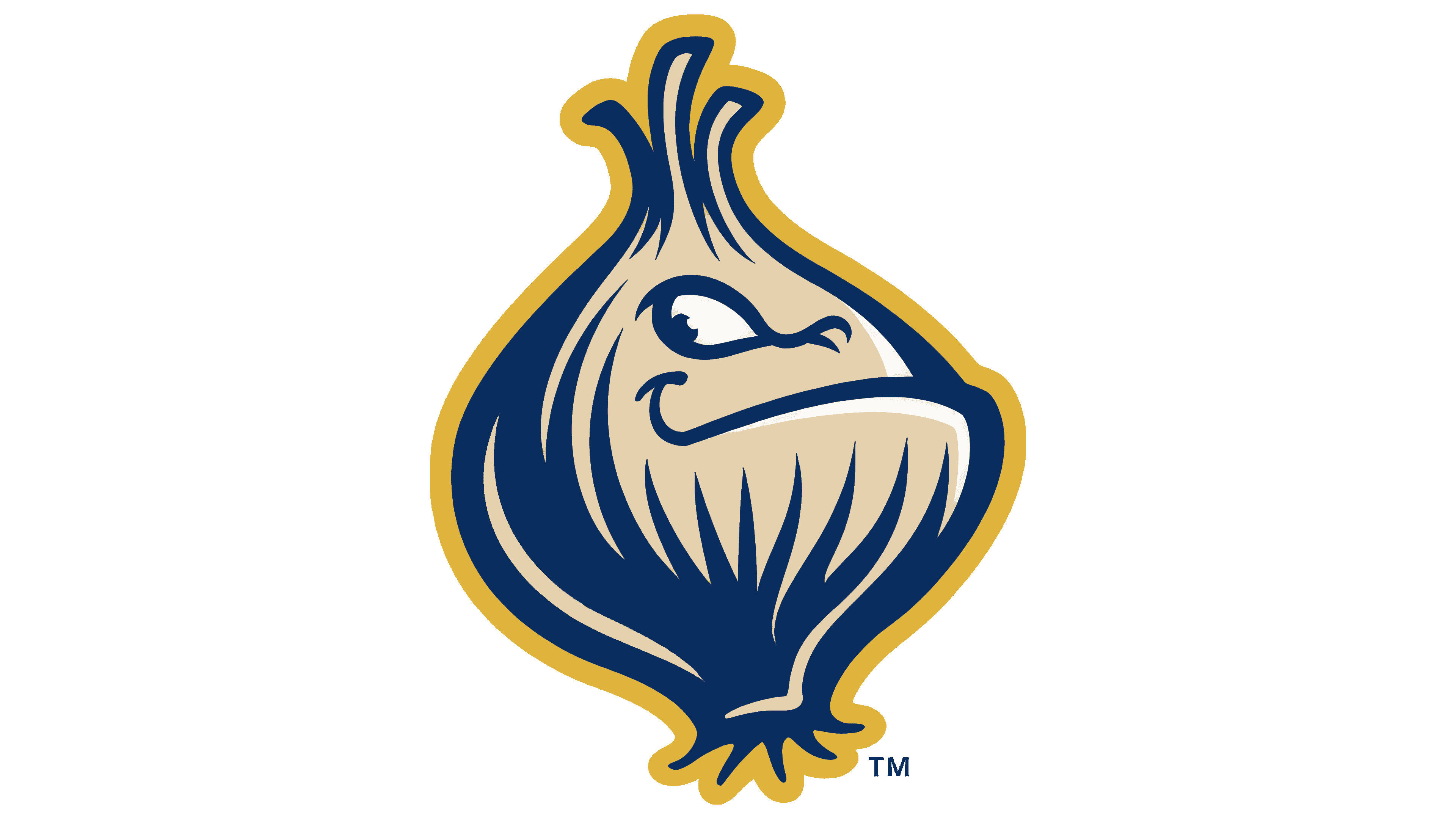
The central symbol is a funny character, the “Walla Walla Sweet Onion,” a variety long regarded as a regional symbol. Bow has a confident, even slightly cocky expression on his face: smiling broadly, he squints, giving the impression of an athlete determined to win. He has a baseball bat over his shoulder. The detailed image of the bulb, conveying its natural structure, links the design to the region’s rich cultural heritage.
The words “Walla Walla” are on a red ribbon running through the composition. The font is capitalized, white, and simple. The word “Sweets,” on the other hand, is more decorative: a large, curved font with swirls adds dynamics. The white letters stand out against the background, and the red outline and dark blue shadow stroke create a three-dimensional effect.
The logo’s color palette is rich and harmonious. Four basic colors are used: gold, dark blue, red, and white. The golden hue is applied to the contours and details, symbolizing the region’s commitment to quality and uniqueness. Dark blue adds depth, forming the basis of contrast. Red lends the composition energy and emotionality, while white enhances text readability and creates balance.
The multi-layered structure with a character, text symbols, and decorative details creates a sense of integrity. A ribbon with the team’s name passes before the character, combining all fragments into one visual space. Undulating lines and strokes add volume and the illusion of movement, creating a sense of energy and speed characteristic of baseball.
The logo style can be described as cartoonish with retro design components. It is friendly and appealing to a family audience. It reflects the team’s sporting character and conveys the festive atmosphere felt by the fans at the Borleske stadium.
![]()