


![]() Toronto Blue Jays Logo PNG
Toronto Blue Jays Logo PNG
The Toronto Blue Jays logo is committed to the region’s history and idiosyncrasies. The color palette, elements of state symbolism, and the mascot on the emblem reflect national identity, valuing origin and showing respect for their roots.
The Toronto Blue Jays are a professional baseball team playing in the Eastern Division of the American League of Major League Baseball. Their hometown is Toronto, Ontario. The club plays matches at the Rogers Centre on the northern shore of Lake Ontario. The team was named after the blue jay, a passerine bird native to North America and Canada. Historically, blue has been a traditional color of various Toronto sports teams.
The Toronto Blue Jays emerged in 1977 as an expansion franchise in Major League Baseball. They became the second MLB club located outside the United States.
In the late 1970s and early 1980s, the Toronto Blue Jays faced the hurdles expected of an expansion team, usually finishing last in their division. 1983 marked their first winning season. Two years later, in 1985, they became the champions of the Eastern Division. From 1985 to 1993, the Toronto Blue Jays were a powerful force in the American League’s Eastern Division. Over nine seasons, they won five division championships. In 1992 and 1993, the team became the World Series champions, defeating the Atlanta Braves and Philadelphia Phillies.
The Toronto Blue Jays are the first (and, to date, the only) franchise outside the United States to have won the World Series. Unfortunately, after 1993, the team did not make the playoffs for 21 consecutive seasons until 2015, when they achieved a playoff spot, ending the longest drought in baseball history. In 2016, the club finished second in the playoffs but lost to the Cleveland Indians in the AL Championship Series. Over two years, the Toronto Blue Jays won the AL Division Series but lost the AL Championship Series.
The team initially played at Exhibition Stadium, but in 1989, it began hosting its matches in SkyDome (the original name of Rogers Center). Since 2000, the Blue Jays have had new owners: the Canadian communications company Rogers Communications. In 2004, the company acquired SkyDome and renamed it the Rogers Center.
The official color palette of the Toronto Blue Jays uniform includes royal blue, dark blue, red, and white. The team enjoys immense popularity in Canada and the USA and is warmly welcomed at home and away matches.
Meaning and History
![]()
The history of this team’s logos began with the blue jay, proposed by the Toronto company Savage Sloan Ltd. Over the club’s history, the jay has undergone several transformations. Still, it has always been present in the corporate logo. Realistic, fragmentary, and anthropomorphic, its image is captured only in part by the six original emblems.
What is Toronto Blue Jays?
The Toronto Blue Jays are a Major League Baseball team that joined the American League East in 1977 when they played their first game. Currently, it is the only league participant belonging to a city outside the USA. It appeared in Canada because Toronto was very eager to secure an MLB franchise and even tried to lure the San Francisco Giants to the city.
1977 – 1996
![]()
During this period, the Toronto Blue Jays were the only Canadian team in Major League Baseball. They appeared as part of MLB’s expansion in 1977. Savage Sloan Ltd designed the first Toronto Blue Jays emblem. It was classic in every way, with iconic inscriptions and images. The logo featured a baseball with red stitching, a red maple leaf sprouting from it, and a stylized blue jay head on top. Including the red maple leaf in the emblem was a crucial design element to ensure the Blue Jays’ status as “the Canadian team.” Around the baseball was the wordmark “Toronto Blue Jays” in blue lettering.
1997 – 2002
![]()
A modified logo was introduced in 1997, twenty years after the team entered MLB. It featured a blue jay on a white baseball with red seams. The emphasis was on the red maple leaf as a background. The jay was given texture, and a new dark blue font with the inscription “Blue Jays” was used as the word mark.
2003
![]()
In 2003, the team added another logo. It featured an animated version of the team’s mascot, Ace, wrapping a poorly stylized letter “T” and holding a white baseball with red seams and a yellow bat. The red letter “T” obviously stood for “Toronto.” The blue jay’s maple leaf tattoo on the left bicep seems like a matter of course.
2004 – 2011
![]()
This was the period of Angry Birds. In 2004, Brandid, another Toronto company, developed a new Toronto Blue Jays logo. It featured a three-dimensional but angry Blue Jay positioned to the left of “Jays.” This design completely abandoned the maple leaf and red color. A metallic scheme of blue, gray, and white was balanced. The word “Blue” was also removed from the team’s name.
2012 – 2019
![]()
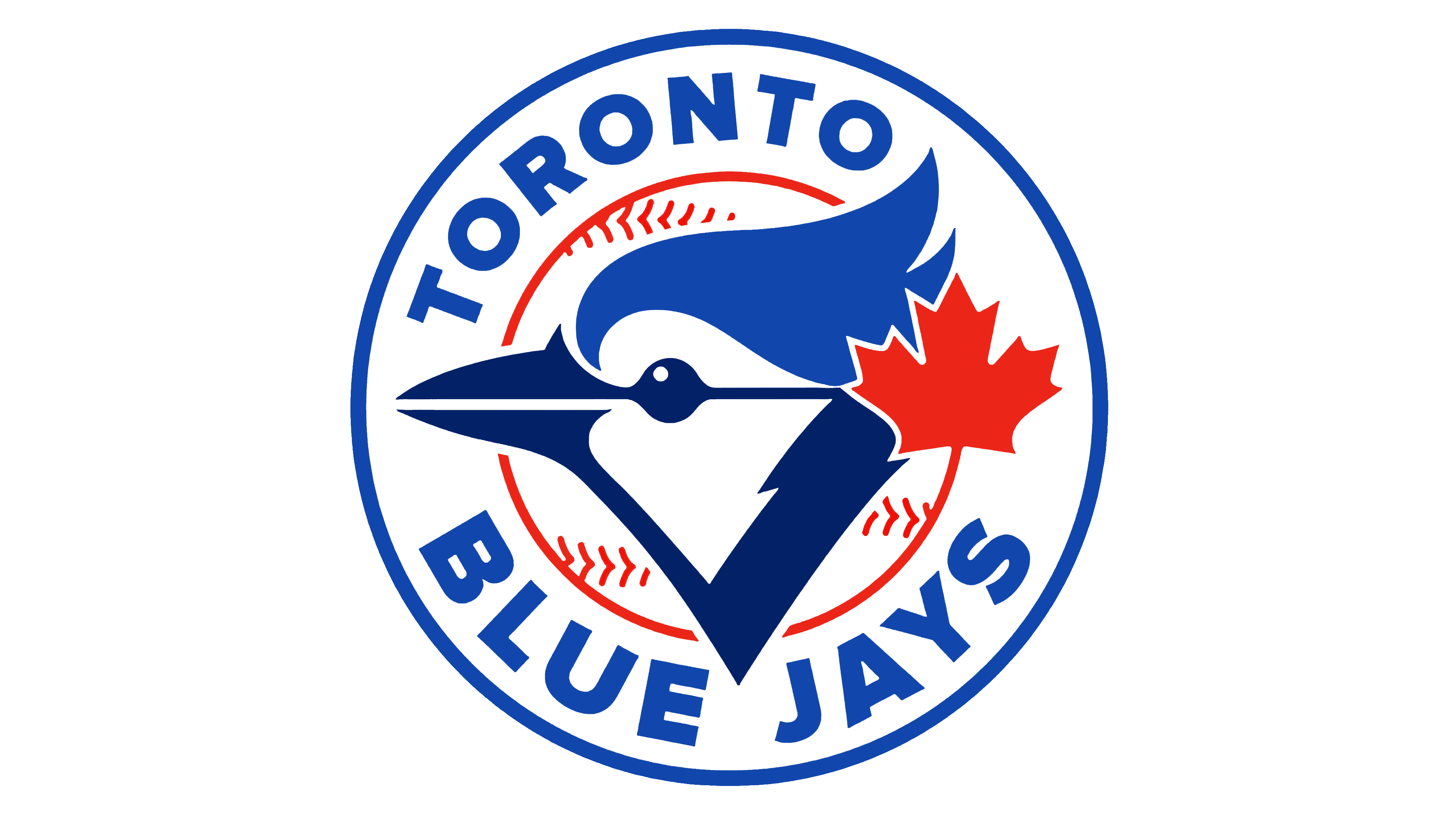
Returning to a simplified design and capitalizing on nostalgia for the team’s glory years, add a new modern emblem to the Toronto Blue Jays. The current Toronto Blue Jays logo was developed with assistance from the MLB design service, headed by Vice President of Design Anne Occi. Like the original 1977 logo, it features blue and dark blue Blue Jays heads with a red maple leaf on the right on a baseball, a split-team name font, and a blue double contour. The “jays” have more distinct features, and the red leaf no longer protrudes from the baseball’s red line. The words “Toronto” and “Blue Jays” are solid dark blue and are arranged in a semicircle on the inner white circle. This design signals to fans and the league that the Blue Jays are focused on winning in the long game.
2019 – today
![]()
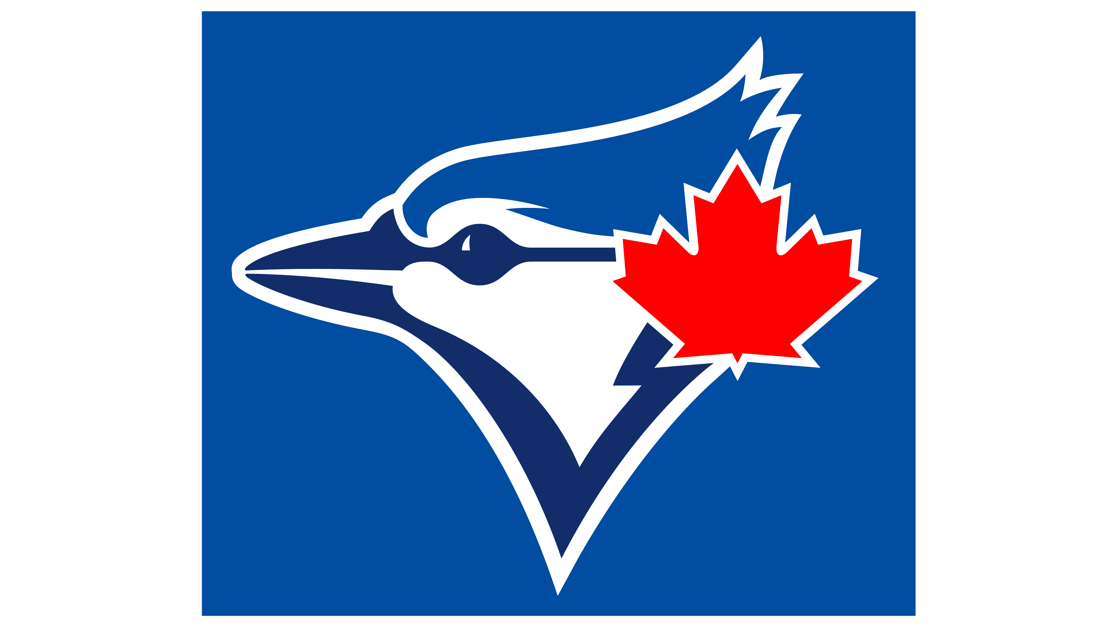
Today, the franchise uses a version introduced at the beginning of its sports career and reworked in 2012. In the previous version, developed by the MLB Design Services Department under the leadership of Anna Occi, only the blue jay with the maple leaf, which had previously been located at the center of the rondel, remained.
The current logo shows the bird’s head turned to the left. One horizontal line connects the upper part of the beak to the eyes. The lower half of the beak harmoniously blends into the contour outlines, forming a neck. The blue jay has a raised crest and a strict red maple leaf next to it.
Font and Colors
Almost all emblems supplement the bird with a ball, reflecting the club’s sports orientation and connection with baseball. The only exceptions are the modern version and 2004-2011, where there is a blue jay but no ball. The same can be said of the maple leaf, which is missing from only one logo. In the other five cases, it appears as a background on the hand of an anthropomorphic character or on the character’s head.
Having changed several options, the team’s management recognized that the debut emblem was the most successful. They returned to it from 2012 to 2019 and later developed a minimalist version. The most sensational logo dates to 2003, featuring an anthropomorphic blue jay with a bat peeking out from behind a huge letter “T.”
The Toronto Blue Jays’ branding uses a font similar to ITC Elan Bold, a glyphic serif font proposed by Albert Boton. Despite the difference in proportions of some characters, the similarity is traced in the design of the serifs. In other years, the font was double, chopped, and italic.
The baseball club’s official palette is stable, so all versions contain two shades of blue (Royal and Navy), white, and red. Yellow also appeared in 2003.
FAQ
Who developed the original Blue Jays logo?
The first Blue Jays logo was developed by the graphic studio Savage Sloan, Ltd., but Richard Walker, an employee of the Labatt Brewing Company, had all the ideas. He insisted that the symbol be round, feature a maple leaf, and use a red, white, and blue color palette. Artist Paco Belsue helped him develop the concept. Don McDougall and Dave Savage also contributed to the development of the logo.
When did the Blue Jays change their logo?
The Blue Jays received a new logo in 2020. Before that, it had changed its graphic symbol several times: in 1997, 2003, 2004, and 2012. Most versions were similar, as they contained the head of a blue jay, a maple leaf, a baseball, and the team name.
Did the Toronto Blue Jays change their logo?
Yes, the Toronto Blue Jays franchise recently updated its visual style. In 2020, the main and alternate logos were swapped, and the team now uses a minimalist Jay head and a maple leaf icon.
Who owns the Toronto Blue Jays?
The sports team was originally owned by Labatt Brewing Company (45%), a Belgian brewing company. Since 2000, Rogers Communications Inc., a Canadian media company, has owned the Toronto Blue Jays.