The Boston Red Sox club stands out among the well-known baseball teams’ glorious history and long-standing traditions. It is notable for its recognizable emblem and popularity. The Boston Red Sox logo is original and provocative—knitted red socks reflect the team’s name and legend.
Boston Red Sox: Brand overview
When the team was originally formed as the Boston Americans in 1901, the Boston Red Sox’s history officially began. They were one of the American League’s original eight charter teams. Their home stadium was Huntington Avenue Grounds. The team got off to a bright start, finishing second in the league in its inaugural season.
The Boston Americans defeated the Pittsburgh Pirates in eight games to win the inaugural World Series in 1903 (the series was eventually played to five victories). This momentous accomplishment made Boston the center of baseball in the US. The franchise formally changed to the Boston Red Sox in 1908. Owner John I. Taylor gave the squad the “Red Sox” moniker of the team’s red uniform element.
The club relocated to a new stadium, Fenway Park, in 1912 and is still based there today. The squad defeated the New York Giants in the World Series that same year. The team ruled the American League from 1914 until 1919, winning the World Series in 1915, 1916, and 1918. Babe Ruth, a pitcher and batter who established multiple league records, was a significant player.
Babe Ruth was sold by team owner Harry Frazee to the New York Yankees in 1920. This deal, frequently called the most notorious in baseball history, began the so-called “Curse of the Bambino,” 86 years without a World Series victory for the team.
From the 1930s to the 1950s, the team failed to win the World Series despite having players like Ted Williams, who is regarded as one of the all-time great hitters. In 1946 and 1967, the team made it to the championship game, but the St. Louis Cardinals defeated them both.
After a string of disappointing seasons, the club unexpectedly won the American League championship in 1967—a season that came to be known as the “Impossible Dream.” Boston’s passion for baseball was revived this season despite the team’s World Series defeat.
In 1975, the team and Cincinnati Reds engaged in one of history’s most thrilling World Series. Carlton Fisk’s home run helped the team win the sixth game, which will always be remembered. However, the Reds won the seventh game.
The team went through another thrilling World Series in 1986. The club failed to win the championship by one run in the sixth and seventh games against the New York Mets.
The “Curse of the Bambino” was ultimately broken in 2004 when the club won the World Series for the first time in 86 years. After trailing the New York Yankees 0-3 in the American League Championship Series, the team pulled off a remarkable comeback, winning the World Series against the St. Louis Cardinals.
The club added two more World Series victories in 2007 and 2013, cementing their place among the most prosperous teams in contemporary baseball.
The team won 108 games during the regular season of 2018, setting a new team record. Its postseason success continued as it defeated the Los Angeles Dodgers to win its ninth World Series.
In 2021, the team made it to the American League Championship Series, where the Houston Astros defeated it despite having low expectations going into the season.
Boston’s Fenway Park has been the team’s home stadium since 1912. It is the oldest stadium home to MLB players and can hold 40,000 or more fans. The eleven-meter-tall wall in left field, known as the “Green Monster,” has made Fenway Park incredibly well-known. The team is currently building a new training facility. The government has announced the name Jet Blue Park. The “Green Monster” and other Fenway Park architectural and technology elements will be included in the new stadium.
Stephen King, a well-known horror author, greatly admires the series. He frequently attends the team’s home and away games and references them in his writings. Written in 2004, “Faithful” is a history of the club’s greatest sports comeback and their first championship in eighty-six years. “Sweet Caroline” by Neil Diamond is the team’s anthem.
Meaning and History
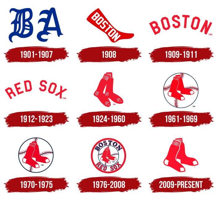
Evolution of the Boston Red Sox LogoThis emblem is widely discussed, and the team is considered legendary despite several unsuccessful seasons. Although the attribute depicted on the logo can hardly be called baseball-related, it still conveys the eccentricity of the club that delights fans with beautiful play. The first single iconic sock appeared on official symbols in 1908, and a paired version was approved in 1924. Since then, socks have remained an unchanged attribute, having changed only twice. And that’s not too much, considering that the franchise has had nine versions of individual styles.
What is Boston Red Sox?
The Boston Red Sox is a professional baseball club based in Boston, Massachusetts. Founded in 1901, the team is part of the MLB and plays in the American League’s Eastern Division. The athletes are among the top three teams in Major League Baseball and have become World Series champions nine times. Their home stadium is Fenway Park.
1901 – 1907
The “Boston Americans” emblem was created in 1901 when the team was just beginning its journey in baseball. This was when baseball was actively developing and becoming a popular sport in the United States. The logo’s simple and refined design reflected the spirit of the time and suited the new yet uncomplicated standards of sports graphics.
The “Boston Americans” team logo featured an image of two letters, “B” and “A,” rendered in Old English style and colored blue. This simple and concise design lasted for six years.
The logo symbolizes the team’s initial phase of existence. Using Old English font emphasizes respect for baseball’s traditions and historical roots. The letters “B” and “A” represent the abbreviation of the team’s name, “Boston Americans.”
The emblem demonstrates affiliation with the city of Boston and highlights the club’s American origin. The design’s simplicity and restraint reflect the early development stage of baseball teams’ development and their logos.
The logo is executed in an Old English font, giving the letters “B” and “A” a classic and majestic look. This font is often associated with tradition and history, making it an ideal choice for a team striving to emphasize its heritage.
Blue symbolizes trust, loyalty, and stability. It is also associated with the American flag, underscoring the team’s patriotic spirit and commitment to national values.
1908
The logo was introduced in 1908 when the team began its history in professional baseball. At this time, the team sought a way to stand out and create a recognizable brand. The “Boston Red Sox” logo features an image of a red sock with the word “Boston” in white font. This design was the first to feature a red sock, symbolizing the team’s name. Introducing the red sock as the central element of the logo was an important step in forming the team’s unique identity. This logo reflected the team’s aspiration for recognition and success and its close connection to the city of Boston.
The red sock is the central element of the logo and symbolizes the team’s name, “Red Sox.” Using the sock as a symbol emphasizes the team’s uniqueness and memorability. The inscription “Boston” indicates the city, presenting the club as a pride and symbol of the city’s sporting achievements.
The emblem symbolizes a new era for the “Boston Red Sox,” emphasizing their individuality and connection to the city of Boston. The red sock has become an icon of the team, highlighting its name and identity in baseball. The white inscription “Boston” stands out against the bright red background, symbolizing purity and dedication.
The font used for the word “Boston” is simple yet expressive, making it easy to read and remember. The white font contrasts the sock’s red background, making the inscription noticeable and clear. The logo’s style is minimalist but effective in conveying the primary message.
The logo’s main colors are red and white. Red symbolizes passion and strength and is associated with the “Red Sox” team. The white color of the inscription symbolizes purity, honesty, and dedication, highlighting the importance of these qualities for the team and its fans.
1909 – 1911
The new emblem features the red inscription “BOSTON,” written in capital letters. The font has distinctive angular and blocky shapes, giving it a masculine and determined look. The letters are arranged in an arc, creating a sense of movement and energy.
The red inscription symbolizes the team’s passion, energy, and fighting spirit. It also references the historical red socks (Red Sox) that became the team’s hallmark and gave it its name. Choosing a simple logo design without unnecessary elements emphasizes tradition and a return to basics.
Historically, this period for the team was a time of returning to its roots and foundations. After briefly using images of red socks, the team reverted to a more concise and straightforward logo with the inscription “BOSTON.” This decision reflected a desire to highlight city pride and sporting achievements.
1912 – 1923
The logo changed the inscription from “Boston” to “Red Sox,” further strengthening the team’s identity and its connection to the red socks symbolism. This change emphasized the team’s uniqueness and recognizability, among other things. Despite the changes, the logo’s style remained familiar and retained its connection to previous versions.
The new logo features the inscription “RED SOX,” written in bright red capital letters. The font has distinctive angular and blocky shapes, giving it a strong and imposing look. The letters are arranged in an arc, creating a sense of dynamism and movement.
1924 – 1960
The logo depicted in the image features a pair of hanging red socks. This symbol has become one of the most recognizable and enduring logos in the team’s history. The red socks are designed in a simple and minimalist style, with white stripes at the top and bottom, adding texture and realism. The hanging socks create an image of calmness and confidence, emphasizing that the team is always ready for new challenges and victories. This logo has become a symbol of continuity and stability, reflecting the team’s spirit and ambitions.
1961 – 1969
1961, the “hanging socks” were updated and placed inside a large white baseball. The baseball itself was bordered with two red lines and dark blue stitches. The socks looked neater and more realistic, with white toes and heels.
1970 – 1975
The next logo had minor color changes and depicted baseball and red stitches. The red socks remained the main logo of the Boston Red Sox.
1976 – 2008
The logo was introduced in 1976 and used for 32 years, becoming one of the team’s longest-lasting symbols. This period was marked by significant events in the team’s history, including long-awaited victories and lifting the “Curse of the Bambino.” The logo reflects an era of modernization and success for the team, symbolizing its revival and triumphs.
The “Boston Red Sox” logo used during these years features a red and white circle with an image of a baseball and a pair of red socks in the center. At the top of the circle is the city’s name, “Boston,” in blue font, and at the bottom is “Red Sox” in red with a blue outline.
The logo’s red socks symbolize the team’s name, “Red Sox,” and are the central element of the design. The baseball in the logo’s center emphasizes the club’s sporting focus and dedication to baseball. The logo’s round format symbolizes the team’s unity and integrity.
The emblem conveys the idea of a strong connection between the team and the city of Boston and its history. Using the baseball and red socks highlights the team’s main symbols. The logo also symbolizes the team’s victories and achievements during its use, including the lifting of the infamous “Curse of the Bambino.”
The “Boston” and “Red Sox” fonts are classic and easily readable. The blue color of the “Boston” font harmonizes with the red “Red Sox,” creating a visually appealing contrast. The emblem’s style combines tradition and modernity, making it recognizable and significant for fans.
The red color symbolizes energy. The white color symbolizes purity and honesty, emphasizing the importance of these qualities for the team. Blue adds stability and confidence, making the logo balanced and harmonious.
2009 – today
In 2009, the logo was updated to the current version. During this period, the team achieved high recognition and success in baseball, allowing them to eliminate complex elements and retain only the main symbol – a pair of red socks. This change reflects the team’s confidence in its brand and its significance to fans. The logo used since 2009 is characterized by extreme minimalism. The modern version of the logo features a pair of standing red socks. All other details have been removed: there are no inscriptions, lines, circles, baseballs, scrolls, or other elements that were previously present.
The red socks are the team’s central element and symbol. Their use emphasizes the historical heritage and recognizability of the “Red Sox” brand. The socks’ standing position adds stability and strength to the symbol. The logo underscores the strength of the brand and its historical significance. Simplifying the logo to a single pair of socks indicates that the brand has reached a level of recognition where additional elements are unnecessary for identification.
The emblem contains no inscriptions or typographic elements, emphasizing the minimalist approach and confidence in the brand’s recognizability. The color palette remains the same: red socks with white markings on the heels and toes. Light lines on the cuffs add detail and highlight quality and attention to detail.
Boston Red Sox: Interesting Facts
The Boston Red Sox are a baseball team with a lot of history, famous players, and big moments.
- Starting Strong: They began in 1901 and quickly won five World Series by 1918.
- The Babe Ruth Curse: After selling Babe Ruth to the Yankees in 1919, the team didn’t win a World Series for 86 years, which some people called the “Curse of the Bambino.”
- Curse Broken: In 2004, they won the World Series again, beating the St. Louis Cardinals after a tough series against the Yankees.
- Fenway Park: Their home since 1912, Fenway Park is the oldest MLB ballpark. It’s famous for the Green Monster, a tall wall in left field.
- Yankees Rivalry: The club and New York Yankees have a big rivalry, full of exciting games and moments.
- Ted Williams: He played his whole career with the team, from 1939 to 1960, and was the last player to hit over .400 in a season.
- More Wins: They also won the World Series in 2007, 2013, and 2018, making them one of the top teams of the 21st century.
- David Ortiz: “Big Papi” was key to winning the 2004, 2007, and 2013 World Series. Fans love him for his big hits and fun personality.
- All-Fenway Team: In 2012, for Fenway Park’s 100th birthday, they made a team of the best players to play there.
- Helping Out: The club works closely with the Jimmy Fund, helping with cancer research and care. This shows how much they care about their community.
The team has a big place in baseball history with their famous players, important wins, and connection to their fans.
Font and Colors
The image used in the logo directly reflects the team’s name. Moreover, despite the external similarity, the main element differs from other versions. In 1908, it was single; in 1924, with fine strokes; in 1961 and 1970, with large geometric shapes and against the background of a baseball; in 1976, in the form of a traditional print; the current one is minimalist. At the same time, the position of the socks has never changed: they have always been as we see them now.
The emblem’s textual part existed from 1976 to 2008, but graphics predominated at other times. The font used initially consisted of chopped letters with clipped sides—their corners were cut off. In a later version, uppercase letters appeared, complemented by serifs. The Red Sox also had a spike in the middle, which made the inscription unique in the Old English style.
The palette speaks for itself—the socks are red. The team’s official colors are white and dark blue. The logo still presents the former, while the latter appears periodically.

