The identity of the Chicago Cubs baseball team and its logo reflect its professional specialty and close connection with the city it represents. The minimalist emblem, reminiscent of a stylized rondel, highlights the name, emphasizing its merits.
Chicago Cubs: Brand overview
| Founded: | 1876 |
| Founder: | Thomas S. Ricketts, Laura Ricketts, Pete Ricketts, Todd Ricketts, Joe Ricketts |
| Headquarters: | Chicago, Illinois, U.S. |
| Website: | mlb.com |
The Chicago Cubs is a professional-level baseball club founded in 1876. Since 2000, the team has been playing in the MLB and represents the National League’s Central Division. The club is a current leader of the World Series. The team is based in Chicago, Illinois.
The team had many nicknames until one became the official name. Names like “Orphans” and “White Stockings” are just two of many. The club’s name, “Cubs,” was the last suggestion approved by athletes and the public.
Previously, a Chicago newspaper conducted a contest for the best club name. “Cubs” was the winning option. In 1902, this name was first mentioned in the press, but it was long ignored and unrecognized. One of the first to use the name in an article was Fred Hayner, a sports editor for the Chicago Daily News. His initiative turned the nickname into a familiar name for everyone within four years.
The franchise’s first owner was William A. Hulbert, who led the team until 1882. Among the team’s owners were also Albert G. Spalding, James Hart, Charles W. Murphy, Charles Phelps Taft, and Charles Weeghman, from whom the Wrigley family bought the team—the family-owned the club for 60 years. Owners included William Wrigley Jr. (1921-1932), Philip K. Wrigley (1932-1977), William Wrigley III (1977-1981).
The franchise then passed to the Tribune company. In turn, the company sold a stake to the Ricketts dynasty, providing a controlling share of the stock in exchange for the possibility of avoiding bankruptcy. Today, the club belongs to Joe Ricketts.
Meaning and History
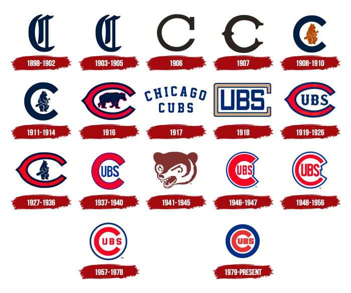
One of the oldest representatives of the National League has more than 15 logos. A continuous revolution of logos began in 1919. There have been six different versions of logos with the letter “C,” and most logos throughout the club’s history had the concept of the name “Cubs” inside the letter “C.” Some are entirely different, but all feature a graphically stylized letter “C.” The sign’s font, as well as the design, evolved from an Old English variant to a modern one. A pivotal moment in the symbol’s development was 1918 – the time of the appearance of the inscription “UBS.” This inscription is still used today.
What is Chicago Cubs?
Chicago Cubs is one of the two Major League Baseball franchises belonging to the most populous city in Illinois. The team has been playing in the National Central League since 1994 and is a founder of the National League of Professional Baseball Clubs. Since 1916, the Chicago club’s home stadium has been Wrigley Field.
1898 – 1902
Initially, the club was called “Chicago Orphans,” with the classic Old English letter “C” of dark blue color representing the city of Chicago as its logo.
1903 – 1905
Four years later, the club was renamed “Chicago Cubs.” The Old English letter “C” remains on the logo, slightly lightening the dark blue color.
1906
The style of the letter “C” changes to a classic print, and the color from dark blue to brown. The letter also symbolizes the city of Chicago.
1907
Another version of the Old English font appears in 1907. The letter “C” has forked edges and an elongated middle.
1908 – 1910
For the first time on the Chicago Cubs logo, an image of a brown bear appears. A light brown teddy bear with a baseball bat in its paw was placed inside a large printed letter “C” of dark brown color.
1911 – 1914
The sixth club logo is different from the previous one only in that the bear’s color changes from brown to blue.
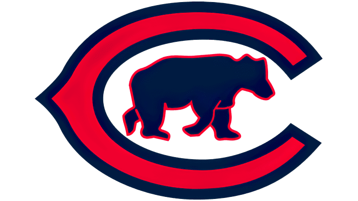
1916
In 1916, the logo was completely redesigned. Inside a red letter “C” with a dark blue outline, a dark brown bear on all fours appeared. The image was also outlined with a thin red border.
1917
For the first time in the history of the “Chicago Cubs” emblem, the logo simply depicted the team’s name in dark blue print letters.
1918
In 1918, for the first time in the history of the club’s logos, the idea of placing the letters “UBS” inside a large, almost closed letter “C” of light brown color appeared, thus forming the team’s name “Cubs.” The letters “UBS” were of dark blue color.
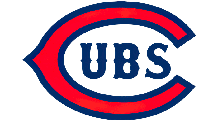
1919 – 1926
The letter “C” acquires a rounded shape and changes its color from brown to red, adding a dark blue outline. The letters “UBS” also change the font, adding more patterns and details.
1927 – 1936
For the next nine years, the club returned to the image of a bear with a baseball bat in its paw, which was previously present on the logo of 1911. It is placed inside a large red letter “C” with a dark blue outline, indicating the team’s location – the city of Chicago.
1937 – 1940
Again, the logo features the concept of blue letters “UBS” depicted inside a large red letter “C” with a thin blue outline.
1941 – 1945
Experimenting with logos, in 1941, an image of the head of a growling brown teddy bear appeared. The logo resembles the concept of the Chicago Bears Club.
1946 – 1947
A revised version of the 1937 logo is different in that the figure has one common blue outline, and the letters “UBS” become red.
1948 – 1956
Chicago Cubs refines the shape of the logo, stretching the letters “UBS” diagonally and making them larger. Additionally, the white and blue contours on the image are now of the same thickness.
1957 – 1978
The word “Cubs” is placed inside a dark blue circle on a white background. The letters “UBS” return to their previous size and classic print form. The shape of the logo acquires a round form, making the Chicago Cubs emblem look more stylish.
1979 – today
For 40 years, this logo has been used by the Chicago Cubs as its primary emblem. The image is based on a classic rondel with a central dot and a wide outlining ring. The red letter “C” almost encircles the letters “UBS” of the same color. The letter “C” has become even more rounded and increased in thickness, as has the outer dark blue circle, which has become several times thicker. The letters “UBS” now occupy more space on the logo than before. Over a long time, they have undergone many changes, both in shape and size. In the end, the designers settled on a simple and strict font, preserving the original concept. All elements are placed on a white background, surrounded by a blue strip.
Chicago Cubs: Interesting Facts
The Chicago Cubs are a baseball team with a long history and many fans.
- How They Started: The Cubs began in 1876, first called the Chicago White Stockings. They changed their name several times before becoming the Cubs in 1903.
- Their Home: They play at Wrigley Field, which opened in 1914. It’s old and famous for its walls covered in ivy and the scoreboard that people change by hand.
- A Goat’s Curse: People said the Cubs were cursed in 1945 because a goat wasn’t allowed into Wrigley Field. This “curse” was blamed for the Cubs not winning for long.
- A Long Wait: The Cubs didn’t win the World Series for 108 years, from 1908 until 2016. That was the longest time any team in baseball had to wait.
- Winning Again: In 2016, the Cubs finally won the World Series, beating the Cleveland Indians. It was a big deal, and lots of people celebrated.
- Big Rivalries: The Cubs have big rivalries, especially with the St. Louis Cardinals and the Chicago White Sox. These games are always exciting.
- Famous Fans: Some celebrities like Bill Murray and Eddie Vedder like the Cubs and go to their games.
- Night Games: In 1988, Wrigley Field was the last baseball field to get lights for night games because some people didn’t want them, and they liked playing during the day.
- Ernie Banks: A player called “Mr. Cub,” Ernie Banks loved baseball so much that he said, “Let’s play two!” He’s a Cubs legend.
- The Ivy: The walls in the outfield at Wrigley Field have ivy. It’s pretty and can make playing tricky if a ball gets stuck.
The Cubs are known for their old field, fun traditions, and finally winning again after waiting a long time.
Font and Colors
One of the oldest National League baseball clubs has seventeen emblems. Although they are all of different types, they have a common element that makes them recognizable. It is the letter “C” – the single beginning of both words in the phrase “Chicago Cubs.” At different times, designers originally decorated it: until 1908, it was single, then an image of a bear appeared, an inscription in the form of an elongated letter, and a print form.
The most successful was the version with part of the name inside “C.” The original concept for it was to combine the letter with a miniature bear. The result of the idea’s transformation was the appearance of the modern version in the form of a rondel. The stylized word “Cubs” is placed on the blue ring. The first letter is written in uppercase. It is made very large and resembles an open circle, inside which is the rest of the team’s name – “UBS.”
Since 1898, several fonts have been used on the baseball club’s logo. Designers have played with the letter “C” in different ways. The font alternated with serifs, Old English, chopped, grotesque. Now, the text on the emblem is made in a Sans Serif category font. Smooth, streamlined symbols combine well with the circle. The ends of the “C” are longer than usual: they almost close after “B,” so it seems that “S” is separate from the other characters.
The predominant color in the logo is red: it appears most often. The second is blue. It is followed by white, which acts as a background palette. Light brown and beige were also used at different times.
Chicago Cubs color codes
| Blue | Hex color: | #0e3386 |
|---|---|---|
| RGB: | 39 59 129 | |
| CMYK: | 100 58 0 21 | |
| Pantone: | PMS 294 C |
| Red | Hex color: | #cc3433 |
|---|---|---|
| RGB: | 204 52 51 | |
| CMYK: | 0 100 81 4 | |
| Pantone: | PMS 186 C |
FAQ
What does the “Chicago Cubs” logo represent?
In color, shape, and structure, the “Chicago Cubs” logo resembles a rondel, but not a classic one, a stylized one. Its base is a white circle with a large bold letter C. It is part of the name of the baseball team, but the letters UBS are not located to the right – they are right inside C. The borders of the emblem are outlined by a wide blue ring.
When was the “Chicago Cubs” team founded?
The team debuted on April 29, 1870, under the name Chicago White Stockings. However, the official date of its creation is considered to be 1876, when it joined the National League as a founding member. The current name (Chicago Cubs) was given to the franchise in 1907.
Who came first, “White Sox” or “Cubs”?
The Chicago baseball club, named the “Chicago White Sox,” appeared shortly before its debut in 1870. It was renamed the “Chicago Cubs” almost 40 years later – in 1907.
Who founded the “Chicago Cubs”?
The Chicago White Stockings team, which preceded the Chicago Cubs, was founded by enthusiasts who wanted to compete with the Cincinnati Red Stockings. However, William Ambrose Hulbert made a much more significant contribution to the club’s development. Taking over the club, he made it more organized and initiated the creation of the National League of Professional Baseball Clubs.

